- Empty.PRESENTED_IMAGE_DEFAULT
## Semantic DOM
## Design Token
---
Title: Form
URL: https://ant.design/components/form
---
## When to use {#when-to-use}
- When you need to create an instance or collect information.
- When you need to validate fields in certain rules.
## Examples
Basic Usage
Form methods
Form Layout
Form mix layout
Form disabled
Form variants
Required style
Form size
label can wrap
No block rule
Watch Hooks
Validate Trigger
Validate Only
Path Prefix
Dynamic Form Item
Dynamic Form nest Items
Dynamic Form nest pure Items
Complex Dynamic Form Item
Nest
complex form control
Customized Form Controls
Store Form Data into Upper Component
Control between forms
Inline Login Form
Login Form
Registration
Advanced search
Form in Modal to Create
Time-related Controls
Handle Form Data Manually
Customized Validation
Dynamic Rules
Dependencies
getValueProps + normalize
Slide to error field
Other Form Controls
Disabled Input Debug
label ellipsis
Test col 24 usage
Ref item
Custom feedback icons
Component Token
## API
Common props ref:[Common props](/docs/react/common-props)
### Form
| Property | Description | Type | Default | Version |
| --- | --- | --- | --- | --- |
| colon | Configure the default value of `colon` for Form.Item. Indicates whether the colon after the label is displayed (only effective when prop layout is horizontal) | boolean | true | |
| disabled | Set form component disable, only available for antd components | boolean | false | 4.21.0 |
| component | Set the Form rendering element. Do not create a DOM node for `false` | ComponentType \| false | form | |
| fields | Control of form fields through state management (such as redux). Not recommended for non-strong demand. View [example](#form-demo-global-state) | [FieldData](#fielddata)\[] | - | |
| form | Form control instance created by `Form.useForm()`. Automatically created when not provided | [FormInstance](#forminstance) | - | |
| feedbackIcons | Can be passed custom icons while `Form.Item` element has `hasFeedback` | [FeedbackIcons](#feedbackicons) | - | 5.9.0 |
| initialValues | Set value by Form initialization or reset | object | - | |
| labelAlign | The text align of label of all items | `left` \| `right` | `right` | |
| labelWrap | whether label can be wrap | boolean | false | 4.18.0 |
| labelCol | Label layout, like `
` component. Set `span` `offset` value like `{span: 3, offset: 12}` or `sm: {span: 3, offset: 12}` | [object](/components/grid/#col) | - | |
| layout | Form layout | `horizontal` \| `vertical` \| `inline` | `horizontal` | |
| name | Form name. Will be the prefix of Field `id` | string | - | |
| preserve | Keep field value even when field removed. You can get the preserve field value by `getFieldsValue(true)` | boolean | true | 4.4.0 |
| requiredMark | Required mark style. Can use required mark or optional mark. You can not config to single Form.Item since this is a Form level config | boolean \| `optional` \| ((label: ReactNode, info: { required: boolean }) => ReactNode) | true | `renderProps`: 5.9.0 |
| scrollToFirstError | Auto scroll to first failed field when submit | boolean \| [Options](https://github.com/stipsan/scroll-into-view-if-needed/tree/ece40bd9143f48caf4b99503425ecb16b0ad8249#options) \| { focus: boolean } | false | focus: 5.24.0 |
| size | Set field component size (antd components only) | `small` \| `middle` \| `large` | - | |
| validateMessages | Validation prompt template, description [see below](#validatemessages) | [ValidateMessages](https://github.com/ant-design/ant-design/blob/6234509d18bac1ac60fbb3f92a5b2c6a6361295a/components/locale/en_US.ts#L88-L134) | - | |
| validateTrigger | Config field validate trigger | string \| string\[] | `onChange` | 4.3.0 |
| variant | Variant of components inside form | `outlined` \| `borderless` \| `filled` \| `underlined` | `outlined` | 5.13.0 \| `underlined`: 5.24.0 |
| wrapperCol | The layout for input controls, same as `labelCol` | [object](/components/grid/#col) | - | |
| onFieldsChange | Trigger when field updated | function(changedFields, allFields) | - | |
| onFinish | Trigger after submitting the form and verifying data successfully | function(values) | - | |
| onFinishFailed | Trigger after submitting the form and verifying data failed | function({ values, errorFields, outOfDate }) | - | |
| onValuesChange | Trigger when value updated | function(changedValues, allValues) | - | |
| clearOnDestroy | Clear form values when the form is uninstalled | boolean | false | 5.18.0 |
> It accepts all props which native forms support but `onSubmit`.
### validateMessages
Form provides [default verification error messages](https://github.com/ant-design/ant-design/blob/6234509d18bac1ac60fbb3f92a5b2c6a6361295a/components/locale/en_US.ts#L88-L134). You can modify the template by configuring `validateMessages` property. A common usage is to configure localization:
```jsx
const validateMessages = {
required: "'${name}' is required!",
// ...
};
;
```
Besides, [ConfigProvider](/components/config-provider/) also provides a global configuration scheme that allows for uniform configuration error notification templates:
```jsx
const validateMessages = {
required: "'${name}' is Required!",
// ...
};
;
```
## Form.Item
Form field component for data bidirectional binding, validation, layout, and so on.
| Property | Description | Type | Default | Version |
| --- | --- | --- | --- | --- |
| colon | Used with `label`, whether to display `:` after label text. | boolean | true | |
| dependencies | Set the dependency field. See [below](#dependencies) | [NamePath](#namepath)\[] | - | |
| extra | The extra prompt message. It is similar to help. Usage example: to display error message and prompt message at the same time | ReactNode | - | |
| getValueFromEvent | Specify how to get value from event or other onChange arguments | (..args: any\[]) => any | - | |
| getValueProps | Additional props with sub component (It's not recommended to generate dynamic function prop by `getValueProps`. Please pass it to child component directly) | (value: any) => Record
| - | 4.2.0 |
| hasFeedback | Used with `validateStatus`, this option specifies the validation status icon. Recommended to be used only with `Input`. Also, It can get feedback icons via icons prop. | boolean \| { icons: [FeedbackIcons](#feedbackicons) } | false | icons: 5.9.0 |
| help | The prompt message. If not provided, the prompt message will be generated by the validation rule. | ReactNode | - | |
| hidden | Whether to hide Form.Item (still collect and validate value) | boolean | false | 4.4.0 |
| htmlFor | Set sub label `htmlFor` | string | - | |
| initialValue | Config sub default value. Form `initialValues` get higher priority when conflict | string | - | 4.2.0 |
| label | Label text. When there is no need for a label but it needs to be aligned with a colon, it can be set to null | ReactNode | - | null: 5.22.0 |
| labelAlign | The text align of label, | `left` \| `right` | `right` | |
| labelCol | The layout of label. You can set `span` `offset` to something like `{span: 3, offset: 12}` or `sm: {span: 3, offset: 12}` same as with ``
### shouldUpdate
Form updates only the modified field-related components for performance optimization purposes by incremental update. In most cases, you only need to write code or do validation with the [`dependencies`](#dependencies) property. In some specific cases, such as when a new field option appears with a field value changed, or you just want to keep some area updating by form update, you can modify the update logic of Form.Item via the `shouldUpdate`.
When `shouldUpdate` is `true`, any Form update will cause the Form.Item to be re-rendered. This is very helpful for custom rendering some areas. It should be noted that the child component should be returned in a function, otherwise `shouldUpdate` won't behave correctly:
related issue: [#34500](https://github.com/ant-design/ant-design/issues/34500)
```jsx
{() => {
return {JSON.stringify(form.getFieldsValue(), null, 2)} ;
}}
```
You can ref [example](#form-demo-inline-login) to see detail.
When `shouldUpdate` is a function, it will be called by form values update. Providing original values and current value to compare. This is very helpful for rendering additional fields based on values:
```jsx
prevValues.additional !== curValues.additional}>
{() => {
return (
);
}}
```
You can ref [example](#form-demo-control-hooks) to see detail.
### messageVariables
You can modify the default verification information of Form.Item through `messageVariables`.
```jsx
```
Since `5.20.2`, when you don't want to convert `${}`, you can use `\\${}` to skip:
```jsx
{ required: true, message: '${label} is convert, \\${label} is not convert' }
// good is convert, ${label} is not convert
```
## Form.List
Provides array management for fields.
| Property | Description | Type | Default | Version |
| --- | --- | --- | --- | --- |
| children | Render function | (fields: Field\[], operation: { add, remove, move }, meta: { errors }) => React.ReactNode | - | |
| initialValue | Config sub default value. Form `initialValues` get higher priority when conflict | any\[] | - | 4.9.0 |
| name | Field name, support array. List is also a field, so it will return all the values by `getFieldsValue`. You can change this logic by [config](#getfieldsvalue) | [NamePath](#namepath) | - | |
| rules | Validate rules, only support customize validator. Should work with [ErrorList](#formerrorlist) | { validator, message }\[] | - | 4.7.0 |
```tsx
{(fields) => (
{fields.map((field) => (
))}
)}
```
Note: You should not configure Form.Item `initialValue` under Form.List. It always should be configured by Form.List `initialValue` or Form `initialValues`.
## operation
Some operator functions in render form of Form.List.
| Property | Description | Type | Default | Version |
| --- | --- | --- | --- | --- |
| add | add form item | (defaultValue?: any, insertIndex?: number) => void | insertIndex | 4.6.0 |
| move | move form item | (from: number, to: number) => void | - | |
| remove | remove form item | (index: number \| number\[]) => void | number\[] | 4.5.0 |
## Form.ErrorList
New in 4.7.0. Show error messages, should only work with `rules` of Form.List. See [example](#form-demo-dynamic-form-item).
| Property | Description | Type | Default |
| -------- | ----------- | ------------ | ------- |
| errors | Error list | ReactNode\[] | - |
## Form.Provider
Provide linkage between forms. If a sub form with `name` prop update, it will auto trigger Provider related events. See [example](#form-demo-form-context).
| Property | Description | Type | Default |
| --- | --- | --- | --- |
| onFormChange | Triggered when a sub form field updates | function(formName: string, info: { changedFields, forms }) | - |
| onFormFinish | Triggered when a sub form submits | function(formName: string, info: { values, forms }) | - |
```jsx
{
if (name === 'form1') {
// Do something...
}
}}
>
```
### FormInstance
| Name | Description | Type | Version |
| --- | --- | --- | --- |
| getFieldError | Get the error messages by the field name | (name: [NamePath](#namepath)) => string\[] | |
| getFieldInstance | Get field instance | (name: [NamePath](#namepath)) => any | 4.4.0 |
| getFieldsError | Get the error messages by the fields name. Return as an array | (nameList?: [NamePath](#namepath)\[]) => FieldError\[] | |
| getFieldsValue | Get values by a set of field names. Return according to the corresponding structure. Default return mounted field value, but you can use `getFieldsValue(true)` to get all values | [GetFieldsValue](#getfieldsvalue) | |
| getFieldValue | Get the value by the field name | (name: [NamePath](#namepath)) => any | |
| isFieldsTouched | Check if fields have been operated. Check if all fields is touched when `allTouched` is `true` | (nameList?: [NamePath](#namepath)\[], allTouched?: boolean) => boolean | |
| isFieldTouched | Check if a field has been operated | (name: [NamePath](#namepath)) => boolean | |
| isFieldValidating | Check field if is in validating | (name: [NamePath](#namepath)) => boolean | |
| resetFields | Reset fields to `initialValues` | (fields?: [NamePath](#namepath)\[]) => void | |
| scrollToField | Scroll to field position | (name: [NamePath](#namepath), options: [ScrollOptions](https://github.com/stipsan/scroll-into-view-if-needed/tree/ece40bd9143f48caf4b99503425ecb16b0ad8249#options) \| { focus: boolean }) => void | focus: 5.24.0 |
| setFields | Set fields status | (fields: [FieldData](#fielddata)\[]) => void | |
| setFieldValue | Set fields value(Will directly pass to form store and **reset validation message**. If you do not want to modify passed object, please clone first) | (name: [NamePath](#namepath), value: any) => void | 4.22.0 |
| setFieldsValue | Set fields value(Will directly pass to form store and **reset validation message**. If you do not want to modify passed object, please clone first). Use `setFieldValue` instead if you want to only config single value in Form.List | (values) => void | |
| submit | Submit the form. It's same as click `submit` button | () => void | |
| validateFields | Validate fields. Use `recursive` to validate all the field in the path | (nameList?: [NamePath](#namepath)\[], config?: [ValidateConfig](#validatefields)) => Promise | |
#### validateFields
```tsx
export interface ValidateConfig {
// New in 5.5.0. Only validate content and not show error message on UI.
validateOnly?: boolean;
// New in 5.9.0. Recursively validate the provided `nameList` and its sub-paths.
recursive?: boolean;
// New in 5.11.0. Validate dirty fields (touched + validated).
// It's useful to validate fields only when they are touched or validated.
dirty?: boolean;
}
```
return sample:
```jsx
validateFields()
.then((values) => {
/*
values:
{
username: 'username',
password: 'password',
}
*/
})
.catch((errorInfo) => {
/*
errorInfo:
{
values: {
username: 'username',
password: 'password',
},
errorFields: [
{ name: ['password'], errors: ['Please input your Password!'] },
],
outOfDate: false,
}
*/
});
```
## Hooks
### Form.useForm
`type Form.useForm = (): [FormInstance]`
Create Form instance to maintain data store.
### Form.useFormInstance
`type Form.useFormInstance = (): FormInstance`
Added in `4.20.0`. Get current context form instance to avoid pass as props between components:
```tsx
const Sub = () => {
const form = Form.useFormInstance();
return form.setFieldsValue({})} />;
};
export default () => {
const [form] = Form.useForm();
return (
);
};
```
### Form.useWatch
`type Form.useWatch = (namePath: NamePath | (selector: (values: Store) => any), formInstance?: FormInstance | WatchOptions): Value`
`5.12.0` add `selector`
Watch the value of a field. You can use this to interact with other hooks like `useSWR` to reduce development costs:
```tsx
const Demo = () => {
const [form] = Form.useForm();
const userName = Form.useWatch('username', form);
const { data: options } = useSWR(`/api/user/${userName}`, fetcher);
return (
);
};
```
If your component is wrapped by `Form.Item`, you can omit the second argument, `Form.useWatch` will find the nearest `FormInstance` automatically.
By default `useWatch` only watches the registered field. If you want to watch the unregistered field, please use `preserve`:
```tsx
const Demo = () => {
const [form] = Form.useForm();
const age = Form.useWatch('age', { form, preserve: true });
console.log(age);
return (
form.setFieldValue('age', 2)}>Update
);
};
```
### Form.Item.useStatus
`type Form.Item.useStatus = (): { status: ValidateStatus | undefined, errors: ReactNode[], warnings: ReactNode[] }`
Added in `4.22.0`. Could be used to get validate status of Form.Item. If this hook is not used under Form.Item, `status` would be `undefined`. Added `error` and `warnings` in `5.4.0`, Could be used to get error messages and warning messages of Form.Item:
```tsx
const CustomInput = ({ value, onChange }) => {
const { status, errors } = Form.Item.useStatus();
return (
```
### How does `name` fill value when it's an array?
`name` will fill value by array order. When there exists number in it and no related field in form store, it will auto convert field to array. If you want to keep it as object, use string like: `['1', 'name']`.
### Why is there a form warning when used in Modal?
> Warning: Instance created by `useForm` is not connect to any Form element. Forget to pass `form` prop?
Before Modal opens, children elements do not exist in the view. You can set `forceRender` on Modal to pre-render its children. Click [here](https://codesandbox.io/s/antd-reproduction-template-ibu5c) to view an example.
### Why is component `defaultValue` not working when inside Form.Item?
Components inside Form.Item with name property will turn into controlled mode, which makes `defaultValue` not work anymore. Please try `initialValues` of Form to set default value.
### Why can not call `ref` of Form at first time?
`ref` only receives the mounted instance. please ref React official doc:
### Why will `resetFields` re-mount component?
`resetFields` will re-mount component under Field to clean up customize component side effects (like async data, cached state, etc.). It's by design.
### Difference between Form initialValues and Item initialValue?
In most case, we always recommend to use Form `initialValues`. Use Item `initialValue` only with dynamic field usage. Priority follows the rules:
1. Form `initialValues` is the first priority
2. Field `initialValue` is secondary \*. Does not work when multiple Item with same `name` setting the `initialValue`
### Why can't `getFieldsValue` get value at first render?
`getFieldsValue` returns collected field data by default, but the Form.Item node is not ready at the first render. You can get all field data by `getFieldsValue(true)`.
### Why some component not response with `setFieldsValue` to `undefined`?
`value` change from certain one to `undefined` in React means from controlled mode to uncontrolled mode. Thus it will not change display value but modified FormStore in fact. You can HOC to handle this:
```jsx
const MyInput = ({
// Force use controlled mode
value = '',
...rest
}) =>
;
```
### Why does `onFieldsChange` trigger three times on change when field sets `rules`?
Validating is also part of the value updating. It pass follow steps:
1. Trigger value change
2. Rule validating
3. Rule validated
In each `onFieldsChange`, you will get `false` > `true` > `false` with `isFieldValidating`.
### Why doesn't Form.List support `label` and need ErrorList to show errors?
Form.List use renderProps which mean internal structure is flexible. Thus `label` and `error` can not have best place. If you want to use antd `label`, you can wrap with Form.Item instead.
### Why can't Form.Item `dependencies` work on Form.List field?
Your name path should also contain Form.List `name`:
```tsx
{(fields) =>
fields.map((field) => (
))
}
```
dependencies should be `['users', 0, 'name']`
### Why doesn't `normalize` support async?
React can not get correct interaction of controlled component with async value update. When user trigger `onChange`, component will do no response since `value` update is async. If you want to trigger value update async, you should use customize component to handle value state internal and pass sync value control to Form instead.
### `scrollToFirstError` and `scrollToField` not working?
1. use custom form control
See similar issues: [#28370](https://github.com/ant-design/ant-design/issues/28370) [#27994](https://github.com/ant-design/ant-design/issues/27994)
Starting from version `5.17.0`, the sliding operation will prioritize using the ref element forwarded by the form control elements. Therefore, when considering custom components to support verification scrolling, please consider forwarding it to the form control elements first.
`scrollToFirstError` and `scrollToField` deps on `id` attribute passed to form control, please make sure that it hasn't been ignored in your custom form control. Check [codesandbox](https://codesandbox.io/s/antd-reproduction-template-forked-25nul?file=/index.js) for solution.
2. multiple forms on same page
If there are multiple forms on the page, and there are duplicate same `name` form item, the form scroll probably may find the form item with the same name in another form. You need to set a different `name` for the `Form` component to distinguish it.
### Continue, why not use `ref` to bind element?
Form can not get real DOM node when customize component not support `ref`. It will get warning in React Strict Mode if wrap with Class Component and call `findDOMNode`. So we use `id` to locate element.
### `setFieldsValue` do not trigger `onFieldsChange` or `onValuesChange`?
It's by design. Only user interactive can trigger the change event. This design is aim to avoid call `setFieldsValue` in change event which may makes loop calling.
### Why Form.Item not update value when children is nest?
Form.Item will inject `value` and `onChange` to children when render. Once your field component is wrapped, props will not pass to the correct node. Follow code will not work as expect:
```jsx
I am a wrapped Input
```
You can use HOC to solve this problem, don't forget passing props to form control component:
```jsx
const MyInput = (props) => (
I am a wrapped Input
;
```
### Why does clicking the label in the form change the component state?
> Related issue: [#47031](https://github.com/ant-design/ant-design/issues/47031), [#43175](https://github.com/ant-design/ant-design/issues/43175), [#52152](https://github.com/ant-design/ant-design/issues/52152)
Form label use [HTML label](https://developer.mozilla.org/en-US/docs/Web/HTML/Element/label) elements to wrap form controls, which focuses the corresponding control when clicked. This is the native behavior of label elements, designed to improve accessibility and user experience. This standard interaction pattern makes it easier for users to interact with form controls. If you need to disable this behavior, you can use `htmlFor={null}`, though it's generally not recommended.
```diff
-
+
```
---
Title: Descriptions
URL: https://ant.design/components/descriptions
---
## When To Use
Commonly displayed on the details page.
```tsx | pure
// works when >= 5.8.0, recommended ✅
const items: DescriptionsProps['items'] = [
{
key: '1',
label: 'UserName',
children: Zhou Maomao
,
},
{
key: '2',
label: 'Telephone',
children: 1810000000
,
},
{
key: '3',
label: 'Live',
children: Hangzhou, Zhejiang
,
},
{
key: '4',
label: 'Remark',
children: empty
,
},
{
key: '5',
label: 'Address',
children: No. 18, Wantang Road, Xihu District, Hangzhou, Zhejiang, China
,
},
];
Zhou Maomao
1810000000
Hangzhou, Zhejiang
empty
No. 18, Wantang Road, Xihu District, Hangzhou, Zhejiang, China
;
```
## Examples
Basic
border
border
padding
Custom size
responsive
Vertical
Vertical border
Customize label & wrapper style
JSX demo
Component Token
row
## API
Common props ref:[Common props](/docs/react/common-props)
### Descriptions
| Property | Description | Type | Default | Version |
| --- | --- | --- | --- | --- |
| bordered | Whether to display the border | boolean | false | |
| colon | Change default props `colon` value of Descriptions.Item. Indicates whether the colon after the label is displayed | boolean | true | |
| column | The number of `DescriptionItems` in a row, could be an object (like `{ xs: 8, sm: 16, md: 24}`, but must have `bordered={true}`) or a number | number \| [Record](https://github.com/ant-design/ant-design/blob/84ca0d23ae52e4f0940f20b0e22eabe743f90dca/components/descriptions/index.tsx#L111C21-L111C56) | 3 | |
| ~~contentStyle~~ | Customize content style, Please use `styles={{ content: {} }}` instead | CSSProperties | - | 4.10.0 |
| extra | The action area of the description list, placed at the top-right | ReactNode | - | 4.5.0 |
| items | Describe the contents of the list item | [DescriptionsItem](#descriptionitem)[] | - | 5.8.0 |
| ~~labelStyle~~ | Customize label style | CSSProperties, Please use `styles={{ label: {} }}` instead | - | 4.10.0 |
| layout | Define description layout | `horizontal` \| `vertical` | `horizontal` | |
| size | Set the size of the list. Can be set to `middle`,`small`, or not filled | `default` \| `middle` \| `small` | - | |
| title | The title of the description list, placed at the top | ReactNode | - | |
| classNames | Semantic DOM class | [Record](#semantic-dom) | - | 5.23.0 |
| styles | Semantic DOM style | [Record](#semantic-dom) | - | 5.23.0 |
### DescriptionItem
| Property | Description | Type | Default | Version |
| --- | --- | --- | --- | --- |
| ~~contentStyle~~ | Customize content style, Please use `styles={{ content: {} }}` instead | CSSProperties | - | 4.9.0 |
| label | The description of the content | ReactNode | - | |
| ~~labelStyle~~ | Customize label style, Please use `styles={{ label: {} }}` instead | CSSProperties | - | 4.9.0 |
| span | The number of columns included(`filled` Fill the remaining part of the current row) | number \| `filled` \| [Screens](/components/grid#col) | 1 | `screens: 5.9.0`, `filled: 5.22.0` |
> The number of span Description.Item. Span={2} takes up the width of two DescriptionItems. When both `style` and `labelStyle`(or `contentStyle`) configured, both of them will work. And next one will overwrite first when conflict.
## Semantic DOM
Basic
Custom Placement
Loading
Extra Actions
Render in current dom
Submit form in drawer
Preview drawer
Multi-level drawer
Preset size
Customize className for build-in module
ConfigProvider
No mask
_InternalPanelDoNotUseOrYouWillBeFired
Scroll Debug
Component Token
## API
Common props ref:[Common props](/docs/react/common-props)
:::warning{title=Note}
v5 uses `rootClassName` & `rootStyle` to configure the outermost element style, instead of `className` & `style` from v4. This is done to align the API with Modal.
:::
| Props | Description | Type | Default | Version |
| --- | --- | --- | --- | --- |
| autoFocus | Whether Drawer should get focused after open | boolean | true | 4.17.0 |
| afterOpenChange | Callback after the animation ends when switching drawers | function(open) | - | |
| className | Config Drawer Panel className. Use `rootClassName` if want to config top DOM style | string | - | |
| classNames | Semantic structure className | [Record](#semantic-dom) | - | 5.10.0 |
| closeIcon | Custom close icon. 5.7.0: close button will be hidden when setting to `null` or `false` | ReactNode | <CloseOutlined /> | |
| ~~destroyOnClose~~ | Whether to unmount child components on closing drawer or not | boolean | false | |
| destroyOnHidden | Whether to unmount child components on closing drawer or not | boolean | false | 5.25.0 |
| extra | Extra actions area at corner | ReactNode | - | 4.17.0 |
| footer | The footer for Drawer | ReactNode | - | |
| forceRender | Pre-render Drawer component forcibly | boolean | false | |
| getContainer | mounted node and display window for Drawer | HTMLElement \| () => HTMLElement \| Selectors \| false | body | |
| headerStyle | Style of the drawer header part | CSSProperties | - | |
| height | Placement is `top` or `bottom`, height of the Drawer dialog | string \| number | 378 | |
| keyboard | Whether support press esc to close | boolean | true | |
| mask | Whether to show mask or not | boolean | true | |
| maskClosable | Clicking on the mask (area outside the Drawer) to close the Drawer or not | boolean | true | |
| placement | The placement of the Drawer | `top` \| `right` \| `bottom` \| `left` | `right` | |
| push | Nested drawers push behavior | boolean \| { distance: string \| number } | { distance: 180 } | 4.5.0+ |
| rootStyle | Style of wrapper element which **contains mask** compare to `style` | CSSProperties | - | |
| style | Style of Drawer panel. Use `styles.body` if want to config body only | CSSProperties | - | |
| styles | Semantic structure style | [Record](#semantic-dom) | - | 5.10.0 |
| size | preset size of drawer, default `378px` and large `736px` | 'default' \| 'large' | 'default' | 4.17.0 |
| title | The title for Drawer | ReactNode | - | |
| loading | Show the Skeleton | boolean | false | 5.17.0 |
| open | Whether the Drawer dialog is visible or not | boolean | false | |
| width | Width of the Drawer dialog | string \| number | 378 | |
| zIndex | The `z-index` of the Drawer | number | 1000 | |
| onClose | Specify a callback that will be called when a user clicks mask, close button or Cancel button | function(e) | - | |
| drawerRender | Custom drawer content render | (node: ReactNode) => ReactNode | - | 5.18.0 |
## Semantic DOM
Basic
Range Picker
Multiple
Multiple Debug
Need Confirm
Switchable picker
Date Format
Choose Time
Mask Format
Limit Date Range
Disabled
Disabled Date & Time
Allow Empty
Select range dates
Preset Ranges
Extra Footer
Three Sizes
Customized Cell Rendering
Customize Panel
External use panel
Buddhist Era
Status
Variants
Filled Debug
Placement
Controlled Panels
Customized Range Picker
Prefix and Suffix
\_InternalPanelDoNotUseOrYouWillBeFired
Component Token
## API
Common props ref:[Common props](/docs/react/common-props)
There are five kinds of picker:
- DatePicker
- DatePicker\[picker="month"]
- DatePicker\[picker="week"]
- DatePicker\[picker="year"]
- DatePicker\[picker="quarter"] (Added in 4.1.0)
- RangePicker
### Localization
The default locale is en-US, if you need to use other languages, recommend to use internationalized components provided by us at the entrance. Look at: [ConfigProvider](https://ant.design/components/config-provider/).
If there are special needs (only modifying single component language), Please use the property: local. Example: [default](https://github.com/ant-design/ant-design/blob/master/components/date-picker/locale/example.json).
```jsx
// The default locale is en-US, if you want to use other locale, just set locale in entry file globally.
// Make sure you import the relevant dayjs file as well, otherwise the locale won't change for all texts (e.g. range picker months)
import locale from 'antd/locale/zh_CN';
import dayjs from 'dayjs';
import 'dayjs/locale/zh-cn';
dayjs.locale('zh-cn');
;
```
:::warning
When use with Next.js App Router, make sure to add `'use client'` before import locale file of dayjs. It's because all components of Ant Design only works in client, importing locale in RSC will not work.
:::
### Common API
The following APIs are shared by DatePicker, RangePicker.
| Property | Description | Type | Default | Version |
| --- | --- | --- | --- | --- |
| allowClear | Customize clear button | boolean \| { clearIcon?: ReactNode } | true | 5.8.0: Support object type |
| autoFocus | If get focus when component mounted | boolean | false | |
| className | The picker className | string | - | |
| dateRender | Custom rendering function for date cells, >= 5.4.0 use `cellRender` instead. | function(currentDate: dayjs, today: dayjs) => React.ReactNode | - | < 5.4.0 |
| cellRender | Custom rendering function for picker cells | (current: dayjs, info: { originNode: React.ReactElement,today: DateType, range?: 'start' \| 'end', type: PanelMode, locale?: Locale, subType?: 'hour' \| 'minute' \| 'second' \| 'meridiem' }) => React.ReactNode | - | 5.4.0 |
| components | Custom panels | Record | - | 5.14.0 |
| defaultOpen | Initial open state of picker | boolean | - | |
| disabled | Determine whether the DatePicker is disabled | boolean | false | |
| disabledDate | Specify the date that cannot be selected | (currentDate: dayjs, info: { from?: dayjs, type: Picker }) => boolean | - | `info`: 5.14.0 |
| format | To set the date format, support multi-format matching when it is an array, display the first one shall prevail. refer to [dayjs#format](https://day.js.org/docs/en/display/format). for example: [Custom Format](#date-picker-demo-format) | [formatType](#formattype) | [rc-picker](https://github.com/react-component/picker/blob/f512f18ed59d6791280d1c3d7d37abbb9867eb0b/src/utils/uiUtil.ts#L155-L177) | |
| order | Auto order date when multiple or range selection | boolean | true | 5.14.0 |
| ~~popupClassName~~ | To customize the className of the popup calendar, use `classNames.popup.root` instead | string | - | 4.23.0 |
| preserveInvalidOnBlur | Not clean input on blur even when the typing is invalidate | boolean | false | 5.14.0 |
| getPopupContainer | To set the container of the floating layer, while the default is to create a `div` element in `body` | function(trigger) | - | |
| inputReadOnly | Set the `readonly` attribute of the input tag (avoids virtual keyboard on touch devices) | boolean | false | |
| locale | Localization configuration | object | [default](https://github.com/ant-design/ant-design/blob/master/components/date-picker/locale/example.json) | |
| minDate | The minimum date, which also limits the range of panel switching | dayjs | - | 5.14.0 |
| maxDate | The maximum date, which also limits the range of panel switching | dayjs | - | 5.14.0 |
| mode | The picker panel mode( [Cannot select year or month anymore?](/docs/react/faq#when-set-mode-to-datepickerrangepicker-cannot-select-year-or-month-anymore) ) | `time` \| `date` \| `month` \| `year` \| `decade` | - | |
| needConfirm | Need click confirm button to trigger value change. Default `false` when `multiple` | boolean | - | 5.14.0 |
| nextIcon | The custom next icon | ReactNode | - | 4.17.0 |
| open | The open state of picker | boolean | - | |
| panelRender | Customize panel render | (panelNode) => ReactNode | - | 4.5.0 |
| picker | Set picker type | `date` \| `week` \| `month` \| `quarter` \| `year` | `date` | `quarter`: 4.1.0 |
| placeholder | The placeholder of date input | string \| \[string,string] | - | |
| placement | The position where the selection box pops up | `bottomLeft` `bottomRight` `topLeft` `topRight` | bottomLeft | |
| ~~popupStyle~~ | To customize the style of the popup calendar, use `styles.popup.root` instead | CSSProperties | {} | |
| prefix | The custom prefix | ReactNode | - | 5.22.0 |
| presets | The preset ranges for quick selection, Since `5.8.0`, preset value supports callback function. | { label: React.ReactNode, value: Dayjs \| (() => Dayjs) }\[] | - | |
| prevIcon | The custom prev icon | ReactNode | - | 4.17.0 |
| size | To determine the size of the input box, the height of `large` and `small`, are 40px and 24px respectively, while default size is 32px | `large` \| `middle` \| `small` | - | |
| status | Set validation status | 'error' \| 'warning' | - | 4.19.0 |
| style | To customize the style of the input box | CSSProperties | {} | |
| suffixIcon | The custom suffix icon | ReactNode | - | |
| superNextIcon | The custom super next icon | ReactNode | - | 4.17.0 |
| superPrevIcon | The custom super prev icon | ReactNode | - | 4.17.0 |
| variant | Variants of picker | `outlined` \| `borderless` \| `filled` \| `underlined` | `outlined` | 5.13.0 \| `underlined`: 5.24.0 |
| onOpenChange | Callback function, can be executed whether the popup calendar is popped up or closed | function(open) | - | |
| onPanelChange | Callback when picker panel mode is changed | function(value, mode) | - | |
### Common Methods
| Name | Description | Version |
| ------- | ------------ | ------- |
| blur() | Remove focus | |
| focus() | Get focus | |
### DatePicker
| Property | Description | Type | Default | Version |
| --- | --- | --- | --- | --- |
| defaultPickerValue | Default panel date, will be reset when panel open | [dayjs](https://day.js.org/) | - | 5.14.0 |
| defaultValue | To set default date, if start time or end time is null or undefined, the date range will be an open interval | [dayjs](https://day.js.org/) | - | |
| disabledTime | To specify the time that cannot be selected | function(date) | - | |
| format | To set the date format. refer to [dayjs#format](https://day.js.org/docs/en/display/format) | [formatType](#formattype) | `YYYY-MM-DD` | |
| multiple | Enable multiple selection. Not support `showTime` | boolean | false | 5.14.0 |
| pickerValue | Panel date. Used for controlled switching of panel date. Work with `onPanelChange` | [dayjs](https://day.js.org/) | - | 5.14.0 |
| renderExtraFooter | Render extra footer in panel | (mode) => React.ReactNode | - | |
| showNow | Show the fast access of current datetime | boolean | - | 4.4.0 |
| showTime | To provide an additional time selection | object \| boolean | [TimePicker Options](/components/time-picker/#api) | |
| showTime.defaultValue | To set default time of selected date, [demo](#date-picker-demo-disabled-date) | [dayjs](https://day.js.org/) | dayjs() | |
| showWeek | Show week info when in DatePicker | boolean | false | 5.14.0 |
| value | To set date | [dayjs](https://day.js.org/) | - | |
| onChange | Callback function, can be executed when the selected time is changing | function(date: dayjs, dateString: string) | - | |
| onOk | Callback when click ok button | function() | - | |
| onPanelChange | Callback function for panel changing | function(value, mode) | - | |
### DatePicker\[picker=year]
| Property | Description | Type | Default | Version |
| --- | --- | --- | --- | --- |
| defaultValue | To set default date | [dayjs](https://day.js.org/) | - | |
| format | To set the date format. refer to [dayjs#format](https://day.js.org/docs/en/display/format) | [formatType](#formattype) | `YYYY` | |
| multiple | Enable multiple selection | boolean | false | 5.14.0 |
| renderExtraFooter | Render extra footer in panel | () => React.ReactNode | - | |
| value | To set date | [dayjs](https://day.js.org/) | - | |
| onChange | Callback function, can be executed when the selected time is changing | function(date: dayjs, dateString: string) | - | |
### DatePicker\[picker=quarter]
Added in `4.1.0`.
| Property | Description | Type | Default | Version |
| --- | --- | --- | --- | --- |
| defaultValue | To set default date | [dayjs](https://day.js.org/) | - | |
| format | To set the date format. refer to [dayjs#format](https://day.js.org/docs/en/display/format) | [formatType](#formattype) | `YYYY-\QQ` | |
| multiple | Enable multiple selection | boolean | false | 5.14.0 |
| renderExtraFooter | Render extra footer in panel | () => React.ReactNode | - | |
| value | To set date | [dayjs](https://day.js.org/) | - | |
| onChange | Callback function, can be executed when the selected time is changing | function(date: dayjs, dateString: string) | - | |
### DatePicker\[picker=month]
| Property | Description | Type | Default | Version |
| --- | --- | --- | --- | --- |
| defaultValue | To set default date | [dayjs](https://day.js.org/) | - | |
| format | To set the date format. refer to [dayjs#format](https://day.js.org/docs/en/display/format) | [formatType](#formattype) | `YYYY-MM` | |
| multiple | Enable multiple selection | boolean | false | 5.14.0 |
| renderExtraFooter | Render extra footer in panel | () => React.ReactNode | - | |
| value | To set date | [dayjs](https://day.js.org/) | - | |
| onChange | Callback function, can be executed when the selected time is changing | function(date: dayjs, dateString: string) | - | |
### DatePicker\[picker=week]
| Property | Description | Type | Default | Version |
| --- | --- | --- | --- | --- |
| defaultValue | To set default date | [dayjs](https://day.js.org/) | - | |
| format | To set the date format. refer to [dayjs#format](https://day.js.org/docs/en/display/format) | [formatType](#formattype) | `YYYY-wo` | |
| multiple | Enable multiple selection | boolean | false | 5.14.0 |
| renderExtraFooter | Render extra footer in panel | (mode) => React.ReactNode | - | |
| value | To set date | [dayjs](https://day.js.org/) | - | |
| onChange | Callback function, can be executed when the selected time is changing | function(date: dayjs, dateString: string) | - | |
| showWeek | Show week info when in DatePicker | boolean | true | 5.14.0 |
### RangePicker
| Property | Description | Type | Default | Version |
| --- | --- | --- | --- | --- |
| allowEmpty | Allow start or end input leave empty | \[boolean, boolean] | \[false, false] | |
| cellRender | Custom rendering function for picker cells | (current: dayjs, info: { originNode: React.ReactElement,today: DateType, range?: 'start' \| 'end', type: PanelMode, locale?: Locale, subType?: 'hour' \| 'minute' \| 'second' \| 'meridiem' }) => React.ReactNode | - | 5.4.0 |
| dateRender | Custom rendering function for date cells, >= 5.4.0 use `cellRender` instead. | function(currentDate: dayjs, today: dayjs) => React.ReactNode | - | < 5.4.0 |
| defaultPickerValue | Default panel date, will be reset when panel open | [dayjs](https://day.js.org/) | - | 5.14.0 |
| defaultValue | To set default date | \[[dayjs](https://day.js.org/), [dayjs](https://day.js.org/)] | - | |
| disabled | If disable start or end | \[boolean, boolean] | - | |
| disabledTime | To specify the time that cannot be selected | function(date: dayjs, partial: `start` \| `end`, info: { from?: dayjs }) | - | `info.from`: 5.17.0 |
| format | To set the date format. refer to [dayjs#format](https://day.js.org/docs/en/display/format) | [formatType](#formattype) | `YYYY-MM-DD HH:mm:ss` | |
| id | Config input ids | { start?: string, end?: string } | - | 5.14.0 |
| pickerValue | Panel date. Used for controlled switching of panel date. Work with `onPanelChange` | [dayjs](https://day.js.org/) | - | 5.14.0 |
| presets | The preset ranges for quick selection, Since `5.8.0`, preset value supports callback function. | { label: React.ReactNode, value: (Dayjs \| (() => Dayjs))\[] }\[] | - | |
| renderExtraFooter | Render extra footer in panel | () => React.ReactNode | - | |
| separator | Set separator between inputs | React.ReactNode | `
| {
format: string;
type?: 'mask';
};
```
Note: `type` is added in `5.14.0`.
## Semantic DOM
```js
import dayjs from 'dayjs';
import 'dayjs/locale/zh-cn';
import updateLocale from 'dayjs/plugin/updateLocale';
dayjs.extend(updateLocale);
dayjs.updateLocale('zh-cn', {
weekStart: 0,
});
```
### Why origin panel don't switch when using `panelRender`?
When you change the layout of nodes by `panelRender`, React will unmount and re-mount it which reset the component state. You should keep the layout stable. Please ref [#27263](https://github.com/ant-design/ant-design/issues/27263) for more info.
### How to understand disabled time and date?
Please refer to the blog ['Why is it so hard to disable the date?'](/docs/blog/picker), to learn how to use it.
---
Title: Divider
URL: https://ant.design/components/divider
---
## When To Use
- Divide sections of an article.
- Divide inline text and links such as the operation column of table.
## Examples
Horizontal
Divider with title
Set the spacing size of the divider
Text without heading style
Vertical
Style Customization
Component Token
Variant
## API
Common props ref:[Common props](/docs/react/common-props)
| Property | Description | Type | Default | Version |
| --- | --- | --- | --- | --- |
| children | The wrapped title | ReactNode | - | |
| className | The className of container | string | - | |
| dashed | Whether line is dashed | boolean | false | |
| variant | Whether line is dashed, dotted or solid | `dashed` \| `dotted` \| `solid` | solid | 5.20.0 |
| orientation | The position of title inside divider | `start` \| `end` \| `center` | `center` | `start` `end`: 5.24.0 |
| orientationMargin | The margin-left/right between the title and its closest border, while the `orientation` should not be `center`, If a numeric value of type `string` is provided without a unit, it is assumed to be in pixels (px) by default. | string \| number | - | |
| plain | Divider text show as plain style | boolean | true | 4.2.0 |
| style | The style object of container | CSSProperties | - | |
| size | The size of divider. Only valid for horizontal layout | `small` \| `middle` \| `large` | - | 5.25.0 |
| type | The direction type of divider | `horizontal` \| `vertical` | `horizontal` | |
## Design Token
);
export default Demo;
```
### Content Security Policy {#csp}
Some components use dynamic style to support wave effect. You can config `csp` prop if Content Security Policy (CSP) is enabled:
```tsx
My Button
```
## Examples
Locale
Direction
Component size
Theme
Custom Wave
Static function
prefixCls
useConfig
warning
## API
| Property | Description | Type | Default | Version |
| --- | --- | --- | --- | --- |
| componentDisabled | Config antd component `disabled` | boolean | - | 4.21.0 |
| componentSize | Config antd component size | `small` \| `middle` \| `large` | - | |
| csp | Set [Content Security Policy](https://developer.mozilla.org/en-US/docs/Web/HTTP/CSP) config | { nonce: string } | - | |
| direction | Set direction of layout. See [demo](#config-provider-demo-direction) | `ltr` \| `rtl` | `ltr` | |
| getPopupContainer | To set the container of the popup element. The default is to create a `div` element in `body` | function(triggerNode) | () => document.body | |
| getTargetContainer | Config Affix, Anchor scroll target container | () => HTMLElement | () => window | 4.2.0 |
| iconPrefixCls | Set icon prefix className | string | `anticon` | 4.11.0 |
| locale | Language package setting, you can find the packages in [antd/locale](http://unpkg.com/antd/locale/) | object | - | |
| popupMatchSelectWidth | Determine whether the dropdown menu and the select input are the same width. Default set `min-width` same as input. Will ignore when value less than select width. `false` will disable virtual scroll | boolean \| number | - | 5.5.0 |
| popupOverflow | Select like component popup logic. Can set to show in viewport or follow window scroll | 'viewport' \| 'scroll'
{children}
),
});
```
### ConfigProvider.useConfig() 5.3.0+ {#useconfig}
Get the value of the parent `Provider`, Such as `DisabledContextProvider`, `SizeContextProvider`.
```jsx
const {
componentDisabled, // 5.3.0+
componentSize, // 5.3.0+
} = ConfigProvider.useConfig();
```
| Property | Description | Type | Default | Version |
| --- | --- | --- | --- | --- |
| componentDisabled | antd component disabled state | boolean | - | 5.3.0 |
| componentSize | antd component size state | `small` \| `middle` \| `large` | - | 5.3.0 |
### Component Config
| Property | Description | Type | Default | Version |
| --- | --- | --- | --- | --- |
| alert | Set Alert common props | { className?: string, style?: React.CSSProperties, closeIcon?: React.ReactNode } | - | 5.7.0, `closeIcon`: 5.14.0 |
| anchor | Set Anchor common props | { className?: string, style?: React.CSSProperties } | - | 5.7.0 |
| avatar | Set Avatar common props | { className?: string, style?: React.CSSProperties } | - | 5.7.0 |
| badge | Set Badge common props | { className?: string, style?: React.CSSProperties, classNames?: [BadgeProps\["classNames"\]](/components/badge#api), styles?: [BadgeProps\["styles"\]](/components/badge#api) } | - | 5.7.0 |
| breadcrumb | Set Breadcrumb common props | { className?: string, style?: React.CSSProperties } | - | 5.7.0 |
| button | Set Button common props | { className?: string, style?: React.CSSProperties, classNames?: [ButtonProps\["classNames"\]](/components/button#api), styles?: [ButtonProps\["styles"\]](/components/button#api), autoInsertSpace?: boolean, variant?: ButtonVariantType, color?: ButtonColorType } | - | 5.6.0, `autoInsertSpace`: 5.17.0, `variant` and `color`: 5.25.0 |
| card | Set Card common props | { className?: string, style?: React.CSSProperties, classNames?: [CardProps\["classNames"\]](/components/card#api), styles?: [CardProps\["styles"\]](/components/card#api) } | - | 5.7.0, `classNames` and `styles`: 5.14.0 |
| calendar | Set Calendar common props | { className?: string, style?: React.CSSProperties } | - | 5.7.0 |
| carousel | Set Carousel common props | { className?: string, style?: React.CSSProperties } | - | 5.7.0 |
| cascader | Set Cascader common props | { className?: string, style?: React.CSSProperties, classNames?: [CascaderProps\["classNames"\]](/components/cascader#semantic-dom), styles?: [CascaderProps\["styles"\]](/components/cascader#semantic-dom) } | - | 5.7.0, `classNames` and `styles`: 5.25.0 |
| checkbox | Set Checkbox common props | { className?: string, style?: React.CSSProperties } | - | 5.7.0 |
| collapse | Set Collapse common props | { className?: string, style?: React.CSSProperties, expandIcon?: (props) => ReactNode } | - | 5.7.0, `expandIcon`: 5.15.0 |
| colorPicker | Set ColorPicker common props | { className?: string, style?: React.CSSProperties } | - | 5.7.0 |
| datePicker | Set datePicker common props | { className?: string, style?: React.CSSProperties, classNames?: [DatePickerConfig\["classNames"\]](/components/date-picker#semantic-dom), styles?: [DatePickerConfig\["styles"\]](/components/date-picker#semantic-dom) } | - | 5.7.0, `classNames` 和 `styles`: 5.25.0 |
| rangePicker | Set rangePicker common props | { className?: string, style?: React.CSSProperties } | - | 5.11.0 |
| descriptions | Set Descriptions common props | { className?: string, style?: React.CSSProperties, classNames?: [DescriptionsProps\["classNames"\]](/components/descriptions#api), styles?: [DescriptionsProps\["styles"\]](/components/descriptions#api) } | - | 5.7.0, `classNames` and `styles`: 5.23.0 |
| divider | Set Divider common props | { className?: string, style?: React.CSSProperties } | - | 5.7.0 |
| drawer | Set Drawer common props | { className?: string, style?: React.CSSProperties, classNames?: [DrawerProps\["classNames"\]](/components/drawer#api), styles?: [DrawerProps\["styles"\]](/components/drawer#api), closeIcon?: ReactNode } | - | 5.7.0, `classNames` and `styles`: 5.10.0, `closeIcon`: 5.14.0 |
| dropdown | Set Dropdown common props | { className?: string, style?: React.CSSProperties } | - | 5.11.0 |
| empty | Set Empty common props | { className?: string, style?: React.CSSProperties, classNames?: [EmptyProps\["classNames"\]](/components/empty#api), styles?: [EmptyProps\["styles"\]](/components/empty#api) } | - | 5.7.0, `classNames` and `styles`: 5.23.0 |
| flex | Set Flex common props | { className?: string, style?: React.CSSProperties, vertical?: boolean } | - | 5.10.0 |
| floatButtonGroup | Set FloatButton.Group common props | { closeIcon?: React.ReactNode } | - | 5.16.0 |
| form | Set Form common props | { className?: string, style?: React.CSSProperties, validateMessages?: [ValidateMessages](/components/form/#validatemessages), requiredMark?: boolean \| `optional`, scrollToFirstError?: boolean \| [Options](https://github.com/stipsan/scroll-into-view-if-needed/tree/ece40bd9143f48caf4b99503425ecb16b0ad8249#options) } | - | `requiredMark`: 4.8.0; `colon`: 4.18.0; `scrollToFirstError`: 5.2.0; `className` and `style`: 5.7.0 |
| image | Set Image common props | { className?: string, style?: React.CSSProperties, preview?: { closeIcon?: React.ReactNode } } | - | 5.7.0, `closeIcon`: 5.14.0 |
| input | Set Input common props | { autoComplete?: string, className?: string, style?: React.CSSProperties, allowClear?: boolean \| { clearIcon?: ReactNode } } | - | 4.2.0, `allowClear`: 5.15.0 |
| textArea | Set TextArea common props | { autoComplete?: string, className?: string, style?: React.CSSProperties, allowClear?: boolean \| { clearIcon?: ReactNode } } | - | 5.15.0 |
| layout | Set Layout common props | { className?: string, style?: React.CSSProperties } | - | 5.7.0 |
| list | Set List common props | { className?: string, style?: React.CSSProperties, item?:{ classNames: [ListItemProps\["classNames"\]](/components/list#listitem), styles: [ListItemProps\["styles"\]](/components/list#listitem) } } | - | 5.7.0 |
| menu | Set Menu common props | { className?: string, style?: React.CSSProperties, expandIcon?: ReactNode \| props => ReactNode } | - | 5.7.0, `expandIcon`: 5.15.0 |
| mentions | Set Mentions common props | { className?: string, style?: React.CSSProperties } | - | 5.7.0 |
| message | Set Message common props | { className?: string, style?: React.CSSProperties } | - | 5.7.0 |
| modal | Set Modal common props | { className?: string, style?: React.CSSProperties, classNames?: [ModalProps\["classNames"\]](/components/modal#api), styles?: [ModalProps\["styles"\]](/components/modal#api), closeIcon?: React.ReactNode } | - | 5.7.0, `classNames` and `styles`: 5.10.0, `closeIcon`: 5.14.0 |
| notification | Set Notification common props | { className?: string, style?: React.CSSProperties, closeIcon?: React.ReactNode } | - | 5.7.0, `closeIcon`: 5.14.0 |
| pagination | Set Pagination common props | { showSizeChanger?: boolean, className?: string, style?: React.CSSProperties } | - | 5.7.0 |
| progress | Set Progress common props | { className?: string, style?: React.CSSProperties } | - | 5.7.0 |
| radio | Set Radio common props | { className?: string, style?: React.CSSProperties } | - | 5.7.0 |
| rate | Set Rate common props | { className?: string, style?: React.CSSProperties } | - | 5.7.0 |
| result | Set Result common props | { className?: string, style?: React.CSSProperties } | - | 5.7.0 |
| skeleton | Set Skeleton common props | { className?: string, style?: React.CSSProperties } | - | 5.7.0 |
| segmented | Set Segmented common props | { className?: string, style?: React.CSSProperties } | - | 5.7.0 |
| select | Set Select common props | { className?: string, showSearch?: boolean, style?: React.CSSProperties, classNames?: [SelectProps\["classNames"\]](/components/select#api), styles?: [SelectProps\["styles"\]](/components/select#api) } | - | 5.7.0, `classNames` and `styles`: 5.25.0 |
| slider | Set Slider common props | { className?: string, style?: React.CSSProperties, classNames?: [SliderProps\["classNames"\]](/components/slider#api), styles?: [SliderProps\["styles"\]](/components/slider#api) } | - | 5.7.0, `classNames` and `styles`: 5.23.0 |
| switch | Set Switch common props | { className?: string, style?: React.CSSProperties } | - | 5.7.0 |
| space | Set Space common props, ref [Space](/components/space) | { size: `small` \| `middle` \| `large` \| `number`, className?: string, style?: React.CSSProperties, classNames?: [SpaceProps\["classNames"\]](/components/space#api), styles?: [SpaceProps\["styles"\]](/components/space#api) } | - | 5.6.0 |
| splitter | Set Splitter common props | { className?: string, style?: React.CSSProperties } | - | 5.21.0 |
| spin | Set Spin common props | { className?: string, style?: React.CSSProperties, indicator?: React.ReactElement } | - | 5.7.0, `indicator`: 5.20.0 |
| statistic | Set Statistic common props | { className?: string, style?: React.CSSProperties } | - | 5.7.0 |
| steps | Set Steps common props | { className?: string, style?: React.CSSProperties } | - | 5.7.0 |
| table | Set Table common props | { className?: string, style?: React.CSSProperties, expandable?: { expandIcon?: props => React.ReactNode } } | - | 5.7.0, `expandable`: 5.14.0 |
| tabs | Set Tabs common props | { className?: string, style?: React.CSSProperties, indicator?: { size?: GetIndicatorSize, align?: `start` \| `center` \| `end` }, moreIcon?: ReactNode, addIcon?: ReactNode, removeIcon?: ReactNode } | - | 5.7.0, `moreIcon` and `addIcon`: 5.14.0, `removeIcon`: 5.15.0 |
| tag | Set Tag common props | { className?: string, style?: React.CSSProperties, closeIcon?: React.ReactNode } | - | 5.7.0, `closeIcon`: 5.14.0 |
| timeline | Set Timeline common props | { className?: string, style?: React.CSSProperties } | - | 5.7.0 |
| timePicker | Set TimePicker common props | { className?: string, style?: React.CSSProperties, classNames?: [TimePickerConfig\["classNames"\]](/components/time-picker#semantic-dom), styles?: [TimePickerConfig\["styles"\]](/components/time-picker#semantic-dom) } | - | 5.7.0, `classNames` 和 `styles`: 5.25.0 |
| tour | Set Tour common props | { closeIcon?: React.ReactNode } | - | 5.14.0 |
| tooltip | Set Tooltip common props | { className?: string, style?: React.CSSProperties, classNames?:[Tooltip\["classNames"\]](/components/tooltip#api), styles?: [Tooltip\["styles"\]](/components/tooltip#api) } | - | 5.23.0 |
| popover | Set Popover common props | { className?: string, style?: React.CSSProperties, classNames?:[Popover\["classNames"\]](/components/popover#api), styles?: [Popover\["styles"\]](/components/popover#api) } | - | 5.23.0 |
| popconfirm | Set Popconfirm common props | { className?: string, style?: React.CSSProperties, classNames?:[Popconfirm\["classNames"\]](/components/popconfirm#api), styles?: [Popconfirm\["styles"\]](/components/popconfirm#api) } | - | 5.23.0 |
| transfer | Set Transfer common props | { className?: string, style?: React.CSSProperties, selectionsIcon?: React.ReactNode } | - | 5.7.0, `selectionsIcon`: 5.14.0 |
| tree | Set Tree common props | { className?: string, style?: React.CSSProperties } | - | 5.7.0 |
| treeSelect | Set TreeSelect common props | { classNames?:[TreeSelect\["classNames"\]](/components/tree-select#api), styles?: [TreeSelect\["styles"\]](/components/tree-select#api) } | - | 5.25.0 |
| typography | Set Typography common props | { className?: string, style?: React.CSSProperties } | - | 5.7.0 |
| upload | Set Upload common props | { className?: string, style?: React.CSSProperties } | - | 5.7.0 |
| wave | Config wave effect | { disabled?: boolean, showEffect?: (node: HTMLElement, info: { className, token, component }) => void } | - | 5.8.0 |
## FAQ
### How to contribute a new language? {#faq-add-locale}
See [<Adding new language>](/docs/react/i18n#adding-newplanguage).
### Date-related components locale is not working? {#faq-locale-not-work}
See FAQ [Date-related-components-locale-is-not-working?](/docs/react/faq#date-related-components-locale-is-not-working)
### Modal throw error when setting `getPopupContainer`? {#faq-get-popup-container}
Related issue:
When you config `getPopupContainer` to parentNode globally, Modal will throw error of `triggerNode is undefined` because it did not have a triggerNode. You can try the [fix](https://github.com/afc163/feedback-antd/commit/3e4d1ad1bc1a38460dc3bf3c56517f737fe7d44a) below.
```diff
triggerNode.parentNode}
+ getPopupContainer={node => {
+ if (node) {
+ return node.parentNode;
+ }
+ return document.body;
+ }}
>
```
### Why can't ConfigProvider props (like `prefixCls` and `theme`) affect ReactNode inside `message.info`, `notification.open`, `Modal.confirm`? {#faq-message-inherit}
antd will dynamic create React instance by `ReactDOM.render` when call message methods. Whose context is different with origin code located context. We recommend `useMessage`, `useNotification` and `useModal` which , the methods came from `message/notification/Modal` has been deprecated in 5.x.
### Locale is not working with Vite in production mode? {#faq-vite-locale-not-work}
Related issue: [#39045](https://github.com/ant-design/ant-design/issues/39045)
In production mode of Vite, default exports from cjs file should be used like this: `enUS.default`. So you can directly import locale from `es/` directory like `import enUS from 'antd/es/locale/en_US'` to make dev and production have the same behavior.
### `prefixCls` priority(The former is covered by the latter) {#faq-prefixcls-priority}
1. `ConfigProvider.config({ prefixCls: 'prefix-1' })`
2. `ConfigProvider.config({ holderRender: (children) => {children} })`
3. `message.config({ prefixCls: 'prefix-3' })`
---
Title: ColorPicker
URL: https://ant.design/components/color-picker
---
## When To Use
Used when the user needs to make a customized color selection.
## Examples
Basic Usage
Trigger size
controlled mode
Line Gradient
Rendering Trigger Text
Disable
Disabled Alpha
Clear Color
Custom Trigger
Custom Trigger Event
Color Format
Preset Colors
Custom Render Panel
Pure Render
## API
Common props ref:[Common props](/docs/react/common-props)
> This component is available since `antd@5.5.0`.
| Property | Description | Type | Default | Version |
| :-- | :-- | :-- | :-- | :-- |
| allowClear | Allow clearing color selected | boolean | false | |
| arrow | Configuration for popup arrow | `boolean \| { pointAtCenter: boolean }` | true | |
| children | Trigger of ColorPicker | React.ReactNode | - | |
| defaultValue | Default value of color | string \| `Color` | - | |
| defaultFormat | Default format of color | `rgb` \| `hex` \| `hsb` | `hex` | 5.9.0 |
| disabled | Disable ColorPicker | boolean | - | |
| disabledAlpha | Disable Alpha | boolean | - | 5.8.0 |
| disabledFormat | Disable format of color | boolean | - | |
| ~~destroyTooltipOnHide~~ | Whether destroy dom when close | `boolean` | false | 5.7.0 |
| destroyOnHidden | Whether destroy dom when close | `boolean` | false | 5.25.0 |
| format | Format of color | `rgb` \| `hex` \| `hsb` | - | |
| mode | Configure single or gradient color | `'single' \| 'gradient' \| ('single' \| 'gradient')[]` | `single` | 5.20.0 |
| open | Whether to show popup | boolean | - | |
| presets | Preset colors | `{ label: ReactNode, colors: Array, defaultOpen?: boolean, key?: React.Key }[]` | - | `defaultOpen: 5.11.0, key: 5.23.0` |
| placement | Placement of popup | The design of the [placement](/components/tooltip/#api) parameter is the same as the `Tooltips` component. | `bottomLeft` | |
| panelRender | Custom Render Panel | `(panel: React.ReactNode, extra: { components: { Picker: FC; Presets: FC } }) => React.ReactNode` | - | 5.7.0 |
| showText | Show color text | boolean \| `(color: Color) => React.ReactNode` | - | 5.7.0 |
| size | Setting the trigger size | `large` \| `middle` \| `small` | `middle` | 5.7.0 |
| trigger | ColorPicker trigger mode | `hover` \| `click` | `click` | |
| value | Value of color | string \| `Color` | - | |
| onChange | Callback when `value` is changed | `(value: Color, css: string) => void` | - | |
| onChangeComplete | Called when color pick ends. Will not change the display color when `value` controlled by `onChangeComplete` | `(value: Color) => void` | - | 5.7.0 |
| onFormatChange | Callback when `format` is changed | `(format: 'hex' \| 'rgb' \| 'hsb') => void` | - | |
| onOpenChange | Callback when `open` is changed | `(open: boolean) => void` | - | |
| onClear | Called when clear | `() => void` | - | 5.6.0 |
### Color
| Property | Description | Type | Version |
| :-- | :-- | :-- | :-- |
| toCssString | Convert to CSS support format | `() => string` | 5.20.0 |
| toHex | Convert to `hex` format characters, the return type like: `1677ff` | `() => string` | - |
| toHexString | Convert to `hex` format color string, the return type like: `#1677ff` | `() => string` | - |
| toHsb | Convert to `hsb` object | `() => ({ h: number, s: number, b: number, a number })` | - |
| toHsbString | Convert to `hsb` format color string, the return type like: `hsb(215, 91%, 100%)` | `() => string` | - |
| toRgb | Convert to `rgb` object | `() => ({ r: number, g: number, b: number, a number })` | - |
| toRgbString | Convert to `rgb` format color string, the return type like: `rgb(22, 119, 255)` | `() => string` | - |
## FAQ
### Questions about color assignment
The value of the color selector supports both string color values and selector-generated `Color` objects. However, since there is a precision error when converting color strings of different formats to each other, it is recommended to use selector-generated `Color` objects for assignment operations in controlled scenarios, so that the precision problem can be avoided and the values are guaranteed to be accurate and the selector can work as expected.
---
Title: Checkbox
URL: https://ant.design/components/checkbox
---
## When To Use
- Used for selecting multiple values from several options.
- If you use only one checkbox, it is the same as using Switch to toggle between two states. The difference is that Switch will trigger the state change directly, but Checkbox just marks the state as changed and this needs to be submitted.
## Examples
Basic
Disabled
Controlled Checkbox
Checkbox Group
Check all
Use with Grid
Same line
Disabled to show Tooltip
customize lineWidth
## API
Common props ref:[Common props](/docs/react/common-props)
#### Checkbox
| Property | Description | Type | Default | Version |
| --- | --- | --- | --- | --- |
| autoFocus | If get focus when component mounted | boolean | false | |
| checked | Specifies whether the checkbox is selected | boolean | false | |
| defaultChecked | Specifies the initial state: whether or not the checkbox is selected | boolean | false | |
| disabled | If disable checkbox | boolean | false | |
| indeterminate | The indeterminate checked state of checkbox | boolean | false | |
| onChange | The callback function that is triggered when the state changes | (e: CheckboxChangeEvent) => void | - | |
| onBlur | Called when leaving the component | function() | - | |
| onFocus | Called when entering the component | function() | - | |
#### Checkbox.Group
| Property | Description | Type | Default | Version |
| --- | --- | --- | --- | --- |
| defaultValue | Default selected value | (string \| number)\[] | \[] | |
| disabled | If disable all checkboxes | boolean | false | |
| name | The `name` property of all `input[type="checkbox"]` children | string | - | |
| options | Specifies options | string\[] \| number\[] \| Option\[] | \[] | |
| value | Used for setting the currently selected value | (string \| number \| boolean)\[] | \[] | |
| title | title of the option | `string` | - | |
| className | className of the option | `string` | - | 5.25.0 |
| style | styles of the option | `React.CSSProperties` | - | |
| onChange | The callback function that is triggered when the state changes | (checkedValue: T[]) => void | - | |
##### Option
```typescript
interface Option {
label: string;
value: string;
disabled?: boolean;
}
```
### Methods
#### Checkbox
| Name | Description | Version |
| ------------- | ------------------------------------ | ------- |
| blur() | Remove focus | |
| focus() | Get focus | |
| nativeElement | Returns the DOM node of the Checkbox | 5.17.3 |
## Design Token
```
---
Title: Collapse
URL: https://ant.design/components/collapse
---
## When To Use
- Can be used to group or hide complex regions to keep the page clean.
- `Accordion` is a special kind of `Collapse`, which allows only one panel to be expanded at a time.
```tsx | pure
// works when >= 5.6.0, recommended ✅
const text = `
A dog is a type of domesticated animal.
Known for its loyalty and faithfulness,
it can be found as a welcome guest in many households across the world.
`;
const items: CollapseProps['items'] = [
{
key: '1',
label: 'This is panel header 1',
children: {text}
,
},
{
key: '2',
label: 'This is panel header 2',
children: {text}
,
},
{
key: '3',
label: 'This is panel header 3',
children: {text}
,
},
];
{text}
{text}
{text}
;
```
## Examples
Collapse
Size
Accordion
Nested panel
Borderless
Custom Panel
No arrow
Extra node
Ghost Collapse
Collapsible
Component Token
## API
Common props ref:[Common props](/docs/react/common-props)
### Collapse
| Property | Description | Type | Default | Version |
| --- | --- | --- | --- | --- |
| accordion | If true, Collapse renders as Accordion | boolean | false | |
| activeKey | Key of the active panel | string\[] \| string `](#semantic-dom) | - | 5.21.0 |
| collapsible | Specify whether the panel be collapsible or the trigger area of collapsible | `header` \| `icon` \| `disabled` | - | |
| children | Body area content | ReactNode | - | |
| extra | The extra element in the corner | ReactNode | - | |
| forceRender | Forced render of content on panel, instead of lazy rendering after clicking on header | boolean | false | |
| key | Unique key identifying the panel from among its siblings | string \| number | - | |
| label | Title of the panel | ReactNode | - | - |
| showArrow | If false, panel will not show arrow icon. If false, collapsible can't be set as icon | boolean | true | |
| styles | Semantic DOM style | [`Record`](#semantic-dom) | - | 5.21.0 |
### Collapse.Panel
:::warning{title=Deprecated}
When using version >= 5.6.0, we prefer to configuring the panel by `items`.
:::
| Property | Description | Type | Default | Version |
| --- | --- | --- | --- | --- |
| collapsible | Specify whether the panel be collapsible or the trigger area of collapsible | `header` \| `icon` \| `disabled` | - | 4.9.0 (icon: 4.24.0) |
| extra | The extra element in the corner | ReactNode | - | |
| forceRender | Forced render of content on panel, instead of lazy rendering after clicking on header | boolean | false | |
| header | Title of the panel | ReactNode | - | |
| key | Unique key identifying the panel from among its siblings | string \| number | - | |
| showArrow | If false, panel will not show arrow icon. If false, collapsible can't be set as icon | boolean | true | |
## Semantic DOM
Basic
Extra node
Placement
Arrow
Other elements
Arrow pointing at the center
Trigger mode
Click event
Button with dropdown menu
Custom dropdown
Cascading menu
Cascading menu
The way of hiding menu.
Context Menu
Loading
Selectable Menu
Menu full styles
\_InternalPanelDoNotUseOrYouWillBeFired
Icon debug
## API
Common props ref:[Common props](/docs/react/common-props)
### Dropdown
| Property | Description | Type | Default | Version |
| --- | --- | --- | --- | --- |
| arrow | Whether the dropdown arrow should be visible | boolean \| { pointAtCenter: boolean } | false | |
| autoAdjustOverflow | Whether to adjust dropdown placement automatically when dropdown is off screen | boolean | true | 5.2.0 |
| autoFocus | Focus element in `overlay` when opened | boolean | false | 4.21.0 |
| disabled | Whether the dropdown menu is disabled | boolean | - | |
| ~~destroyPopupOnHide~~ | Whether destroy dropdown when hidden, use `destroyOnHidden` instead | boolean | false | |
| destroyOnHidden | Whether destroy dropdown when hidden | boolean | false | 5.25.0 |
| ~~dropdownRender~~ | Customize dropdown content, use `popupRender` instead | (menus: ReactNode) => ReactNode | - | 4.24.0 |
| popupRender | Customize popup content | (menus: ReactNode) => ReactNode | - | 5.25.0 |
| getPopupContainer | To set the container of the dropdown menu. The default is to create a div element in body, but you can reset it to the scrolling area and make a relative reposition. [Example on CodePen](https://codepen.io/afc163/pen/zEjNOy?editors=0010) | (triggerNode: HTMLElement) => HTMLElement | () => document.body | |
| menu | The menu props | [MenuProps](/components/menu/#api) | - | 4.24.0 |
| overlayClassName | The class name of the dropdown root element | string | - | |
| overlayStyle | The style of the dropdown root element | CSSProperties | - | |
| placement | Placement of popup menu: `bottom` `bottomLeft` `bottomRight` `top` `topLeft` `topRight` | string | `bottomLeft` | |
| trigger | The trigger mode which executes the dropdown action. Note that hover can't be used on touchscreens | Array<`click`\|`hover`\|`contextMenu`> | \[`hover`] | |
| open | Whether the dropdown menu is currently open. Use `visible` under 4.23.0 ([why?](/docs/react/faq#why-open)) | boolean | - | 4.23.0 |
| onOpenChange | Called when the open state is changed. Not trigger when hidden by click item. Use `onVisibleChange` under 4.23.0 ([why?](/docs/react/faq#why-open)) | (open: boolean, info: { source: 'trigger' \| 'menu' }) => void | - | `info.source`: 5.11.0 |
### Dropdown.Button
Same props from Dropdown. And includes additional props:
| Property | Description | Type | Default | Version |
| --- | --- | --- | --- | --- |
| buttonsRender | Custom buttons inside Dropdown.Button | (buttons: ReactNode\[]) => ReactNode\[] | - | |
| loading | Set the loading status of button, the same as [Button](/components/button/#api) | boolean \| { delay: number, icon: ReactNode } | false | icon: 5.23.0 |
| danger | Set the danger status of button | boolean | - | 4.23.0 |
| icon | Icon (appears on the right) | ReactNode | - | |
| size | Size of the button, the same as [Button](/components/button/#api) | `large` \| `middle` \| `small` | `middle` | |
| type | Type of the button, the same as [Button](/components/button/#api) | `primary` \| `dashed` \| `link` \| `text` \| `default` | `default` | |
| onClick | The same as [Button](/components/button/#api): called when you click the button on the left | (event: React.MouseEvent) => void | - | |
## Note
Please ensure that the child node of `Dropdown` accepts `onMouseEnter`, `onMouseLeave`, `onFocus`, `onClick` events.
## Design Token
Basic card
No border
Simple card
Customized content
Card in column
Loading card
Grid card
Inner card
With tabs
Support more content configuration
Component Token
## API
Common props ref:[Common props](/docs/react/common-props)
```jsx
Card content
```
| Property | Description | Type | Default | Version |
| --- | --- | --- | --- | --- |
| actions | The action list, shows at the bottom of the Card | Array<ReactNode> | - | |
| activeTabKey | Current TabPane's key | string | - | |
| ~~bordered~~ | Toggles rendering of the border around the card, please use `variant` instead | boolean | true | |
| variant | Variants of Card | `outlined` \| `borderless` \| | `outlined` | 5.24.0 |
| cover | Card cover | ReactNode | - | |
| defaultActiveTabKey | Initial active TabPane's key, if `activeTabKey` is not set | string | `The key of first tab` | |
| extra | Content to render in the top-right corner of the card | ReactNode | - | |
| hoverable | Lift up when hovering card | boolean | false | |
| loading | Shows a loading indicator while the contents of the card are being fetched | boolean | false | |
| size | Size of card | `default` \| `small` | `default` | |
| tabBarExtraContent | Extra content in tab bar | ReactNode | - | |
| tabList | List of TabPane's head | [TabItemType](/components/tabs#tabitemtype)[] | - | |
| tabProps | [Tabs](/components/tabs/#tabs) | - | - | |
| title | Card title | ReactNode | - | |
| type | Card style type, can be set to `inner` or not set | string | - | |
| classNames | Config Card build-in module's className | [Record](#semantic-dom) | - | 5.14.0 |
| styles | Config Card build-in module's style | [Record](#semantic-dom) | - | 5.14.0 |
| onTabChange | Callback when tab is switched | (key) => void | - | |
### Card.Grid
| Property | Description | Type | Default | Version |
| --------- | ------------------------------- | ------------- | ------- | ------- |
| className | The className of container | string | - | |
| hoverable | Lift up when hovering card grid | boolean | true | |
| style | The style object of container | CSSProperties | - | |
### Card.Meta
| Property | Description | Type | Default | Version |
| ----------- | ----------------------------- | ------------- | ------- | ------- |
| avatar | Avatar or icon | ReactNode | - | |
| className | The className of container | string | - | |
| description | Description content | ReactNode | - | |
| style | The style object of container | CSSProperties | - | |
| title | Title content | ReactNode | - | |
## Semantic DOM
Basic
Position
Scroll automatically
Fade in
Arrows for switching
Progress of dots
Component Token
## API
Common props ref:[Common props](/docs/react/common-props)
| Property | Description | Type | Default | Version |
| --- | --- | --- | --- | --- |
| arrows | Whether to show switch arrows | boolean | false | 5.17.0 |
| autoplay | Whether to scroll automatically, you can specify `autoplay={{ dotDuration: true }}` to display the progress bar | boolean \| { dotDuration?: boolean } | false | dotDuration: 5.24.0 |
| autoplaySpeed | Delay between each auto scroll (in milliseconds) | number | 3000 | |
| adaptiveHeight | Adjust the slide's height automatically | boolean | false | |
| dotPosition | The position of the dots, which can be one of `top` `bottom` `left` `right` | string | `bottom` | |
| dots | Whether to show the dots at the bottom of the gallery, `object` for `dotsClass` | boolean \| { className?: string } | true | |
| draggable | Enable scrollable via dragging on desktop | boolean | false | |
| fade | Whether to use fade transition | boolean | false | |
| infinite | Infinitely wrap around contents | boolean | true | |
| speed | Animation speed in milliseconds | number | 500 | |
| easing | Transition interpolation function name | string | `linear` | |
| effect | Transition effect | `scrollx` \| `fade` | `scrollx` | |
| afterChange | Callback function called after the current index changes | (current: number) => void | - | |
| beforeChange | Callback function called before the current index changes | (current: number, next: number) => void | - | |
| waitForAnimate | Whether to wait for the animation when switching | boolean | false | |
Find more APIs in react-slick [documentation](https://react-slick.neostack.com/docs/api).
## Methods
| Name | Description |
| --- | --- |
| goTo(slideNumber, dontAnimate) | Go to slide index, if dontAnimate=true, it happens without animation |
| next() | Change current slide to next slide |
| prev() | Change current slide to previous slide |
## Design Token
Basic
Notice Calendar
Card
Selectable Calendar
Lunar Calendar
Show Week
Customize Header
Component Token
## API
Common props ref:[Common props](/docs/react/common-props)
**Note:** Part of the Calendar's locale is read from `value`. So, please set the locale of `dayjs` correctly.
```jsx
// The default locale is en-US, if you want to use other locale, just set locale in entry file globally.
// import dayjs from 'dayjs';
// import 'dayjs/locale/zh-cn';
// dayjs.locale('zh-cn');
{
if (source === 'date') {
console.log('Panel Select:', source);
}
}}
/>
```
---
Title: Badge
URL: https://ant.design/components/badge
---
## When To Use
Badge normally appears in proximity to notifications or user avatars with eye-catching appeal, typically displaying unread messages count.
## Examples
Basic
Standalone
Overflow Count
Red badge
Dynamic
Clickable
Offset
Size
Status
Colorful Badge
Ribbon
Ribbon Debug
Mixed usage
Title
Colorful Badge support count Debug
Component Token
## API
Common props ref:[Common props](/docs/react/common-props)
### Badge
| Property | Description | Type | Default | Version |
| --- | --- | --- | --- | --- |
| color | Customize Badge dot color | string | - | |
| count | Number to show in badge | ReactNode | - | |
| classNames | Semantic DOM class | [Record](#semantic-dom) | - | 5.7.0 |
| dot | Whether to display a red dot instead of `count` | boolean | false | |
| offset | Set offset of the badge dot | \[number, number] | - | |
| overflowCount | Max count to show | number | 99 | |
| showZero | Whether to show badge when `count` is zero | boolean | false | |
| size | If `count` is set, `size` sets the size of badge | `default` \| `small` | - | - |
| status | Set Badge as a status dot | `success` \| `processing` \| `default` \| `error` \| `warning` | - | |
| styles | Semantic DOM style | [Record](#semantic-dom) | - | 5.7.0 |
| text | If `status` is set, `text` sets the display text of the status `dot` | ReactNode | - | |
| title | Text to show when hovering over the badge | string | - | |
### Badge.Ribbon
| Property | Description | Type | Default | Version |
| --- | --- | --- | --- | --- |
| color | Customize Ribbon color | string | - | |
| placement | The placement of the Ribbon, `start` and `end` follow text direction (RTL or LTR) | `start` \| `end` | `end` | |
| text | Content inside the Ribbon | ReactNode | - | |
## Semantic DOM
Syntactic sugar
Color & Variant
Debug Color & Variant
Icon
Icon Position
Debug Icon
Debug Block
Size
Disabled
Loading
Multiple Buttons
Ghost Button
Danger Buttons
Block Button
Deprecated Button Group
Loading style bug
Component Token
Gradient Button
## API
Common props ref:[Common props](/docs/react/common-props)
Different button styles generated by setting Button properties. The recommended order is: `type` -> `shape` -> `size` -> `loading` -> `disabled`.
| Property | Description | Type | Default | Version |
| --- | --- | --- | --- | --- |
| autoInsertSpace | We add a space between two Chinese characters by default, which removed by setting `autoInsertSpace` to `false`. | boolean | `true` | 5.17.0 |
| block | Option to fit button width to its parent width | boolean | false | |
| classNames | Semantic DOM class | [Record](#semantic-dom) | - | 5.4.0 |
| color | Set button color | `default` \| `primary` \| `danger` \| [PresetColors](#presetcolors) | - | `default`, `primary` and `danger`: 5.21.0, `PresetColors`: 5.23.0 |
| danger | Syntactic sugar. Set the danger status of button. will follow `color` if provided | boolean | false | |
| disabled | Disabled state of button | boolean | false | |
| ghost | Make background transparent and invert text and border colors | boolean | false | |
| href | Redirect url of link button | string | - | |
| htmlType | Set the original html `type` of `button`, see: [MDN](https://developer.mozilla.org/en-US/docs/Web/HTML/Element/button#type) | `submit` \| `reset` \| `button` | `button` | |
| icon | Set the icon component of button | ReactNode | - | |
| iconPosition | Set the icon position of button | `start` \| `end` | `start` | 5.17.0 |
| loading | Set the loading status of button | boolean \| { delay: number, icon: ReactNode } | false | icon: 5.23.0 |
| shape | Can be used to set button shape | `default` \| `circle` \| `round` | `default` | |
| size | Set the size of button | `large` \| `middle` \| `small` | `middle` | |
| styles | Semantic DOM style | [Record](#semantic-dom) | - | 5.4.0 |
| target | Same as target attribute of a, works when href is specified | string | - | |
| type | Syntactic sugar. Set button type. Will follow `variant` & `color` if provided | `primary` \| `dashed` \| `link` \| `text` \| `default` | `default` | |
| onClick | Set the handler to handle `click` event | (event: React.MouseEvent) => void | - | |
| variant | Set button variant | `outlined` \| `dashed` \| `solid` \| `filled` \| `text` \| `link` | - | 5.21.0 |
It accepts all props which native buttons support.
### PresetColors
> type PresetColors = 'blue' | 'purple' | 'cyan' | 'green' | 'magenta' | 'pink' | 'red' | 'orange' | 'yellow' | 'volcano' | 'geekblue' | 'lime' | 'gold';
## Semantic DOM
click
```
Equivalent
```jsx
click
```
### How to close the click wave effect? {#faq-close-wave-effect}
If you don't need this feature, you can set `disabled` of `wave` in [ConfigProvider](/components/config-provider#api) as `true`.
```jsx
click
```
---
Title: Cascader
URL: https://ant.design/components/cascader
---
## When To Use
- When you need to select from a set of associated data set. Such as province/city/district, company level, things classification.
- When selecting from a large data set, with multi-stage classifications separated for easy selection.
- Chooses cascade items in one float layer for better user experience.
## Examples
Basic
Default value
Custom trigger
Hover
Disabled option
Change on select
Multiple
ShowCheckedStrategy
Size
Custom render
Search
Load Options Lazily
Custom Field Names
Prefix and Suffix
Custom dropdown
Placement
Variants
Status
Panel
_InternalPanelDoNotUseOrYouWillBeFired
Component Token
## API
Common props ref:[Common props](/docs/react/common-props)
```jsx
](#semantic-dom) | - | 5.25.0 |
| defaultOpen | Initial visible of cascader popup | boolean | - | |
| defaultValue | Initial selected value | string\[] \| number\[] | \[] | |
| disabled | Whether disabled select | boolean | false | |
| displayRender | The render function of displaying selected options | (label, selectedOptions) => ReactNode | label => label.join(`/`) | `multiple`: 4.18.0 |
| tagRender | Custom render function for tags in `multiple` mode | (label: string, onClose: function, value: string) => ReactNode | - | |
| ~~popupClassName~~ | The additional className of popup overlay, use `classNames.popup.root` instead | string | - | 4.23.0 |
| ~~dropdownRender~~ | Customize dropdown content, use `popupRender` instead | (menus: ReactNode) => ReactNode | - | 4.4.0 |
| popupRender | Customize dropdown content | (menus: ReactNode) => ReactNode | - | |
| ~~dropdownStyle~~ | The style of dropdown menu, use `styles.popup.root` instead | CSSProperties | - | |
| expandIcon | Customize the current item expand icon | ReactNode | - | 4.4.0 |
| expandTrigger | expand current item when click or hover, one of `click` `hover` | string | `click` | |
| fieldNames | Custom field name for label and value and children | object | { label: `label`, value: `value`, children: `children` } | |
| getPopupContainer | Parent Node which the selector should be rendered to. Default to `body`. When position issues happen, try to modify it into scrollable content and position it relative. [example](https://codepen.io/afc163/pen/zEjNOy?editors=0010) | function(triggerNode) | () => document.body | |
| loadData | To load option lazily, and it cannot work with `showSearch` | (selectedOptions) => void | - | |
| maxTagCount | Max tag count to show. `responsive` will cost render performance | number \| `responsive` | - | 4.17.0 |
| maxTagPlaceholder | Placeholder for not showing tags | ReactNode \| function(omittedValues) | - | 4.17.0 |
| maxTagTextLength | Max tag text length to show | number | - | 4.17.0 |
| notFoundContent | Specify content to show when no result matches | ReactNode | `Not Found` | |
| open | Set visible of cascader popup | boolean | - | 4.17.0 |
| options | The data options of cascade | [Option](#option)\[] | - | |
| placeholder | The input placeholder | string | - | |
| placement | Use preset popup align config from builtinPlacements | `bottomLeft` `bottomRight` `topLeft` `topRight` | `bottomLeft` | 4.17.0 |
| prefix | The custom prefix | ReactNode | - | 5.22.0 |
| showSearch | Whether show search input in single mode | boolean \| [Object](#showsearch) | false | |
| size | The input size | `large` \| `middle` \| `small` | - | |
| status | Set validation status | 'error' \| 'warning' | - | 4.19.0 |
| styles | Semantic DOM style | [Record](#semantic-dom) | - | 5.25.0 |
| suffixIcon | The custom suffix icon | ReactNode | - | |
| value | The selected value | string\[] \| number\[] | - | |
| variant | Variants of selector | `outlined` \| `borderless` \| `filled` \| `underlined` | `outlined` | 5.13.0 \| `underlined`: 5.24.0 |
| onChange | Callback when finishing cascader select | (value, selectedOptions) => void | - | |
| ~~onDropdownVisibleChange~~ | Callback when popup shown or hidden, use `onOpenChange` instead | (value) => void | - | 4.17.0 |
| onOpenChange | Callback when popup shown or hidden | (value) => void | - | |
| multiple | Support multiple or not | boolean | - | 4.17.0 |
| removeIcon | The custom remove icon | ReactNode | - | |
| showCheckedStrategy | The way show selected item in box. ** `SHOW_CHILD`: ** just show child treeNode. **`Cascader.SHOW_PARENT`:** just show parent treeNode (when all child treeNode under the parent treeNode are checked) | `Cascader.SHOW_PARENT` \| `Cascader.SHOW_CHILD` | `Cascader.SHOW_PARENT` | 4.20.0 |
| searchValue | Set search value, Need work with `showSearch` | string | - | 4.17.0 |
| onSearch | The callback function triggered when input changed | (search: string) => void | - | 4.17.0 |
| ~~dropdownMenuColumnStyle~~ | The style of the drop-down menu column, use `popupMenuColumnStyle` instead | CSSProperties | - | |
| popupMenuColumnStyle | The style of the drop-down menu column | CSSProperties | - | |
| loadingIcon | The appearance of lazy loading (now is useless) | ReactNode | - | |
| optionRender | Customize the rendering dropdown options | (option: Option) => React.ReactNode | - | 5.16.0 |
### showSearch
| Property | Description | Type | Default | Version |
| --- | --- | --- | --- | --- |
| filter | The function will receive two arguments, inputValue and option, if the function returns true, the option will be included in the filtered set; Otherwise, it will be excluded | function(inputValue, path): boolean | - | |
| limit | Set the count of filtered items | number \| false | 50 | |
| matchInputWidth | Whether the width of list matches input, ([how it looks](https://github.com/ant-design/ant-design/issues/25779)) | boolean | true | |
| render | Used to render filtered options | function(inputValue, path): ReactNode | - | |
| sort | Used to sort filtered options | function(a, b, inputValue) | - | |
### Option
```typescript
interface Option {
value: string | number;
label?: React.ReactNode;
disabled?: boolean;
children?: Option[];
// Determines if this is a leaf node(effective when `loadData` is specified).
// `false` will force trade TreeNode as a parent node.
// Show expand icon even if the current node has no children.
isLeaf?: boolean;
}
```
## Methods
| Name | Description | Version |
| ------- | ------------ | ------- |
| blur() | Remove focus | |
| focus() | Get focus | |
## Semantic DOM
Basic
Hooks config
## How to use
### Basic usage
App provides upstream and downstream method calls through `Context`, because useApp needs to be used as a subcomponent, we recommend encapsulating App at the top level in the application.
```tsx
import React from 'react';
import { App } from 'antd';
const MyPage: React.FC = () => {
const { message, notification, modal } = App.useApp();
message.success('Good!');
notification.info({ message: 'Good' });
modal.warning({ title: 'Good' });
// ....
// other message, notification, modal static function
return Hello word
;
};
const MyApp: React.FC = () => (
);
export default MyApp;
```
Note: App.useApp must be available under App.
### Sequence with ConfigProvider
The App component can only use the token in the `ConfigProvider`, if you need to use the Token, the ConfigProvider and the App component must appear in pairs.
```tsx
...
```
### Embedded usage scenarios (if not necessary, try not to do nesting)
```tsx
...
...
```
### Global scene (redux scene)
```tsx
// Entry component
import { App } from 'antd';
import type { MessageInstance } from 'antd/es/message/interface';
import type { ModalStaticFunctions } from 'antd/es/modal/confirm';
import type { NotificationInstance } from 'antd/es/notification/interface';
let message: MessageInstance;
let notification: NotificationInstance;
let modal: Omit;
export default () => {
const staticFunction = App.useApp();
message = staticFunction.message;
modal = staticFunction.modal;
notification = staticFunction.notification;
return null;
};
export { message, modal, notification };
```
```tsx
// sub page
import React from 'react';
import { Button, Space } from 'antd';
import { message } from './store';
export default () => {
const showMessage = () => {
message.success('Success!');
};
return (
Open message
);
};
```
## API
Common props ref:[Common props](/docs/react/common-props)
> This component is available since `antd@5.1.0`.
### App
| Property | Description | Type | Default | Version |
| --- | --- | --- | --- | --- |
| component | Config render element, if `false` will not create DOM node | ComponentType \| false | div | 5.11.0 |
| message | Global config for Message | [MessageConfig](/components/message/#messageconfig) | - | 5.3.0 |
| notification | Global config for Notification | [NotificationConfig](/components/notification/#notificationconfig) | - | 5.3.0 |
## Design Token
`
Make sure the App `component` is a valid html tag, so when you're turning on CSS variables, there's a container to hold the CSS class name. If not set, it defaults to the `div` tag. If set to `false`, no additional DOM nodes will be created, and no default styles will be provided.
---
Title: AutoComplete
URL: https://ant.design/components/auto-complete
---
## When To Use
- When you need an input box instead of a selector.
- When you need input suggestions or helping text.
The differences with Select are:
- AutoComplete is an input box with text hints, and users can type freely. The keyword is aiding **input**.
- Select is selecting among given choices. The keyword is **select**.
## Examples
Basic Usage
Customized
Customize Input Component
Non-case-sensitive AutoComplete
Lookup-Patterns - Certain Category
Lookup-Patterns - Uncertain Category
Status
Variants
Customize clear button
Debug in Form
AutoComplete and Select
_InternalPanelDoNotUseOrYouWillBeFired
## API
Common props ref:[Common props](/docs/react/common-props)
| Property | Description | Type | Default | Version |
| --- | --- | --- | --- | --- |
| allowClear | Show clear button | boolean \| { clearIcon?: ReactNode } | false | 5.8.0: Support Object type |
| autoFocus | If get focus when component mounted | boolean | false | |
| backfill | If backfill selected item the input when using keyboard | boolean | false | |
| children (for customize input element) | Customize input element | HTMLInputElement \| HTMLTextAreaElement \| React.ReactElement<InputProps> | <Input /> | |
| children (for dataSource) | Data source to auto complete | React.ReactElement<OptionProps> \| Array<React.ReactElement<OptionProps>> | - | |
| classNames | Semantic DOM class | [Record](#semantic-dom) | - | 5.25.0 |
| defaultActiveFirstOption | Whether active first option by default | boolean | true | |
| defaultOpen | Initial open state of dropdown | boolean | - | |
| defaultValue | Initial selected option | string | - | |
| disabled | Whether disabled select | boolean | false | |
| ~~dropdownRender~~ | Customize dropdown content, use `popupRender` instead | (originNode: ReactNode) => ReactNode | - | 4.24.0 |
| popupRender | Customize dropdown content | (originNode: ReactNode) => ReactNode | - | |
| ~~dropdownStyle~~ | The style of dropdown menu, use `styles.popup.root` instead | CSSProperties | - | |
| ~~popupClassName~~ | The className of dropdown menu, use `classNames.popup.root` instead | string | - | 4.23.0 |
| popupMatchSelectWidth | Determine whether the dropdown menu and the select input are the same width. Default set `min-width` same as input. Will ignore when value less than select width. `false` will disable virtual scroll | boolean \| number | true | |
| filterOption | If true, filter options by input, if function, filter options against it. The function will receive two arguments, `inputValue` and `option`, if the function returns true, the option will be included in the filtered set; Otherwise, it will be excluded | boolean \| function(inputValue, option) | true | |
| getPopupContainer | Parent node of the dropdown. Default to body, if you encountered positioning problems during scroll, try changing to the scrollable area and position relative to it. [Example](https://codesandbox.io/s/4j168r7jw0) | function(triggerNode) | () => document.body | |
| notFoundContent | Specify content to show when no result matches | ReactNode | - | |
| open | Controlled open state of dropdown | boolean | - | |
| options | Select options. Will get better perf than jsx definition | { label, value }\[] | - | |
| placeholder | The placeholder of input | string | - | |
| status | Set validation status | 'error' \| 'warning' | - | 4.19.0 |
| size | The size of the input box | `large` \| `middle` \| `small` | - | |
| value | Selected option | string | - | |
| styles | Semantic DOM style | [Record](#semantic-dom) | - | 5.25.0 |
| variant | Variants of input | `outlined` \| `borderless` \| `filled` | `outlined` | 5.13.0 |
| virtual | Disable virtual scroll when set to false | boolean | true | 4.1.0 |
| onBlur | Called when leaving the component | function() | - | |
| onChange | Called when selecting an option or changing an input value | function(value) | - | |
| ~~onDropdownVisibleChange~~ | Called when dropdown open, use `onOpenChange` instead | (open: boolean) => void | - | |
| onOpenChange | Called when dropdown open | (open: boolean) => void | - | |
| onFocus | Called when entering the component | function() | - | |
| onSearch | Called when searching items | function(value) | - | |
| onSelect | Called when a option is selected. param is option's value and option instance | function(value, option) | - | |
| onClear | Called when clear | function | - | 4.6.0 |
| onInputKeyDown | Called when key pressed | (event: KeyboardEvent) => void | - | |
| onPopupScroll | Called when dropdown scrolls | (event: UIEvent) => void | - | |
## Methods
| Name | Description | Version |
| ------- | ------------ | ------- |
| blur() | Remove focus | |
| focus() | Get focus | |
## Semantic DOM
Basic
Horizontal Anchor
Static Anchor
Customize the onClick event
Customize the anchor highlight
Set Anchor scroll offset
Listening for anchor link change
Replace href in history
Deprecated JSX demo
Component Token
## API
Common props ref:[Common props](/docs/react/common-props)
### Anchor Props
| Property | Description | Type | Default | Version |
| --- | --- | --- | --- | --- |
| affix | Fixed mode of Anchor | boolean \| Omit | true | object: 5.19.0 |
| bounds | Bounding distance of anchor area | number | 5 | |
| getContainer | Scrolling container | () => HTMLElement | () => window | |
| getCurrentAnchor | Customize the anchor highlight | (activeLink: string) => string | - | |
| offsetTop | Pixels to offset from top when calculating position of scroll | number | 0 | |
| showInkInFixed | Whether show ink-square when `affix={false}` | boolean | false | |
| targetOffset | Anchor scroll offset, default as `offsetTop`, [example](#anchor-demo-targetoffset) | number | - | |
| onChange | Listening for anchor link change | (currentActiveLink: string) => void | | |
| onClick | Set the handler to handle `click` event | (e: MouseEvent, link: object) => void | - | |
| items | Data configuration option content, support nesting through children | { key, href, title, target, children }\[] [see](#anchoritem) | - | 5.1.0 |
| direction | Set Anchor direction | `vertical` \| `horizontal` | `vertical` | 5.2.0 |
| replace | Replace items' href in browser history instead of pushing it | boolean | false | 5.7.0 |
### AnchorItem
| Property | Description | Type | Default | Version |
| --- | --- | --- | --- | --- |
| key | The unique identifier of the Anchor Link | string \| number | - | |
| href | The target of hyperlink | string | | |
| target | Specifies where to display the linked URL | string | | |
| title | The content of hyperlink | ReactNode | | |
| children | Nested Anchor Link, `Attention: This attribute does not support horizontal orientation` | [AnchorItem](#anchoritem)\[] | - | |
| replace | Replace item href in browser history instead of pushing it | boolean | false | 5.7.0 |
### Link Props
We recommend using the items form instead.
| Property | Description | Type | Default | Version |
| -------- | ----------------------------------------- | --------- | ------- | ------- |
| href | The target of hyperlink | string | | |
| target | Specifies where to display the linked URL | string | | |
| title | The content of hyperlink | ReactNode | | |
## Design Token
Basic
Type
Autoset Font Size
With Badge
Avatar.Group
Calculate text style when hiding
Responsive Size
Fallback
Component Token
## API
Common props ref:[Common props](/docs/react/common-props)
### Avatar
| Property | Description | Type | Default | Version |
| --- | --- | --- | --- | --- |
| alt | This attribute defines the alternative text describing the image | string | - | |
| gap | Letter type unit distance between left and right sides | number | 4 | 4.3.0 |
| icon | Custom icon type for an icon avatar | ReactNode | - | |
| shape | The shape of avatar | `circle` \| `square` | `circle` | |
| size | The size of the avatar | number \| `large` \| `small` \| `default` \| { xs: number, sm: number, ...} | `default` | 4.7.0 |
| src | The address of the image for an image avatar or image element | string \| ReactNode | - | ReactNode: 4.8.0 |
| srcSet | A list of sources to use for different screen resolutions | string | - | |
| draggable | Whether the picture is allowed to be dragged | boolean \| `'true'` \| `'false'` | true | |
| crossOrigin | CORS settings attributes | `'anonymous'` \| `'use-credentials'` \| `''` | - | 4.17.0 |
| onError | Handler when img load error, return false to prevent default fallback behavior | () => boolean | - | |
> Tip: You can set `icon` or `children` as the fallback for image load error, with the priority of `icon` > `children`
### Avatar.Group 4.5.0+
| Property | Description | Type | Default | Version |
| --- | --- | --- | --- | --- |
| max | Set maximum display related configurations, Before `5.18.0` you can use [parameters](https://github.com/ant-design/ant-design/blob/9d134859becbdae5b9ce276f6d9af4264691d81f/components/avatar/group.tsx#L35-L38) | `{ count?: number; style?: CSSProperties; popover?: PopoverProps }` | - | 5.18.0 |
| size | The size of the avatar | number \| `large` \| `small` \| `default` \| { xs: number, sm: number, ...} | `default` | 4.8.0 |
| shape | The shape of the avatar | `circle` \| `square` | `circle` | 5.8.0 |
## Design Token
; // BaseSelectRef
```
## GetProps
Get the `props` property definition of the component:
```tsx
import { Checkbox } from 'antd';
import type { GetProps } from 'antd';
type CheckboxGroupType = GetProps;
```
## GetProp
Get the single `props` property definition of the component. It has encapsulated `NonNullable`, so you don't have to worry about it being empty:
```tsx
import { Select } from 'antd';
import type { GetProp, SelectProps } from 'antd';
// Both of these can work
type SelectOptionType1 = GetProp[number];
type SelectOptionType2 = GetProp[number];
```
---
Title: Alert
URL: https://ant.design/components/alert
---
## When To Use
- When you need to show alert messages to users.
- When you need a persistent static container which is closable by user actions.
## Examples
Basic
More types
Closable
Description
Icon
Banner
Loop Banner
Smoothly Unmount
ErrorBoundary
Custom Icon
Custom action
Component Token
## API
Common props ref:[Common props](/docs/react/common-props)
| Property | Description | Type | Default | Version |
| --- | --- | --- | --- | --- |
| action | The action of Alert | ReactNode | - | 4.9.0 |
| afterClose | Called when close animation is finished | () => void | - | |
| banner | Whether to show as banner | boolean | false | |
| closable | The config of closable, >=5.15.0: support `aria-*` | boolean \| ({ closeIcon?: React.ReactNode } & React.AriaAttributes) | `false` | |
| description | Additional content of Alert | ReactNode | - | |
| icon | Custom icon, effective when `showIcon` is true | ReactNode | - | |
| message | Content of Alert | ReactNode | - | |
| showIcon | Whether to show icon | boolean | false, in `banner` mode default is true | |
| type | Type of Alert styles, options: `success`, `info`, `warning`, `error` | string | `info`, in `banner` mode default is `warning` | |
| onClose | Callback when Alert is closed | (e: MouseEvent) => void | - | |
### Alert.ErrorBoundary
| Property | Description | Type | Default | Version |
| ----------- | -------------------------------- | --------- | ----------------- | ------- |
| description | Custom error description to show | ReactNode | {{ error stack }} | |
| message | Custom error message to show | ReactNode | {{ error }} | |
## Design Token
sample
);
// or
return Basic Usage
With an Icon
With Params
Configuring the Separator
Bread crumbs with drop down menu
Configuring the Separator Independently
Debug Routes
Component Token
## API
Common props ref:[Common props](/docs/react/common-props)
### Breadcrumb
| Property | Description | Type | Default | Version |
| --- | --- | --- | --- | --- |
| itemRender | Custom item renderer | (route, params, routes, paths) => ReactNode | - | |
| params | Routing parameters | object | - | |
| items | The routing stack information of router | [ItemType\[\]](#itemtype) | - | 5.3.0 |
| separator | Custom separator | ReactNode | `/` | |
### ItemType
> type ItemType = Omit<[RouteItemType](#routeitemtype), 'title' | 'path'> | [SeparatorType](#separatortype)
### RouteItemType
| Property | Description | Type | Default | Version |
| --- | --- | --- | --- | --- |
| className | The additional css class | string | - | |
| dropdownProps | The dropdown props | [Dropdown](/components/dropdown) | - | |
| href | Target of hyperlink. Can not work with `path` | string | - | |
| path | Connected path. Each path will connect with prev one. Can not work with `href` | string | - | |
| menu | The menu props | [MenuProps](/components/menu/#api) | - | 4.24.0 |
| onClick | Set the handler to handle click event | (e:MouseEvent) => void | - | |
| title | item name | ReactNode | - | |
### SeparatorType
```ts
const item = {
type: 'separator', // Must have
separator: '/',
};
```
| Property | Description | Type | Default | Version |
| --------- | ----------------- | ----------- | ------- | ------- |
| type | Mark as separator | `separator` | | 5.3.0 |
| separator | Custom separator | ReactNode | `/` | 5.3.0 |
### Use with browserHistory
The link of Breadcrumb item targets `#` by default, you can use `itemRender` to make a `browserHistory` Link.
```jsx
import { Link } from 'react-router';
const items = [
{
path: '/index',
title: 'home',
},
{
path: '/first',
title: 'first',
children: [
{
path: '/general',
title: 'General',
},
{
path: '/layout',
title: 'Layout',
},
{
path: '/navigation',
title: 'Navigation',
},
],
},
{
path: '/second',
title: 'second',
},
];
function itemRender(currentRoute, params, items, paths) {
const isLast = currentRoute?.path === items[items.length - 1]?.path;
return isLast ? (
{currentRoute.title}
) : (
Basic
Callback
Container to scroll.
debug
## API
Common props ref:[Common props](/docs/react/common-props)
| Property | Description | Type | Default |
| --- | --- | --- | --- |
| offsetBottom | Offset from the bottom of the viewport (in pixels) | number | - |
| offsetTop | Offset from the top of the viewport (in pixels) | number | 0 |
| target | Specifies the scrollable area DOM node | () => HTMLElement | () => window |
| onChange | Callback for when Affix state is changed | (affixed?: boolean) => void | - |
**Note:** Children of `Affix` must not have the property `position: absolute`, but you can set `position: absolute` on `Affix` itself:
```jsx
...
```
## FAQ
### When binding container with `target` in Affix, elements sometimes move out of the container.
We only listen to container scroll events for performance consideration. You can add custom listeners if you still want to:
Related issues:[#3938](https://github.com/ant-design/ant-design/issues/3938) [#5642](https://github.com/ant-design/ant-design/issues/5642) [#16120](https://github.com/ant-design/ant-design/issues/16120)
### When Affix is used in a horizontal scroll container, the position of the element `left` is incorrect.
Affix is generally only applicable to areas with one-way scrolling, and only supports usage in vertical scrolling containers. If you want to use it in a horizontal container, you can consider implementing with the native `position: sticky` property.
Related issues:[#29108](https://github.com/ant-design/ant-design/issues/29108)
---
Title: Visualization Page
URL: https://ant.design/docs/spec/visualization-page
---
Data visualization templates depict information and assist users to understand the data, by displaying a series of multiple charts. By viewing and interacting with the charts, users can analyze the data and eventually create data-driven strategies.
## Design Goals
To help users quickly and clearly understand the meaning of data, analyze trends and make decisions.
---
## Design Principles
Organized
Define the layout logically, sort the content by priority. In most cases, in order to emphasize the common-used analysis thoughts, you should organize the information from top to bottom and from left to right, or use progressive interactions. To sum up, put the summary first, then focus on filters, and finally provide details whenever the user needs.
Focused
Put the most important charts and the key scorecards on the top or upper part the page.
Accurate
Keep data accurate, clear and complete.
### Do’s & Don’ts
When the data is highly aggregated, add details to your chart.
Try to highlight the primary information by placing it first on a screen. Limit the sum of modules to 5-9 to avoid information overload.
Make good use of filtering capability. Let users observe the overview and check the detailed data at the same time. This way users can explore data quickly whenever they have questions. [text](vscode-file://vscode-app/Applications/VSCodium.app/Contents/Resources/app/out/vs/code/electron-sandbox/workbench/workbench.html)
## Typical Templates
### Presentation Dashboards
In order to help users make decisions, tile the most critical data from the overall perspective on the whole page. When all of the indicators share similar importance, choose the layout on the left; to emphasize one of them, select the one on the right.
#### Indicator Dashboards
**When to use**
When decision-makers need an overview and the option to gain further insights via drill-down.
**Related capabilities**
Key indicator, scorecard, filter, chart.
#### [Monitor Dashboards](https://preview.pro.ant.design/dashboard/monitor)
**When to use**
This type of dashboard provides an overview of the data for decision making. Usually there is a central topic, around which presents multi-dimension indicators, helping the users find out abnormal immediately.
**Related capabilities**
Key indicator, scorecard, chart, map.
### Analytics Dashboards
Analytics dashboards separate the data-analysis interface into several parts. Usually their layouts are "summary and description" structure, showing overviews of the whole information with different aspects. These dashboards can assist the users to discover the current problems.
#### Multi-dimension Analytics Dashboards
**When to use**
To analyze multiple dimension of data, surround the same topic.
**Related capabilities**
Key indicator, scorecard, filter, chart.
### Detail Templates
Detail templates display the overview and detailed information of a report or a unique indicator. Users can set texts, lists and charts according to their business needs.
#### Data Details
**When to use**
To show the details of the reports.
**Related capabilities**
Filter, chart, table.
### Design Suggestions
#### Connect Analysis Steps
- Figure out users’ roles and aims, and choose the categories of template accordingly. Different business roles pay attention to different key data. There are two common-used types of indicators: high-level dashboard data, and detailed information.
- Decision-makers can select templates which describe the results;
- Operators can choose templates which provide more analysis capabilities and detailed information.
- Confirm the priority of the key indicators, and then define the page layouts accordingly. Put the most important data on the most outstanding positions.
- Please remember, you can connect the user interfaces through interactive modes, telling your own stories.
#### Combination Methods of Cards
1. One card, one topic.
2. Place closely-related datasets on one card, and use split lines to break it into different areas.
#### Use Suitable Charts
After designing the draft layout, select related visualization charts based on how summarized or detailed the data is. Usually scorecards and ranking lists are used for information summaries, tables and texts express details, and charts are between the two categories.
#### Color Palette
## Read more
### Relative Rules
- [AntV Visualizatio Design Principles](https://www.yuque.com/mo-college/vis-design/pwh679)
- [AntV Visualization Color Palette](https://www.yuque.com/mo-college/vis-design/ugbofr)
- [AntV Visualization Interaction Design Guidelines](https://www.yuque.com/mo-college/vis-design/yygtlg)
### Relative Modules or Components
- [AntV Chart Samples](https://g2plot.antv.vision/en/examples/gallery)
---
Title: Visualization
URL: https://ant.design/docs/spec/visual
---
The visual language is based on a set of design guidelines with data visualization features derived from the intermediate design language Ant Design, which makes the data expression more in line with the user's psychology, helping the “designer” to incubate visual solutions with more business characteristics to meet the individualization. Design requirements, shielding unnecessary design differences and implementation costs, thus liberating the "designer" and front-end R&D resources, and achieving comprehensive improvement of data chart development efficiency.
At the same time, this is a dynamically updated design document, your reading and feedback is the driving force for us to continue to advance, here is our [GitHub feedback url](https://github.com/antvis/site/issues).
## Design Resources
We provide comprehensive design principles & guidelines and design resource files (Sketch), as well as a complete graphical usage note to help users quickly understand charts and design high quality visualization charts.
- [Design Principles](https://antv.vision/zh/docs/specification/principles/basic)
- [Design Resources](https://antv.vision/zh/docs/specification/resources)
- [Charts Usage](https://antv-2018.alipay.com/zh-cn/vis/chart/index.html)
## Front end implementation
We encapsulate a set of AntV component libraries based on native JavaScript, which includes a high-interaction base chart library G2Plot, a chart library G6 focusing on process and relationship analysis, a chart library F2 for mobile applications, and other frameworks in the community.
- [G2: Grammar of Graphics](https://g2.antv.vision/en)
- [G2Plot: a charting library](https://g2plot.antv.vision/en) 🔥
- [G6: Graph Visualization Framework](https://g6.antv.vision/en)
- [F2: Mobile Charts](https://f2.antv.vision/en)
- [L7: Geospatial Visualization Analysis](https://l7.antv.vision/en)
- [React AntV](https://charts.ant.design/en)
## How to Design
### Understanding the users
Who are the users? What information do they want to get from the visualisations? In an enterprise product, users may be company executives, BI analysts, operations, data developers, and other different roles. Different roles may use visualisations for different purposes and in different ways. It is recommended to fully profile the users before starting the design in order to tell your data story completely and present your data insights accurately.
### Design Principles
- Accuracy: The conversion of data into visual representations that do not distort, mislead or omit, and that faithfully reflect the information contained in the data;
- Effective: Information is conveyed in a focused manner, with restraint and without redundancy, avoiding information overload, and using the most appropriate amount of Data-ink Ratio (Data-ink Ratio) to express the most useful information to the user;
- Clarity: The presentation is clear, easy to read and organised, which helps users to reach their goals quickly and get more information in the least amount of time;
- Aesthetics: perfect expression of the data, reasonable use of visual elements for artistic creation, without excessive modification, to give users an elegant experience.
## Chart usage
### Choosing the right chart type
We provide a complete description of chart usage to help you choose chart types more wisely.
#### Time series
Typically used to show trends and changes in data in the time dimension.
#### Comparison
Uses the length, width, position, area, angle and colour of a graph to compare the magnitude of values and is often used to show comparisons of values between different classifications.
#### Distribution
Typically used to show the distribution of values on continuous data.
#### Process
Typically used to represent process flow, flow relationships.
#### Proportion
Shows the percentage relationship on the same dimension.
For more chart usage content, go to [AntV Chart usage](https://antv-2018.alipay.com/zh-cn/vis/chart/index.html)
### Colour Swatches
AntV provides a default set of chart colours, including colour usage.For more colour swatches, go to [AntV - Design language - Vision](https://antv.vision/specification/language/palette)
### Component Usage Recommendations
#### Title and Notes
The title is a paragraph that elaborates on the subject of the chart; the notes indicate the source of the data and make the chart appear to be from a clear and reliable source.
#### Axle
Used to define the mapping relationship between data in a coordinate system in terms of direction and value.
#### Legend
Used to explain the meaning of all visual elements contained in the chart area.
#### Labels
Content annotation for the current set of data.
#### Alerts Message
This means that when the mouse hovers over the chart or the finger clicks on a data point of the mobile device, the data of the point is displayed in the form of interactive prompts, such as the value of the point, the unit of the data, etc.
#### Graphics
The graph is the visual presentation of the visual channels of the statistical chart mapped on the shape and is the main part of the chart, the other chart components are intended to help the reader to better understand the relationship of the data mapped on the graph.
For suggestions on how to use the components, go to [AntV - Design language - Component Design Guidelines](https://antv.vision/zh/docs/specification/components/titlenotes)
### Chart layout adaptation
Data visualisation is always facing the conflict between massive data volume and limited screen space, how to solve the problem of adapting the content to different ends and different screen sizes, and help users understand the information and analyse the insights faster in the limited space is the problem we have been committed to research.
In Ant Design's visualisation system, we have developed a set of layout adaptation rules for full-volume charts, sorting out a layout adaptation system that applies to all charts, from the overall chart, to the atomic components within the chart. Take the moving image on the right as an example, where the axis labels of the horizontal axis are rotated to follow the specific dimensions. More content will be released soon, stay tuned.
### Interaction
Different from the relatively static presentation of traditional data reports, interactive charts do not stop at the level of information display. Users continuously interact with the charts to get deeper analysis and information from the data.
In data visualisation, we break down the interaction actions into three layers, namely "data acquisition", "information processing" and "knowledge flow", according to the user's level of consciousness and the goals corresponding to each level. It matches the motto of "overview first, focus on filtering, and then view the details as needed" in visual information retrieval. It is also in line with the basic logic of human seeking information: first general, then local, and then focus on the point of interest to explore, which is a process from the surface to the inside.
For more interactive charts go to [AntV - Design language - Interaction](https://antv.vision/zh/docs/specification/language/interact)
---
Title: Design Values
URL: https://ant.design/docs/spec/values
---
The design values of Ant Design provide designers with internal standards for evaluation, enlighten and inspire the design principles and design patterns, and then offer guidance and general solutions for specific design problems.
Here are four design values of Ant Design:
## Natural
The light-speed iteration of the digital world makes products more complex. However, human consciousness and attention resources are limited. Facing this design contradiction, the pursuit of natural interaction will be the consistent direction of Ant Design.
- **Natural user cognition**: According to cognitive psychology, about 80% of external information is obtained through visual channels. The most important visual elements in the interface design, including layout, colors, illustrations, icons, etc., should fully absorb the laws of nature, thereby reducing the user's cognitive cost and bringing authentic and smooth feelings. In some scenarios, opportunely adding other sensory channels such as hearing, touch can create a richer and more natural product experience.
- **Natural user behavior**: In the interaction with the system, the designer should fully understand the relationship between users, system roles, and task objectives, and also contextually organize system functions and services. At the same time, a series of methods such as behavior analysis, artificial intelligence and sensors could be applied to assist users to make effective decisions and reduce extra operations of users, to save users' mental and physical resources and make human-computer interaction more natural.
> To get to know the past and present of natural values, [please move to the column](https://zhuanlan.zhihu.com/p/44809866).
## Certain
Interfaces are the medium of interaction between users and the system. They are the means rather than the purpose. Based on the pursuit of "natural" interaction, the product interfaces created by Ant Design should be high certainty and low cooperative entropy.
- **Designer certainty**: Enterprise products are made by collaboration. The more participants, the higher the entropy of cooperation. This is why low-efficiency design and difficult maintenance of the product system exists. By exploring the design rules and modular design ideas, designers should be provided with simplified design rules, components and patterns so they can reduce the cooperative entropy and a more efficient design process.
- **Keep restraint**: Don't make a decision before you figure it out. Designers should focus on the most valuable product features using minimal design elements to express. As Antoine de St. Exupery said: "Perfection is achieved, not when there is nothing more to add, but when there is nothing left to take away."
- **Object-oriented**: Explore design rules and abstract them as "objects" to enhance the flexibility and maintainability of user interface design, while reducing the designer's subjective judgment and uncertainty of the system. For example, color value conversion and spacing typesetting.
- **Modular design**: Encapsulating the complex or reusable parts could provide limited interfaces to interact with other modules, ultimately reducing overall system complexity, thereby improving reliability and maintainability. Designers can use existing resources or abstract their reusable resources to save the unnecessary and low additional design to keep their focus on where creativity is most needed.
- **User certainty**: User's daily work is completed through the collaboration of enterprise products. In addition to considering the consistency of a single product design, good certainty is required to be maintained across products, terminals, and systems. Consistent appearance and interaction, maintaining a familiarity to user, can reduce the difficulty of learning, cognitive and operating costs, and improve work efficiency.
## Meaningful
A product or function is created by a designer not because of the designer's needs, but to carry a user's work mission. Product design should be user-centered to promote the achievement of the user's mission. Simultaneously, based on "nature" and "certainty" design values, we should regard user's human needs and create meaningful human-computer interaction for the work process.
- **Meaning of result**: Clear goals, immediate feedback. Understand the objectives, clearly disassemble the sub-objectives according to the use process, and let each interaction revolve around the achievement of the main objectives. Provide appropriate and immediate feedback for each action, so that users can understand the operation results. Besides, emotional design can be used to pacify users' negative emotions and enhance users' positive emotions.
- **Meaning of process**: Moderate challenge, full devotion. Adjust the difficulty of work in different scenarios, make the function trigger at the right time to match the user's skill. If not necessary, do not add entities. Do not distract users, let users focus on task achievement, rather than the interface. Let the current work be neither to simple nor too complex. The challenges are moderate, but higher challenges are raised as the user's capabilities grow. It allows users to continue to immerse themselves in the flow of work and gain fulfilling work experience.
## Growing
The growth of enterprise product's capabilities is accompanied by the evolution of user system roles. Designers should be responsible for the products they create and improve the discoverability of functions and values. Designers should design with the vision of development and consider the common growth of both ends of humans and computers.
- **Value connection**: The growth of products depends on the expansion and deep use of users, while the growth of users depends on the growth of product functions. Designers should establish system design thinking, understand the value of product functions, explore user needs in different scenarios, and establish a connection between value and needs. Let product value be discovered and help users build more effective and efficient ways of working.
- **Man-Computer Symbiosis**: More connections between product functions and user requirements make human-computer interaction closer and users and system are growing together. When designing products, users and systems should not be separated from each other. They should be considered as a dynamic group to ensure that they are flexible, inclusive and full of vitality.
---
Title: Use Transition
URL: https://ant.design/docs/spec/transition
---
Our Gray Matter are wired to react to dynamic things like movement, shape change and color change. Transitions smooth out the jarring world of the Web, making changes appear more natural. The main purpose for Transitions is to provide an engaging interface and reinforce communication.
- Adding: The added elements should inform the users how to use, and the modified elements should be recognized.
- Receding: The irrelevant page elements should be removed properly.
- Normal: The elements without any change on the page can be safely ignored.
---
## Maintain Context While Changing Views
Double-confirm overlay: Using the Modal to double confirm should be avoided, while affording an opportunity to undo is preferred.
Detail Overlay: Allows an overlay to present additional information when the user clicks or hovers over a link or section of content.
> Note that when a mouseover event occurs to trigger the Detail Overlay, 0.5-second delay needs to be added, and when the mouse is out, the overlay needs to be closed immediately.
Input Overlay: Let the user enter small amounts of text on the overlay.
List Inlay: Works as an effective way to hide detail until needed — while at the same time preserving space on the page for high-level overview information.
Tabs: Provides additional panels of information accessible by tab controls.
Responsive Disclosure: Make the experience for selecting painless by providing disclosures as quickly as possible, and doing it all in a single-page interface.
Configurator Process: Provides a configurator that allows users to help them accomplish the task or build their own product.
Dialog Overlay Process: Any page switch is an interruption to the user's mental flow. In addition, any context switch is a chance for a user to leave the site. But sometimes the step-by-step flow is necessary.
---
Title: Shadow
URL: https://ant.design/docs/spec/shadow
---
Shadow originates from the physical phenomenon of reflecting the distance between objects in real life. For the user interface (UI), we often simulate this through element projection to inform the user about the height distance and layer hierarchy between elements.
## Height
Shadows are produced by two surfaces at different levels, and the intensity is determined by the distance between them. Therefore, the height of an object directly affects its shadow. The farther an object is from the ground, the larger and blurrier the shadow becomes. We will divide the system into four UI levels: none, low, medium, and high, each distributed across different height levels, with varying shadow properties.
**Layer 0**: When an object is close to the ground, its shadow overlaps completely with the object itself. In the UI, no shadow value is defined for this layer. For example: input boxes.
**Layer 1**: When an object appears at the low level, it enters a floating state when manipulated (hovered, clicked, etc). Once the operation is completed or canceled, the hover state feedback disappears, and the object returns to its original level. For example: card hovering.
**Layer 2**: When an object appears at the medium level, it expands and follows the relationship with the reference layer. The object opens from elements on the ground and moves with the movement of the elements at that level. For example: dropdown panels.
**Layer 3**: When an object appears at the high level, its movement is independent of other levels. For example: dialog boxes.
## Light Source
The direction of a shadow is determined by the relative position of the light source and the object. Assuming the height of the light source remains constant, the distance between the light source and the object, as well as the distance between the object and the shadow, are directly proportional. The further away the light source, the further away the shadow from the object. In the UI, the direction of shadows is typically represented using the `X, Y` coordinates.
## Shadow Values
As mentioned above, shadows are generated by illumination. The main factors affecting their values are the height of the object and the position of the light source:
1. At different heights, the shadow's color, blur, and area vary. Objects further from the ground produce lighter shadows with higher blur and larger area, while those closer to the ground create darker shadows with lower blur and smaller area.
2. The direction of the projection is primarily determined by the relative position of the light source and the object.
In Ant Design, different shadow directions are used in various contexts:
- Downwards Shadow: mainly used inside components or the components themselves, which is the most common use case.
- Upwards Shadow: mainly applied to bottom navigation or toolbars, etc.
- Leftwards Shadow: mainly used in right-side navigation bars, drawer components, or fixed table headers.
- Rightwards Shadow: mainly used in left-side navigation bars, drawer components, or fixed table headers.
Shadow simulates real-world feedback. To make shadows more realistic, Ant Design adopted a three-layer shadow expression method in version 4.0, making shadows softer and more realistic.
### Common Shadow Usage Design Table
**Layer One:**
Shadow Type
Shadow Color (rgba)
Direction (X, Y)
Blur
Spread
@shadow-1-up
rgba(0, 0, 0, 0.16)
0px, -1px
2px
-2px
rgba(0, 0, 0, 0.12)
0px, -3px
6px
0px
rgba(0, 0, 0, 0.09)
0px, -5px
12px
4px
@shadow-1-down
rgba(0, 0, 0, 0.16)
0px, 1px
2px
-2px
rgba(0, 0, 0, 0.12)
0px, 3px
6px
0px
rgba(0, 0, 0, 0.09)
0px, 5px
12px
4px
@shadow-1-left
rgba(0, 0, 0, 0.16)
-1px, 0px
2px
-2px
rgba(0, 0, 0, 0.12)
-3px, 0px
6px
0px
rgba(0, 0, 0, 0.09)
-5px, 0px
12px
4px
@shadow-1-right
rgba(0, 0, 0, 0.16)
1px, 0px
2px
-2px
rgba(0, 0, 0, 0.12)
3px, 0px
6px
0px
rgba(0, 0, 0, 0.09)
5px, 0px
12px
4px
**Layer Two:**
Shadow Type
Shadow Color (rgba)
Direction (X, Y)
Blur
Spread
@shadow-2-up
rgba(0, 0, 0, 0.12)
0px, -3px
6px
-4px
rgba(0, 0, 0, 0.08)
0px, -6px
16px
0px
rgba(0, 0, 0, 0.05)
0px, -9px
28px
8px
@shadow-2-down
rgba(0, 0, 0, 0.12)
0px, 3px
6px
-4px
rgba(0, 0, 0, 0.08)
0px, 6px
16px
0px
rgba(0, 0, 0, 0.05)
0px, 9px
28px
8px
@shadow-2-left
rgba(0, 0, 0, 0.12)
-3px, 0px
6px
-4px
rgba(0, 0, 0, 0.08)
-6px, 0px
16px
0px
rgba(0, 0, 0, 0.05)
-9px, 0px
28px
8px
@shadow-2-right
rgba(0, 0, 0, 0.12)
3px, 0px
6px
-4px
rgba(0, 0, 0, 0.08)
6px, 0px
16px
0px
rgba(0, 0, 0, 0.05)
9px, 0px
28px
8px
**Layer Three:**
Shadow Type
Shadow Color (rgba)
Direction (X, Y)
Blur
Spread
@shadow-3-up
rgba(0, 0, 0, 0.08)
0px, -6px
16px
-8px
rgba(0, 0, 0, 0.05)
0px, -9px
28px
0px
rgba(0, 0, 0, 0.03)
0px, -12px
48px
16px
@shadow-3-down
rgba(0, 0, 0, 0.08)
0px, 6px
16px
-8px
rgba(0, 0, 0, 0.05)
0px, 9px
28px
0px
rgba(0, 0, 0, 0.03)
0px, 12px
48px
16px
@shadow-3-left
rgba(0, 0, 0, 0.08)
-6px, 0px
16px
-8px
rgba(0, 0, 0, 0.05)
-9px, 0px
28px
0px
rgba(0, 0, 0, 0.03)
-12px, 0px
48px
16px
@shadow-3-right
rgba(0, 0, 0, 0.08)
6px, 0px
16px
-8px
rgba(0, 0, 0, 0.05)
9px, 0px
28px
0px
rgba(0, 0, 0, 0.03)
12px, 0px
48px
16px
---
Title: Workbench
URL: https://ant.design/docs/spec/research-workbench
---
The workbench is often used as the homepage of an application, providing a convenient hub for users. It offers common information entry points, navigating to various functional modules of the application in a hub-and-spoke manner; it presents information that the user currently needs to focus on, shortening the path to key information; and allows users to directly perform some high-frequency tasks on the workbench.
---
## Design Goals
User-side: Provide shortcuts for handling and viewing information and necessary help for users;
Findability
Can users locate the information they want?
Reduce Memory Load
Understand the core goals of users returning to the site and provide the shortest navigation paths to possible destinations.
## How to Design
#### Template - Workbench
**When to Use**
- Shorten the navigation path for users returning to the site;
- Provide common navigation entry points for users.
**Involved Functions**
Help; Core Data; Shortcuts; To-Do List; Focus; Operational Modules.
**Design Suggestions**
- Display modules related to daily work, keeping the total number of modules between 5-9;
- Present the most frequently used content on the first screen whenever possible;
- Provide role-based differentiated views.
#### Template - New User Guide
**When to Use**
- When new users arrive at the platform and have not yet started any work, shorten the learning time for new users;
- When some modules have no content, refer to the "Empty State" guidelines.
**Involved Functions**
Help; Empty State Guide.
**Design Suggestions**
- Introduce the platform's purpose to users and guide them to start working;
- If users need to manage complex objects, provide a Demo preview entry;
### Design Suggestions
#### Choose the Right Navigation Method
This type of page generally provides two types of navigation forms.
Arrange the content based on usage frequency in the daily work.
#### Consider Error States
See Error Page
> Additionally, whether to recommend personalized customization for users is still under exploration.
---
Title: Result Page
URL: https://ant.design/docs/spec/research-result
---
A result page is a page that provides feedback on the outcome of an operation. It is the strongest form of feedback mode.
## When to Use
When an operation process is completed and clear feedback is needed for the user, such as the final step of a step form.
Use Cautiously
The result page is a heavy feedback method, only suitable for scenarios where strong user attention is needed, the information volume is large, and the page stays permanently. It is not recommended for other scenarios.
End Instantly
When the result status is successful, it can automatically jump after a few seconds (3-5 seconds is recommended).
Simplify Information
The information on the result page should be the result triggered by the submission action, such as validation should be completed in the form. The information on the result page should be concise, only displaying result-related content. Additional information can be added for special scenarios.
## Design Suggestions
The title should be constructed as "Object + Action + Result/Status" or "Action + Result/Status".
It is recommended to limit the guidance operations to no more than 2 items, as too many operations can cause confusion for users.
For lighter feedback, it is not recommended to use a result page. Use global tips, warning tips, notification boxes, etc. Refer to feedback design guidelines for details.
If the result status is successful, inform the user that it will automatically jump after a few seconds on the main button.
## How to Design
### Basic Layout
The result page can provide the following content:
1. Result Feedback: Clearly inform the user of the submission result;
2. Result Explanation (optional): Used for brief explanations of the result if needed;
3. Suggested Actions: Guide the user to continue with subsequent tasks;
4. Additional Information (optional): Provide supplementary information to the user along with the result; marketing modules.
#### Template - Basic Result Page
Displays the result status and guides the user to the next operation.
#### Template - Complex Result Page
In addition to basic information like result status and guidance operations, it also displays related recommendations, process progress, error details, etc.
#### Additional Information Types
## Further Reading
### Relevant Global Rules
- [Feedback](/docs/spec/research-message-and-feedback)
### Relevant Modules or Components
- [Form Page](/components/form-cn/)
### External Reference Articles
- [Fiori Message Feedback Component Rules](https://experience.sap.com/fiori-design-web/message-box/)
- [Aliyun Result Page Design](https://xconsole.aliyun-inc.com/scenes/resultpage)
- [CANVAS Message Feedback Component Rules](https://canvas.hubspot.com/components/alerts-messaging)
- [PREDIX Notification and Alert Component Rules](https://www.predix-ui.com/#/design/communication/notifications)
---
Title: Design Patterns (Research)
URL: https://ant.design/docs/spec/research-overview
---
In the Exploration channel, we will publicly share the design patterns we are researching and improving, as well as unfinished content. Most of the content can be built using existing antd components. Of course, there may be a small number of new components that have not yet been developed. The original intention of opening the Exploration channel is to improve Ant Design together with users. If you are using this content, your feedback can help us optimize and iterate faster, and promote components to enter the development state as soon as possible.
[Feedback](https://www.yuque.com/antdesign/topics) | [Alibaba Internal Feedback](https://yuque.antfin-inc.com/ui-assets/topics)
---
Title: Navigation
URL: https://ant.design/docs/spec/research-navigation
---
Navigation is used to display where the user is in the current product and where they can go.
## Design Goals
Make users clearly aware of their current position in the product and conveniently and quickly take them to where they want to go.
---
## Design Principles
Findability
Users can locate the information they want.
Efficiency
1. Multiple entry points: Provide multiple links to the same destination;
2. Shortcuts: Provide shortcuts to access content, such as related links;
3. Escape hatch: Click the logo to return to the homepage and restart the information search.
---
## Design Suggestions
### Information Architecture
• Keep the information architecture hierarchy shallow, flat, and wide as much as possible during design;
• Consider navigation from the user's usage path rather than just based on the hierarchical structure;
• Common organizational methods include:
1. By topic, such as the services or content categories provided by the product, which directly presents the site's content scope;
2. By audience, such as administrators, operators, users;
3. By task, such as understanding cooperation models, contacting cooperation specialists, signing process, cooperation coordination, business operation, customer service.
### Navigation Paths
A complete navigation should allow users to move along multiple paths:
**A - Lateral Move**: Jump to the same level
**B - Drill Down**: Enter lower-level content
**C - Return**: Browse back through history or higher-level content
**D - Associative Navigation**: Navigate to content based on relevance
---
## Types
Correct understanding and use of navigation components are crucial to the overall product experience.
We divide navigation into the following 5 types:
1. Global Navigation
2. Back Navigation
3. In-Page Navigation
4. Drill Down Navigation
5. Associative Navigation
### Global Navigation
Global navigation reflects the core organizational structure of the website.
#### Sidebar Navigation
- Used when there are many menus, recommended for more than 6 menu items;
- Can carry multiple levels, but 1-3 levels are recommended;
- Enterprise products are recommended to use sidebar navigation, which has better visibility and is easier to scan. The importance of each menu is less affected by the menu order.
#### Top Navigation
- The weight of each menu is often positively correlated with the order, meaning the order affects the frequency of user use;
- Recommended for 2~7 content items;
- Recommended for 1-2 levels; when more than 2 levels, pop-up navigation is recommended.
#### Pop-Up Navigation
Used to expand the navigation bearing level, suitable for large websites.
Sitemap-style navigation allows users to see the available functions of the entire site at a glance.
1. Do not make users follow a narrow hover path to get navigation menus;
2. Do not make users open each layer of the menu step by step to find, inefficient and difficult;
> This suggestion is only for navigation menus, not for operational menus.
#### Utility Navigation
Usually placed in the upper right corner of the website, it is a habitual usage. Users are used to finding these contents in this position.
Content usually includes:
• Global search
• Notification center
• Site help
• Customer service information, shopping cart
• Favorites
• Login tools
• Language switch
**Do not place in-page operations in utility tools.**
### Subsite Navigation
Enterprise products often adopt a mixed structure of hierarchy + database in information architecture. This structure usually has deep layers. To achieve a shallow, flat, and wide perception level for users, organize several deep layers into a subsite to reduce the number of levels in a single site and reduce user cognitive load.
Another subsite scenario is to face complex tasks that require a large workspace and handle tasks immersively as a subsite. The most common is the editor. In subsite mode, there is a low demand for full-site navigation functions, usually only needing to provide an exit to return to the upper level or homepage.
> Here, the database is a form of information architecture where the content of each page is independent but follows a consistent format.
#### Immersive Navigation
Used to handle complex tasks or those requiring a large workspace.
#### Multilevel Site Navigation
- Used for subsites with many menus;
- Subsite design should be significantly different from full-site navigation, requiring a significant transition to indicate entering a new space.
### In-Page Navigation
For content navigation at lower levels of the information architecture, use in-page navigation. If the page needs to be shared with others, add a location mark in the URL.
#### Page Header
The page header is located above the page content, mainly for declaring the page theme, in-page information navigation, and page-level content operations.
#### Tree Control
Displays a multi-level structure within the page.
#### Anchor
Jumps between various page sections, used when the content displayed in a flat layout is too long.
#### Back to Top
Quickly returns to the top of the page.
#### Carousel
Cycles through a series of content.
### Drill Down Navigation
Click to enter the lower-level content of the information architecture. Defaults to in-site navigation; opens a new tab for external sites. A typical scenario is drilling down from a list to details.
### Back Navigation
#### Breadcrumbs
Reflects the current page's position within the website structure. When there are fewer than three levels, there is no need to display breadcrumbs, as the global navigation can directly present the location. Users can return to the previous page through breadcrumbs.
#### Back Button
**Titles typically appear alongside breadcrumbs. When breadcrumbs are present, back buttons in titles are not recommended.**
The back button in the page header is equivalent to a short breadcrumb, used to return to the previous level. It is suitable for subsite scenarios where full-site navigation is hidden, and users need to return to the upper level through the back button.
### Associative Navigation
#### Step Bar
Guides users step by step according to a predefined sequence.
Displays the step bar on each page of a series of pages, marking the current page's position on this linear path.
Suitable for:
• Linear user visit paths;
• Step bars break down complex tasks into easy-to-handle small tasks, reducing user errors and completing tasks faster.
#### Previous/Next
Helps us move to other closely related web pages.
---
## How to Validate Design Results
To test the quality of the navigation system, conduct a stress test: parachute into the site, testing the navigation system's limits.
1. Ignore the homepage and go directly to a random page on the site;
2. Check if users can know their current position and its relation to other parts of the site. Which part of the site is this? What is the upper-level page?
3. Do they know where this page will take them? Does the link text explain the destination?
---
## Further Reading
### External Reference Articles
- [Alibaba Cloud - Console Navigation System](https://xconsole.aliyun-inc.com/spec/hxzewz)
- [Material Design Navigation](https://material.io/design/navigation/understanding-navigation.html#)
- [Predix Navigation](https://www.predix-ui.com/#/design/foundation/navigation)
- [Windows - UWP Navigation Design Basics](https://docs.microsoft.com/zh-cn/windows/uwp/design/basics/navigation-basics)
- [When You Should Use a Breadcrumb Navigation?](https://uxmovement.com/navigation/when-you-should-use-a-breadcrumb-navigation/)
- [Books: "Information Architecture for the World Wide Web" - Navigation Systems](https://www.oreilly.com/library/view/information-architecture-for/0596527349)
- [Books: "Designing Web Navigation"](https://www.oreilly.com/library/view/designing-web-navigation/9780596528102/)
---
Title: Message and Feedback
URL: https://ant.design/docs/spec/research-message-and-feedback
---
Used to provide feedback to the user on the results of their actions or to convey messages when necessary.
## Design Goals
Ensure that users receive feedback or messages that match the context and urgency of their actions under different scenarios, achieving reasonable and effective communication.
## Feedback Methods
When designing, consider the task the user is attempting to complete and the method of attention required. The feedback methods are listed below:
## When to Use
### Success
#### Stay in Place
**Modal Dialog**
Notify users of important success results without interrupting their workflow.
####
**Global Message**
Display a brief success message without interrupting the user’s ongoing task.
#### Redirect
**Inline Text & Illustration**
- Notify users of success at the end of a long-form process;
- Provide detailed supplementary information (e.g., configuration details).
####
**Global Message**
Display a brief success message without interrupting the user’s ongoing task.
### Failure
#### Stay in Place
**Modal Dialog**
Alert users to important actions outside the current workflow (e.g., safety warnings).
####
**Alert**
Inform users of critical errors that require immediate attention.
####
**Form Validation**
- User input does not meet field or form requirements;
- User skipped required fields;
- System detects errors in form data.
####
**Notification**
- Inform users of important issues or failure statuses that require immediate decisions;
- Feedback on backend process failures & alerts.
#### Redirect
**Inline Text & Illustration**
- Notify users of failure at the end of a long-form process due to third-party causes (e.g., application engine creation failure);
- Provide detailed failure information.
### Background Operations
**Notification**
- Inform users of important issues or failure statuses that require immediate decisions;
- Feedback on backend process results.
####
**Notification Center**
Notify users of related activity information (e.g., items that need user approval or the progress of user-submitted approvals).
---
Title: List Page
URL: https://ant.design/docs/spec/research-list
---
A list page allows viewing and handling a large number of entries, often with navigation to detailed pages. Users can filter, compare, add, analyze entries, and drill down to complete detail pages from the list page.
---
## Design Goals
Help users view, handle, and find entries more efficiently.
## Design Principles
Scannability
Use a consistent format to highlight key information that aids in object recognition. Utilize rich interactive layered information to reduce cognitive load.
Findability
Organize lists in a logically browsable order. Provide suitable search components to help users quickly find information.
## How to Design
### Basic Layout
#### Single Column Layout
Stack from top to bottom, with the data filtering module at the top. After filtering the data, users can browse and analyze from the general to the specific.
#### Two-Column Layout
Place the data filtering module in the sidebar when there are many filtering conditions and ample horizontal space.
#### [Template - Query Table](https://preview.pro.ant.design/list/table-list)
**When to Use**
When each entry needs to expose many fields; use when users have an accurate query scope when searching for entries.
#### Template - Standard List
**When to Use**
Provide an overview of each entry, with navigation to entry details by clicking the list. The page often provides statistical functions for users to understand the overall progress. It can be used as a simplified version of a workbench.
#### [Template - Card List](https://preview.pro.ant.design/list/card-list)
**When to Use**
When users do not need to browse entries in a specific order, present each entry attractively.
#### Template - Search List
**When to Use**
Primarily used for searching specific entry information, search results across many topics using keywords. Suitable for searching and filtering a large number of different types of content, meeting the needs of finding vague targets.
**Involves Operations**
Filter, search
#### Template - Member Management
**When to Use**
Member management is used to display and manage the basic information and permissions of members within an object. Management operations usually include adding members, deleting members, assigning member roles and permissions, etc.
**Involves Operations**
Filter, delete, etc.
## Design Suggestions
#### Batch Operations
Page-level batch operations affect the entire page and can be placed at the bottom of the page.
## Further Reading
#### External Reference Articles
- [Canvas Filters](https://canvas.hubspot.com/patterns/filters)
- [Canvas Search](https://canvas.hubspot.com/patterns/search)
- [Fiori Analytical List Page](https://experience.sap.com/fiori-design-web/analytical-list-page/)
- [QuickBook Table Design Rules](https://designsystem.quickbooks.com/component/tables/)
- [Article: Data Table Design](https://medium.com/@taras.bakusevych/data-tables-design-3c705b106a64)
- [Article: Designing Tables for Reusability](https://uxdesign.cc/designing-tables-for-reusability-490a3760533)
- [Article: Affordances in Design](http://www.woshipm.com/pd/1479.html)
---
Title: Form Page
URL: https://ant.design/docs/spec/research-form
---
A form page is a type of page used for information addition and entry. It ensures that users enter information according to requirements and submit it for system use or guide users in application settings.
## Design Goals
Help users clearly understand the current page tasks, quickly find and locate modification targets, easily and accurately understand the meaning and effects of form items, while simplifying the filling process, ensuring that users can complete tasks accurately, easily, and quickly.
## Design Principles
Efficient
Use reasonable information organization and form components to enable users to quickly complete form page tasks.
Clear
1. Quickly locate important information and target options;
2. Titles, options, and prompts accurately convey meanings;
3. Allow users to perceive the cause and effect of different operations and respond promptly with relevant feedback.
Security
Reasonable mechanisms to ensure the consequences of operations, such as providing distributed or instant save mechanisms for complex forms; offering regret and quick fix functions like return, reset, cancel, clear, and undo for different scenario tasks.
### Do & Don’t
When organizing and presenting form items on the form page, pay attention to concise expression, efficiency, and accuracy to avoid increasing the cost of user input.
Do not use different components or presentation forms for the same type of content in a form page, as it increases the user's comprehension cost.
The titles and prompts of form items should not use incomprehensible words or be too long, causing high comprehension costs. If uncommon words are unavoidable, use auxiliary elements like help descriptions.
Avoid filling hints with redundant correct statements, e.g., an input hint for a form item called "Name" is "Please enter your name."
**When to Use**
When a simple and quick task needs to be completed, e.g., creating with minimal information input.
### Task Decomposition and Arrangement
Decompose large, complex tasks into multiple parts and group them by relevance to reduce user input burden. Although each part is handled individually, they are ultimately submitted together. Suitable for large, complex forms. Proper task segmentation can reduce user error rates.
#### Template - Basic Step Form
**When to Use**
Organize the information users need to fill and confirm in a linear process, using step bars to inform users of the complete process and progress. Often, users are asked to confirm the information again before the final submission, and clear feedback is provided at the end of the process. Suitable for tasks with clear linear logic.
#### Template - Grouped Form
**When to Use**
When the form page requires a lot of content to be filled in a single task, and different content can be classified and summarized.
#### Template - Editable List (In Development)
**When to Use**
Dynamic Increase/Decrease: Recommended when the number of form items ≤3, and each input box does not require a separate title.
Editable Table: Recommended when the number of form items is between 2 and 5, so each row of content can be fully displayed.
Collapsible Panel Editing: Recommended when the number of form items is between 6 and 8.
Drawer Editing: Recommended when the number of form items is >8.
Rule Tree: Applied in rule editing scenarios.
Suitable for pages that need to add one or more objects, and each object requires multiple groups of data to be added or edited.
### Specific Scenario Templates
#### Template - Settings
**When to Use**
Personal profiles, application configuration, and other settings pages are infrequently used. Generally, users will not frequently modify them after operation.
**Usage Suggestions**
Choose one setting mode per page:
> - Instant Effect Mode: Changes take effect immediately when users modify options;
> - Submission Effect Mode: Use submission effect mode when there are interdependencies among settings items.
Determine whether to group according to the number of settings items:
> - Number <7, grouping is not recommended;
> - Number 7~15, grouping is recommended;
> - Number >15, tab grouping is recommended.
#### [Template - Login](https://preview.pro.ant.design/user/login)
Ant Design standard login template
#### [Template - Register](https://preview.pro.ant.design/user/register)
Ant Design standard registration template
## Design Suggestions
### Preparation
- The core of a form page consists of form items. It is recommended to familiarize yourself with the [basic rules of forms](/components/form/) before designing;
- Organize the information types involved in the user's current information entry tasks, and determine the components to be used according to the [Ant Design data entry rules](/docs/spec/data-entry/).
### Layout Methods
In a single form page, reasonable layout should be made according to the amount of content to balance page display and user efficiency. Form page layout can be divided into four gradients from simple to complex, and each gradient is compatible with the previous layout method.
#### Basic Layout
Arrange all the information to be filled out from top to bottom in a single column within one area, guiding users to read vertically. According to [research](https://www.uxmatters.com/mt/archives/2006/07/label-placement-in-forms.php), this is the most efficient layout method for task completion.
#### Weak Grouping
When space is limited, form items with shorter widths and relevant content can be grouped into one line, suggesting grouping.
#### In-Area Grouping
When there is a lot of content in one area that can be categorized, in-area grouping can be achieved by distinguishing titles.
#### Card Grouping
When there is a lot of content on a page (usually more than two screens) that can be categorized, card grouping can be used to carry it. Each card needs to include a large title.
#### Determine Layout Method
The determination of which layout method to use is similar to the [Detail Page](/docs/spec/detail-page#%E8%AE%BE%E8%AE%A1%E5%BB%BA%E8%AE%AE), and should be sorted out from the two dimensions of information complexity and relevance. Then choose the appropriate template to quickly build the page.
Friendly
Use friendly, clear language to express, avoiding confusing terms that might bewilder the user.
Provide Invitation
Guide users to the next level of interaction with reminders and hints, indicating what can be done on the next screen.
---
## Types
### Error Page
Displayed when a page encounters an error, it includes the following elements:
1. Illustration: Add a bit of fun to the heavy error, easing user frustration;
2. Error Code/Issue: Display specific HTTP error codes if available;
3. Error Description: Briefly describe the error cause, making it easier for users to report the issue;
4. Suggested Actions: Help users deal with the error or guide them back on the right path.
#### Template - 404
**When to Use**
When the page, item, resource, etc., the user requested is not found.
#### Template - 403
**When to Use**
No permission, which might include no application or data permissions, depending on the situation.
#### Template - 500
**When to Use**
When the server encounters an error and cannot provide service to the user.
#### Template - Browser Incompatibility
**When to Use**
When the browser is incompatible, preventing users from opening the webpage.
**Design Recommendations**
When the browser is incompatible, affecting the operation to different extents, use global prompts if it does not seriously impact usage, allowing users to continue.
### Empty State
Displayed when there is no content/data to show to the user. An empty state is also a specific type of error page. For detailed content, please refer to the [Empty State](/docs/spec/research-empty) document.
### Load Failure
**When to Use**
Displayed when a page fails to load content due to various reasons such as network issues, generally combined with retry options.
### Design Recommendations
The overall interaction flow of a page may consist of different states. Designers should not only focus on the ideal state but also consider various unexpected scenarios comprehensively, preventing interruptions in the user experience.
- Ideal State: The state where all page modules are displayed normally;
- Partial State: Some modules are missing or some content is in an empty state, refer to the design of [Empty State](/docs/spec/research-empty);
- Loading State: Use Spin or Skeleton to indicate the loading state;
- Error State: System errors, no permissions, etc.;
- Empty State: The state where the content is completely empty, it is recommended to use guide-like [Empty State](/docs/spec/research-empty) prompts. For new users, refer to the new user guide page.
---
## Further Reading
### Related Template Documents
- [Empty State](/docs/spec/research-empty)
### External Reference
- [Avoid Being Embarrassed by Your Error Messages](https://www.uxmatters.com/mt/archives/2010/08/avoid-being-embarrassed-by-your-error-messages.php)
- [How to fix a bad user interface](https://www.scotthurff.com/posts/why-your-user-interface-is-awkward-youre-ignoring-the-ui-stack/#partial)
---
Title: Empty Status
URL: https://ant.design/docs/spec/research-empty
---
## Design Goals
- The empty state should provide a prompt to help users understand the reason for the empty state, avoiding confusion and misunderstanding;
- Provide recommended action tips to help users get out of the empty state.
---
## Design Principles
Clarity
Inform users of the specific reason for the empty state through clear language, illustrations, etc.
Provide Invitation
Provide help text, suggested actions, and other solutions to indicate what can be done on the next screen, guiding users to take action.
### Do & Don’t
---
## Use Cases
### New User Guidance
Generally, new users expect empty states to have explanatory notes and recommended actions. Empty states are very useful in scenarios of first-time use of an application or feature, as they show the functionality and process to users and help them get started quickly. To assist new users in their first use, the empty state can be filled with feature guides, help documents, etc.
#### Using Guide Variations
The guide consists of three parts: state prompt, help guide, and suggested actions. During design, you can choose modules based on the business process to form the page and variations. For empty state pages within a complex process, you can also provide process guide modules to help users understand the operation process globally, and provide text buttons for quick operations related to the process.
### Completion or Clearance
This empty state occurs when users voluntarily delete data from the feature. For example, customers have completed all items on their task list or read all notifications. Generally, this type of scenario does not require action guidance, just use graphical elements or prompt information to explain the empty state.
### No Data
The scenario of no data in the content area is displayed with a combination of graphical elements, prompt information, and suggested actions. Whether to provide suggested actions depends on the use case.
---
## Further Reading
### External Reference Articles
- [Salesforce Empty State Design Guidelines](https://www.lightningdesignsystem.com/guidelines/empty-state/#Message)
- [PREDIX Empty State Design Guidelines](https://www.predix-ui.com/#/design/communication/empty-states)
- [Material Design Empty State Design Guidelines](https://material.io/design/communication/empty-states.html#content)
---
Title: Repetition
URL: https://ant.design/docs/spec/repetition
---
The same elements keep repeating in the whole interface, which not only could lower the user's learning cost effectively, but also help user recognize the relevance between these elements.
---
## Repetitive elements
The repetitive element may be a thick rule(line), a wireframe, color, design elements, particular format, spatial relationships, etc.
---
Title: React Immediately
URL: https://ant.design/docs/spec/reaction
---
Invitations are powerful because they directly address discoverability and provide feedback before an interaction happens. Transitions are useful because they provide visual feedback during an interaction. But another class of feedback exists. It is the feedback that happens immediately after each interaction with the system, an immediate reaction paired with the user's action.
While we can't literally extend Newton's law to the world of user interfaces, we certainly can apply this principle to the way we should interact with users. When users click on a button, they expect the button to depress. When they type in a field, they expect to see characters show up in the text box. When they make a mistake, they want the application to tell them where they goofed.
While there is a possibility of too much feedback (or, more accurately, too much of the wrong feedback—a concept we will discuss in the upcoming chapters), a system with little or no feedback feels sluggish and thickheaded.
> **Newton's Third Law of Motion**: For every action, there is an equal and opposite reaction, from Wikipedia.
---
## Lookup Patterns
Auto Complete: As the user types input into a field, a drop-down menu of matching values is displayed. Depending on the categories of search results, it can be divided into two types, Certain Category and Uncertain Category.
Live Suggest: Live Suggest provides real-time search term suggestions for creating a search.
Live Preview: A Live Preview gives the users a glimpse beforehand of how the application will interpret their input once submitted.
> Note: An ounce of prevention is worth a pound of cure. Use Live Previews to prevent errors.
Progress Indicator: Progress Indicators keep a conversation going with the user when the rest of the interface is currently unavailable. Common Progress Indicators, such as Loading Button, Loading Table, Loading List and Loading Page, can be displayed respectively according to the frequency and importance of operation.
Click Refresh: Click Refresh notifies the user of fresh content and provides button or tool to refresh.
Periodic Refresh: Periodic Refresh brings in fresh content on a periodic basis without direct user interaction.
---
Title: Proximity
URL: https://ant.design/docs/spec/proximity
---
When several items are in close proximity to each other, they become one visual unit rather than several separate units. Otherwise, their distance should be larger and look more like several visual units. The basic purpose of proximity is to organize. To give an apparent view of the page structure and the hierarchy of information to users.
---
## The relation of vertical spacing
Divide the hierarchy of information through three formats:「small spacing」, 「middle spacing」and「large spacing」
In the case that the three formats are applicable, the hierarchy of information can be separated clearly through adding or cutting down the multiple of 「basic spacing」, or adding elements.
> Note: in Ant Design, y = 8 + 8 \* n, among which, n >= 0, y stands for the vertical spacing and 8 represents 「basic spacing」.
---
## Relationship of horizontal spacing
To adapt to screens of different sizes, in the horizontal direction, use grid layout to arrange the components to ensure the flexibility of the layout.
In the inner of a component, the horizontal spacing of elements should differ too.
---
Title: Design Patterns
URL: https://ant.design/docs/spec/overview
---
The use of design patterns in enterprise-level businesses can significantly increase the certainty of the R&D team, save unnecessary design and maintain system consistency, allowing designers to focus on creativity where it is most needed.
Design patterns adhere to Ant Design design values and provide a general solution to recurring design issues in enterprise products. The designer can directly use the design pattern to complete the interface design, or the design pattern can be used as a starting point to derive a more business-specific solution to meet the individual design needs.
At the same time, this is a dynamically updated design document, and your reading and feedback is the driving force behind our progress, [GitHub Feedback Address](https://github.com/ant-design/ant-design/issues).
## Framework Information

The complete design pattern will include examples of templates, components (ETC), and general-purpose concepts:
- **Function example:** Consists of multiple templates to inspire users how to use and build a common feature.
- **Template:** A page-level example that inspires users how to build a typical page in a system, such as a detail page.
- **Component**
- Basic components: The most basic elements of the system, such as buttons and pagers.
- Business components/modules: Block-level examples, typically consisting of multiple components.
- **General concepts:** Some conventions that guarantee ETC systematization, such as typesetting, fonts, and copywriting.
## Resources
We work with engineers to transform design patterns into reusable code that maximizes your productivity and communication efficiency.
- [Ant Design Pro](https://pro.ant.design): Out-of-the-box solution with 20+ templates and 10+ business components.
- [Official UI](/components/overview): Ant Design's React UI library is a global component library with 60+ base components.
- [Axure Library](http://library.ant.design/): Axure resource packs are included with the code to make your prototype look like a visual draft, including templates, components, and more.
---
Title: Navigation
URL: https://ant.design/docs/spec/navigation
---
Broadly speaking, anything telling users where they are, where to go and how to get there can be called navigation. When using navigation or customizing navigational structures, please pay attention to following common pitfalls:
- Provide visual and contextual cues as many as possible, to prevent users from getting lost
- Maintain consistency between form and behavior, or reduce the number of items in navigation, to decrease user's learning cost
- Minimize page transitions (i.e. reduce the number of page transitions required by a task from several to just once or twice), to ensure that user travels only a short distance from any page to another
---
## Menu
Navigation menu is an effective and user-friendly way for representing site structure to users. A proper form of navigation should be utilized, once the information architecture of your site becomes clear and stable.
### Top Navigation
Top navigation menu put hyperlinks in a row and present information in a simple and straightforward way. It is suitable for landing pages and consumer facing web apps. The number of first level menu items should be between 2 and 7. Title for each menu item should contain less than 15 characters.
### Side Navigation
Vertical navigation is more flexible than horizontal one, menu items are easily extensible downward, and longer labels can be allowed. With help from a scrollbar, unlimited number of menu items can be supported. It is suitable for multi-level, operation intensive and dashboard-like web apps.
- More layouts with navigation: [Layout](/components/layout/).
---
## Breadcrumb
Breadcrumb tell users where they are now among page hierarchy, and parent-child relationships between pages.
> Notes:
>
> 1. When hierarchy is deep, it is recommended to hide certain pages. Depth of pages shown should at best be lower than 3, and should not exceed 5.
> 2. Avoid using breadcrumb as much as you can, especially when page contains other navigation components sufficiently telling where users are.
---
## Tabs
Tabs categorize content, in order to present large amount of information in a limited space. User can easily switch among tab panels without transitioning from one page to another. Categories can be determined via business logics or states, label for each category should contain less than 15 characters.
### Basic
Control content of the entire page. Usually used for switching among core functionalities.
### Card
Control part of page content. Bordered container naturally separate it from other parts of the page.
### Pill
Switch among options in a card. Usually used along with other types of tabs, so that user can navigate to intended content via quick tab switching.
### Vertical
Used for large number of tab options. It can be easily extended to contain an unlimited number of categories.
---
## Steps
Steps is a navigation bar guiding users to perform a task following a predefined workflow. It gives users a rough estimate about how long the task is going take, tells them which step they are in, and showcases users' progress in an explicit way. It is always a good idea to break complex and procedural task into steps.
### Horizontal
Used for more than 2 but less than 5 steps. Title for each step should contain less than 12 characters.
### Vertical
Usually float at the left side of pages, in a fixed position. Multi-line description can be attached to each step. Suitable for large or dynamic number of steps, i.e. time-based steps with dynamic descriptions.
---
## Pagination
Used for paginating large amount of content. Users can clearly know the total amount of content, how much they have already browsed and how much remains to be browsed.
### Basic
When there is a large number of rows, page size can be made customizable by users, so that users can query and browse information more flexibly and effectively.
### Mini
Commonly used in a Card or a floating layer.
### Simple
Commonly used in a Card or a data table, for no more than 10 pages.
---
Title: Motion
URL: https://ant.design/docs/spec/motion
---
> [Ant Motion](https://motion.ant.design/) is an animation library based on Ant Design's principles. It is more than just a single library, but also an entire React based solution for modern applications. The goal is to help developers to apply animations in their projects with minimal efforts. Ant Motion provides animations with all levels of granularity - from single action to combination of moves.
Animations bring vividness to interfaces and reinforce user experiences.
## Values of Animations
- **Smooth interactions** - Animations can make user interactions more natural.
- **Bring vividness** - Animations can attract users' attention and increase users' motivation to interact by bring more vividness.
- **Define hierarchies** - Animations can define elements' hierarchies and logical relationships in the most intuitive way.
- **Provide feedbacks** - Animations can reinforce user experiences by providing motional feedbacks.
## Effectiveness of Animations
We can determine if an animation is effective or not from the following two aspects:
- **Justified** - Is this animation necessary? Does this animation help its users to digest the information? An effective animation should not be redundant.
- **Performant** - Is there any frame loss or lag? An effective animation must be smooth, and must not hurt the overall performance of the product.
## Principles
Different from animations usage in typical front-office applications, animations in enterprise level applications spend a great amount of efforts on reinforcing user interactions and the effectiveness of those interactions. Therefore, we derived three animation design principles from Ant Design's core design language:
```jsx | demo
/**
* inline: true
*/
import { Col, Row } from 'antd';
const text = [
{
title: 'Natural',
img: 'https://gw.alipayobjects.com/zos/rmsportal/LyTPSGknLUlxiVdwMWyu.gif',
content:
'The animation should based on law of nature. This assures the animation is smooth by its nature and intuitive to its users.',
},
{
title: 'Performant',
img: 'https://gw.alipayobjects.com/zos/rmsportal/SQOZVQVIossbXpzDmihu.gif',
content:
'The animation should have a transition time as minimal as possible so that it serves its purpose in the most effective way.',
},
{
title: 'Concise',
img: 'https://gw.alipayobjects.com/zos/rmsportal/OkIXkscKxywYLSrilPIf.gif',
content:
'The animation should be meaningful and justified. An over fancy animation will frustrate its users, and therefore should always be avoided.',
},
];
function Principle() {
const childrenToRender = text.map((item) => (
{item.title}
{item.content}
));
return (
{childrenToRender}
);
}
export default Principle;
```
### Natural
Intuitive animations usually are backed by law of nature. This requires the animations to be smooth so that their users can feel the animations' motion being justified. A natural animation triggers its users with positive user experiences.
If an action is critical, expose it directly in the interface and keep it always visible.
Instead of making Contextual Tools always visible, we can show them on demand. One way to do this is to reveal the tools when the user pauses the mouse over an object.
Toggle a tool mode for an area or page when the actions are not the main flow. The tools to accomplish this are revealed on the activation of the toggle.
The clickable area of hypertext is affected by the length of the string in a cell. The whole cell can be set to a hot spot in order to be triggered easier.
Increase the clickable hot spot to strengthen the responsiveness rather than increase the size of the button.
> Note that it is especially suited for Mobile.
---
Title: Layout
URL: https://ant.design/docs/spec/layout
---
Spatial layout is the starting point of systematic visual design. The difference from traditional graphic design is that the layout space of UI interface should be based on the dynamic and systematic perspective. We were inspired by the architectural ethic of the architect Le Corbusier and explored the dynamic spatial order in UI design and formed the interface layout of Ant Design based on the principle of 'beauty of order', making it possible for designers to create spatial layout that comes with rational beauty.
While defining the layout system in a visual system, we propose to start from the following 5 aspects::
1. Unified Canvas Dimension
2. Adaptation
3. Grid Unit
4. Raster
5. Common Scales
## Unified Design Board Dimension
In order to minimize communication cost, it is necessary to unify the size of the design board within the organization. E.g., the unified design board width of the ant design team is 1440.
## Adaptation
In the design process, the designer also needs to establish the concept of adaptation. Decision needs to made for things like whether a system needs to be adapted depends on the specific situation, and/or what are the blocks that needs dynamic layout. According to statistics, mainstream screen resolution includes 1920, 1440, and 1366. Some devices still have resolution of 1280.
Ant Design's two typical adaptation type:
### 1. Left-Right Layout
Commonly used in design schemes for left and right layouts, the common practice is to fix the left navigation bar and dynamically scale the right work area.

### 2. Top-Bottom Layout
Common used in design schemes for top and bottom layouts. The practice is to define the minimum value for the marginal areas on both sides. After the blanking area reaches the limit value, the intermediate main content area is dynamically scaled.

The above are just two simple adaptation ideas, the actual design of a perfect adaptation program requires the designer to have front end perspective, plane composition perspective and interactive perspective.
## Grid Unit
Ant Design uses the grid system to achieve the order of the visual system. The base unit of the grid is 8, which not only matches the even number of ideas but also matches most mainstream display devices. Grid system thinking can help designers quickly achieve design decisions in the layout space while simplifying communication between designers developers.
## Raster
Ant Design uses a 24-grid architecture. Taking the structure of the 1440 top-bottom layout as an example, the content area with a width of 1168 is divided into 24 grids, as shown in the following picture. We set the value of the Gutter of the grid in the page, such that when the browser expands or shrinks in a certain range, the column width of the grid will expand or shrink accordingly, but the width of Gutter is always fixed.

For developers, the grid is a way to achieve dynamic layout, however the designer's understanding of the grid is derived from the grid in the graphic design. Differences of the perspectives are likely to cause deviations that ultimately affect the degree of visual restoration, which in turn increases communication costs.
Ant Design's designers keep the following 4 things in mind in the communication with engineers:
1. Clear definition of dynamic layout area
2. Try to always use even numbers
3. Delivery of critical numbers (Gutter, Column)
4. Always use beginning column and ending column to define blocks.
## Common Scales
AntFin's projects cover a large number of products of different types and even different orders of magnitude. In order to help designers of various levels to have consistency and similar rhythm in designing page layout, to unify designing language and reduce the restoration losses, Ant Design proposed the concept of UI common scales. From a large amount of practices, we have extracted a set of arrays that can be used as dimensions for UI layout decision. All the numbers are multiples of 8 and have a dynamic sense of rhythm. After verification, it can help us to achieve a faster and better design decision making of layout design.


## Inspiration, But Not Limitation
The result of Ant Design in layout space is not to limit design output, but to guide designers to do it better. The two 8-fold array can be made into a myriad of possibilities by permutations and combinations, but there is a difference between "simply applying a permutation" and "really well designed". We need to consider availability in the pursuit of beauty, and we're still on our way to achieve a design system that is both reasonable and elegant. There are still plenty of things to explore for enterprise-level application interface layout. translate-layout
---
Title: Provide an Invitation
URL: https://ant.design/docs/spec/invitation
---
A common problem with many of these rich interactions (e.g. Drag and Drop, Inline Editing, and Contextual Tools) is their lack of discoverability. Providing an invitation to the user is one of the keys to successful interactive interfaces.
Invitations are the prompts and cues that lead users through an interaction. They often include just-in-time tips or visual affordances that hint at what will happen next in the interface.
> **Signifiers** are signals, communication devices. These signs tell you about the possible actions; what to do, and where to do it. Signifiers are often visible, audible or tangible, from the Design of Everyday Things.
> **Affordances** are the relationships (read: possible actions) between an object and an entity (most often a person). The presence of an affordance is determined by the properties of the object and of the abilities of the entity who's interacting with the object, from the Design of Everyday Things.
---
## Static Invitations
By providing cues for interaction directly on the page we can statically indicate to the user the expected interface behavior. Static Invitations provide cues directly on the page.
Call to Action Invitations are generally provided as static instructions on the page. But visually they can be provided in many different ways such as Text Invitation, Blank Slate Invitation and Unfinished Invitation.
Tour invitation can be a nice way to explain design changes to a web application, especially for a well-designed interface. But providing tours will not solve the real problems an interface may have during interaction.
> Note that make Tour Invitations short and simple, easy to exit, and clear to restart.
Hover Invitation: Provide an invitation during mouse hover.
Inference Invitation: Use visual inferences during interaction to cue users as to what the system has inferred about their intent.
More Content Invitation: Indicate that there is more content on the page.
Sea Hare's color matching system is inspired by Ant Design's application of color palette in scenes. Differing from the UI's color scheme. The color matching system used in illustrations will be relatively more vibrant and flexible. Taking inspiration from Ant Design's basic color palette, we tweaked brightness and tolerance. The result is more efficient and easy to use. Since it originates from Any Design's color palette, it integrates seamlessly with other UI assets.
### Default Asset Colors of Sea Hare
Through research, we discovered blue and white accounts for a large proportion among enterprise products. We chose Geek Blue as our primary color for its technological, exploration and focused vibes.
Sea Hare's palette combined with Adobe's ternary color picker and mosaic ball, you can easily obtain the default version of the basic color palette.
In view of the natural design principle, we do not recommend using Q version cartoons and overly exaggerated artistic styles. Rather, we recommend a realistic head-to-body ratio.
Concurrently, we integrated emotions when designing the 9 common professional roles. Fusing some characteristics of the role while radiating vastly different personalities, meeting the needs of varies business requirements.
Taking the basic character design, we break down each character and rearrange them to match the desired skeleton structure. This means various postures can be reused and extended.
Memory comes from difference and professionalism from uniformity. Elementary Components refers to some status in the business settings that are constantly shifting and changing. We hope to achieve uniformity while not constraining creativity. To achieve a consistent sense of rhythm, we recommend a 1024\*1024 grid while maintaining a rounded corner with sizes that are multiples of 8.
How do I utilize this wealth of assets? With HiTu's design principles as a guide, I recommend designers to construct a sense of spatial awareness along the Z-axis, dividing the illustration into 3 layers of foreground, middle ground and background. Placing the key elements in the foreground (such as people, elementary components, etc), environment and context in the middle and creating atmosphere in the background. The foreground should also have the highest saturation and visibility, both decreasing in level as the level decreases.
System icons are often used to represent commonly used operations, such as: save, edit, delete. Ant Design also includes icons to represent file types and state.
- [View the icons](/components/icon/)
### Key Contour Lines
Contour lines play an important role in making various icons with the same visual effect.
Please make all icons in the 1024×1024 resolution (16×16 64 times).
- [Illustrator tips](https://zos.alipayobjects.com/rmsportal/hmNuLjCkBssupcZgYAde.png)
### Stroke Weight
Consistent stroke weight is the key to maintaining the visual unity of the entire icon system. Ant Design's icons have a consistent line width of 72px.
### Corners
Consistent rounding of corners and sizing of angles is also an important element in maintaining visual unity.
Icons that follow Ant Design should have rounded corners and edges using a 72px radius.
### Visual Correction
In certain special cases (for example, when the icon is too compact), adjustments to line width, outlines, or other subtle changes may be made to increase readability.
### Perspective
Always keep a simple, flat style. Icons should not have a sense of depth nor a large amount of detail.
### Naming Conventions
Uniform naming conventions make finding icons faster and easier. For example, icons with a surrounding outline have a uniform "-o" suffix.
### Icon Sizing
Icons should be scaled according to the text size, according to the Ant Design specification.
For example, icons inline with 12pt font should be 12px in size with 8px of spacing.
### Color
The color of the icon should be consistent the color of the surrounding copy, unless the icon is being used to express state (in which case it should be colored accordingly).
---
## Business Icons
Business icons, unlike system icons, do not themselves have functional operations, but rather an abstraction that assists with copywriting. Compared to the system icon, the business icon is more rich in the details of the design, the size of the use of relatively large.
> Note: Business icons design principles and system icons are basically the same, the details of the processing (such as stroke weight, fillet size, etc.) depending on the specific scene may be.
### Icon Sizing
In normal use, there are 32px (minimum size), 48px and 64px (maximum size) three options.
### Color
There are two kinds of business icon, single-color (neutral color) and double-color (neutral color + primary color), the area of primary color does not exceed 40% of the entire icon.
---
Title: Font
URL: https://ant.design/docs/spec/font
---
The font system is one of the most foundational parts of any interface design.
Text is a major channel for users to understand application content and complete their work, and a well designed font system will greatly enhance the user's reading experience and work efficiency. The Ant Design typography system is based on the design principle of "dynamic order" combined with the law of natural logarithm and temperament. We strongly recommend it since it has been verified by a large number of Ant products. While defining the font system for a visual system, we propose to start from the following five aspects:
1. Font Family
2. Base Font Size
3. Font Scale & Line Height
4. Font Weight
5. Font Color
---
## Font Family
In order to implement a good font system, the first thing is to choose an appropriate font family. Ant Design prefers the system default font family and then also provides a set of alternative font libraries to maintain readability for screens on different platforms and browsers and to make sure it's always user friendly, stable and professional to end user.
```css
@font-family: -apple-system, BlinkMacSystemFont, 'Segoe UI', Roboto, 'Helvetica Neue', Arial,
'Noto Sans', sans-serif, 'Apple Color Emoji', 'Segoe UI Emoji', 'Segoe UI Symbol',
'Noto Color Emoji';
```
> References:https://www.smashingmagazine.com/2015/11/using-system-ui-fonts-practical-guide/ and http://markdotto.com/2018/02/07/github-system-fonts/
In addition, in many applications, numbers often need to be displayed vertically. We set the CSS property `font-variant-numeric` to `tabular-nums;` to use [tabular figures](https://www.fonts.com/content/learning/fontology/level-3/numbers/proportional-vs-tabular-figures).
> References:https://stackoverflow.com/questions/32660748/how-to-use-apples-new-san-francisco-font-on-a-webpage#comment78509178_32660790
## Base Font Size
We have updated Ant Design's base font size from the original 12 to 14 to ensure the best user reading efficiency on most common monitors based on display screen reading distance (50 cm) and optimal reading angle (0.3).
## Font Scale & Line Height
The font scale and line height determine the beauty of the dynamics and order of a font system. Font scale refers to a series of font with different sizes. Line height can be understood as an invisible box wrapped outside the font.
Ant Design was inspired by the pentatonic scale and natural law to define 10 different font sizes and corresponding line heights.
In Ant Design's visual system, our recommended base font size is 14, and its corresponding line height is 22. The choice of the rest of the font scale can be freely defined according to the specific circumstances. It is recommended that in a design system (except for display pages), the choice of font scale should be controlled within 3 to 5 types, and the principle of restraint should be maintained.
## Font Weight
The choice of font weight is also based on the principles of order, stability, and restraint. In most cases, just regular(400) and medium(500) should be enough. In the case of bold English words, semibold(600) could be used.
## Font Color
Text will be difficult to read if it is too close to the background color. To achieve barrier-free design, we follow the WCAG standard, which maintains an AAA level of contrast ratio, i.e. 7:1 or more between body text, title, and background color.
## Advanced Tips
The construction of the font system is the first step to achieve "the beauty of dynamic order". In practical design, we have three more advanced tips:
1. **Establish a systematic design thinking:** In the UI design of the same system, a systematic design thinking should be established first. The primary, secondary, auxiliary, title, display, and other types of fonts are planned in a unified manner. And then make any necessary fine tuning according to the specific situation. The establishment of a systematic design approach helps to increase the consistency of horizontal font landing, improve the cost-effectiveness of font uses, and avoid unnecessary style waste.
1. **Less is more:** Visual design should be achieved with as few styles as possible. Avoid meaningless use of large numbers of font scales, colors, and font weight to emphasize visual or contrast relationships.
1. **Try to make font scale dance like a note:** When you need to expand any gap, you can try to choose the different sizes of the font from the font scale table, which will create a subtle rhythm between the word scales.
---
Title: Feedback
URL: https://ant.design/docs/spec/feedback
---
In order to help users understand what the application is currently doing, and to refer to the user's next behavior, and to understand the results of the operation, when the user need to interact with the system , use different modes to feedback information or results. When the designer uses feedback or customizes some feedback, please note:
- Provide users with necessary, positive and immediate feedback at all stages;
- Avoid excessive feedback, so as not to cause unnecessary disturbance to the user, you can omit the feedback prompt at the results users can see immediately and simple operation.
---
## Prompt message
Any product can not be separated from user guidance and information prompts even if the user interface is doing well. The prompt information is used to tell the user what needs to be known and what action to take.
### Alert
#### Alert
It is a non-blocking information display. It does not interrupt the user's current operation. It usually stays at a certain position on the page (top preferentially). The static display form of the non-floating layer is always displayed and will not disappear automatically. The user can click shut down.
> Note: The close button can be added or hidden according to business needs.
### Notification
#### Notification
The important global notification information actively pushed by the system is displayed in the upper right corner of the system.
#### Badge
The message prompt for the aggregate type, generally appearing in the upper right corner of the notification icon or avatar, attracts the user's eye through a striking visual form.
> Note: Relatively important and user-related information prompts, use digital precision prompts; weights are not high and are not the user's special concern message prompts, use red dot to make tips.
### Help
#### Popover
When the target element has further description and related operations, it can be stored in the card and displayed according to the user's operation behavior.
> Note: The difference between Tooltip and Popover is that Popover can carry more complex content, such as links or buttons.
#### Tooltip
Used to accurately describe the pointed object, such as icons, graphics, links, etc. When the mouse is moved in, the prompt is displayed, when the mouse is moved out, the prompt is disappeared. And the complex text and operations are not carried.
---
## Process feedback
Feedback of the status is given to the user as much as possible during the operation, and the immediate response will give the user a sense of trust.
### Loading status progress feedback
When the operation takes a while (usually more than 2 seconds) to complete, the system should immediately give a reminder, clearly inform the loading status or loading progress bar, and maintain communication with the user.
> Note: If the loading time is long, a cancel operation should be provided.
### Input feedback
During the operation, different verification rules and forms can be used to allow users to find and correct errors in time.
> Note: The feedback text is followed by the block to be explained (the feedback content is generally an error description) and does not disappear automatically (it disappears when the user performs the corresponding interaction).
#### Popconfirm
When the operation of the target element requires further confirmation by the user, a floating layer prompt is ejected near the target element to inquire the user.
---
## Result feedback
Feedback of the status is given to the user as much as possible during the operation, and the immediate response will give the user a sense of trust.
### Message
The feedback floating layer triggered by an operation is centered on the top and disappears automatically, which is a lightweight reminder that does not interrupt the user's operation.
Since the feedback floating layer has a short presentation time (default 3s), for more important failure notifications, it is recommended to use a dialog box to notify you to avoid missing information.
### Dialog feedback
The feedback floating layer triggered by an operation is located at the center of the page, and the feedback content can be closed by the confirmation or cancel button. The user cannot perform any operation when the feedback layer appears, it's for important feedback.
> Note: Avoid displaying unnecessary reminders except it fails. Dialog is a strong feedback mechanism that is only needed when passing on very important and actionable information.
---
Title: Make it Direct
URL: https://ant.design/docs/spec/direct
---
As Alan Cooper states:「Where there is output, let there be input」. This is the principle of direct manipulation. eg:Instead of editing content on a separate page, do it directly in context.
---
## In-Page Editing
Single-Field Inline Edit
If 「readability」 is more important than 「editability」, 「click to edit」 can be used.
If the priority is given to 「readability」 and the 「editability」 of operation lines need to be highlighted at the same time, 「text link/icon edit」can be used.
Multi-Field Inline Edit
> Note:In「Multi-Field Inline Edit」, there are huge different between the content and required field, So it is more needed to use the [「Explain What Just Happened」](/docs/spec/transition#解释刚刚发生了什么) in 「Use Transition」to eliminate this visual effects.
Drag and Drop List
Drag and Drop can only be limited in one dimension(upper/down or left/right)
Drag and Drop picture/file
Direct
Try to display the information as flat as possible. Do not hide or fold up the content if not necessary.
Clear hierarchy
In order to decrease the information complexity on each page, put information in levels and groups, following the principle of proximity.
Concise
Reduce the use of complex structures, try to use similar layouts and modules to reduce the interference of structural differences to users, and let them focus on information itself.
## Typical Templates
### Basic Layouts
Basic Detail Pages directly show all the information at the same level of hierarchy. We suggest such method of displaying data.
#### [Basic Detail Templates](https://preview.pro.ant.design/profile/basic)
Basic layout templates display the main information on one whole card, using non-column split lines to separate the content into groups.
**When to use**
To display information with less content and low complexity.
#### Document Detail Templates
Document Detail Templates display the detailed information of approval documents. They use cards to separate the modules with complex content.
**When to use**
To display approval process and detailed approval information, as well as some approval operations.
**Related operations**
Pass, reject, transfer, sign, suspend and withdraw.
### Complex Layouts
Deal with complex details in the following way: Divide information with high complexity and weak correlation into multiple parts. And put the parts into groups according to their relativities, with tabs, steps, cards, etc.
#### [Advanced Detail Templates](https://preview.pro.ant.design/profile/advanced)
**When to use**
When the detail page has large and complex content, it has to be split into multiple tabs to guide users to browse information.
#### Publish Process Templates
Divide the content into steps, letting users to browse and operate step by step.
**When to use**
Such templates are suitable for developing and collaborating processes.
## Design Suggestions
#### How to choose template
Based on information complexity and correlation model, choose related modes to present the information, and select suitable layouts to display the contents of detail pages.
#### Separation Methods
Conclude the closeness of each information module according to the relevance among them. Usually, the more relevant the contents are, the closer they are to each other.
- Non-column split lines: to separate relevant contents;
- Full-column split lines: to divide the content into multiple parts;
- Cards: to display information on one topic;
- Tabs: to put the information into groups according to some feature, such as version, intention, phase, etc.
#### Content Components
Select presentation modes of the information according to its types and complexity. Abased on the complexity from low to high, the followings are available components:
## Read more
#### Related Global Rules
- [Data Format](/docs/spec/data-format)
- [Button](/docs/spec/buttons)
#### Related Modules or Components
- [Description](/components/descriptions/)
- [Collapse](/components/collapse/)
- [Table](/components/table/)
#### Reference
- [Fiori – How to Design an Object Page](https://blogs.sap.com/2017/08/06/fiori-elements-how-to-design-an-object-page/)
- [SAP Fiori 2.0: The Object Page —— Part 1: It's History](https://experience.sap.com/skillup/sap-fiori-2-0-the-object-page-part-1-its-history/)
- [Object Page Floorplan](https://experience.sap.com/fiori-design-web/object-page/)
- [Principle of Product Display in Supermarkets](https://experience.sap.com/fiori-design-web/object-page/)
---
Title: Data List
URL: https://ant.design/docs/spec/data-list
---
## Design goals
- Make lists easy to scan.
- Quickly find objects in the list.
## List type
### Table
Emphasis on browsing. The matrix layout tends to display complex data, and the data is aligned according to the matrix layout, which is convenient for browsing data horizontally and vertically, and studying the relationship between data. Tables are used especially when the user would benefit from more data exposure without having to go into the details of the object.
### List
Consider both browsing and presentation. Arranged vertically, it tends to show the basic overview of the object, and the content is displayed hierarchically, which is suitable for quick scanning. Especially when the display space is limited, such as smaller pop-up windows, sidebars, drop-down panels and other containers, use lists.
### Card list
Emphasis on presentation. The grid layout has no specific browsing order, and each object has a more equal display opportunity. The grid layout is more attractive on the page and is suitable for highlighting objects.
## Operation Behavior
### Search data
Select the appropriate search component.
**1)Identify the main search patterns of users.**
- Known Items Exploration: Start the search with verbally describable known items.
- Exploratory query: search for a target with a defined but broad scope.
**2)The higher the search frequency, the higher the efficiency requirements.**
**3)Communicate well with developers to understand system performance and select appropriate components.**
#### Inquire
According to the preset conditions, select multiple query conditions and submit the acquisition query at one time.
#### Filter
Users adjust the filters and the results adjust accordingly.
### Search
Smarter search, enter keywords to query in multiple data attributes at one time, and display the results.
### Paging
By default, page loading is used to reduce user waiting. The user's browsing position in the original list should be cached, and the browsed items in the list should be marked. When the user returns to the previous page, the user returns to the original browsing position.
#### Pagination
Recommended by default. When used, when the content of the page is less than one page, the pager will not be displayed.
#### same page load
This mode can be considered when users can often find the desired item at the top of the list and there is no need to locate a specific list item, such as dynamics and emails.
#### view all
Use when you need to jump to the page to view the complete list.
### Navigate to details
#### By default, click on the title to navigate to the details, and you can judge how to open the details from the following angles:
- From the perspective of natural interaction, **Expand the list on the same page** is more natural, and it should be noted that the height of the expanded content area should not exceed one screen;
- From the perspective of the amount of information in the details, if the information display exceeds one screen, it is not convenient for the user to use the unfolding method. At this time, it is better to use **Drawer Expand**;
- Details need to be shared with others separately, or complex immersive tasks, **jump to independent page** is more suitable;
- There may be content that the user is interested in in each item of detail, so as to facilitate switching navigation, quickly view and process different items, you can use the ** double column display. **
### Batch operations
When the user checks the item, the batch operation mode is triggered, and the list toolbar calls out the batch operation toolbar.
### New
#### New button in the upper right corner
Click to trigger a new form pop-up window, drawer, page, etc. After the creation is completed, the newly created content appears in the first item of the list and is briefly highlighted.
#### Dashed New Button
Click New, and the object editing area will appear at the button position, and the newly created object will be displayed at this position after the creation is completed. The dotted new button position is placed at the beginning or end of the list.
### delete
#### Delete directly
After deletion, allow user to undo.
#### Second Confirmation
When clicking the delete operation, a second confirmation is required.
#### Security check
Destructive operations require high-level security verification to confirm operations.
### List Toolbar
Common features needed to integrate lists in a small space, highly recommended.
## layout
List layouts are usually tiled from top to bottom, in the following order. Among them, the exclusive area provides an expansion space for solving complex data search and data statistics content that cannot be integrated in the toolbar.
## Empty state
When the list has no data or no search results, an empty state should be displayed.
---
Title: Data format
URL: https://ant.design/docs/spec/data-format
---
## Design Goals
Standardize data expression to ensure intuitive, accurate and consistent understanding of data.
## Types
### Numerical
The numerical value is used to indicate the measurement size, it can be used alone or with digital symbols.
| Symbol Format | How and When to Use | Example |
| --- | --- | --- |
| Decimal separator | Use commas to separate groups of thousands to help users read. | 123,123,220 |
| Unit of measurement | Put units of measurement in lowercase. | 123,220kg |
| Percentage | To present proportionality, etc. | 12.32% |
| Forward slash | To express progress with fractions. | 12/30 |
**Position**: To let users read the data intuitively and accurately, it is necessary to make it clear and concise. In a table with numerical values, "right-aligned" method is usually adopted, which not only facilitates the user to quickly read, but also allows the user to compare the longitudinal data.
### Amount
**Amount Format**: The standard format is "currency symbol + number". For example, "CNY1,123.00". **Currency Symbol**: There are two types: abbreviations letters and characters. You can check symbols for different currencies from [CURRENCY SYMBOLS](https://www.iban.com/currency-codes).
| Currency Symbol | How and When to Use | Example |
| --- | --- | --- |
| Character | Take RMB as example, its character symbol is `¥`, placed in front of the amount. | ¥123.00 |
| Letter | Take RMB as example, it is recommended to use `CNY`, which is the international currency code. | CNY123.00 |
Large amount: If an amount is large, "M/Mill." (abbreviation of million) and "B/Bill." (abbreviation of billion) can be used.
### Date/Time
#### Absolute Time
Absolute time is for users with high time accuracy requirements, it emphasizes the precise time point of information release. Through absolute time, users can retrieve information and review the past content.
**Date Format:**
We suggest the following formats:
| Format | How and when to use | Examples |
| --- | --- | --- |
| Year, month, day | In China `YYYY-MM-DD` format is used by default. | 2019-12-08 |
| Terms | When a special term containing a date expressed with numbers, display a `.` between the month and the day, and quotation marks should be added before and after the term. | 6.1 children's day |
| Date range | Put `~` or `-` between the date or time range (space is required before and after). | 2018-12-08 ~ 2019-12-07 |
**Time Format:**
| Time System | How and when to use | Examples |
| --- | --- | --- |
| 24-hour clock | The format is `HH:MM:SS`. Omit hours or second if not apply. Use the 24-hour clock by default. | 14:08:00 |
| 12-hour clock | Use the format `H:MM:SS AM/PM` (or am/pm). | 2:08:00 PM ~ 2:08:00 AM |
**Standard format**: When put a date and a time together, show a space between them, e.g. "2019-12-08 06:00:00".
#### Relative Time
To the users, the accuracy of time is not so important as the immediacy of the information. In the console platform, relative time is generally used for message and notification. And users tend to pay more attention to the unit of time, instead of working out the specific time point of publication.
| Time | Display form |
| -------------------- | ------------------------------------------- |
| Less than 1 minute | just now |
| Less than 1 hour | N minutes ago |
| Within 24 hours | N hours ago |
| Longer than 24 hours | `MM-DD HH:MM`, e.g. "12-08 08:00" |
| Longer than one year | `YYYY-MM-DD HH:MM`, e.g. "2019-12-08 08:00" |
### Data Redaction
Data redaction refers to representing truncated data to protect sensitive privacy information. The rules presented here are general guidelines, which can be adjusted according to business scenarios with strong data security.
#### Complete Redaction
Generally used for particularly important and sensitive information such as amount and time. All the numbers need to be hidden. And the data is replaced by `***`.
#### Partial Redaction
Generally used for situations that require partial information for identification. In such cases, some part of the information is truncated, but the numerical digits of the numbers need to retain. The truncated data is replaced by `*`.
| Data Type | How and When to Use | Example |
| --- | --- | --- |
| Name | Two-character name: display the first character, followed by a `*`. | 仲\* |
| | Names with three characters or more: display the first character and the last character, replace the middle character(s) with `*`. | 仲\*妮
Display `--` to express no-data status.
#### Loading
Use Skeleton screen when loading data.
## Reference
- [Currency Symbol List](https://baike.baidu.com/item/%E8%B4%A7%E5%B8%81%E4%BB%A3%E7%A0%81/7467182?fr=aladdin)
- [Time Data Formats for Different Countries](https://zh.wikipedia.org/wiki/%E5%90%84%E5%9C%B0%E6%97%A5%E6%9C%9F%E5%92%8C%E6%97%B6%E9%97%B4%E8%A1%A8%E7%A4%BA%E6%B3%95)
- [Digital Specification for Publications](http://www.moe.gov.cn/ewebeditor/uploadfile/2015/01/13/20150113091154536.pdf)
---
Title: Data Entry
URL: https://ant.design/docs/spec/data-entry
---
Data Entry is an important interactive way to retrieve information of objects since users will frequently add, change or delete information. Diverse ways for text input entry and selection entry help users finish interactions more clearly and efficiently. Designers should pay attention to things as follows:
- Straightforward text should be provided as "Label" for novice users and users that access occasionally, while terminology should be provided as "Label" for domain experts. When sensitive information should be provided by users, hints can be used to specify why the system need to do so. For example, when it's necessary to retrieve a user's identity (ID) or phone number.
- Allow users to get information via context to help completing their input. It avoids users to have wild guesses from the empty input through approaches like "good default values", "structured formats", "hints", "input tips" etc.
---
## Text Input Entry
Input is the basic and common way for data entry, which provides a text editable component for users.
### Input
It uses a single line for text input with limited length.
> Note: Specific styles can be applied to some text (e.g. numbers, URL). Please refer to [Input](/components/input/).
### Textarea
It's a multi-line text input for single long text.
### Tips and helps
Hints is usually added in Input to help remind users, which can increase efficiency for the data entry.
> Note: Input usually works together with label which is to the left of input by default, while it can be on top as well when the text is too long or in English context. However, it should be consistent within the same system.
### Search
Search can help users reduce the range for target and retrieve the necessary information quickly from a huge information pool.
---
## Selection entry
Allow users to select from a specific range
#### Radio Button
Radio button allows a user to select only one value from several options. Radio options should not be too many because all the options are default visible to a user so that the user can make the selection via comparison.
> Note: Radio Button must be more than two options, and normally less than five.
### Checkbox
Checkbox is used to select multiple values from several options.
> Note:
>
> 1. Checkbox often works together with submit action for state.
> 2. A single checkbox can represent the switch of two states.
### Switch
It's used to switch the state of a single option. The inline label of "Switch" should be displayed clearly, e.g. Disable/Enable, Disallow/Allow etc.
> Note: It will trigger the state change directly when a user toggle the "Switch".
### Dropdown
Dropdown provides more flexibility for the number of options, allowing a user to select one or multiple values from a list of options.
> Note:
>
> 1. Used when there are more than five options.
> 2. Options is listed with logical sorting and content should be fully displayed.
### Slider
Slider allows to select a suitable value by moving the anchor in a continuous or discontinuous range. It's a better choice for reflecting options of intensities or grades, e.g. volume, brightness, color saturation etc.
> Note: Operations can be more flexible and convenient using "Slider" when precise value is not required. "NumberInput" can be worked together with Slider for precise values.
### Transfer
Transfer the elements between two columns in an intuitive and efficient way.
### DatePicker
DatePicker provides a visual way to browse and select a date or date range for users.
---
## Upload
Upload is the process of publishing information (from local or cloud storage) to a remote server via a web page or a upload tool.
### Upload by simple clicks
Normally used to upload a single file which doesn't require preview. Click the button will prompt the file selection window.
### Upload by displaying thumbnails
Normally used to upload images. Users can upload images and display thumbnails in the list. The upload button will disappear when the number of images is up to a threshold.
### Upload by drag-and-drop
Drag files into a specific area to upload, while it supports upload by clicking as well.
> Note: Specific file size and format is required for file upload, e.g.: Please select text files (support PDF, ZIP, EXL) with size no more than 5M. Progress of uploading should be displayed.
---
Title: Data Display
URL: https://ant.design/docs/spec/data-display
---
The suitable way to display data helps users quickly locate and browse data, and work together more efficiently. There are the following points to note when designing:
- Organize the order of presentations according to the importance level of the information, the frequency of operation, and the degree of association.
- Pay attention to the guidance in extreme situations. For example, the data information is too long, and the initial state when content is empty.
---
## Table
The table is recognized as one of the clearest and most efficient forms of presentation data. It is often used in conjunction with other interface elements such as sorting, searching, filtering, and paging, and is suitable for information collection and display, data analysis and induction, and manipulation of structured data. It's structure is simple, it's separation and induction are clear, the information is easier to compare, and the user's receiving efficiency and understanding of the information is greatly improved.
> Note:
>
> 1. The time, status, and action bar in the table need to keep the words intact without occupying multiple lines.
> 2. When table cell is empty, use `-` to indicate that there is no data.
## Collapse
Collapse guides the user to obtain information in a progressive manner by folding and arranging information, so that the interface is kept clean and the space is effectively utilized.
These components are used extensively in navigation and are also suitable for lengthy, irregular content management.
> Note: If the collapsed content has little conjunction to each other, you can use the more space-saving "accordion" mode - "accordion" is a special collapse that allows only a single content area to be unfolded.
---
## Card
A card is a container for carrying information. There is not too much limit to the types of content that can be carried. It makes a type of information centralized, enhances the sense of block and is easier to operate. Cards are usually arranged in a grid or matrix to convey the hierarchical relationship between each other. Cards are suitable for lighter and more personalized information block display.
> Note:
>
> 1. Cards are usually arranged according to the grid, and a maximum of four lines is recommended.
> 2. In the limited card space, you need to pay attention to the spacing between the information. If the information is too long, you can cut off the information. For example, "Ant Design is suitable for the middle station..."
---
## Carousel
As a set of same hierarchy content parallel display mode, often used for picture or card carousel, can be triggered by the user or the system automatically rotates. It is suitable for display blocks such as the official website home page and product introduction page.
> Note:
>
> 1. The number of carousels should not be too much to avoid user boredom, it is best to control between 3 and 5.
> 2. It is recommended to provide hints on the design to allow users to maintain a clear understanding of the number and direction of the carousel.
---
## Tree
"Tree" displays the hierarchical relationship of information in the form of a step-by-step outline, which is efficient and has excellent visual visibility, making the overall information framework clear at a glance.
Users can view and process multiple tree-level content at the same time. Tree is applicable to any information scenarios that need to be organized through a hierarchy, such as folders, organizational structures, taxonomy, country regions, and more.
---
## Timeline
Timeline is used to display time-flow information vertically, generally recording events in time by flashback, tracking what the user is doing now and what he has done in the past.
Each piece of information is time-based, and the content can cover topics, types, related additional content, and so on. Suitable for including events, tasks, calendar annotations, and other related data presentations.
---
Title: Dark Mode
URL: https://ant.design/docs/spec/dark
---
Dark mode is a theme where all UI elements are darkened.
## When to use
- Dark mode is recommended when you are in a dark environment as it prevents eye strain.
- Dark mode is great for highlighting important content
> It works similarly to turning off the lights in a movie theater.
## Design Principles
1. **Comfort of content**
Avoid using highly contrasting colors or content in dark mode. Continuous use will bring fatigue.
2. **Consistency of Information**
The information content in the dark mode needs to be consistent with the light mode, and the initialization hierarchical relationship should not be broken.
## Color
In the application of colors, we are based on 12 sets of basic swatches and combine longer rule processing to make colors better blend under different environmental colors.
### Color Palette
When expressing content, the focus should be on users -- what they can do with your product? Not what you and your product are doing for them. The foothold of content representation is very important. Since it is user-centred design, copywriting should be user-centred as much as possible.
> Note: Use "we" to communicate with users when they are reporting questions, suggestions or complaints to the systems, such as "We will consider your complaint.".
### Concise statement
Omit useless words and do not repeat facts known to users. In most situations, there is no need for the interface to describe all the details. Try to provide short and accessible content.
### Use words familiar to the user
Use simple, direct and easy-to-understand words. Indirect, ambiguous, obscure, and overly "refined" copywriting will increase user's cognitive load.
### Express consistently
- Use consistent words that describe the same thing;
- Use consistent grammar, language and word orders of the context;
- Use consistent operation names and page titles.
### Place important information in a prominent position
Let users see the most important content at first glance.
> Note: When considering security issues, private information can be adjusted to "visible after click".
### Express completely and directly
When we want the user to take an action, we should focus on what the user can get and how he/she feels. Telling users the purpose or importance of the action can make them more willing to perform it.
Error reporting is a common feature in the UI, and it is an important part of user experience. When the user inputs the wrong content, your error message should be consistent with the user's cognition, and expressed in an easy-to-understand way.
### Use words precisely and completely
Use general basic words normatively. Spell correctly, express completely. Professional terms should be accurate, according to industry standards; the expression of time must be clear.
## Tone
Language defines content, while emotions and atmosphere are expressed more in tone. The same content can be expressed in different tones to different users. Take an example, to professional operators and new users, we should use different copywriting.
### Bring each other closer
Don't refer to the user by using "my" and "your" in the same phrase.
> Note: To avoid confusing the users, don't mix first person("I", "me", or "my") and second person("you", "your") in the same sentence.
### Be friendly and respectful
Give users support and encouragement, not commands or pressure. If you want to keep your users, don't blame them when things go wrong. Focus on solving problems, not blaming.
### Do not be too extreme
Don't use too absolute expression that will make the user uncomfortable.
## Capitalization and punctuation
### Uppercase and lowercase
When using the full name of the product, capitalize the first letter of each word. Write the abbreviations of product names in capital, such as ESC, SLB, etc.
> People are much more used to reading words in lowercase letters, those are what our brains find easiest to scan and instantly absorb. Please avoid capitalizing whole words or phrases.
Use the correct case.
Use sentence capital case in headlines, titles, labels, menu items, buttons, etc.
### Arabic numbers
Users perceive numbers faster. Numbers transmit information more effectively than words.
### Omit unnecessary punctuation
To help users scan the text more efficiently, unnecessary periods can be omitted. No need to use punctuation when the following elements appear alone:
- Label
- Title
- Tips under the input box
- Text in tooltip component
- Sentences in the table
The following elements need to be punctuated when they appear separately:
- Multiple sentences or paragraphs
- Any sentence before a link
### Use exclamation marks with caution
The exclamation mark will make the tone appear too excited, and it will easily make the atmosphere too tense.
> Note: When expressing greetings or congratulations to the user, use "!" is reasonable, such as" Welcome back to the community! ".
---
Title: Contrast
URL: https://ant.design/docs/spec/contrast
---
Contrast is one of the effective ways to add visual interest to your page, and to create an organizational hierarchy among different elements that aid user in finding the information quickly.
> Note: The important rule for contrast to be effective, it must be strong. Don't be wimp.
---
## The Contrast of major and minor relationship
In order to help user make a quick operation (something like the form, modal), a more important operation or an operation with higher frequency would be emphasized.
> Notes: ways of emphasizing are not just to intensify the key item. It could also weaken the other items.
When there's something needs users to make decision prudently, the system should remain neutral. It shouldn't make the decision for users or lead them to make judgement.
---
## Contrast of whole and part
Taking advantage of changing the typesetting, the typeface and the size, we highlight the different levels and differentiate the ensemble and the part, which would make the page be more flexible and rhythmic.
---
## Contrast of the state relation
Taking advantage of changing colors and adding assistant shapes, we realize the comparison of state relation, which could help users differentiate various information better
The forms we usually see include 「static contrast」 and 「dynamic contrast」.
---
Title: Global Styles
URL: https://ant.design/docs/spec/colors
---
Ant Design interprets the color system into two levels: a system-level color system and a product-level color system.
The system-level color system mainly defines the basic color palette, neutral color palette and data visualization color palette in the design of Ant Financial. The product-level color system is in the specific design process, based on the color of the system to further define the tone of the product in accordance with the requirements and function of the color.
---
## Color Model
Ant Design's design team preferred to design with the HSB color model, which makes it easier for designers to have a clear psychological expectation of color when adjusting colors, as well as facilitate communication in teams.
## System-level Color System
Ant Design system-level color system also comes from the "natural" design language. Designers abstract the natural scenes through the capture, combined with the technical gene of Ant Financial, forming a unique 12 colors. Further through a large number of observations, to capture the different colors of natural light under the law of change, with the art of drawing ideas, the 12 colors were derived. The definition of neutral color palette is balanced with readability, aesthetics and usability.
### Base Color Palettes
Ant Design's base color palette totals 120 colors, including 12 primary colors and their derivative colors. These colors can basically include the need for color in background applications design.
The brand color is one of the most intuitive visual elements used that is used to embody product characteristics and communicate ideas. When selecting colors, it is important to understand how the brand color is used in the user interface. In the basic color palette to choose the main color, we recommend choosing the color plate from the shallow depth of the sixth color as the main color. Ant Design's brand color comes from blue of the base color palette, it's Hex value is `#1677ff`, application scenarios include: key action point, the operation status, important information highlighting, graphics and other scenes.
### Functional Color
Functional color represents a clear message as well as status, such as success, error, failure, reminder, link and so on. Functional color selection need to comply with the user's basic understanding of color. We suggest that the functional colors should be kept as consistent as possible under a set of product systems. Do not have too much customization to interfere with the user's cognitive experience. Ant Design's functional color palette is shown on the right:
### Neutral Color
Neutral color is mainly used in a large part of the text interface, in addition to the background, borders, dividing lines, and other scenes are also very common. Neutral color definition needs to consider the difference between dark background and light background, while incorporating the WCAG 2.0 standard. The neutral color of Ant Design is based on transparency, as shown on the right:
---
## Color Application In Enterprise Product Design
In the design of background applications of Ant Financial, our attitude towards color is restrained. Color is used more based on information delivery, operational guidance and interactive feedback purposes. Above these principles that do not undermine operational efficiency and affect the clear communication of information, a rational choice of color is key. Of course, with illustrations and display page can be properly broken this idea.
---
Title: Cases
URL: https://ant.design/docs/spec/cases
---
Starting in April 2015, more and more products of Ant Financial follow Ant Design specification, covering multiple business lines and more than 80 applications. Designed for enterprise-class complex UIs, used by both professional and non-professional designers, Ant Design has a low learning curve that helps you get started fast and achieve rapid results.
Currently, there are many products and sites using Ant Design. If your solutions are using Ant Design, please [leave us a message](https://github.com/ant-design/ant-design/issues/477).
## Best Practices
---
### Ant Financial Technology
Cloud-oriented financial services, used by financial institutions that benefit from customized business cloud computing services. It assists financial institutions to upgrade to a new financial restructuring, promotion of capacity platforms, data and technology.
[Visit](https://tech.antfin.com)

### OceanBase Cloud Platform
OceanBase Cloud is a distributed relational database in a real sense, and OceanBase Cloud Platform is the OceanBase cloud-based database service that can help users quickly create and use OceanBase service.
[Visit](https://en.oceanbase.com/docs/)

### Ant Design Pro
Based on Ant Design's design values, Ant Design Pro is an enterprise-class frontend/design solution that continues to build up and refine typical template/business components/ancillary design resources based on design specifications and foundation components, Further enhance the experience of "users" and "designers" in the design and development of enterprise-class product design.
[Visit](https://pro.ant.design)

### Alibaba Cloud StreamCompute
Alibaba Cloud StreamCompute is a streaming analysis platform running on Alibaba Cloud platform. It provides users with tools for real-time analysis of streaming data in the cloud.
[Visit](https://data.aliyun.com/product/sc)
---
Title: Button
URL: https://ant.design/docs/spec/buttons
---
## Design Principal
- Guide users to achieve the desired actions.
- Prevent user to make mistakes.
## Types
### Common Button Types
#### ① Default Button
Default buttons are used for non-primary actions. If not sure which button type to choose from, the default button is always a safe bet.
#### ② Primary Button
Emphasize on "complete" or "recommend" action. There is at most one primary button per a button group.
#### ③ Text Button
Low emphasis and light-weight button type, such as actions in a table.
#### ④ Icon Button
Icon provides a visual clue.
- It could fit more buttons in a small space.
- Buttons with icon only need to provide Tooltip to indicate the meaning of the button.
#### ⑤ Text Button with Icon
Provides supplementary meaning to the button.
### Emphasis
Common button types could be used to showcase to different **emphasis**.
### Do & Don't
### Special Button Types
#### Dashed Button
Guide users to add content in an area.
#### Danger Button
Warns users that there are risks involved in the action.
#### Ghost Button
Used in the dark or colored background.
#### Call to Action
Usually appeared alone and intend to used as a command. For example, it is used in the landing page or welcome banner. It could be as wide as its parent container. It is recommended to have just 1 "Call to Action" button in 1 screen.
## Placement
Place buttons in the users' reading pattern for the ease of discovery, such as the "F-Shaped Reading Pattern" and "Z-Shaped Reading Pattern".
### How to Decide Button Placement?
#### Page/Card/Section presents a subject, where it could be broken into 3 areas:
- Header: subject's heading, summary and navigation
- Body: detailed content
- Footer: supplementary information or toolbar
Place buttons in different areas could have different meanings.
### When to Put Buttons in the Footer?
- Body section has collapsed or hidden content, such as it could not show the entire content in one screen;
- Body section has complex content. For example, it has multiple subgroups and each subgroup has its own actions. Now it is needed to separate "Complete" action from body section to avoid confusion.
In short, footer's purpose is to have a separation from body.
## Ordering
### Button Ordering
Recommend to start from the reading flow, collapsed content should always be on the right.
**How to Decide Button Ordering**
- Conversation Flow: place buttons in the order similar to a conversation between computers and users. **Ask users the needed actions or your desired actions, then present the risks involved.**
- Navigation Flow: for example, if a button represents going back, should be placed on the left implying it is going to the previous step.
### Button Group
When multiple buttons form a group, align buttons in one line with spaces in between.
### Grouping Buttons
When there are too many buttons on the screen, we could group relevant buttons together and use similar design for that group. If one of the buttons is primary action, we could still use emphasis.
**Collapse buttons in the order of importance**
**Flat display of all the buttons:** could separate different groups using space; or use divider to group similar buttons.
## Label
Labels should clearly indicate to users what would happen when buttons got clicked.
- Should use verb (except dropdown buttons)
- Should be relevant to the context and be concise.
Ant Design use "OK / Cancel" as default label, but you could still use below methods to customize the label text:
- Describe the action result.
> Publish, Login, Register.
- If primary action means negative, stress the consequences.
> Are you sure to delete it? Delete / Cancel
---
Title: Alignment
URL: https://ant.design/docs/spec/alignment
---
As is described in the Law of Continuity of Gestalt psychology, in the perceptual process, people usually tend to understand the object in the way that it is firstly perceived, to let the straight lines be straight and let the curve lines be curve. In the design of interface, aligning the elements meets users' perception, also delivers the information to users in a smoother way.
> **Gestalt psychology or gestaltism (German:Gestalttheorie)**: Gestalttheorie is an important genre of psychology. It rose in the beginning of the 20 century in Germany. The central principle of gestalt psychology is that the mind forms a global whole with self-organizing tendencies.「The whole is other than the sum of the parts.」--Quote from Wikipedia
---
## Text Alignment
If the paragraphs or the length of the words are too short or too loose, then a unified visual starting point is needed.
---
## Form Alignment
Colon alignment(right-align) can encircle the content into a certain range. Users can infer where the chart is through the regular arranged colon so that the speed of filling in the chart can be speeded up.
---
## Numbers Alignment
To compare the numbers faster, we suggest that all numbers should keep the same digit numbers after decimal point; meanwhile all numbers should be right-aligned.
---
Title: Pain of static methods
URL: https://ant.design/docs/blog/why-not-static
---
> `message.success` is working well, why do you warn me to use hooks? antd is getting worse and worse, goodbye!
We've heard some complaints about hooks replacement of static methods. We know it's painful, but after years of consideration, we still decide to do a cut in v5 (yes, this discussion is even older than hooks, but there was no simple way to implement it before hooks, so we just put it aside).
## Static methods
For the early JS, there already exists a simple and easy-to-use API `alert`. You can call it anytime, anywhere. And at the framework level, this kind of convenience is also fascinating. A common example is that use `message.error` to display an error message on the screen when the ajax request fails in Redux:
);
```
Static methods are actually implemented by creating a new React instance through `ReactDOM.render`. So it's completely irrelevant to the current context. So you might think, if I configure the theme, internationalization, global configuration, etc., then these configurations will not take effect.
But when I say this, you may react to: "Wait! The static method of antd internationalization is working!"
Yes, but this is not really consuming the Context. We have done a very Hack implementation. When the user provides the `locale` property through ConfigProvider, we will temporarily store it in a global variable. And when the static method is called, use it to fill in:
```tsx
// Sample. Not real world code.
let globalLocale = null;
const ConfigProvider = (props) => {
if (props.locale) {
globalLocale = props.locale;
}
// ...
};
Modal.confirm = (props) => {
// ...
ReactDOM.render(
,
);
};
```
You can easily find that this code is very fragile. Static methods don't know what the call stack is, it may be called inside or outside the ConfigProvider. Even there may be multiple ConfigProvider configurations at the same time. In this case, we cannot and cannot guarantee that the static method can correctly obtain the current configuration.
When we start to support dynamic theme, this problem will become more obvious. In the theme, it is easy to encounter a mixed theme. The style of Modal, message, notification called by developers at different levels may be completely different.
### Hooks
As we said above, in order to consume context, we need to know the current node position when calling the method. Therefore, in v4, we introduced the corresponding Hooks method for static methods:
```tsx
const Demo = () => {
const [messageApi, contextHolder] = message.useMessage();
const info = () => {
messageApi.info('Hello, Ant Design!');
};
return (
<>
{/* Different insert holder position will get different context */}
{contextHolder}
Display normal message
);
};
```
You can find it's not convenient. For developers, each usage place is directly called from the past, and it becomes must to set the injected Context node. In most cases, the Context of the static method in the past only needs to pay attention to stable configurations such as internationalization and theme. So if we can have a place to put the Holder, it would be better to reuse it directly in other places.
#### App
Thus we provide App component in v5. This component has a DOM structure, which will add some reset styles to the sub-nodes (for example, the global style pollution that was criticized in the past version, now it will only work under App). At the same time, Modal, message, notification holder is also added in App. So after the developer adds App to the outermost layer of the application, it can be used simply in the code:
```tsx
const Demo = () => {
const { message } = App.useApp();
React.useEffect(() => {
message.success('Hello World');
}, []);
// ...
};
```
### After All
It's a bad implementation from the design perspective. But we know that static methods are so convenient and easy to use in business scenarios. Even if it has some "harmless" shortcomings, it is still worth having a place in history. So we are thinking, is there any other way to remove these side effects from the component library, but at the same time can also serve developers. For example, improve the umi antd plugin, and automatically static the top-level App instance to antd when configuring `appData`. Of course, these are just some ideas. We will continue to explore this issue in subsequent versions.
---
Title: 👀 Visual Regression Testing
URL: https://ant.design/docs/blog/visual-regression
---
Visual Regression Testing is a software testing technique that focuses on detecting visual changes and differences in the user interface of web applications or websites. It involves capturing screenshots of web pages at different stages of development and comparing them to identify any unexpected visual regressions caused by code changes or updates.
## Baseline Screenshots
The main goal of Ant Design's visual regression testing is to detect visual changes in components and avoid visual issues introduced by PR changes. We use [jest-puppeteer](https://jestjs.io/docs/puppeteer) as our testing framework. By combining Puppeteer with Jest, we take screenshots of each component demo and compare them with baseline screenshots.
You can find visual regression test code in `__tests__/image.test.ts` under each component. You can run visual screenshots in the antd repository using the following command:
```bash
npm run test:image # Screenshots will be saved in the imageSnapshots directory. For specific component screenshots, use: npm run test:image -- components/button
```
## Visual Regression Solutions
### Argos
Initially, we used [Argos](https://argos-ci.com/) as our visual regression testing solution. However, Argos changed their pricing strategy, and with antd triggering visual regression tests on every PR, comparing nearly 6,000 screenshots each time, the cost became unsustainable for us.
### Self-hosted
We built our own visual regression testing solution using jest-puppeteer mentioned earlier. We take screenshots of each component demo using four themes: `dark`, `light`, `compact`, and `cssVar`, then upload these screenshots to [Alibaba Cloud OSS](https://www.aliyun.com/product/oss) as baseline screenshots.
Using GitHub Actions for continuous integration, we automatically capture and upload screenshots to OSS whenever the base branch code changes, ensuring the baseline screenshots stay up-to-date.
For branches requiring visual regression testing, we use [pixelmatch](https://github.com/mapbox/pixelmatch) to compare current screenshots with baseline screenshots. If differences are found, difference screenshots are generated, and the difference report is uploaded to OSS.
Further leveraging GitHub Actions, we implement baseline screenshot comparison in PRs. If visual differences are detected, the CI uploads the difference screenshots and report to OSS, displays the visual differences in the PR, and marks it as failed, requiring developers to fix the issues.

## Local Visual Regression Testing
When developing locally and preparing to submit a PR contribution, we can run visual regression tests in advance using the following command:
```bash
npm run test:visual-regression:local # Follow the prompts to select components for visual regression testing
```
## References
- For visual regression CI implementation, refer to [.github/workflows/visual-regression-\*.yml](https://github.com/search?q=repo%3Aant-design%2Fant-design%20path%3A%2F%5E%5C.github%5C%2Fworkflows%5C%2F%2F%20Visual%20Regression&type=code)
- For baseline screenshot implementation, refer to [tests/shared/imageTest.tsx](https://github.com/ant-design/ant-design/blob/46a8eff/tests/shared/imageTest.tsx#L38)
- For visual regression test code implementation, refer to [scripts/visual-regression](https://github.com/ant-design/ant-design/tree/46a8eff/scripts/visual-regression)
---
Title: Virtual Table is here!
URL: https://ant.design/docs/blog/virtual-table
---
## Preface
In v4, we added a custom `components` example for Table, which replaces the default `` with `components.body` to achieve virtual scrolling. But many developers feedback that the virtual table in the Demo has many functions that cannot be implemented. For example, fixed columns, merged rows and columns, expandable rows, etc.
So we proposed [[RFC] StaticTable for fast perf & virtual scroll support](https://github.com/ant-design/ant-design/discussions/41500) in v5. The RFC expects to provide a high-performance Table.StaticTable, which will support virtual scrolling by default. But as the development progressed, we eventually decided to implement StaticTable on the underlying `rc-table`, and on the antd side, we only need to enable it with ``.
## TL;DR
Table supports virtual scrolling by setting the `virtual` prop. At the same time, the original Table's functions can be used normally:
```tsx
```
### Fixed columns
### Expandable
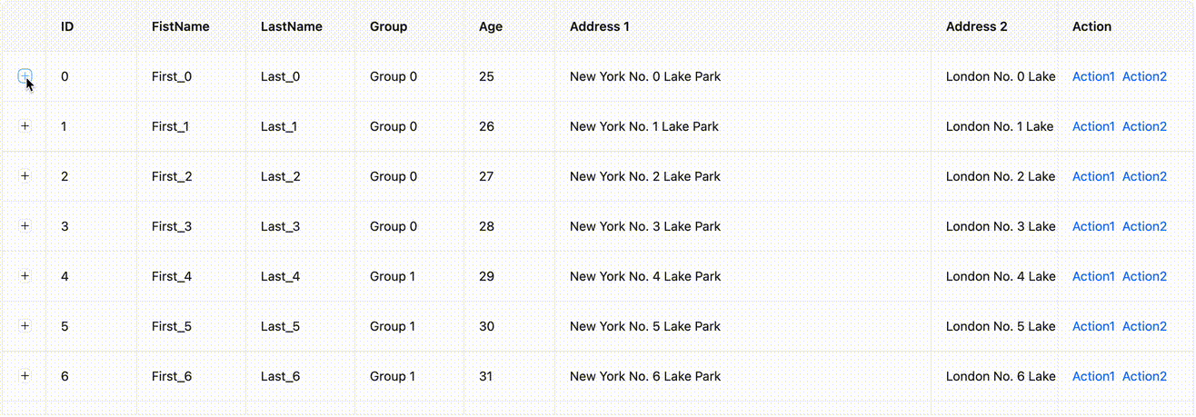
### RowSpan & ColSpan
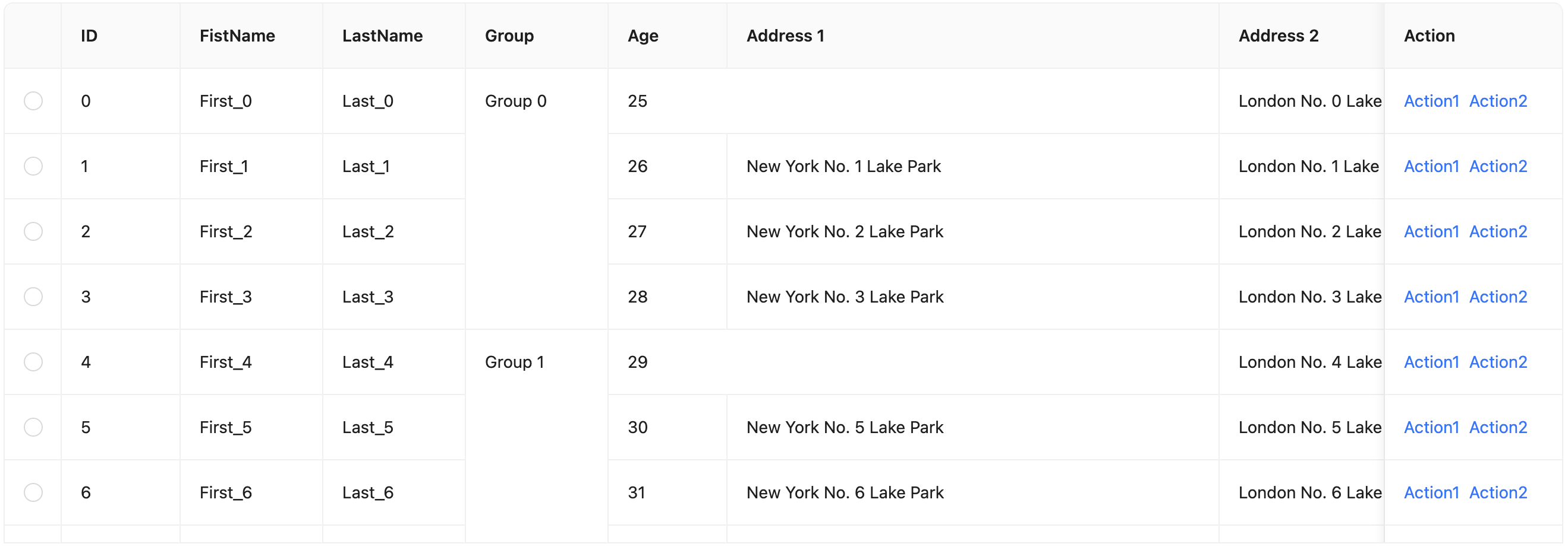
You can visit the [virtual list](/components/table#table-demo-virtual-list) example to experience it.
## Some details
Table in antd internally uses the `rc-table` component. Our virtual scrolling feature also reuses the `components` property mentioned above. Replace the middle ` ` with `rc-virtual-list`, which is widely used in various virtual scrolling scenarios of antd like Select and Tree. `rc-virtual-list` itself does not support horizontal scrolling, so we also added horizontal scrolling support for it in this refactoring.
### Fixed columns
In v4, we refactored the fixed columns of Table into `position: sticky`. This CSS allows you to fix an element at a certain position when scrolling. So as to avoid the need to render an extra Table in v3 to achieve the fixed position effect:
(data: T[] = []) {
let tmpList: T[] = [];
for (let i = 0; i < data.length; i += 1) {
const record = data[i];
tmpList = [...tmpList, record, ...flatten(record.children)];
}
return tmpList;
}
```
When traversing, although `children` is empty and only enters recursion once. But when looping through each Record, a temporary empty array will be created. But when `dataSource` data is huge, they will continue to trigger GC to clean up these temporary arrays. So we added logic to avoid unnecessary consumption:
```tsx
// Fake code. Not used in real word
function flatten(data: T[] = [], list: T[] = []) {
for (let i = 0; i < data.length; i += 1) {
const record = data[i];
list.push(record);
flatten(record.children, list);
}
return list;
}
```
### RowSpan & ColSpan
If you are familiar with the implementation of Table, you will know that row and column merging is achieved through `rowSpan` and `colSpan`. In virtual scrolling, since not all nodes are rendered, there will be cases where the rows and columns to be rendered do not exist:
= NonNullable['options']>[number];
```
It's not a difficult task for developer who are familiar with TypeScript. But for TypeScript beginners, this may be a difficult problem. Therefore, we have launched a type tool library to help developers simplify the process of extracting types.
### Type Util
We now provide 3 additional utility types in antd:
- `GetProps`
- `GetProp`
- `GetRef`
Previous two are used to help developers extract the props type of the component, and the last one is used to extract the ref type of the component. We can understand the usage of these types through the following examples:
#### Get props definition by GetProps
Some sub-component definition may not be exported in antd. You can get it directly through `GetProps`:
```tsx
import type { Checkbox, GetProps } from 'antd';
type CheckboxGroupType = GetProps;
```
#### Get property type by GetProp
For the property type of the component, we can get it through `GetProp`. It has been encapsulated with `NonNullable`. So there is no need to consider the null case:
```tsx
import type { GetProp, Select, SelectProps } from 'antd';
// Both of this can work
type SelectOptionType1 = GetProp[number];
type SelectOptionType2 = GetProp[number];
```
#### Get ref definition by GetRef
Through `GetRef`, you don't need to remember what the ref type of the component is, HTMLElement or some special definition. Just use it:
```tsx
import React, { forwardRef } from 'react';
import type { GetRef, Select } from 'antd';
type SelectRefType = GetRef; // BaseSelectRef
const Div = forwardRef((_, ref) =>
);
type DomRefType = GetRef; // HTMLDivElement
```
### The End
Here is the type util we provided, hope it can help you. If you have better ideas, please feel free to raise an issue or PR on GitHub.
---
Title: Bundle Size Optimization
URL: https://ant.design/docs/blog/tree-shaking
---
In modern JS applications, unused module can be automatically removed by modular packaging tools. This process is called [Tree Shaking](https://developer.mozilla.org/en-US/docs/Glossary/Tree_shaking). However, if you are already very familiar with it, you will find that it is not so perfect in reality. We still need some extra operations to achieve the best size optimization effect. Today, let's talk about a problem that ConfigProvider causes Tree Shaking to fail.
### ConfigProvider and rc-field-form
In daily maintenance, we encountered some problems that using ConfigProvider would cause bundle size to increase:
- https://github.com/ant-design/ant-design/issues/41607
- https://github.com/ant-design/ant-design/issues/43019
- https://github.com/ant-design/ant-design/issues/42499
The community also found the package that was incorrectly packaged while giving feedback `rc-field-form`. Here we directly borrow the illustration in the issue:
{children}
);
};
```
Meanwhile, FormProvider itself encapsulates the FormContext of `rc-field-form`, which causes more content of `rc-field-form` to be packaged after introducing FormProvider:
{node} ;
}
return node;
};
```
Unfortunately, this is not possible. Tree Shaking is a static compilation process, and `validateMessages` is a runtime configuration. So in the packaging process, we cannot know whether `validateMessages` exists, so we cannot achieve this optimization.
### Decompose Dependencies
We can adjust `rc-field-form` dependencies, so that FormProvider can be decoupled. But obviously, we should not rely on the adjustment of third-party libraries though `rc-field-form` is also maintained by us. We should solve this problem fundamentally, so that ConfigProvider no longer depends on FormProvider. The implementation is also very simple. Since this is unique to `rc-field-form`, we directly extract a Context, so that ConfigProvider no longer perceives FormProvider:
```tsx
// Sample only. Not real world code.
import { ValidateMessageContext } from '../form/context.ts';
const ConfigProvider = ({ validateMessages, children }) => {
const mergedValidateMessages = ...
return (
// Just use the proxy context
{children}
);
};
```
Form also consumes the proxy Context:
```tsx
// Sample only. Not real world code.
import Form, { FormProvider } from 'rc-field-form';
import { ValidateMessageContext } from './context';
export default (props) => {
const validateMessages = React.useContext(ValidateMessageContext);
return (
);
};
```
Decomposing the dependencies in this way:
{value}
;
}
```
"Obviously", since you have `maxLen`, you should display `Hello` instead of `Hello World`.
But this intuitive approach is not correct in all cases. If you use native input, you will find that the behavior is not like this:
```tsx
```
,
);
```
### 2. interact & event
`enzyme` provides `simulate(event)` method to simulate event triggering and user interaction, `event` is the name of the event, and the corresponding `fireEvent` method in `@testing-library`:
```diff
++ import { fireEvent } from '@testing-library/react';
-- wrapper.find('.ant-handle').simulate('click');
++ fireEvent.click(container.querySelector('.ant-handle'));
```
### 3. DOM element
In `enzyme`, some built-in APIs are provided to manipulate dom, or find components:
- instance(): Returns an instance of the test component
- at(index): returns a rendered object
- text(): Returns the text content of the current component
- html(): Returns the HTML code form of the current component
- props(): Returns all properties of the component
- prop(key): Returns the specified property of the component
- state(): Returns the state of the component
- setState(nextState): Set the state of the component
- setProps(nextProps): Set the properties of the component
- find(selector): Find the node according to the selector, the selector can be the selector in CSS, or the constructor of the component, and the displayName of the component, etc.
In `testing-library`, these APIs are not provided (as mentioned above - `testing-library` focuses more on behavioral testing), so it needs to be replaced by native dom operations:
```diff
expect(ref.current.getPopupDomNode()).toBe(null);
-- popover.find('span').simulate('click');
-- expect(popover.find('Trigger PopupInner').props().visible).toBeTruthy();
++ expect(container.querySelector('.ant-popover-inner-content')).toBeFalsy();
++ fireEvent.click(popover.container.querySelector('span'));
++ expect(container.querySelector('.ant-popover-inner-content')).toBeTruthy();
```
### 4. compatibility test
While the major version is being upgraded, some components are discarded, but they are not removed in antd. For example, the BackTop component needs to add warning to the component to ensure compatibility, so it is also necessary to write a special unit test for warning:
```diff
describe('BackTop', () => {
++ it('should console Error', () => {
++ const errSpy = jest.spyOn(console, 'error').mockImplementation(() => {});
++ render(
--
Hello World
```
After testing `innerHTML` of dom, it is found that 17 and 18 are the same. So at the beginning of the problem, we simply changed the test case to compare `innerHTML`:
```ts
expect(container.querySelector('.className').innerHTML).toMatchSnapshot();
```
However, as you migrate more, you will gradually see this happening over and over again. Comparing `innerHTML` is also not a long-term solution. So began to explore why this happens.
## pretty-format
`pretty-format` is an interesting library that converts any object into a string. One of its uses is for snapshot comparison of jest. One of its features is that conversion rules can be customized.
Compared with `snapshot` in `jest`, `format` will be done first, for common objects such as native `dom`, `object`. It has built-in a set of `plugins` for format conversion:
```html
↓
```
The first reaction to the appearance of extra spaces is whether it is because the version of `@testing-lib/react` introduced by 17 & 18 is different, which affects the version of `pretty-format` that `jest` depends on. After checking, they are all consistent:
```json
{
"devDependencies": {
"pretty-format": "^29.0.0",
"@testing-library/react": "^13.0.0"
}
}
```
After this judgment is wrong, it is another situation. There is an `empty element` in the dom, which makes `pretty-format` perceptible, but it does not affect `innerHTML`, so I wrote a simple test case:
```ts
const holder = document.createElement('div');
holder.append('');
holder.append(document.createElement('a'));
expect(holder).toMatchSnapshot();
console.log(holder.innerHTML);
```
and get the following output:
```snap
// snapshot
exports[`debug exports modules correctly 1`] = `
`;
// console.log
(null);
useEffect(() => {
console.log(holderRef.current?.childNodes);
}, []);
return (
);
};
export default App;
```
as predicted:
| React 17 | React 18 |
| ----------------------- | -------------- |
| NodeList(2) \[text, p\] | NodeList \[p\] |
Check the `Fiber` node information, you can find that `React 17` will treat empty elements as `Fiber` nodes, while `React 18` will ignore empty elements:
> React 17:

> React 18:

You can find the relevant PR by following the map:
- https://github.com/facebook/react/pull/22807

## a solution
Antd needs to test React16, 17, and 18. If snapshot is not feasible, it will cause too much cost. So we need to modify jest. `enzyme-to-json` gave me inspiration, we can modify the snapshot generation logic to smooth out the diff between different versions of React:
```ts
expect.addSnapshotSerializer({
// Determine whether it is a dom element, if yes, go to our own serialization logic
// The code has been simplified, more logic is needed for real judgment, you can refer to setupAfterEnv.ts of antd
test: (element) => element instanceof HTMLElement,
// ...
});
```
Then access `pretty-format` and add your own logic:
```ts
const htmlContent = format(element, {
plugins: [plugins.DOMCollection, plugins.DOMElement],
});
expect.addSnapshotSerializer({
test: '//...',
print: (element) => {
const filtered = htmlContent
.split(/[\n\r]+/)
.filter((line) => line.trim())
.map((line) => line.replace(/\s+$/, ''))
.join('\n');
return filtered;
},
});
```
## knock off
The above are some problems encountered during the migration of the antd test framework. I hope to help students who need to migrate or have not yet started writing test cases. Everyone is also welcome to join the antd community and contribute to open source together.
---
Title: Suspense breaks styles
URL: https://ant.design/docs/blog/suspense
---
We know that React 18 provides a `useInsertionEffect` hooks specifically for CSS-IN-JS, which has a faster timing priority than `useLayoutEffect`, so that the order of calls will not be affected by the order of writing:
```tsx
useLayoutEffect(() => {
console.log('layout effect');
}, []);
useInsertionEffect(() => {
console.log('insertion effect');
}, []);
// Console:
// - insertion effect
// - layout effect
```
In early `@ant-design/cssinjs` implementation, we did not choose `useInsertionEffect` because we needed to be compatible with React 17 version, but simulated the effect of inserting in advance by adding styles in the render phase:
```tsx
// pseudocode. Not used in real world
function useStyleInsertion(hash: string, counter: Record) {
useMemo(() => {
if (!counter[hash]) {
// Insert only when current style not inserted
}
counter[hash] += 1;
}, [hash]);
useEffect(
() => () => {
counter[hash] -= 1;
if (!counter[hash]) {
// Remove if set to clear on destroy
}
},
[hash],
);
}
```
Above code will count the usage of styles, if the current style has not been inserted, it will insert the style in the render phase. Similarly, if the current style is configured to be unloaded when it is not in use, it will be cleared after the effect confirms the count. In addition, there is a similar logic that listens for changes in tokens, and when there are multiple tokens, it will clear all styles `` corresponding to tokens that are no longer in use to avoid memory leaks caused by too many theme switches.
These code can run perfectly in React 17, and also run very well in React 18's StrictMode. `counter` always appears and disappears in pairs. But under Suspense, it may have problems.
## StrictMode
The StrictMode of React 18 is different from [React 17](https://17.reactjs.org/docs/strict-mode.html) in that it will be called multiple times in each phase to ensure that developers clean up the Effect:
```tsx
const My = () => {
console.log('render');
useMemo(() => {
console.log('memo');
}, []);
useEffect(() => {
console.log('effect');
return () => {
console.log('effect cleanup');
};
}, []);
};
;
// Console:
// - render
// - memo
// - render
// - memo
// - effect
// - effect cleanup
// - effect
```
With above sample, we can know that `counter` in StrictMode will be accumulated, but the final value will be correct (that is, each component will only be counted once):
- memo: 1
- memo: 2
- effect cleanup: 1
But StrictMode is just a simulation of Suspense. In the real scenario, the number of executions is not guaranteed to appear in pairs.
## Suspense
We use [umi](https://github.com/umijs/umi) for site development, which is split by page and loaded on demand by default. Display the loading state during the loading process through Suspense:
```tsx
```
When switching pages, there is a chance that some styles will be lost when the page is switched back and forth:
A
;
};
const B = () => {
React.useMemo(() => {
console.log('B render');
}, []);
React.useEffect(() => {
console.log('B mounted');
return () => {
console.log('B unmounted');
};
}, []);
return B
;
};
export default function App() {
const [show, setShow] = React.useState(true);
const toggle = () => {
setShow((prev) => !prev);
};
return (
);
}
```
In this code (strict mode), clicking the button will switch the rendering of A and B. So what will the order of console be when switching from A to B? The answer is:
```
B render
B render
A unmounted
B mounted
B unmounted
B mounted
```
We can see that the rendering of the new component is before the unmount callback of the old component. Remember the processing logic of `cssinjs` in React 17? Let's mark it:
```
B render // Write to cache and insert style tag
B render // Write to cache and insert style tag
A unmounted // **Reference count--** (Reference count changed from 1 to 0, so the style was unloaded)
B mounted // Reference count++ (Reference count changed from 0 to 1, but the style was inserted before unloaded)
B unmounted // Reference count--
B mounted // Reference count++
```
We finally find out that due to reference count is not updated in time, the style was unloaded, which in not as expected.
And the solution is simple: when the count changes from 0 to 1, style will be inserted again.
## Summary
Suspense brings rendering performance improvements, but it also makes timing very important. It is not the best way to only 'work on' StrictMode. Different logic is used for different React versions is not good choice since it will have timing problem. `render` will trigger from parent node to child node in turn, while `useInsertionEffect` is the opposite. However, from the perspective of antd, the component styles are independent of each other, so this problem will not affect us.
---
Title: Unnecessary Rerender
URL: https://ant.design/docs/blog/render-times
---
For heavy components, some bug fixes or new features can easily destroy the original performance optimization inadvertently over time. Recently, we are refactoring the Table to troubleshoot and restore the performance loss caused by some historical updates. Here, we introduce some common troubleshooting method and frequently meet problems.
Before that, we recommend you to read the official [Perf tool](https://reactjs.org/docs/perf.html) to choose what you need.
### Render count statistics
In most cases, invalid rendering is not as dramatic as an un-optimized loop. However, in some scenarios such as large forms, tables, and lists, due to the large number of sub components, the performance impact of invalid rendering overlays is also terrible.
For example, in antd v4, in order to improve Table hover highlighting experience of `rowSpan`, we added an event listener for `tr`, and added an additional `className` for the selected row in `td` to support multiple row highlighting capability. However, because `td` consumes `hoverStartRow` and `hoverEndRow` data in the context, non-related rows will [re-render](https://github.com/ant-design/ant-design/issues/33342) due to changes of `hoverStartRow` and `hoverEndRow`.
Problems like this are repeated in heavy components, so we need some helper way to determine the number of renders. In the latest [`rc-table`](https://github.com/react-component/table), we encapsulate a [`useRenderTimes`](https://github.com/react-component/table/blob/ecf3fdb77523b370ee86e19164e95f00e65281a8/src/hooks/useRenderTimes.tsx) method. It will mark the monitored rendering times on React Dev Tools through React's `useDebugValue` in development mode:
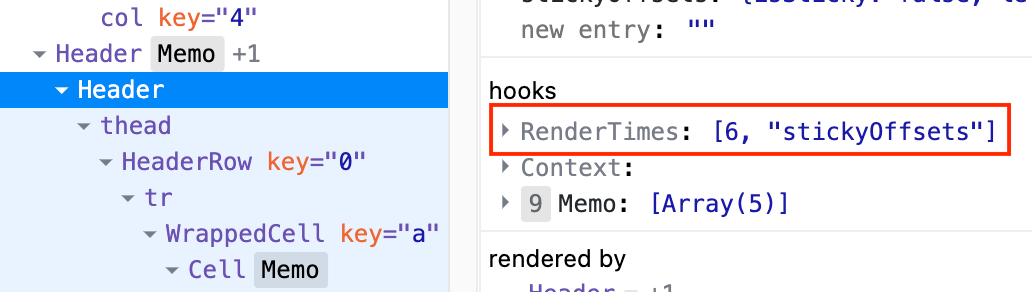
```tsx
// Sample Code, please view real world code if needed
import React from 'react';
function useRenderTimes(props: T) {
// Render times
const timesRef = React.useRef(0);
timesRef.current += 1;
// Cache for prev props
const cacheProps = React.useRef(props);
const changedPropKeys = getDiff(props, cacheProps.current); // Some compare logic
React.useDebugValue(timesRef.current);
React.useDebugValue(changedPropKeys);
cacheProps.current = props;
}
export default process.env.NODE_ENV !== 'production' ? useRenderTimes : () => {};
```
### Context
#### useMemo
Generally on the root node of the component, we will create a Context based on `props` and `state` to pass the aggregated data down. But in some cases, the actual content of the Context may not change and trigger the re-render of the child component:
```tsx
// pseudocode
const MyContext = React.createContext<{ prop1: string; prop2: string }>();
const Child = React.memo(() => {
const { prop1 } = React.useContext(MyContext);
return <>{prop1};
});
const Root = ({ prop1, prop2 }) => {
const [count, setCount] = React.useState(0);
// Some logic to trigger rerender
React.useEffect(() => {
setCount(1);
}, []);
return (
);
};
```
In the example, although `prop1` and `prop2` have not changed, it is obvious that `value` in MyContext is a new object, causing the child component to re-render even if `prop1` has not changed. So we need to Memo the Context `value`:
```tsx
// pseudocode
const context = React.useMemo(() => ({ prop1, prop2 }), [prop1, prop2]);
return (
);
```
Note: You can configure eslint [rules](https://github.com/jsx-eslint/eslint-plugin-react/blob/3256c92ca1b3bc7ec3461a89c278c797e7dc18cb/docs/rules/jsx-no-constructed-context-values.md) to avoid this case.
#### Split Context
Also, refer to the example above. If we put both `prop1` and `prop2` in the Context, then even if `prop1` does not change, `prop2` changes will cause the child component to re-render. Therefore, we can split the Context into several according to the function, thereby reducing the scope of influence:
```tsx
// pseudocode
const MyContext1 = React.createContext<{ prop1: string }>();
const MyContext2 = React.createContext<{ prop2: string }>();
// Child
const { prop1 } = React.useContext(MyContext1);
// Root
;
```
In `rc-table`, we split it into multiple to optimize rendering performance:
- BodyContext
- ExpandedRowContext
- HoverContext
- PerfContext
- ResizeContext
- StickyContext
- TableContext
#### useContextSelector
If you have used Redux, then you may be familiar with `useSelector`, which only rerender when the data that needs to be consumed changes. In React, there is also a related RFC([#118](https://github.com/reactjs/rfcs/pull/118))([#119](https://github.com/reactjs/rfcs/pull/119)) about `useContextSelector`, which will also be implemented in React 18 in the future:
Before the API is officially launched, there are many third-party libraries implement (of course, you can also use redux directly). It is no longer necessary to consider the problem of function splitting Context through `useContextSelector`, which also reduces the mental burden of developers:
```tsx
// pseudocode
const Child = React.memo(() => {
const prop1 = useContextSelector(MyContext, (context) => context.prop1);
return <>{prop1};
});
```
### Closure problem
After optimizing in various ways, we still have to face a problem. If some rendering needs to pass through the external render method, and it happens that the method uses a closure. Then `React.memo` is unaware:
```tsx
// pseudocode
import React from 'react';
const MyComponent = React.memo(({ valueRender }: { valueRender: () => React.ReactElement }) =>
valueRender(),
);
const App = () => {
const countRef = React.useRef(0);
const [, forceUpdate] = React.useState({});
React.useEffect(() => {
countRef.current += 1;
forceUpdate({});
}, []);
// In real world, class component often meet this by `this.state`
const valueRender = React.useCallback(() => countRef.current, []);
return
{
modal.confirm({ title: 'Hello World' });
}}
>
Confirm
{/* 🚨 BUG when put here */}
{contextHolder}
{/* ✅ Work as expect when put here */}
{/* {contextHolder} */}
);
};
```
Workable version:
Bug version:
From the figure above, we can see that when `contextHolder` is placed inside `Modal`, the pop-up position of the hooks call is incorrect.
### Why?
antd's Modal internal calls the `rc-dialog` component library, which accepts a `mousePosition` attribute to control the pop-up position([Dialog/Content/index.tsx](https://github.com/react-component/dialog/blob/79649e187ee512be6b3eb3b76e4a6b618b67ebc7/src/Dialog/Content/index.tsx#L43)):
```tsx
// pseudocode
const elementOffset = offset(dialogElement);
const transformOrigin = `${mousePosition.x - elementOffset.left}px ${
mousePosition.y - elementOffset.top
}px`;
```
The `offset` method is used to obtain the coordinate position of the form itself([util.ts](https://github.com/react-component/dialog/blob/79649e187ee512be6b3eb3b76e4a6b618b67ebc7/src/util.ts#L28)):
```tsx
// pseudocode
function offset(el: Element) {
const { left, top } = el.getBoundingClientRect();
return { left, top };
}
```
Through breakpoint debugging, we can find that the value of `mousePosition` is correct, but the value of `rect` obtained in `offset` is wrong:
```json
{
"left": 0,
"top": 0,
"width": 0,
"height": 0
}
```
This value obviously means that the form component has not been added to the DOM tree at the animation start node, so we need to check the logic added by Dialog.
### createPortal
`rc-dialog` creates a node in the document through `rc-portal`, and then renders the component to this node through `ReactDOM.createPortal`. For the different positions of `contextHolder` and different interactive, it can be speculated that there must be a problem with the timing of creating nodes in the document, so we can take a closer look at the part of adding nodes by default in `rc-portal`([useDom.tsx](https://github.com/react-component/portal/blob/85e6e15ee97c70ec260c5409d9d273d6967e3560/src/useDom.tsx#L55)):
```tsx
// pseudocode
function append() {
// This is not real world code, just for explain
document.body.appendChild(document.createElement('div'));
}
useLayoutEffect(() => {
if (queueCreate) {
queueCreate(append);
} else {
append();
}
}, []);
```
Among them, `queueCreate` is obtained through `context`, the purpose is to prevent the situation that the child element is created before the parent element under the nesting level:
```tsx
```
```html
```
Use `queueCreate` to add the `append` of the child element to the queue, and then use `useLayoutEffect` to execute:
```tsx
// pseudocode
const [queue, setQueue] = useState([]);
function queueCreate(appendFn: VoidFunction) {
setQueue((origin) => {
const newQueue = [appendFn, ...origin];
return newQueue;
});
}
useLayoutEffect(() => {
if (queue.length) {
queue.forEach((appendFn) => appendFn());
setQueue([]);
}
}, [queue]);
```
### Resolution
Due to the above queue operation, the DOM of the portal will be triggered in the next `useLayoutEffect` under nesting. This causes the `useLayoutEffect` timing of the animation to start in `rc-dialog` after the node behavior is added, resulting in the element not being in the document and unable to obtain the correct coordinate information.
Since Modal is already enabled, it does not need to be executed asynchronously through `queue`, so we only need to add a judgment if it is enabled, and execute `append` directly:
```tsx
// pseudocode
const appendedRef = useRef(false);
const queueCreate = !appendedRef.current
? (appendFn: VoidFunction) => {
// same code
}
: undefined;
function append() {
// This is not real world code, just for explain
document.body.appendChild(document.createElement('div'));
appendedRef.current = true;
}
// ...
return {children} ;
```
That's all.
---
Title: Dependency troubleshooting
URL: https://ant.design/docs/blog/mock-project-build
---
As a large component library, Ant Design has complex internal dependencies. Sometimes there is nothing change in antd, but the update of the internal dependencies may also cause the developer's build failure. For example, my recent mistake with [path case error](https://github.com/ant-design/ant-design/issues/41236) made the build fail under Linux.
It's easier to find out the problem with the dependencies own by ourselves. But for third-party dependencies, it is often difficult to find out in the first time. Hours may have passed when developers report, making it somewhat difficult to find differences among hundreds of packages. We have accumulated some troubleshooting experience and will share it with you, but at the same time, in order to solve the problem faster, we have also done some extra things.
### Confirm information
We have added a [template site](https://new-issue.ant.design/) for GitHub issue. Developers will see the following form when submitting issues, and developers will be asked to fill in the relevant information as completely as possible:

Most error problems can be combined to dig through antd version, React version, system, and browser version information which helps narrow the scope of troubleshooting as much as possible. Let's roughly determine if it's a general problem or a system-specific problem. Here we will not talk about component implementation bugs, but just talk about dependencies.
### Determine the scope
From the issue being discovered, we can reverse the time range through the commit CI of github:

Then through the issue description, you can determine the approximate package and which ones are related (for example [#41236](https://github.com/ant-design/ant-design/issues/41236) from `@rc-component/trigger`, [#15930](https://github.com/ant-design/ant-design/issues/15930) via `@types/react`). Then check the version release status of the related package through npm:

When we find relevant updates, we will install the previous version for comparison to see if the build was successful. After checking one by one, we can determine which version the problem is, and we will also raise an issue for the corresponding GitHub (of course, if there is already one, just +1). At the same time, we also need to send a patch version to temporarily lock the corresponding version and remove it after the next update.
### Schedule build
As you can see, the above troubleshooting method has a certain lag. We hope to reduce additional human labor by building regularly, and at the same time allow us to find problems faster. So we reused the [create-next-app-antd](https://github.com/ant-design/ant-design-examples/tree/main/examples/with-nextjs-inline-style) project as the base (in this way, if something goes wrong with the template project, we can also be detected in advance). Created a `mock-project-build.yml` CI that executes every half hour, which periodically pulls [create-next-app-antd](https://github.com/ant-design/create-next-app-antd) repo to build:
```yml
on:
workflow_dispatch:
schedule:
- cron: '*/30 * * * *'
```
Pass `--depth=1` to only pull the last commit. Then execute `yarn` to install dependencies to generate the corresponding `yarn.lock` file, and finally execute `yarn build` to build to completely simulate the construction process of a project.
Every time the build is successful, CI will cache the current `yarn.lock` file. In this way, if the next build fails, we can easily pull the two files for comparison to troubleshoot the problem. Although `actions/cache` does not allow cache keys with the same name, it allows `restore-keys` to get the latest cache, which is very convenient:
```yml
- uses: actions/cache@v4
with:
path: ~tmpProj/yarn.lock
key: primes-${{ runner.os }}-${{ github.run_id }}
restore-keys: mock-proj-lock-file
```
Then monitor the build failure event and compare the `yarn.lock` file to quickly find out the changed dependencies:
```yml
- name: 🎨 Diff Report
if: ${{ failure() }}
run: npx diff-yarn-lock --source=~tmpProj/yarn.lock --target=~tmpProj/yarn.lock.failed
```


We also push messages to the developer group through the IM push protocol when failed, so we can identify the problem in the first place. The complete script can be viewed [here](https://github.com/ant-design/ant-design/blob/da83561f9cb57b0eb03d18543d96393689f799be/.github/workflows/mock-project-build.yml).
### Finally
We have been continuously optimizing the problems encountered in the maintenance process. If you have any good ideas or suggestions in use, you are welcome to put them in our issue or discussion. Have a nice day.
---
Title: Line Ellipsis Calculation
URL: https://ant.design/docs/blog/line-ellipsis
---
Ant Design's Typography component provides an `ellipsis` property to display ellipsis when text overflows. It supports limiting the number of displayed lines through the `ellipsis.rows` configuration. If it is pure text content, it will be implemented through the CSS `-webkit-line-clamp` property. Although it has a `-webkit-` prefix, it has been well supported in modern browsers.
```tsx
{text}
```
## Some issues with CSS
However, CSS implementation also has limitations, that is, it does not support modifying the ellipsis and supporting additional action buttons (such as copy, edit, expand, etc.):
Operational buttons will be truncated together and cannot be displayed.
Though there are some magic methods to achieve this through styles such as `float`, this method requires targeted processing in different browsers. In addition, it still cannot solve the problem of custom ellipsis. Therefore, the best implementation method is still through JS.
## Using JS
With JS, we can quickly find the truncation position of the text through binary search. As long as the height of the text is inferred based on `rows`, we can traverse and find the maximum number of characters that can be displayed:
And get the line height by simulating an embedded `span`:
```tsx
{text}
{measuring && }
```
But this method also has some problems, for mixed line height scenarios (such as adding images, embedding different sizes of text, etc.). This calculation method often estimates the wrong total height, making the truncation position inaccurate:
Since the height of the image exceeds the line height, the calculation thinks that the image occupies the height of two lines. At the same time, because the image itself cannot be truncated, the final number of ellipsis lines is incorrect (3 lines of ellipsis becomes 2 lines):
Even worse, if the image is on the first line, the entire text will be truncated:
But if you use CSS, there will be no such problem:
## Mixed Measurement
To solve this problem, we can use a mixed measurement method. That is, use CSS to measure the total height of the native multi-line ellipsis, and then use JS to perform binary search to ensure that the truncation position of the text does not exceed the total height measured by CSS:
```tsx
{text}
;
const cssHeight = measureRef.current.clientHeight;
```
```tsx
// pseudocode. Not used in real world
{text.slice(0, walkingMeasureIndex)}
;
if (walkingMeasureRef.current.clientHeight > cssHeight) {
// Not meet the requirement
}
```
This helps to accurately handle mixed line height scenarios:
## Summary
The mixed measurement method allows us to easily use the accuracy of CSS and the flexibility of JS to achieve accurate text truncation even in complex content containing images and other elements with different line heights.
This refactoring has been released in `5.15.0`, welcome to experience it.
---
Title: 'Repost: How to submit a riddle'
URL: https://ant.design/docs/blog/issue-helper
---
There are some common mistake when submitting an issue to the community for the first time, making it difficult for maintainers to help solve problems. Repost an old article, hoping helps for submit issue after laughing :)
> Original link: [How to submit a issue which never can be answered to open source projects](https://zhuanlan.zhihu.com/p/25795393)
---
As a developer, I use and participate in many open source projects. In the open source community, questions and answers are the most interesting part. Some issue with fully communication and some others are not. There are many fascinating and useful commonalities in the way people ask questions. I've distilled them in the hope that they will help those like me who are curious and willing to go out of their way to annoy the maintainers of open source projects.
Here are thirteen tips on how to ask questions which never can be answered:
## 1. Cherish your words
Compress the number of bytes in the question, so that the other party does not think you are long-winded. Use the simplest words to describe your problem, refine keywords, and simplify the lengthy process and tedious details.
#### 😈 'Good Way'
```
Style compilation error
```
#### 👼 'Bad Way'
```
Import xxx.css into my project, and an error occurred during compilation. The error message is as follows:
Module build failed: SyntaxError: Unexpected token
I import it like this:
import 'xxx.css';
balalalala.....
```
## 2. Slow down
If the maintainer answers you, usually they will ask for further information. Remember not to reply in a hurry, that will make you look like a workaholic (bubble by the computer all the time, waiting pitifully for a reply). You still have other lives, drink a cup of coffee and reply after ten days and a half months. Believe me, they will quickly lose patience and close the question, or get depressed because they can't close it for a while.
#### 😈 'Good Way'
```
You: When using Button, I find that the console reports an error, and the prompt is as follows.
Maintainer (within 2 days): I can't reproduce your example, can you provide a reproducible example?
Maintainer (3 days later): @you
Maintainer (one week later): ping~
You (two weeks later): Whoops sorry for the late reply, here is my code.
```
#### 👼 'Bad Way'
```
You: When using Button, I find that the console reports an error, and the prompt is as follows.
Maintainer (within 2 days): I can't reproduce your example, can you provide a reproducible example?
You (in 2 days): Maybe my situation is a bit different, here is the reproduce code.
```
## 3. A big package
Introducing open source modules in a medium or large project is prone to strange problems. There are dozens of files and hundreds of business modules, and the project schedule is tight. It is too hard to check one by one. It is better to hire someone else, and quickly pack a package and send it to the other party.
#### 😈 'Good Way'
```
I have a problem with the front-end component of my database project, here is my code, can anyone help me?
Attachment: db-service-app.rar (434MB)
```
#### 👼 'Bad Way'
```
There is a front-end component problem in my project, I simplified the code,
It is found that the xxx component and the yyy component are used at the same time. Here is a simple reproduction example.
Attachment: component-xxx-yyy-bug.zip (10KB)
```
## 4. To be continued
Always hold back, don't finish the sentence at once, make your question full of mystery, and fully mobilize the reader's curiosity.
#### 😈 'Good Way'
```
You: My code is wrong and I don't know what to do?
You: I have a problem here, can someone help me?
are u there?
```
#### 👼 'Bad Way'
```
You: I used the latest version of xxx just released, and the following error occurred in the console...
I call it like this...
My code repository is here...
```
## 5. Mess with formatting
Never, never format code. You are not an artist, and beautifying the format is not your specialty. Your energy should be used in project development, and you don't have time to learn formatting syntax. As for whether the other party can understand, you don't need to care.
#### 😈 'Good Way'
```tsx
renderBatchButton() {
return(
export warehouse order
);
}
renderExportMenu(category) {
let exportFile=({key})=>{
console. log(key)
}
let items=[];
if(this.props.global.template_list){
items=this.props.global.template_list.map((item)=>{
if(category===item.category){
return {item.name} ;
}
});
}
```
#### 👼 'Bad Way'
```tsx
import React from 'react';
import { Menu } from 'antd';
const Demo: React.FC = () => {
const [collapsed, setCollapsed] = useState(false);
const toggle = () => setCollapsed(!collapsed);
return ... ;
};
export default Demo;
```
## 6. Missing key information
The project code always runs well at the beginning, but when you do a certain operation, or change some code, or in a special environment, a problem occurs. This difference is often the key point of the problem, just keep it in your mind and don't say it easily.
#### 😈 'Good Way'
```
You: My code is wrong.
Maintainer: I have tried various methods but have not reproduced it, please provide the reproduction?
You (much later): Oh! I have this problem in chrome 35.
```
#### 👼 'Bad Way'
```
You: My code is wrong in chrome 35.
Maintainer: Ok, I reproduced it too, I'll see how to fix it.
```
## 7. Providing wrong information
Sometimes you need to do some misleading, intentionally or unintentionally, in short, making difficulties is your strong point
#### 😈 'Good Way'
```
You: My code is wrong.
Maintainer: What version are you using?
You: 0.8.4 (actually 0.8.3 locally)
Maintainer: Are you sure, 0.8.4 should have fixed this issue. I'll take another look...
```
#### 👼 'Bad Way'
```
You: My code is broken in version 0.8.3.
Maintainer: 0.8.4 should have fixed this problem, and upgrading to the new version will solve it.
```
## 8. Feel free to vent your emotions
Open source projects cause bugs in your project, cause you to work overtime on Saturday night, make your missing the party and someone must be responsible. Your work and life are ruined by them, and don't make it easier for them.
#### 😈 'Good Way'
```
This project sucks, it is full of pitfalls to use, and the documentation is too simple. It is really open source to do so.
```
#### 👼 'Bad Way'
```
This project has many details and the documentation is not perfect. Is there any improvement plan?
I have collected the following specific questions and hope to continue to improve them.
```
## 9. Think big
Try asking a question with an ambitious goal, and only those grandmotherly maintainers will try to answer you (which is unlikely to happen). And because you showed unpreparedness and extreme ignorance in all technical details, the other party's answer can't satisfy you.
#### 😈 'Good Way'
```
How to package and release?
```
#### 👼 'Bad Way'
```
I want to develop a front-end single-page project, the back-end is php, and the architecture is completely separated from the front-end.
I have a problem when I try to use xxx to build a package... (50 words omitted) What should I do at this point?
```
## 10. Freedom of expression
The maintainers of many open source projects are arrogant, pedantic, freaks who like to set all kinds of rules. For example, they often provide weird question templates and ask you to fill in the blanks in a long and smelly form. Once you don't do what they say, they will see you as a troublemaker and judge you. How can you stand these constraints, write whatever you want, let them and their templates go to hell!
#### 😈 'Good Way'
```
Call `xxx.close` not trigger popup close, please solve it
```
#### 👼 'Bad Way'
```
The popup of the xxx component is not closed
- Version used: 1.0.0
- Browser: Chrome 56.0987
- OS: Windows 10
## what have you done?
I introduced the component xxx, the code is as follows, I clicked on the component to open the popup, and did the following operations.
## What are you expecting?
Overlays should be turned off.
## What is the actual situation?
The popup closes briefly and then pops up again.
[GIF screenshot]
## Reproducible online demo
https://codesandbox.io/xxx
```
## 11. DDOS the maintainer
Repeat the questions you asked in different places to deepen the other party's impression and subvert the other party's imagination!
#### 😈 'Good Way'
```
Question 1: An error is reported when sending a request: `405 Method not allowed`.
Question 2: Hello, I have the problem of `405 Method not allowed` here.
Question 3: Request 405 error, what should I do?
Question n:...
```
#### 👼 'Bad Way'
```
Problem 1: An error is reported when sending a request: `405 Method not allowed`
You: +1 I had this problem too.
```
## 12. Surprise
Even if you know that there is an official channel, it is recommended to ask the maintainer in other ways: Twitter, Facebook, private Email, personal blog, their friends and so on. go to all the places you can find him to ask questions.
#### 😈 'Good Way'
```
Private message of unfollowed people: Hello, our project uses your framework, I would like to ask, can the xxx component get the focus? for keyboard switching
```
#### 👼 'Bad Way'
```
Official channel: Hello, our project uses your framework. I would like to ask, can the xxx component get the focus? for keyboard switching
```
## 13. High level strike
Raise your question to a higher level, take the moral high ground and make accusations, making they unable to argue.
#### 😈 'Good Way'
```
It turns out that the teams of big companies are like this, don’t they test well? It’s a shame to take this thing out, it’s just a KPI product, and I don’t care about it after the promotion.
```
#### 👼 'Bad Way'
```
Although this project is a product of a large company, it has disadvantages compared with competing products in the following aspects, and I personally do not recommend using it.
```
## Summarize
All in all, maintainers of open source projects always want to see problems happen when they try to answer and solve problems, **don't let them succeed**. Also, most of them have OCD about unclosed questions, try to create as many of them as possible.
---
Title: Where is the dynamic style?
URL: https://ant.design/docs/blog/hydrate-cssinjs
---
As we all know, antd v5 uses CSS-in-JS to support the needs of mixed and dynamic styles. On the contrary, it needs to generate styles at runtime, which will cause some performance loss. Therefore, we developed the `@ant-design/cssinjs` library at the component library level to improve the cache efficiency through certain constraints, so as to achieve the purpose of performance optimization. But we don't stop there. We can skip the stage of generating styles at runtime through some logic.
## Where is the dynamic style?
If you have checked the official website of Ant Design, you will find that Ant Design's components do not dynamically insert `` to control styles, but use CSS files to control styles:
-
);
```

## Customize Wave Effect
There is a special design interaction in Ant Design, which is the click wave effect on some components. You can see them everywhere:
-
);
```
In the early design ([#40111](https://github.com/ant-design/ant-design/pull/40111)), we hope that the wave customization ability belongs to part of the Design Token. But in this way, the Design Token will become a bit too complicated, from the original pure `string | number` type to `string | number | Function`. From the API design point of view, `Function` also has a bad smell, and if there are new customization requirements in the future, the type of Function will become more and more divergent. So [#40111](https://github.com/ant-design/ant-design/pull/40111) stays in the Draft version forever.
### ConfigProvider
Next, we choose to put it in ConfigProvider. ConfigProvider is a global configuration component, which can affect all child components. Its API has also included a lot of component configuration capabilities, so we only need to add a `wave` property:
```tsx
```

Click to [view ConfigProvider demo](/components/config-provider#config-provider-demo-wave).
`showEffect` method will tell you the DOM node that needs to generate the effect. This node has been encapsulated and will always correspond to the correct element (for example, Button is itself, and Radio will find the circle shape DOM from `label`). And tell you which component it is and which Design Token the current node belongs to:
```tsx
type ShowEffect = (target: HTMLElement, info: { component: string; token: GlobalToken }) => void;
```
Through Design Token, you can implement effects that conform to the current theme. For example, in the GIF at the beginning of the article, when the theme color changes, we can get the current theme color and add the corresponding effect.
## One more thing
Happy work theme is still in progress, and we will gradually add more capabilities in subsequent versions. The HappyProvider provided by `@ant-design/happy-work-theme` currently replaces the wave effect through ConfigProvider. We plan that developers will not need to make additional changes in the future, and will gradually add more "happiness" through HappyProvider as the version iterates. Stay tuned.
---
Title: Hi, GitHub Actions
URL: https://ant.design/docs/blog/github-actions-workflow
---
Hi, I'm [Wxh16144](https://github.com/Wxh16144). I have discovered some tools that can improve development efficiency and code quality through learning Ant Design's component library and participating in community contributions. I'd like to take this opportunity to share my experience with you. To help better understand Ant Design, and to apply these techniques to your own projects.
# Preface
Ant Design is hosted on GitHub as an open-source project, making it easy to communicate and collaborate with developers around the world, and allowing developers to submit issues and pull requests. Additionally, we can well manage the code repository and automate workflows such as testing and deployment through utilizing GitHub Actions and its CI/CD capabilities.
## What is GitHub Actions
GitHub Actions is a platform for automating software development workflows, Developers can easily customize and configure their own workflows by adding YAML format files to the `.github/workflows` directory to define the workflow and implement CI (continuous integration). By Understanding GitHub Actions.We can grasp some concepts within workflows through [understanding GitHub actions](https://docs.github.com/en/actions/learn-github-actions/understanding-github-actions).
- **Event**: Triggers a workflow run, such as when someone creates an issue, a pull request, or pushes code to a branch.
- **Job**: A workflow consists of one or more jobs that run in parallel by default, but can be set to run sequentially. Each job can contain multiple steps.
- **Step**: Defines the work to be done for a particular section. Each step runs as a separate process. Each item under this section is a separate operation or shell script.
Here's a visual representation from the official documentation that shows the relationship between **Event**, **Job** and **Step**:
# How to use
With the knowledge we have gained, we know that all of Ant Design's workflows are managed in the [`.github/workflows`](https://github.com/ant-design/ant-design/tree/master/.github/workflows) directory.
Ant Design's CI covers the following aspects:
- **Community management**: Use GitHub Actions to perform quality checks on issues/PRs and improve collaboration efficiency through comments and labels.
- **Code quality**: Use ESLint and Prettier to perform code standard checks to ensure code quality and consistency.
- **Testing**: Use Jest and testing-library to perform unit tests and snapshot tests to ensure code correctness and stability.
- **Build**: Build ES5 and ES6 module specifications to ensure the library can be used in different environments.
- **Deployment**: Use [dumi](https://d.umijs.org/) to automatically generate documentation and publish it to GitHub Pages.
## Issue
As a feature on the GitHub platform, issues serve as a centralized information hub for collecting community feedback and problems. Collaborators can add labels, milestones, and assignees to better organize tasks and projects.
### Ensuring the Quality of Issues
Ensuring issues contain sufficient information helps us to analyze and prioritize. We provide an [issue assistant](http://new-issue.ant.design) to standardize the process of creating issues. Additionally, we use GitHub Actions to check the issues created to auto close if it not pass the assistant's checks. Which will be labeled as [Invalid](https://github.com/ant-design/ant-design/issues?q=label%3AInvalid), and leaving comment to remind the creator how to ask a question properly.

However, team members may sometimes be unable to obtain effective information from the provided content. In such cases,will add labels such as [🤔 Need Reproduce](https://github.com/ant-design/ant-design/issues?q=label%3A%22%F0%9F%A4%94+Need+Reproduce%22+), [needs-more-info](https://github.com/ant-design/ant-design/issues?q=label%3A%22%F0%9F%A4%94+Need+Reproduce%22+), or [help wanted](https://github.com/ant-design/ant-design/issues?q=label%3A%22help+wanted%22+) to notice reporter improving the issue. The [issue-labeled.yml](https://github.com/ant-design/ant-design/blob/da83561f9cb57b0eb03d18543d96393689f799be/.github/workflows/issue-labeled.yml) file records different labels triggering corresponding comment reply jobs.


### Common Issue FAQ
For some common issues, the team provides detailed answers to help developers solve problems more quickly. For example, when the title of an issue contains keywords such as `can not open`, `website`, `down`, `IE`, etc., the [issue-open-check.yml#L43-L94](https://github.com/ant-design/ant-design/blob/da83561f9cb57b0eb03d18543d96393689f799be/.github/workflows/issue-open-check.yml#L43-L94) job records the standard reply format in detail and will automatically close the issue.
### Regular Issue Cleanup
Using GitHub Actions scheduled tasks to help manage and close issues, these automated operations can effectively avoid excessive accumulation of unprocessed issues.
- [issue-close-require.yml](https://github.com/ant-design/ant-design/blob/01a475af6d8ff4943fe4c91d04582120bf9b3a84/.github/workflows/issue-close-require.yml): Checks issues marked as `🤔 Need Reproduce` or `needs-more-info` at a scheduled time. If these tags are not removed after 3 days, the issue will be automatically commented on and closed.
- [issue-check-inactive.yml](https://github.com/ant-design/ant-design/blob/01a475af6d8ff4943fe4c91d04582120bf9b3a84/.github/workflows/issue-check-inactive.yml): Scheduled to check issues which have no activity within the last 30 days every 15 days and add an `Inactive` label to them, without closing. If modified or has new comments, the `Inactive` and `needs-more-info` labels will be automatically removed.

## Pull Request
The Ant Design team strongly encourages community involvement in Pull Request (PR), and provides the [Contributor development maintenance guide](./contributor-development-maintenance-guide) document for reference. It's important to follow certain standards when submitting a PR to ensure quality and effective communication. Additionally, the team uses GitHub Actions to require and review certain aspects of PRs to maintain code quality and ensure long-term project maintenance.
### PR Pre-test
When you initiate a pull request (PR), the description content, including the changelog section, will be generated automatically through the PR template and needs to be filled in by the developer. The [pr-open-check.yml](https://github.com/ant-design/ant-design/blob/3d627eb475e32daf3a47731140685124d568a495/.github/workflows/pr-open-check.yml) Job will check it, and if it is not filled in, the CI will remind you with a comment. Just like this:

If the issue referenced in the PR description has the `🎱 Collaborate PR only` label, the PR will be closed and leave a notification.
The [verify-files-modify.yml](https://github.com/ant-design/ant-design/blob/3d627eb475/.github/workflows/verify-files-modify.yml) job will check the changes. If the changes include specific directories (such as `./github/` and `scripts/`) or specific files (such as `CHANGELOG.md`), community contributions will be rejected. The PR will be automatically closed and assigned to core members.
### Code Style Checking
In the [lint](https://github.com/ant-design/ant-design/blob/dedbdfddafc0134219e391473c109c14766f413d/.github/workflows/test.yml#L52-L75) job, the process always follows the procedure of performing a lint check on the code submitted by each developer.

### PR deploy preview
For every pull request created, GitHub Actions will trigger the build process to ensure the documentation is correct. And PR does not affect the documentation or component demos. PR deployment is divided into multiple jobs, and the specific process is as follows:
- First, the [preview-start.yml](https://github.com/ant-design/ant-design/blob/c6a7dbc09e709a8905aaa6c073593a1fed6bea14/.github/workflows/preview-start.yml)job is triggered to create a placeholder comment on the PR, informing the developer to start the preview build. This is what is often seen as "Preview Preparing..."

- At the same time, the [preview-build.yml](https://github.com/ant-design/ant-design/blob/b7d1d7cdbd888a1d73b3a3bf87bf4977e9b9bf91/.github/workflows/preview-build.yml#L52-L77) job performs the build operation on the site.
- Finally, the [preview-deploy.yml](https://github.com/ant-design/ant-design/blob/c6a7dbc09e709a8905aaa6c073593a1fed6bea14/.github/workflows/preview-deploy.yml) job waits for `preview-build.yml` to complete before performing the corresponding operations. If the build is successful, it will be deployed using [Surge](https://surge.sh/), and the deployment address follows the rule: `https://preview-{PR-id}-ant-design.surge.sh`. The placeholder image in the comment is updated with a success icon (clicking on the image will take you to the specific address), otherwise it is marked with a failure icon.
### Other Reviews
- The [size-limit.yml](https://github.com/ant-design/ant-design/blob/5dfce5443744271f778313c23eb8ec3a5af481f8/.github/workflows/size-limit.ym) job checks the size of the product resulting from the PR.
- Recently, the team has added ChatGPT to GitHub Actions to perform AI-based code review. The specific job can be found in the [chatgpt-cr.yml](https://github.com/ant-design/ant-design/blob/f7fd474cf8792ea01d03461d407c0edc11828a1c/.github/workflows/chatgpt-cr.yml) file.
## Unit Testing
Unit testing is one of the most important components of component library quality assurance. Whenever any code is pushed, this CI is triggered to perform automated testing, including PRs initiated by developers or updates to the main branch.
### Build Testing
The team wanted the packaged product to build properly after each code update. Ant Design has added the [Dist Job](https://github.com/ant-design/ant-design/blob/master/.github/workflows/test.yml#L104-L138) and [Compile Job](https://github.com/ant-design/ant-design/blob/40fb753349c4f2be314c91dbb7e6f1a960097c19/.github/workflows/test.yml#L254-L288) in the test.yml file to ensure the repository can be built and packaged correctly.
### Function Testing
you may notice that there are as many as 30 jobs related to testing only each time.
The team is very cautious about unit testing and needs to consider the running status of components on various major versions of React (usually versions 16, 17, and 18). If it is an update to the main branch, the running status of project build artifacts (usually `dist`, `es`, and `lib`) on three versions of React also needs to be considered. Currently, it is known that all components of Ant Design have over 4000 test cases. In order to further improve the efficiency of testing, we have also set up a distributed testing environment.
With the help of the [Job matrix strategy](https://docs.github.com/en/actions/using-jobs/using-a-matrix-for-your-jobs), CI can configure multiple jobs to perform testing tasks at one time. [Normal test](https://github.com/ant-design/ant-design/blob/40fb753349c4f2be314c91dbb7e6f1a960097c19/.github/workflows/test.yml#L141-L223) and [Module test](https://github.com/ant-design/ant-design/blob/40fb753349c4f2be314c91dbb7e6f1a960097c19/.github/workflows/test.yml#L294-L357) are the jobs that Ant Design uses the matrix strategy to test.
## Website Deploy
The deployment and build process here is consistent with the PR preview deployment and build behavior mentioned earlier, except that the deployment target of the built artifacts is different.
### Official Website Deploy
The [https://ant.design](https://ant.design) official website uses the free [GitHub Pages](https://pages.github.com/) function provided by GitHub. It uses the Actions [Deploy to GitHub Pages](https://github.com/ant-design/ant-design/blob/dedbdfddafc0134219e391473c109c14766f413d/.github/workflows/site-deploy.yml#L73-L78) job to push the built documentation artifacts directly to the [gh-pages](https://github.com/ant-design/ant-design/tree/gh-pages) branch.
### Standalone Versions
As we all know, the [https://ant.design](https://ant.design) official website always maintains the latest version. However, sometimes it is still necessary to refer to the documentation of a specific version. The [Deploy to Surge](https://github.com/ant-design/ant-design/blob/5aad29d937baeba43ca8acde7f86450e9aec99f1/.github/workflows/site-deploy.yml#L80-L90) job is responsible for deploying the website to Surge after each new version is released, with the URL format `https://ant-design-{major}-{minor}-{patch}.surge.sh`, and posting the URL as a comment on each release commit.

## Other
In the previous sections, we introduced many scenarios used by Ant Design. However, there are still some Jobs that haven't been specifically introduced. Here are some additional details to supplement that.
### IM notification
To ensure that developers and community members are informed of relevant information as soon as possible, IM integration is implemented using the events provided by Action:
- [issue-notice](https://github.com/ant-design/ant-design/blob/master/.github/workflows/issue-open-check.yml#L96-L105) and [discussion-notice](https://github.com/ant-design/ant-design/blob/dedbdfddafc0134219e391473c109c14766f413d/.github/workflows/disscustion-open-check.yml#L16-L25) jobs send notifications to the DingTalk community group whenever an issue or discussion is created.
- The [release-helper.yml](https://github.com/ant-design/ant-design/blob/dedbdfddaf/.github/workflows/release-helper.yml) CI file publishes the update log to the DingTalk community group whenever antd releases a version and creates a release.
- Other jobs not mentioned here are waiting for you to explore and discover...
## Apply to your own projects
In the previous sections, we introduced many scenarios in which Ant Design uses GitHub Action. Why not try to apply it to your own project and improve production efficiency? Let's demonstrate this with a simple demo.
### Creating a Project
Create a Vite + React project by running the command `pnpm create vite@latest my-react-app --template react-ts` in the command line.
### Configuring CI Workflow
Create a new file named `ci.yml` in the `.github/workflows` folder located in the project's root directory with the following code:
```yml
name: CI
# Set the event to pull request event and push event of the master branch
on:
push:
branches: [master]
pull_request:
branches: [master]
permissions:
contents: write
jobs:
CI:
runs-on: ubuntu-latest
steps:
- name: Checkout code
uses: actions/checkout@v4
- name: Setup bun
uses: oven-sh/setup-bun@v2
with:
node-version: 16
- name: Install pnpm
uses: pnpm/action-setup@v2
with:
version: 7.0.0
- name: Install dependencies
run: pnpm install
- name: lint
run: pnpm run lint
# The template does not contain test cases. If you need to use test cases, you can uncomment it
# - name: Test
# run: pnpm run test
- name: Build
run: pnpm run build
- name: Upload build artifacts
uses: actions/upload-artifact@v3
with:
name: dist
path: ./dist
- name: Deploy to GitHub Pages
uses: peaceiris/actions-gh-pages@v3
# Only deploy when the push event of the master branch is triggered
if: github.ref == 'refs/heads/master'
with:
github_token: ${{ secrets.GITHUB_TOKEN }}
publish_dir: ./dist
```
The above workflow includes a CI job that will run `lint`, `build`, and `deploy` in sequence when we push to the `master` branch. The process is shown below:

### Adding Caching
To further optimize dependency installation speed, we can add pnpm caching. After that, we can initiate a pull request to verify the previous steps.
```yml
# ...
- name: create pnpm-lock.yaml
run: pnpm install --frozen-lockfile --ignore-scripts
- name: Get pnpm store directory
id: pnpm-cache
shell: bash
run: |
echo "STORE_PATH=$(pnpm store path)" >> $GITHUB_OUTPUT
- name: Setup pnpm cache
uses: actions/cache@v4
with:
path: ${{ steps.pnpm-cache.outputs.STORE_PATH }}
key: ${{ runner.os }}-pnpm-store-${{ hashFiles('**/pnpm-lock.yaml') }}
restore-keys: |
${{ runner.os }}-pnpm-store-
# ...
```
The initiated pull request also triggered the CI job correctly, and our pnpm store has been cached. From now on, Every time CI triggered from now on, it will check the content of the `pnpm-lock.yaml` file to determine whether to read the cache directly.


Regarding the `Setup pnpm cache` step above, any cached items that have not been accessed within 7 days will be deleted. There is no limit to the number of caches that can be stored, but the total size of all caches in the storage repository is limited to 10 GB. For more information, please refer to [Caching dependencies to speed up workflows](https://docs.github.com/en/actions/using-workflows/caching-dependencies-to-speed-up-workflows).

## After all
I hope it has helped you gain a deeper understanding of Ant Design. You are also welcome to participate in discussions and contribute to the project at the [Ant Design Discussion](https://github.com/ant-design/ant-design/discussions).
---
Title: Some change on getContainer
URL: https://ant.design/docs/blog/getContainer
---
We often encounter the need for pop-up elements when developing, such as the Select drop-down box, or the Modal component. When it is directly rendered under the current node, it may be clipped by the `overflow: hidden` of the parent node:
(null);
React.useEffect(() => {
// It's much complex with timing in real world. You can view the source for more detail:
// https://github.com/react-component/portal/blob/master/src/Portal.tsx
const container: HTMLElement = getContainer(eleRef.current);
// ...
}, []);
return (
{...}
);
}
```
```tsx
// Fake Code. Just for Demo
const defaultGetContainer = () => {
const div = document.createElement('div');
document.body.appendChild(div);
return div;
};
const SomeComponent = ({ getContainer = defaultGetContainer }) => (
...
```
Therefore, we adjusted the call implementation, and the default `getContainer` is also managed through state to ensure that the nodes generated by the previous effect will be cleaned up in StrictMode:
```tsx
// Fake Code. Just for Demo
const SomeComponent = ({ getContainer }) => {
const [myContainer, setMyContainer] = React.useState(null);
React.useEffect(() => {
if (getContainer) {
setMyContainer(getContainer());
return;
}
const div = document.createElement('div');
document.body.appendChild(div);
setMyContainer(div);
return () => {
document.body.removeChild(div);
};
}, [getContainer]);
return myContainer} />;
};
```
After putting `getContainer` into effect management, we can manage nodes in a way that is more in line with the React life cycle, and we can also clean up when `getContainer` changes. So as to support the scenario of dynamically changing `getContainer` (although I personally doubt the universality of this usage scenario).
## Finally
Due to the fix that `getContainer` does not support dynamic changes, it also introduces a potential breaking change at the same time. If the developer customizes `getContainer` to create a new DOM node every time, it will cause an infinite loop because of the continuous execution of the effect, resulting in the continuous creation of nodes. If you use this method and encounter problems, you need to pay attention to check.
---
Title: HOC Aggregate FieldItem
URL: https://ant.design/docs/blog/form-names
---
During the form development process, there are occasional needs for combining attributes. The UI display fields are different from the backend data structure fields. For example, when interfacing with the backend, the province and city fields are often defined as two separate fields `{ province: Beijing, city: Haidian }`, rather than a combined one `{ province: [Beijing, Haidian] }`. Therefore, it is necessary to handle the values in `initialValues` and `onFinish` as follows:
```tsx
import React from 'react';
import { Cascader, Form } from 'antd';
const data = { province: 'Beijing', city: 'Haidian' };
const options = [
{ value: 'zhejiang', label: 'Zhejiang', children: [{ value: 'hangzhou', label: 'Hangzhou' }] },
{ value: 'jiangsu', label: 'Jiangsu', children: [{ value: 'nanjing', label: 'Nanjing' }] },
];
const createUser = (values) => console.log(values);
const Demo = () => (
);
export default Demo;
```
## Encapsulating Aggregate Field Components
When the form is relatively simple, it's manageable, but when encountering a `Form.List` scenario, it becomes necessary to process the values using `map`, which can become quite complex. Therefore, we need to encapsulate an aggregated field component to enable a single `Form.Item` to handle multiple `name` attributes.
## Approach Summary
To implement the aggregation field functionality, we need to utilize `getValueProps`, `getValueFromEvent`, and `transform` to facilitate the transformation of data from `FormStore` and to re-insert the structure into `FormStore` upon change.
### getValueProps
By default, `Form.Item` passes the field value from `FormStore` as the `value` prop to the child component. However, with `getValueProps`, you can customize the `props` that are passed to the child component to implement transformation functionality. In an aggregation scenario, we can iterate through `names` and combine the values from `FormStore` into a single `value` that is then passed to the child component:
```tsx
getValueProps={() => ({ value: names.map((name) => form.getFieldValue(name)) })}
```
### getValueFromEvent
When the child component modifies the value, the `setFields` method is used to set the aggregated `value` returned by the child component to the corresponding `name`, thereby updating the values of `names` in `FormStore`:
```tsx
getValueFromEvent={(values) => {
form.setFields(names.map((name, index) => ({ name, value: values[index] })));
return values[0];
}}
```
### transform
In `rules`, the default provided `value` for validation originates from the value passed to the corresponding `name` when the child component changes. Additionally, it is necessary to retrieve the values of `names` from `FormStore` and use the `transform` method to modify the `value` of `rules`:
```tsx
rules={[{
transform: () => {
const values = names.map((name) => form.getFieldValue(name));
return values;
},
}]}
```
## Final Result
```tsx | demo
/**
* defaultShowCode: true
*/
import React from 'react';
import type { FormItemProps } from 'antd';
import { Button, Cascader, DatePicker, Form as OriginForm } from 'antd';
import dayjs from 'dayjs';
interface AggregateProps extends FormItemProps {
names?: FormItemProps['name'][];
}
const Aggregate = (props: AggregateProps) => {
const form = OriginForm.useFormInstance();
const { names = [], rules = [], ...rest } = props;
const [firstName, ...resetNames] = names;
return (
<>
{
const value = names.map((name) => form.getFieldValue(name));
if (value.every((v) => v === undefined)) {
return undefined;
}
return { value };
}}
getValueFromEvent={(values) => {
// Set the form store values for names
const fieldData = names.map((name, index) => ({ name, value: values?.[index] }));
form.setFields(fieldData);
return values?.[0];
}}
rules={rules.map((rule) => {
if (typeof rule === 'object' && rule) {
return {
...rule,
transform: () => {
// Set the values of the names fields for the rule value
const values = names.map((name) => form.getFieldValue(name));
return values;
},
};
}
return rule;
})}
{...rest}
/>
{/* Bind other fields so they can getFieldValue to get values and setFields to set values */}
{resetNames.map((name) => (
Hello World
```
This implementation is simple and effective, the only downside is style pollution for `:nth` selections. But considering that antd components rarely use this selector, the side effects can be ignored.
It worked well at the beginning, and the official website of antd directly supports the SSR style without modification and meet the SEO needs. But as our components gradually migrated to the CSS-in-JS version, we found that the site's bundle size became very large and slowly became unusable. After looking at the HTML, we found that the default inline method is not good, it will cause the style to be doubled inline, for example, if there are 3 Buttons in a page, then it will repeat the inline 3 times:
```html
Hello World 1
Hello World 2
Hello World 3
```
And when most components are converted to CSS-in-JS, inline styles can become huge. So we removed the automatic inlining function in the later stage, and converted it to a form that needs to be collected manually:
```tsx
import { createCache, extractStyle, StyleProvider } from '@ant-design/cssinjs';
import { renderToString } from 'react-dom/server';
const cache = createCache();
// HTML Content
const html = renderToString(
,
);
// Style Content
const styleText = extractStyle(cache);
```
This is the traditional CSS-in-JS injection implementation. As mentioned in the introduction, inline styles cannot be cached and cause additional loading overhead. Therefore, we try to explore some new implementation methods to obtain a loading experience like native CSS.
### Static Extract Style
We are thinking about whether we can pre-bake the style of the component for front-end consumption like the v4 version, so we proposed [\[RFC\] Static Extract style](https://github.com/ant-design/ant-design/discussions/40985). Its idea is very simple that only need to render all the components once in advance to get the complete style from the cache, and then write it into the css file.
```tsx
const cache = createCache();
// HTML Content
renderToString(
,
);
// Style Content
const styleText = extractStyle(cache);
```
Of course, this is a little cumbersome for developers. So we extracted a third-party package to achieve this requirement:
```tsx
import { extractStyle } from '@ant-design/static-style-extract';
import fs from 'fs';
// `extractStyle` containers all the antd component
// excludes popup like component which is no need in ssr: Modal, message, notification, etc.
const css = extractStyle();
fs.writeFile(...);
```
If developers use a hybrid theme, they can also implement the hybrid requirements by themselves:
```tsx
// `node` is the components set we prepared
const css = extractStyle((node) => (
<>
{node}
{node}
{node}
));
```
### Part Static Extract Style
In most cases, the above usage has met the needs. But sometimes, we want to combine the flexibility of CSS-in-JS with the benefits of static file caching. Then at this time we need to start at the application level. After rendering and exporting the required content, it is different from the Inline Style, but converts it to file storage. File caching can be achieved through a simple hash:
```tsx
import { createHash } from 'crypto';
// Get Style content like above
const styleText = extractStyle(cache);
const hash = createHash('md5').update(styleText).digest('hex');
const cssFileName = `css-${hash.substring(0, 8)}.css`;
if (!fs.existsSync(cssFileName)) {
fs.writeFileSync(cssFileName, styleText);
}
```
Then add the corresponding CSS file on the HTML template side:
```html
${html}
```
Click [here](https://github.com/ant-design/ant-design-examples/tree/main/examples/with-nextjs-generate-css-on-demand) for complete implementation.
Corresponding CSS will be generated when visiting different pages, and each CSS will have its corresponding Hash value. When the Hash hits, it means that the CSS file has been placed on the disk and can be used directly. Then, for the client, it is a normal CSS file access and also enjoys the caching capability.
Different styles or custom themes required by different users to access the same page can be distinguished through this Hash.
## Finally
For uncomplicated applications, we recommend using the former Static Extract Style. It is simple enough, but for developers who want finer-grained control over SSR-style rendering for a better access speed experience, you can try the partial static capability. Thanks.
---
Title: Ant Design meets CSS Variables
URL: https://ant.design/docs/blog/css-var-plan
---
## Pain of Ant Design 5.0
Ant Design allows customization of theme tokens through ConfigProvider, supporting nested themes. Nested theme tokens inherit modifications made in the parent theme. From this perspective, antd's theme capabilities have reached their peak in the 5.0 version.
However, the purpose of this article is not to praise antd 5.0 again; that has already been done when it was released. Since the release of version 5.0, almost a year has passed, during which the community has raised various questions and demands. These issues and directions for improvement are the pain points faced by antd.
### CSS Output Size
One significant impact is on users in SSR (Server-Side Rendering) scenarios.
While antd switched to cssinjs, it implemented the ability to selectively import CSS without relying on babel-plugin-import for automatic tree-shaking. However, compared to component libraries like MUI or Mantine, which started using cssinjs from the beginning, antd's adoption of cssinjs can be considered a partial departure. One key difference is that **antd's cssinjs does not follow changes in component props**.
In libraries like MUI or Mantine 6.x, the generated CSS for components with different props configurations is actually different. These styles are placed within a hash class. For example, named classNames in MUI, such as `xxx-focused`, are essentially empty shells, allowing users to customize them easily. The benefit is a significant reduction in the size of the style file. If a page only uses the outlined variant of a Button, there won't be any styles for the filled variant in the final output.
In antd 5.0, whenever a component is used, antd automatically includes all styles related to that component—whether they are used or not. This approach has two reasons:
1. Antd did not change the organization of styles from version 4.x to 5.x; it still combines classes to achieve different style effects.
2. To reduce the frequency of dynamically generating styles, antd has implemented a caching strategy at the component level. The same component will only insert styles once, reducing the performance cost of cssinjs during CSS serialization.
It is evident that the advantages of traditional cssinjs and antd are also each other's disadvantages. Antd's css output size becomes significantly large, which is particularly noticeable in SSR scenarios where inline style tags are required.
### Theme Switching
When switching between light and dark themes in cssinjs component libraries, two common issues arise:
1. There is a delay when switching themes.
2. When a static site is switched to a dark theme and then refreshed, it always reverts from the light theme to the dark theme.
Antd has encountered these two issues, and they stem from the nature of runtime-generated styles using cssinjs. The delay is due to the need for a new round of CSS serialization when switching themes. The inability to seamlessly refresh from a static site to a dark theme is because static sites cannot retain the styles of the switched theme.
These issues are non-existent in theme systems based on CSS variables. Examples of such pages include [react.dev](https://react.dev). The principle is simple:
1. Modifying CSS variables does not require re-serialization of CSS, eliminating this performance cost.
2. CSS variables can be injected before page rendering using a script under the body, blocking rendering and avoiding unnecessary style rendering.
## How to Break Through?
Looking at the case of Mantine 7.0, it seems that a theme system/style engine based on CSS variables has a better user experience. However, for cssinjs, there are reasons not to abandon its flexible theme capabilities. In other words, there is a desire to have both the small size and fast switching features of CSS variables, while retaining cssinjs's theme nesting and ability to have multiple themes coexist.
Naturally, the question arises: can we combine cssinjs with CSS variables? After all, they don't seem to be completely mutually exclusive.
## Ant Design and CSS Variables
Antd has collaborated with CSS variables before, as seen in the 4.x era, where there was a set of CSS files based on CSS variables. In version 4.x, antd's theme was mainly implemented using less variables, assigning less variables as CSS variable names, and then assigning values to these CSS variables elsewhere. This was the capability of antd's 4.x CSS variable theme.
The theme capability of antd 5.0 is actually an evolution from 4.x, still using a set of theme tokens for customization. The current theme system's processing flow involves calculating a unique hash variable based on the values of theme tokens to ensure isolation between themes:
> The :where selector does not increase the overall specificity, making it suitable for theme isolation.
### Mapping CSS Variables
Naturally, we thought of mapping all tokens to CSS variables. In this [RFC](https://github.com/ant-design/ant-design/discussions/44654), all tokens are mapped to CSS variables, and CSS variables are used to fill the values of the tokens with. As a result, the hash calculation for theme isolation becomes fixed because the values of each token, now represented as CSS variables, will not change. Now, we have a stable HTML, and switching themes only requires replacing the corresponding CSS variables without going through the lengthy cssinjs serialization process.
In this approach, the insertion of CSS variables is excluded from the lifecycle of the entire theme. Antd only cares about the replacement between tokens and CSS variables. As long as antd applies CSS variables to various parts of component styles, we can build themes based on CSS variables on top of this.
As shown in the figure, the control of CSS variables for the entire theme is placed under the `:root` selector. This implies that we can modify these CSS variables at any time, either at compile time or in the browser environment. However, placing CSS variables under :root also means that this will be a theme affecting the entire document, and we cannot make adjustments to a specific part of the theme.
Now the question becomes: Can we make CSS variables work locally?
### CSS Variables Isolation
The answer is yes. Recall the hash introduced in 5.0. It plays a crucial role in solving this problem.
By constraining CSS variables within a hash class selector, we can make these CSS variables only effective for components under that theme. At the same time, we can use the provided theme context to dynamically generate CSS variables based on the current theme. We directly convert the values of current theme tokens into CSS variables, combining them with the current hash value to obtain a complete set of styles.

It appears perfect, utilizing the existing theme features to achieve the isolation of CSS variables between themes. However, up to this point, there is a significant flaw in this approach, as mentioned earlier: to ensure the stability of HTML, when calculating the hash, we actually use the mapped token values to CSS variables, similar to var(--color-primary); and these values do not change because we do not intentionally modify the mapping between CSS variables and tokens. This results in a **fixed hash value**.
Consider the scenario of nesting:
```tsx
Button 1
Button 2
```
In the current theme system of Ant Design 5.0, the hash values corresponding to these two buttons are different. As a result, their styles do not affect each other, illustrating the role of hash in theme isolation.
However, in the CSS variable solution, the modification of these two tokens does not actually affect the calculation of the hash. Consequently, theme isolation breaks down, and both `colorPrimary` values end up under the same hash, leading to mutual overlap. To maintain theme isolation, we require different hash values for Button 1 and Button 2, creating a clear contradiction and a new issue.
Let's reconsider the original intention of adopting CSS variables: to achieve faster theme switching and reduce the performance overhead of theme changes. It can be observed that the emphasis is on **switching**.
For nested or parallel themes, their focus is not on "switching" but on "isolation." Therefore, they require distinct and stable hash values, and in most scenarios, their HTML remains stable.
For theme switching, the emphasis is on "switching". What we expect is to achieve fast and high-performance theme switching using CSS variables under a fixed hash (i.e., stable HTML). This does not conflict with theme isolation. Therefore, we still need different hashes to achieve CSS variable isolation. On top of this, different themes corresponding to various hash values can be generated based on user preferences for CSS variable styles.
It might sound a bit abstract, so let's use code to explain the desired outcome. Taking the example of nested themes mentioned earlier, here's what we want the generated CSS file to include:
```css
:where(.css-hash1).ant-btn {
background-color: var(--color-primary);
}
:where(.css-hash2).ant-btn {
background-color: var(--color-primary);
}
.css-hash1 {
--color-primary: blue;
}
.css-hash2 {
--color-primary: green;
}
```
The result is as expected, combining CSS variables with hashes. But in fact, we should adjust our thinking slightly and return the hash calculation to the original value of the token, or directly use CSS variables to calculate the hash:
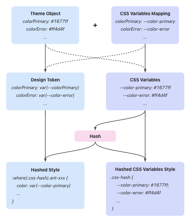
Conditional Styles
It is important to note that the CSS variable query in `@container` is not yet supported by Firefox. Therefore, in v6, we do not rely on `@container` as the primary functionality, but rather as a fallback compatibility mechanism.
## @scope
If there is one of the most enticing properties in CSS, it would be `@scope`. In v5, we used `:where` to implement CSS namespaces, isolating styles for different versions or themes of antd components:
```css
/* Theme 1 */
:where(.css-BamBoo).ant-btn {
color: red;
}
/* Theme 2 */
:where(.css-LIghT).ant-btn {
color: blue;
}
```
However, this approach can sometimes cause issues with nested logic. For example, in the following case, styles for `span` under `Theme1` affect `Theme2`:
```css
/* Theme 1 */
:where(.css-BamBoo) {
.component-a span {
color: red;
}
}
/* Theme 2 */
:where(.css-LIghT) {
.component-b {
color: blue;
}
}
```
```tsx
```
Whereas `@scope` can perfectly solve this problem:
```css
@scope (.component-a) to (span) {
/* ... */
}
```
Scope Impact
However, similarly, `@scope` is not yet supported by Firefox. Applying it in v6 would result in Firefox users being unable to use antd components. Hence, you may only see it in the next major version.
---
Title: Component-level CSS-in-JS
URL: https://ant.design/docs/blog/css-in-js
---
On November 18, 2022, we released Ant Design 5.0. At the same time, Ant Design's unique CSS-in-JS solution was brought into everyone's view. Through this solution, Ant Design achieves higher performance than other CSS-in-JS libraries, but at the cost of sacrificing its flexibility for free use in applications. So we call it a "component-level" CSS-in-JS solution. > = (props) => {
const { getPrefixCls } = React.useContext(ConfigProvider.ConfigContext);
const btnPrefixCls = getPrefixCls('btn');
const { styles } = useButtonStyle(btnPrefixCls);
return {props.children} ;
};
export default GeekProvider;
```
> = (props) => {
const { button, getPrefixCls } = React.useContext(ConfigProvider.ConfigContext);
const btnPrefixCls = getPrefixCls('btn');
const { styles } = useButtonStyle(btnPrefixCls);
return (
{props.children}
);
};
export default GeekProvider;
```
## Summary
Through ConfigProvider, we can further extend the theme. It can isolate styles well and avoid style conflicts. Let's try it out!
---
Title: Color Models and Color Picker
URL: https://ant.design/docs/blog/color-picker
---
Hello everyone, I'm [Redjue](https://github.com/Redjue), and I'm honored to have the opportunity to contribute the [ColorPicker](/components/color-picker) component to **Ant Design** this year. It's been a great learning experience and has given me a deeper understanding of the development process of **Ant Design**. In this article, I will share the specific implementation process.
## Color Models
Before we start implementing, we need to understand a concept: color models. A color model is a mathematical model used to describe colors. Common color models include `RGB`, `HSV`, `HEX`, etc. Among these color models, `RGB` is the most common and easiest to understand, so let's start with the `RGB` color model.
### RGB Color Model
The `RGB` color model represents colors by the combination of three primary colors (red, green, and blue). The value range of each primary color is 0-255, and the combination of the three primary colors can represent 2563 colors. These colors can form a cube, as shown in the following figure: 
In the `RGB` color model, each color can be represented by a triplet `(R, G, B)`, where `R` represents the value of red, `G` represents the value of green, and `B` represents the value of blue. For example, red can be represented as `rgb(255, 0, 0)`, green can be represented as `rgb(0, 255, 0)`, and blue can be represented as `rgb(0, 0, 255)`.
### HSV/HSB Color Model
The `HSV` color model represents colors by hue, saturation, and value. The value range of hue is 0-360, and the value range of saturation and value is 0-100. The `HSV` color model can be represented by a cone, as shown in the following figure: 
In the `HSV` color model, each color can be represented by a triplet `(H, S, V)`, where `H` represents the value of hue, `S` represents the value of saturation, and `V` represents the value of value. For example, red can be represented as `hsv(0, 100, 100)`, green can be represented as `hsv(120, 100, 100)`, and blue can be represented as `hsv(240, 100, 100)`.
### HEX Color Model
The `HEX` color model represents colors by hexadecimal numbers. The first two digits represent the value of red, the middle two digits represent the value of green, and the last two digits represent the value of blue. For example, red can be represented as `#FF0000`, green can be represented as `#00FF00`, and blue can be represented as `#0000FF`. As shown in the following figure: 
This is also the most common way of representing colors because it can be used directly in CSS. Moreover, the representation is very simple, just convert the three numbers in the RGB color model to hexadecimal numbers.
## Conversion of Color Models
Different algorithms are needed for the conversion of color models. There are many mature libraries on the market that can be selected. In the implementation, we chose the library [tinycolor](https://github.com/scttcper/tinycolor), which supports the conversion of multiple color models such as `RGB`, `HSL`, `HSV`, `HEX`, etc. Moreover, its size is very small, only about 10KB, which is very suitable for use in browsers.
## Selection of Color Models
Since we need to implement a color picker, we need to choose a color model to represent colors. In terms of complexity, the `RGB` color model is the simplest because it only needs three numbers to represent a color, and its value range is 0-255, which is very easy to understand. However, the disadvantage of the `RGB` color model is also very obvious. Its color space is a cube, and the color change at the edge of the cube is very obvious. This color space is not suitable for human visual perception.
Therefore, we need to choose a color model that is more suitable for human visual perception. Here we chose the `HSV` color model, which represents colors through hue, saturation, and value. This color space is more in line with human visual perception, and the color change at the edge of the color space is not too obvious.
## Implementation Details
The implementation mainly consists of three parts: the color panel, the selection anchor, and sliders.
### Color Panel
Since we are using the `HSV` color model, we need to represent hue, saturation, and value on the panel.
1. Hue
```css
background-color: rgb(0, 106, 255);
```
This way we get a blue color with both saturation and brightness set to 100%
Button
);
export default App;
```
OK, you should now see a blue primary button displayed on the page. Next you can choose any components of `antd` to develop your application. Visit other workflows of `Vite` at its [User Guide](https://vitejs.dev/).
We are successfully running antd components now, go build your own application!
---
Title: Basic Usage
URL: https://ant.design/docs/react/use-with-umi
---
In real project development, besides UI libraries like Ant Design, you may also need build tools, routing solutions, CSS solutions, data flow solutions, request libraries and request solutions, i18n solutions, permission solutions, Icons solutions, etc. We have launched [Umi](https://umijs.org/), an enterprise application framework based on React, based on the scenarios of business scenarios, which we recommend you to use in your projects.
Umi is a scalable enterprise front-end application framework and the underlying front-end framework of Ant Group, which has served 10,000+ applications directly or indirectly.
This article will guide you through creating a simple application from scratch using Umi, Ant Design and [Ant Design Pro](https://pro.ant.design/).
## Initialization Project
The recommended way to create a Umi scaffold is using [pnpm](https://pnpm.io/) to execute the following command.
```bash
$ mkdir myapp && cd myapp
$ pnpm create umi
```
> If you use npm, you can run `npm create umi` for the same effect; if you use yarn, run `yarn create umi`; if you use bun, which means you are a very hipster, you can run `bunx create-umi` (note that there is a `-` between create and umi).
Select "Simple App" here, because we want to start from "scratch".
```bash
? Pick Umi App Template › - Use arrow-keys. Return to submit.
❯ Simple App
Ant Design Pro
Vue Simple App
```
Here we recommend "pnpm". pnpm is better in speed and handling ghost dependencies.
```bash
? Pick Npm Client › - Use arrow-keys. Return to submit.
npm
cnpm
tnpm
yarn
❯ pnpm
```
For those in China, we recommend choosing "taobao", otherwise choose "npm".
```bash
? Pick Npm Registry › - Use arrow-keys. Return to submit.
❯ npm
taobao
```
The tool then automatically installs the dependencies and executes the initialization script for the umi.
Before starting the project, let's install some more dependencies that will be used in this tutorial.
```bash
$ pnpm i @umijs/plugins -D
$ pnpm i antd axios @ant-design/pro-components -S
```
`@umijs/plugins` is the official plugin set of Umi, containing a large number of plugins such as valtio, react-query, styled-components, locale, access, qiankun, etc. `antd` needs no introduction. `axios` is the request library; `@ant-design/pro-components` is the component used to generate the layouts.
When finished, execute the following command to start the project.
```bash
$ npm run dev
umi dev
info - Umi v4.0.46
╔════════════════════════════════════════════════════╗
║ App listening at: ║
║ > Local: http://localhost:8000 ║
ready - ║ > Network: http://*********:8000 ║
║ ║
║ Now you can open browser with the above addresses↑ ║
╚════════════════════════════════════════════════════╝
```
Follow the prompts and click the url in the command line, which will automatically open the browser. If it goes well, you will see the following screen.
## Create New Routes
We're going to write an application to display a list of products. The first step is to create the routes, which can be thought of as the different pages that make up the application. Umi users don't usually need to care about the implementation behind Umi, but in case you're wondering, Umi's routes are based on react-router@6.3 (Note: not the latest 6.4, which contains loader and action functionality that is not required for Umi).
We can create routes with cli.
```bash
$ npx umi g page products
Write: src/pages/products.tsx
Write: src/pages/products.less
```
Then modify the configuration file `.umirc.ts` with the new route declaration.
```diff
import { defineConfig } from "umi";
export default defineConfig({
routes: [
{ path: "/", component: "index" },
{ path: "/docs", component: "docs" },
+ { path: "/products", component: "products" },
],
npmClient: "pnpm",
});
```
Since the boilerplate uses configured routing, as the name implies, the routes are configured line by line by people, which is tedious but more flexible, this way you need to add the routes field to the configuration, see [Umi Documentation on Routing](https://umijs.org/docs/guides/routes). In addition, Umi also supports protocol-based routing, meaning that the file system is the route, so there is no need to configure routes to take effect.
Then we edit the `src/layouts/index.tsx` file and add the navigation to the `/products` path in the global layout route.
```diff
+
+
```
Open http://localhost:8000/products and if it goes well, you will see the following page.
## Implementing Product UI components
As your application grows, you'll need to share UI elements across multiple pages (or use them multiple times on a single page), and in Umi you can abstract this out into components. Let's write a ProductList component so that we can display the product list in different places.
Create a new `src/components/ProductList.tsx` file with the following code.
```tsx
import React from 'react';
import { Button, Popconfirm, Table } from 'antd';
import type { TableProps } from 'antd';
interface DataType {
id: string;
name: string;
}
const ProductList: React.FC<{ products: DataType[]; onDelete: (id: string) => void }> = ({
onDelete,
products,
}) => {
const columns: TableProps['columns'] = [
{
title: 'Name',
dataIndex: 'name',
},
{
title: 'Actions',
render(text, record) {
return (
onDelete(record.id)}>
Delete
);
},
},
];
return ;
};
export default ProductList;
```
## Preparing Mock Data
Assuming we have agreed on an API interface with the backend developers, we can now use Mock data to locally mock up the data that the API should return, so that front-end and back-end development can proceed simultaneously without the front-end work being blocked because the back-end API is still being developed. Umi provides an out-of-the-box [Mock function](https://umijs.org/docs/guides/mock) that allows you to set up Mock data in a convenient and easy way.
Create a new `mock/products.ts` file in the root directory with the following code.
```ts
import { defineMock } from 'umi';
type Product = {
id: string;
name: string;
};
let products: Product[] = [
{ id: '1', name: 'Umi' },
{ id: '2', name: 'Ant Design' },
{ id: '3', name: 'Ant Design Pro' },
{ id: '4', name: 'Dva' },
];
export default defineMock({
'GET /api/products': (_, res) => {
res.send({
status: 'ok',
data: products,
});
},
'DELETE /api/products/:id': (req, res) => {
products = products.filter((item) => item.id !== req.params.id);
res.send({ status: 'ok' });
},
});
```
Then visit http://localhost:8000/api/products and you will see the api response.
## Complete Products Page
With the UI components and Mock data done, it's time to bring them together. The request solution is needed here, and our choice here is react-query (if you want to say @tanstack/react-query, yes, they are the same library, and @tanstack/react-query is a renamed package of react-query). So before you start, you need to change the configuration to enable the [react-query plugin for Umi](https://umijs.org/docs/max/react-query) with one click.
First edit `.umirc.ts`.
```diff
import { defineConfig } from "umi";
export default defineConfig({
+ plugins: ['@umijs/plugins/dist/react-query'],
+ reactQuery: {},
routes: [
{ path: "/", component: "index" },
{ path: "/docs", component: "docs" },
{ path: "/products", component: "products" },
],
npmClient: 'pnpm',
});
```
Edit `src/pages/products.tsx` with the following code.
```tsx
import React from 'react';
import axios from 'axios';
import { useMutation, useQuery, useQueryClient } from 'umi';
import styles from './products.less';
import ProductList from '@/components/ProductList';
export default function Page() {
const queryClient = useQueryClient();
const productsQuery = useQuery(['products'], {
queryFn() {
return axios.get('/api/products').then((res) => res.data);
},
});
const productsDeleteMutation = useMutation({
mutationFn(id: string) {
return axios.delete(`/api/products/${id}`);
},
onSettled: () => {
queryClient.invalidateQueries({ queryKey: ['products'] });
},
});
if (productsQuery.isLoading) return null;
return (
Page products
{
productsDeleteMutation.mutate(id);
}}
/>
);
}
```
Here, we pull the data from `/api/products` with `useQuery()` and submit a DELETE request to `/api/products/${id}` in the `onDelete` event with `useMutation()` to perform the delete operation. For more details on the use of react-query, please refer to [Umi Plugin for React Query](https://umijs.org/docs/max/react-query) and [React Query Official Website](https://tanstack.com/query/).
After saving, you should see the following screen.
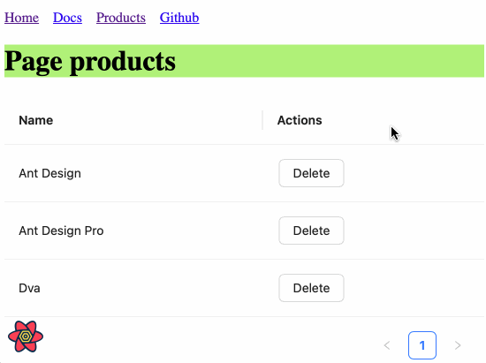
## ProLayout
A standard backend project generally need a layout, this layout is very often highly similar, [ProLayout](https://procomponents.ant.design/components/layout/) encapsulates the common menu, breadcrumbs, page headers and other functions, provides a non-dependent framework and an out-of-the-box advanced layout component. And support `side`, `mix`, `top` three modes, but also built-in menu selection, menu generation breadcrumbs, automatically set the logic of the page title.
Modify the configuration for each route to add a name field for ProLayout to do menu rendering use.
```diff
import { defineConfig } from "umi";
export default defineConfig({
routes: [
- { path: "/", component: "index" },
+ { path: "/", component: "index", name: "home" },
- { path: "/docs", component: "docs" },
+ { path: "/docs", component: "docs", name: "docs" },
- { path: "/products", component: "products" },
+ { path: "/products", component: "products", name: "products" },
],
plugins: ["@umijs/plugins/dist/react-query"],
reactQuery: {},
npmClient: "pnpm",
});
```
Edit `src/layouts/index.tsx` with the following code.
```tsx
import { ProLayout } from '@ant-design/pro-components';
import { Link, Outlet, useAppData, useLocation } from 'umi';
export default function Layout() {
const { clientRoutes } = useAppData();
const location = useLocation();
return (
{
if (menuItemProps.isUrl || menuItemProps.children) {
return defaultDom;
}
if (menuItemProps.path && location.pathname !== menuItemProps.path) {
return (
);
}
```
Here we first use umi's `useAppData` to get the global client route `clientRoutes`, which is a nested routing object, and we pass `clientRoutes[0]` to ProLayout; then we use `useLocation()` to get the location information, which is also passed to ProLayout to decide which menu should be highlighted; we also want to do a route jump when we click on the menu, so we need to customize ProLayout's menuItemRender method.
You may have found `src/layouts/index.less` has no place to refer to him, in order to keep the project file tidy, you can choose to delete him.
The browser will automatically refresh at this point, and if it goes well, you'll see the following screen.
## Build Application
After completing the development and verifying it in the development environment, it is time to deploy it to our users by executing the following command.
```bash
$ npm run build
info - Umi v4.0.46
✔ Webpack
Compiled successfully in 5.31s
info - File sizes after gzip:
122.45 kB dist/umi.js
575 B dist/src__pages__products.async.js
312 B dist/src__pages__index.async.js
291 B dist/layouts__index.async.js
100 B dist/layouts__index.chunk.css
55 B dist/src__pages__products.chunk.css
event - Build index.html
```
The build command will package all resources, including JavaScript, CSS, Web Fonts, images, Html, etc. You can find these files in the `dist/` directory.
## Next Step
We have completed a simple application and you may still have many questions, such as
- How to handle errors uniformly?
- How to handle more routing, such as dynamic routing, nested routing, permission routing, etc.?
- How to use a data flow scheme?
- How to modify webpack configuration or switch to vite build mode?
- etc.
You can.
- Visit [Umi official website](https://umijs.org/)
- Learn about [Umi's Routing](https://umijs.org/docs/guides/routes)
- Learn about [Umi Max](https://umijs.org/docs/max/introduce), which is more integrated than Umi
- Learn about the out-of-the-box middle and backend scaffolding [Ant Design Pro](https://pro.ant.design/)
- Learn about advanced layouts [ProLayout](https://procomponents.ant.design/components/layout)
- Learn about advanced tables [ProTable](https://procomponents.ant.design/components/table)
---
Title: Basic Usage
URL: https://ant.design/docs/react/use-with-rsbuild
---
[Rsbuild](https://rsbuild.dev) is a build tool driven by Rspack. This article will try to use `Rsbuild` to create a project and import antd.
## Install and Initialization
Before all start, you may need install [yarn](https://github.com/yarnpkg/yarn) or [pnpm](https://pnpm.io) or [bun](https://bun.sh).
Button
);
export default App;
```
OK, you should now see a blue primary button displayed on the page. Next you can choose any components of `antd` to develop your application. Visit other workflows of `Rsbuild` at its [Official documentation](https://rsbuild.dev).
### Customize Theme
Ref to the [Customize Theme documentation](/docs/react/customize-theme). Modify theme with ConfigProvider:
```tsx
import React from 'react';
import { ConfigProvider } from 'antd';
const App: React.FC = () => (
);
export default App;
```
We are successfully running the antd components using Rsbuild now, let’s start build your own application!
---
Title: Basic Usage
URL: https://ant.design/docs/react/use-with-refine
---
[Refine](https://github.com/refinedev/refine) is a React meta-framework designed for CRUD-heavy web applications. Its core hooks and components streamline development by offering solutions for authentication, access control, routing, networking, state management, and i18n.
It supports Ant Design with an integration package that includes ready-to-use components and hooks to connect Refine to Ant Design.
This article will guide you through bootstrapping a fully-functional CRUD application example using Refine and Ant Design.
## Install and Initialization
Refine integrates easily with platforms like Vite, Next.js, Remix, React Native, and Electron through a simple routing interface without additional setup.
In this guide, we'll use Vite and the `refine-antd` preset from the `create refine-app` CLI for a quick start to create a new Refine project with Ant Design using predefined options.
Before all start, you may need install [yarn](https://github.com/yarnpkg/yarn/) or [pnpm](https://pnpm.io/).
);
};
```
While Refine's integration offers a set of components and hooks, it is not a replacement for the Ant Design package, you will be able to use all the features of Ant Design in the same way you would use it in a regular React application.
Refine's integration only provides components and hooks for an easier usage of Ant Design components in combination with Refine's features and functionalities.
## How to Add Ant Design to an Existing Refine Project
You can follow the [Refine Ant Design official guide](https://refine.dev/docs/ui-integrations/ant-design/introduction/) to add Ant Design to an existing Refine project.
To bootstrap a Refine app with various integration options like Next.js and Remix, use `npm create refine-app@latest` and select Ant Design as the UI framework from the CLI.
For more detailed tutorials and guides with Ant Design, visit the [Refine documentation](https://refine.dev/tutorial/ui-libraries/intro/ant-design/react-router/).
---
Title: Basic Usage
URL: https://ant.design/docs/react/use-with-next
---
[Next.js](https://nextjs.org/) is currently the most popular React server-side isomorphic framework in the world. This article will try to use `antd` components in projects created by Next.js.
## Install and Initialization
Before all start, you may need install [yarn](https://github.com/yarnpkg/yarn/) or [pnpm](https://pnpm.io/) or [bun](https://bun.sh/).
Button
);
export default Home;
```
OK, you should now see a blue primary button displayed on the page. Next you can choose any components of `antd` to develop your application. Visit other workflows of `Next.js` at its [User Guide](https://nextjs.org/).
You could find that components of antd do not have styles in the first screen. Next, you need to choose different SSR style processing methods according to the mode of Next.js.
## Using App Router Updated
If you are using the App Router in Next.js and using antd as your component library, to make the antd component library work better in your Next.js application and provide a better user experience, you can try using the following method to extract and inject antd's first-screen styles into HTML to avoid page flicker.
1. Install `@ant-design/nextjs-registry`
{children}
);
export default RootLayout;
```
:::warning
Next.js App Router currently not support using sub-components via `.` like `
),
});
const initialProps = await Document.getInitialProps(ctx);
const style = extractStyle(cache, true);
return {
...initialProps,
styles: (
<>
{initialProps.styles}
),
};
};
export default MyDocument;
```
3. Supports custom themes
```ts
// theme/themeConfig.ts
import type { ThemeConfig } from 'antd';
const theme: ThemeConfig = {
token: {
fontSize: 16,
colorPrimary: '#52c41a',
},
};
export default theme;
```
4. Rewrite `pages/_app.tsx`
```tsx
import React from 'react';
import { ConfigProvider } from 'antd';
import type { AppProps } from 'next/app';
import theme from './theme/themeConfig';
const App = ({ Component, pageProps }: AppProps) => (
);
export default App;
```
5. Use antd in page component
```tsx
import React from 'react';
import { Button } from 'antd';
const Home = () => (
Button
);
export default Home;
```
For more detailed information, please refer to [with-nextjs-inline-style](https://github.com/ant-design/ant-design-examples/tree/main/examples/with-nextjs-inline-style).
---
Title: Basic Usage
URL: https://ant.design/docs/react/use-with-farm
---
[Farm](https://www.farmfe.org/) is a Rust-Based Web Building Engine to Facilitate Your Web Program and JavaScript Library. This article will try to use `Farm` to create a project and import antd.
## Install and Initialization
Before all start, you may need install [yarn](https://github.com/yarnpkg/yarn) or [pnpm](https://pnpm.io) or [bun](https://bun.sh).
Button
);
}
```
OK, you should now see a blue primary button displayed on the page. Next you can choose any components of `antd` to develop your application. Visit other workflows of `Farm` at its [Official documentation](https://www.farmfe.org).
### Customize Theme
Ref to the [Customize Theme documentation](/docs/react/customize-theme). Modify theme with ConfigProvider:
```tsx
import React from 'react';
import { Button, ConfigProvider } from 'antd';
export function Main() {
return (
Button
);
}
```
We are successfully running the antd components using Rsbuild now, let’s start build your own application!
---
Title: Advanced
URL: https://ant.design/docs/react/use-custom-date-library
---
By default, Ant Design uses [Day.js](https://day.js.org) to handle time and date. Day.js is an immutable date-time library alternative to Moment.js with the same API.
You might want to use another date library (**Ant design currently supports [moment](http://momentjs.com/), [date-fns](https://date-fns.org), and [luxon](https://moment.github.io/luxon/)**). We provide two ways to customize:
## Custom component
The first way is to use `generatePicker` (or `generateCalendar`) to help create Picker components.
First, we initialize an antd demo. You can refer to [Scaffolding Guide](https://u.ant.design/guide), or you can start directly here [init antd](https://github.com/xiaohuoni/antd4-generate-picker/commit/47fec964e36d48bd15760f8f5abcb9655c259aa6)
### DatePicker.tsx
Create `src/components/DatePicker.tsx`.
For example:
```tsx
import { DatePicker } from 'antd';
import type { Moment } from 'moment';
import momentGenerateConfig from 'rc-picker/lib/generate/moment';
const MyDatePicker = DatePicker.generatePicker(momentGenerateConfig);
export default MyDatePicker;
```
### TimePicker.tsx
Create `src/components/TimePicker.tsx`.
For example:
```tsx
import * as React from 'react';
import type { PickerTimeProps } from 'antd/es/date-picker/generatePicker';
import type { Moment } from 'moment';
import DatePicker from './DatePicker';
export interface TimePickerProps extends Omit, 'picker'> {}
const TimePicker = React.forwardRef((props, ref) => (
(momentGenerateConfig);
export default MyCalendar;
```
### Export Custom component
Create `src/components/index.tsx`.
For example:
```tsx
export { default as Calendar } from './Calendar';
export { default as DatePicker } from './DatePicker';
export { default as TimePicker } from './TimePicker';
```
### Use Custom component
Modify `src/App.tsx`,import `moment` and custom component.
```diff
- import { DatePicker, Calendar } from 'antd';
- import format from 'dayjs';
+ import { DatePicker, TimePicker, Calendar } from './components';
+ import format from 'moment';
```
## antd-moment-webpack-plugin
We also provide another implementation, which we provide with `@ant-design/moment-webpack-plugin`, replacing `Day.js` with `moment` directly without changing a line of existing code. More info can be found at [@ant-design/moment-webpack-plugin](https://github.com/ant-design/antd-moment-webpack-plugin).
```js
// webpack-config.js
const AntdMomentWebpackPlugin = require('@ant-design/moment-webpack-plugin');
module.exports = {
// ...
plugins: [new AntdMomentWebpackPlugin()],
};
```
## Use date-fns
[date-fns](https://date-fns.org/) currently supports custom component methods similar to `dayjs`. The difference is that the parameter types used are different. Support is provided in antd 4.5.0 and above.
For Example:
### DatePicker.tsx
Create `src/components/DatePicker.tsx`.
Code as follows:
```tsx
import { DatePicker } from 'antd';
import dateFnsGenerateConfig from 'rc-picker/lib/generate/dateFns';
const MyDatePicker = DatePicker.generatePicker(dateFnsGenerateConfig);
export default MyDatePicker;
```
## Use luxon
Since `antd 5.4.0`, [luxon](https://moment.github.io/luxon/) can be used instead of `dayjs` and supports the same functionality, but it does introduce some differences in behavior that we will explain below.
### Implementation
Create a `src/components/DatePicker.tsx` file, and implement the luxon based picker as follows:
```tsx
import { DatePicker } from 'antd';
import type { DateTime } from 'luxon';
import luxonGenerateConfig from 'rc-picker/lib/generate/luxon';
const MyDatePicker = DatePicker.generatePicker(luxonGenerateConfig);
export default MyDatePicker;
```
### Notable differences with dayjs
luxon users should be familiar with the fact that it does not come with a custom implementation for localization. Instead, it relies on the browser's native [Intl API](https://developer.mozilla.org/en-US/docs/Web/JavaScript/Reference/Global_Objects/Intl).
This introduces some formatting differences with the other date libraries. As of today, the main differences are:
- First day of the week is always Monday regardless of locale.
- Week of year number is sometimes different (ISO week rules are used to determine it).
- Short week days format will sometimes be different for custom locales (it might have 3 characters instead of 2).
- Selected week label format will be slightly different (e.g. "2021-01" instead of "2021-1st").
It is possible to customize these default luxon behaviors by adjusting the luxon config:
```tsx
import { DatePicker } from 'antd';
import type { DateTime } from 'luxon';
import luxonGenerateConfig from 'rc-picker/lib/generate/luxon';
const customLuxonConfig = {
...luxonGenerateConfig,
getWeekFirstDay(locale) {
// Your custom implementation goes here
},
};
const MyDatePicker = DatePicker.generatePicker(customLuxonConfig);
export default MyDatePicker;
```
Note that by doing such customization, the resulting DatePicker behavior might be altered in unexpected ways, so make sure you are testing for edge cases.
---
Title: Advanced
URL: https://ant.design/docs/react/server-side-rendering
---
There are two options for server-side rendering styles, each with advantages and disadvantages:
- **Inline mode**: there is no need to request additional style files during rendering. The advantage is to reduce additional network requests. The disadvantage is that the HTML volume will increase and the speed of the first screen rendering will be affected. Relevant discussion: [#39891](https://github.com/ant-design/ant-design/issues/39891)
- **Whole export**: The antd component is pre-baked and styled as a css file to be introduced in the page. The advantage is that when opening any page, the same set of css files will be reused just like the traditional css scheme to hit the cache. The disadvantage is that if there are multiple themes in the page, additional baking is required
## Inline Style
Use `@ant-design/cssinjs` to extract style:
```tsx
import React from 'react';
import { createCache, extractStyle, StyleProvider } from '@ant-design/cssinjs';
import type Entity from '@ant-design/cssinjs/es/Cache';
import { renderToString } from 'react-dom/server';
const App = () => {
// SSR Render
const cache = React.useMemo(() => createCache(), []);
const html = renderToString(
,
);
// Grab style from cache
const styleText = extractStyle(cache);
// Mix with style
return `
${styleText}
${html}
`;
};
export default App;
```
## Whole Export
If you want to detach a style file into a css file, try the following schemes:
1. Installation dependency
```bash
npm install ts-node tslib cross-env --save-dev
```
2. Add `tsconfig.node.json`
```json
{
"compilerOptions": {
"strictNullChecks": true,
"module": "NodeNext",
"jsx": "react",
"esModuleInterop": true
},
"include": ["next-env.d.ts", "**/*.ts", "**/*.tsx"]
}
```
3. Add `scripts/genAntdCss.tsx`
```tsx
// scripts/genAntdCss.tsx
import fs from 'fs';
import { extractStyle } from '@ant-design/static-style-extract';
const outputPath = './public/antd.min.css';
const css = extractStyle();
fs.writeFileSync(outputPath, css);
```
If you want to use mixed themes or custom themes, you can use the following script:
```tsx
import fs from 'fs';
import React from 'react';
import { extractStyle } from '@ant-design/static-style-extract';
import { ConfigProvider } from 'antd';
const outputPath = './public/antd.min.css';
const testGreenColor = '#008000';
const testRedColor = '#ff0000';
const css = extractStyle((node) => (
<>
{node}
{node}
));
fs.writeFileSync(outputPath, css);
```
You can choose to execute this script before starting the development command or before compiling. Running this script will generate a full antd.min.css file directly in the specified directory of the current project (e.g. public).
Take Next.js for example([example](https://github.com/ant-design/ant-design-examples/tree/main/examples/with-nextjs-inline-style)):
```json
// package.json
{
"scripts": {
"dev": "next dev",
"build": "next build",
"start": "next start",
"lint": "next lint",
"predev": "ts-node --project ./tsconfig.node.json ./scripts/genAntdCss.tsx",
"prebuild": "cross-env NODE_ENV=production ts-node --project ./tsconfig.node.json ./scripts/genAntdCss.tsx"
}
}
```
Then, you just need to import this file into the `pages/_app.tsx` file:
```tsx
import { StyleProvider } from '@ant-design/cssinjs';
import type { AppProps } from 'next/app';
import '../public/antd.min.css'; // add this line
import '../styles/globals.css';
export default function App({ Component, pageProps }: AppProps) {
return (
);
}
```
### Custom theme
If you're using a custom theme for your project, try baking in the following ways:
```tsx
import { extractStyle } from '@ant-design/static-style-extract';
import { ConfigProvider } from 'antd';
const cssText = extractStyle((node) => (
{node}
));
```
### Mixed theme
If you're using a mixed theme for your project, try baking in the following ways:
```tsx
import { extractStyle } from '@ant-design/static-style-extract';
import { ConfigProvider } from 'antd';
const cssText = extractStyle((node) => (
<>
{node}
{node}
));
```
More about static-style-extract, see [static-style-extract](https://github.com/ant-design/static-style-extract).
## Extract on demand
```tsx
// scripts/genAntdCss.tsx
import { createHash } from 'crypto';
import fs from 'fs';
import path from 'path';
import { extractStyle } from '@ant-design/cssinjs';
import type Entity from '@ant-design/cssinjs/lib/Cache';
export interface DoExtraStyleOptions {
cache: Entity;
dir?: string;
baseFileName?: string;
}
export const doExtraStyle = (opts: DoExtraStyleOptions) => {
const { cache, dir = 'antd-output', baseFileName = 'antd.min' } = opts;
const baseDir = path.resolve(__dirname, '../../static/css');
const outputCssPath = path.join(baseDir, dir);
if (!fs.existsSync(outputCssPath)) {
fs.mkdirSync(outputCssPath, { recursive: true });
}
const css = extractStyle(cache, true);
if (!css) {
return '';
}
const md5 = createHash('md5');
const hash = md5.update(css).digest('hex');
const fileName = `${baseFileName}.${hash.substring(0, 8)}.css`;
const fullpath = path.join(outputCssPath, fileName);
const res = `_next/static/css/${dir}/${fileName}`;
if (fs.existsSync(fullpath)) {
return res;
}
fs.writeFileSync(fullpath, css);
return res;
};
```
Export on demand using the above tools in `_document.tsx`
```tsx
// _document.tsx
import { createCache, StyleProvider } from '@ant-design/cssinjs';
import type { DocumentContext } from 'next/document';
import Document, { Head, Html, Main, NextScript } from 'next/document';
import { doExtraStyle } from '../scripts/genAntdCss';
export default class MyDocument extends Document {
static async getInitialProps(ctx: DocumentContext) {
const cache = createCache();
let fileName = '';
const originalRenderPage = ctx.renderPage;
ctx.renderPage = () =>
originalRenderPage({
enhanceApp: (App) => (props) => (
),
});
const initialProps = await Document.getInitialProps(ctx);
// 1.1 extract style which had been used
fileName = doExtraStyle({
cache,
});
return {
...initialProps,
styles: (
<>
{initialProps.styles}
{/* 1.2 inject css */}
{fileName &&
content
+ content
- tag
+ {visible && tag }
-
-
);
export default App;
```
## Start upgrading
Use git to save your code and install latest version:
```bash
npm install --save antd@5.x
```
If you want to use v4 deprecated component like `Comment` or `PageHeader`. You can install `@ant-design/compatible` and `@ant-design/pro-components` for compatible:
```bash
npm install --save @ant-design/compatible@v5-compatible-v4
npm install --save @ant-design/pro-components
```
You can manually check the code one by one against the above list for modification. In addition, we also provide a codemod cli tool [@ant-design/codemod-v5](https://github.com/ant-design/codemod-v5) To help you quickly upgrade to v5.
Before running codemod cli, please submit your local code changes.
```shell
# Run directly through npx
npx -p @ant-design/codemod-v5 antd5-codemod src
# Or run directly through pnpm
pnpm --package=@ant-design/codemod-v5 dlx antd5-codemod src
```
> Note that codemod cannot cover all scenarios, and it is recommended to check for incompatible changes one by one.
### less migration
If you using antd less variables, you can use compatible package to covert it into v4 less variables and use less-loader to inject them:
```js
const { theme } = require('antd/lib');
const { convertLegacyToken, defaultTheme } = require('@ant-design/compatible/lib');
const { defaultAlgorithm, defaultSeed } = theme;
const mapV5Token = defaultAlgorithm(defaultSeed);
const v5Vars = convertLegacyToken(mapV5Token);
const mapV4Token = theme.getDesignToken(defaultTheme);
const v4Vars = convertLegacyToken(mapV4Token);
// Webpack Config
module.exports = {
// ... other config
loader: 'less-loader',
options: {
lessOptions: {
modifyVars: v5Vars, // or v4Vars
},
},
};
```
And then remove antd less reference in your less file:
```diff
// Your less file
-- @import (reference) '~antd/es/style/themes/index';
or
-- @import '~antd/es/style/some-other-less-file-ref';
```
### Remove babel-plugin-import
Remove `babel-plugin-import` from package.json and modify `.babelrc`:
```diff
"plugins": [
- ["import", { "libraryName": "antd", "libraryDirectory": "lib"}, "antd"],
]
```
Umi user can disable by config:
```diff
// config/config.ts or .umirc
export default {
antd: {
- import: true,
+ import: false,
},
};
```
### Replace Day.js locale
Replace moment.js locale with day.js locale:
```diff
- import moment from 'moment';
+ import dayjs from 'dayjs';
- import 'moment/locale/zh-cn';
+ import 'dayjs/locale/zh-cn';
- moment.locale('zh-cn');
+ dayjs.locale('zh-cn');
```
🚨 You need to pay attention to the day.js plugin system. If you find that the function originally in moment.js cannot be used in day.js, please refer to the [day.js plugin document](https://day.js.org/docs/en/plugin/plugin).
If you do not want to replace with day.js, you can use `@ant-design/moment-webpack-plugin` to keep moment.js:
```bash
npm install --save-dev @ant-design/moment-webpack-plugin
```
```javascript
// webpack-config.js
import AntdMomentWebpackPlugin from '@ant-design/moment-webpack-plugin';
module.exports = {
// ...
plugins: [new AntdMomentWebpackPlugin()],
};
```
### Switch to theme of v4
If you don't want the style to change after upgrade, we have provided a v4 theme in `@ant-design/compatible` that can restore v4 style.
````diff
```sandpack
const sandpackConfig = {
dependencies: {
'@ant-design/compatible': 'v5-compatible-v4',
},
};
import {
defaultTheme, // Default theme
darkTheme, // Dark theme
} from '@ant-design/compatible';
import { ConfigProvider, Button, Radio, Space } from 'antd';
export default () => (
Button
A
B
C
D
);
````
### Legacy browser support
Ant Design v5 using `:where` css selector to reduce CSS-in-JS hash priority. You can use `@ant-design/cssinjs` `StyleProvider` to cancel this function. Please ref [Compatible adjustment](/docs/react/customize-theme#compatible-adjustment).
## Multiple versions coexist
We do not recommend multiple versions coexist, it will make the application more complex (such as style override, ConfigProvider not reused, etc.). It's better to use micro-applications such as [qiankun](https://qiankun.umijs.org/) for page level development.
### Install v5 through alias
```bash
$ npm install --save antd-v5@npm:antd@5
# or
$ yarn add antd-v5@npm:antd@5
# or
$ pnpm add antd-v5@npm:antd@5
```
The package.json will be:
```json
{
"antd": "4.x",
"antd-v5": "npm:antd@5"
}
```
Now, antd in your project is still v4, and antd-v5 is v5.
```tsx
import React from 'react';
import { Button as Button4 } from 'antd'; // v4
import { Button as Button5 } from 'antd-v5'; // v5
export default () => (
<>
);
```
## Encounter problems
If you encounter problems during the upgrade, please go to [GitHub issues](https://new-issue.ant.design/) for feedback. We will respond and improve this document as soon as possible.
---
Title: Migration
URL: https://ant.design/docs/react/migrate-less-variables
---
This document contains the correspondence between all the less variables related to components in version 4.x and the Component Token in version 5.x. If you are upgrading from version 4.x to version 5.x, you can quickly find the corresponding Component Token through this comparison table.
:::info{title=Note}
There are still some less variables that do not have a corresponding Component Token, and these variables have been deprecated in version 5.x.
:::
## How to use Component Token
We could configure global token and component token for each component through the `theme` property of ConfigProvider.
```tsx
import React from 'react';
import { Checkbox, ConfigProvider, Radio } from 'antd';
const App: React.FC = () => (
Radio
Checkbox
);
export default App;
```
## Component Token
### Alert
| Less variables | Component Token | Note |
| --- | --- | --- |
| `@alert-success-border-color` | `colorSuccessBorder` | Global token |
| `@alert-success-bg-color` | `colorSuccessBg` | Global token |
| `@alert-success-icon-color` | `colorSuccess` | Global token |
| `@alert-info-border-color` | `colorInfoBorder` | Global token |
| `@alert-info-bg-color` | `colorInfoBg` | Global token |
| `@alert-info-icon-color` | `colorInfo` | Global token |
| `@alert-warning-border-color` | `colorWarningBorder` | Global token |
| `@alert-warning-bg-color` | `colorWarningBg` | Global token |
| `@alert-warning-icon-color` | `colorWarning` | Global token |
| `@alert-error-border-color` | `colorErrorBorder` | Global token |
| `@alert-error-bg-color` | `colorErrorBg` | Global token |
| `@alert-error-icon-color` | `colorError` | Global token |
| `@alert-message-color` | `colorTextHeading` | Global token |
| `@alert-text-color` | `colorText` | Global Token |
| `@alert-close-color` | `colorIcon` | Global token |
| `@alert-close-hover-color` | `colorIconHover` | Global token |
| `@alert-padding-vertical` | `defaultPadding` | Control the whole padding |
| `@alert-padding-horizontal` | `defaultPadding` | Control the whole padding |
| `@alert-no-icon-padding-vertical` | - | Deprecated |
| `@alert-with-description-no-icon-padding-vertical` | `withDescriptionPadding` | Control the whole padding |
| `@alert-with-description-padding-vertical` | `withDescriptionPadding` | Control the whole padding |
| `@alert-with-description-padding` | `withDescriptionPadding` | Control the whole padding |
| `@alert-icon-top` | - | Deprecated |
| `@alert-with-description-icon-size` | `withDescriptionIconSize` | - |
### Anchor
| Less variables | Component Token | Note |
| --- | --- | --- |
| `@anchor-bg` | '-' | Can be modified directly by `className` or `style` |
| `@anchor-border-color` | `colorSplit` | GlobalToken |
| `@anchor-link-top` | `linkPaddingBlock` | - |
| `@anchor-link-left` | `linkPaddingInlineStart` | - |
| `@anchor-link-padding` | - | `${linkPaddingBlock}px ${linkPaddingInlineStart}px` |
### Avatar
| Less variables | Component Token | Note |
| --- | --- | --- |
| `@avatar-size-base` | `containerSize` | - |
| `@avatar-size-lg` | `containerSizeLG` | - |
| `@avatar-size-sm` | `containerSizeSM` | - |
| `@avatar-font-size-base` | `textFontSize` | - |
| `@avatar-font-size-lg` | `textFontSizeLG` | - |
| `@avatar-font-size-sm` | `textFontSizeSM` | - |
| `@avatar-bg` | - | Can be directly overridden by `className` or `style` |
| `@avatar-color` | `colorTextLightSolid` | Global Token |
| `@avatar-border-radius` | `borderRadius` | Global Token |
| `@avatar-group-overlapping` | - | Deprecated for style change |
| `@avatar-group-space` | `groupSpace` | - |
| `@avatar-group-border-color` | `colorBorderBg` | Global Token |
### Badge
| Less variables | Component Token | Note |
| --- | --- | --- |
| `@zindex-badge` | `indicatorZIndex` | - |
| `@badge-height` | `indicatorHeight` | - |
| `@badge-height-sm` | `indicatorHeightSM` | - |
| `@badge-dot-size` | `dotSize` | - |
| `@badge-font-size` | `textFontSize` | - |
| `@badge-font-size-sm` | `textFontSizeSM` | - |
| `@badge-font-weight` | `textFontWeight` | - |
| `@badge-status-size` | `statusSize` | - |
| `@badge-text-color` | `colorBgContainer` | Global Token |
| `@badge-color` | `colorError` | Global Token |
### BreadCrumb
| Less variables | Component Token | Note |
| --- | --- | --- |
| `@breadcrumb-base-color` | `itemColor` | - |
| `@breadcrumb-last-item-color` | `lastItemColor` | - |
| `@breadcrumb-font-size` | `fontSize` | GlobalToken |
| `@breadcrumb-icon-font-size` | `iconFontSize` | - |
| `@breadcrumb-link-color` | `linkColor` | - |
| `@breadcrumb-link-color-hover` | `linkHoverColor` | - |
| `@breadcrumb-separator-color` | `separatorColor` | - |
| `@breadcrumb-separator-margin` | `separatorMargin` | - |
### Button
| Less variables | Component Token | Note |
| --- | --- | --- |
| `@btn-font-weight` | `fontWeight` | - |
| `@btn-border-radius-base` | `borderRadius` | Global Token |
| `@btn-border-radius-sm` | `borderRadiusSM` | Global Token |
| `@btn-border-width` | `lineWidth` | Global Token |
| `@btn-border-style` | `lineStyle` | Global Token |
| `@btn-shadow` | `defaultShadow` | - |
| `@btn-primary-shadow` | `primaryShadow` | - |
| `@btn-text-shadow` | - | Deprecated for no `text-shadow` any more |
| `@btn-primary-color` | `primaryColor` | - |
| `@btn-primary-bg` | `colorPrimary` | Global Token |
| `@btn-default-color` | `colorText` | Global Token |
| `@btn-default-bg` | `colorBgContainer` | Global Token |
| `@btn-default-border` | `colorBorder` | Global Token |
| `@btn-danger-color` | `dangerColor` | - |
| `@btn-danger-bg` | `colorError` | Global Token |
| `@btn-danger-border` | `colorError` | Global Token |
| `@btn-disable-color` | `colorTextDisabled` | Global Token |
| `@btn-disable-bg` | `colorBgContainerDisabled` | Global Token |
| `@btn-disable-border` | `borderColorDisabled` | - |
| `@btn-default-ghost-color` | `defaultGhostColor` | - |
| `@btn-default-ghost-bg` | `ghostBg` | - |
| `@btn-default-ghost-border` | `defaultGhostBorderColor` | - |
| `@btn-font-size-lg` | `fontSizeLG` | Global Token |
| `@btn-font-size-sm` | `fontSizeSM` | Global Token |
| `@btn-padding-horizontal-base` | `paddingInline` | - |
| `@btn-padding-horizontal-lg` | `paddingInlineLG` | - |
| `@btn-padding-horizontal-sm` | `paddingInlineSM` | - |
| `@btn-height-base` | `controlHeight` | Global Token |
| `@btn-height-lg` | `controlHeightLG` | Global Token |
| `@btn-height-sm` | `controlHeightSM` | Global Token |
| `@btn-line-height` | `lineHeight` | Global Token |
| `@btn-circle-size` | `controlHeight` | Global Token |
| `@btn-circle-size-lg` | `controlHeightLG` | Global Token |
| `@btn-circle-size-sm` | `controlHeightSM` | Global Token |
| `@btn-square-size` | `controlHeight` | Global Token |
| `@btn-square-size-lg` | `controlHeightLG` | Global Token |
| `@btn-square-size-sm` | `controlHeightSM` | Global Token |
| `@btn-square-only-icon-size` | `onlyIconSize` | - |
| `@btn-square-only-icon-size-sm` | `onlyIconSizeSM` | - |
| `@btn-square-only-icon-size-lg` | `onlyIconSizeLG` | - |
| `@btn-group-border` | `groupBorderColor` | - |
| `@btn-link-hover-bg` | `linkHoverBg` | - |
| `@btn-text-hover-bg` | `textHoverBg` | - |
### Calendar
| Less variables | Component Token | Note |
| --- | --- | --- |
| `@calendar-bg` | - | Deprecated for style change |
| `@calendar-input-bg` | - | Deprecated for style change |
| `@calendar-border-color` | - | Deprecated for style change |
| `@calendar-item-active-bg` | `itemActiveBg` | - |
| `@calendar-column-active-bg` | - | Deprecated for style change |
| `@calendar-full-bg` | `fullBg` | - |
| `@calendar-full-panel-bg` | `fullPanelBg` | - |
### Card
| Less variables | Component Token | Note |
| --- | --- | --- |
| `@card-head-color` | `colorTextHeading` | Global Token |
| `@card-head-background` | `headerBg` | - |
| `@card-head-font-size` | `headerFontSize` | - |
| `@card-head-font-size-sm` | `headerFontSizeSM` | - |
| `@card-head-padding` | - | Deprecated |
| `@card-head-padding-sm` | - | Deprecated |
| `@card-head-height` | `headerHeight` | - |
| `@card-head-height-sm` | `headerHeightSM` | - |
| `@card-inner-head-padding` | - | Deprecated |
| `@card-padding-base` | `cardPaddingBase` | - |
| `@card-padding-base-sm` | `cardPaddingBaseSm` | - |
| `@card-actions-background` | `actionsBackground` | - |
| `@card-actions-li-margin` | `actionsLiMargin` | - |
| `@card-skeleton-bg` | - | Deprecated in favor of internal Skeleton |
| `@card-background` | `colorBgContainer` | Global Token |
| `@card-shadow` | - | Could be modified by `className` or `style` directly |
| `@card-radius` | `borderRadiusLG` | Global Token |
| `@card-head-tabs-margin-bottom` | `tabsMarginBottom` | - |
| `@card-head-extra-color` | `extraColor` | - |
### Carousel
| Less variables | Component Token | Note |
| --- | --- | --- |
| `@carousel-dot-width` | `dotWidth` | - |
| `@carousel-dot-height` | `dotHeight` | - |
| `@carousel-dot-active-width` | `dotActiveWidth` | - |
### Cascader
| Less variables | Component Token | Note |
| --- | --- | --- |
| `@cascader-bg` | - | Deprecated |
| `@cascader-item-selected-bg` | `optionSelectedBg` | - |
| `@cascader-menu-bg` | - | Deprecated |
| `@cascader-menu-border-color-split` | `colorSplit` | Global Token |
| `@cascader-dropdown-vertical-padding` | `optionPadding` | - |
| `@cascader-dropdown-edge-child-vertical-padding` | `menuPadding` | - |
| `@cascader-dropdown-font-size` | - | Deprecated |
| `@cascader-dropdown-line-height` | `lineHeight` | Global Token |
### Checkbox
| Less variables | Component Token | Note |
| --- | --- | --- |
| `@checkbox-size` | `controlInteractiveSize` | GlobalToken |
| `@checkbox-color` | `colorPrimary` | - |
| `@checkbox-check-color` | `colorWhite` | - |
| `@checkbox-check-bg` | `colorPrimary` | GlobalToken |
| `@checkbox-border-width` | `lineWidth` | - |
| `@checkbox-border-radius` | `borderRadiusSM` | - |
| `@checkbox-group-item-margin-right` | - | Deprecated for style change |
### Collapse
| Less variables | Component Token | Note |
| --- | --- | --- |
| `@collapse-header-padding` | `headerPadding` | - |
| `@collapse-header-padding-extra` | - | Depreacated |
| `@collapse-header-bg` | `headerBg` | - |
| `@collapse-content-padding` | `contentPadding` | - |
| `@collapse-content-bg` | `contentBg` | - |
| `@collapse-header-arrow-left` | - | Deprecated |
### DatePicker
| Less variables | Component Token | Note |
| --- | --- | --- |
| `@picker-bg` | `colorBgContainer` | Global Token |
| `@picker-basic-cell-hover-color` | `cellHoverBg` | - |
| `@picker-basic-cell-active-with-range-color` | `cellActiveWithRangeBg` | - |
| `@picker-basic-cell-hover-with-range-color` | `cellHoverWithRangeBg` | - |
| `@picker-basic-cell-disabled-bg` | `cellBgDisabled` | - |
| `@picker-border-color` | `colorSplit` | Global Token |
| `@picker-date-hover-range-border-color` | `cellRangeBorderColor` | - |
| `@picker-date-hover-range-color` | `cellHoverWithRangeColor` | - |
| `@picker-time-panel-column-width` | `timeColumnWidth` | - |
| `@picker-time-panel-column-height` | `timeColumnHeight` | - |
| `@picker-time-panel-cell-height` | `timeCellHeight` | - |
| `@picker-panel-cell-height` | `cellHeight` | - |
| `@picker-panel-cell-width` | `cellWidth` | - |
| `@picker-text-height` | `textHeight` | - |
| `@picker-panel-without-time-cell-height` | `withoutTimeCellHeight` | - |
### Descriptions
| Less variables | Component Token | Note |
| --- | --- | --- |
| `@descriptions-bg` | `labelBg` | - |
| `@descriptions-title-margin-bottom` | `titleMarginBottom` | - |
| `@descriptions-default-padding` | `padding`, `paddingLG` | GlobalToken, used as `${token.padding}px ${token.paddingLG}px` |
| `@descriptions-middle-padding` | `paddingSM`, `paddingLG` | GlobalToken, used as `${token.paddingSM}px ${token.paddingLG}px` |
| `@descriptions-small-padding` | `paddingXS`, `padding` | GlobalToken, used as `${token.paddingXS}px ${token.padding}px` |
| `@descriptions-item-padding-bottom` | `itemPaddingBottom` | - |
| `@descriptions-item-trailing-colon` | - | Deprecated for style change |
| `@descriptions-item-label-colon-margin-right` | `colonMarginRight` | - |
| `@descriptions-item-label-colon-margin-left` | `colonMarginLeft` | - |
| `@descriptions-extra-color` | `extraColor` | - |
### Divider
| Less variables | Component Token | Note |
| --- | --- | --- |
| --- | --- | --- |
| `@divider-text-padding` | `textPaddingInline` | - |
| `@divider-orientation-margin` | `orientationMargin` | - |
| `@divider-color` | `colorSplit` | Global Token |
| `@divider-vertical-gutter` | `verticalMarginInline` | - |
### Drawer
| Less variables | Component Token | Note |
| --- | --- | --- |
| `@drawer-bg` | `colorBgElevated` | GlobalToken |
| `@drawer-header-padding` | `padding`, `paddingLG` | GlobalToken, used as `${padding}px ${paddingLG}px` |
| `@drawer-title-font-size` | `fontSizeLG` | GlobalToken |
| `@drawer-title-line-height` | `lineHeightLG` | GlobalToken |
| `@drawer-body-padding` | `paddingLG` | GlobalToken |
| `@drawer-footer-padding-vertical` | `footerPaddingBlock` | `footerPaddingBlock` is a number without units, `@drawer-footer-padding-vertical` with units |
| `@drawer-footer-padding-horizontal` | `footerPaddingInline` | `footerPaddingInline` is a number without units, `@drawer-footer-padding-horizontal` with units |
### Dropdown
| Less variables | Component Token | Note |
| ------------------------------------ | --------------------- | ----------- |
| `@dropdown-selected-color` | `colorPrimary` | GlobalToken |
| `@dropdown-menu-submenu-disabled-bg` | `colorBgElevated` | GlobalToken |
| `@dropdown-selected-bg` | `controlItemBgActive` | GlobalToken |
### Empty
| Less variables | Component Token | Note |
| --- | --- | --- |
| `@empty-font-size` | `fontSize` | GlobalToken |
### Form
| Less variables | Component Token | Note |
| --- | --- | --- |
| `@label-required-color` | `labelRequiredMarkColor` | - |
| `@label-color` | `labelColor` | - |
| `@form-warning-input-bg` | - | Deprecated |
| `@form-item-margin-bottom` | `itemMarginBottom` | - |
| `@form-item-trailing-colon` | - | Deprecated |
| `@form-vertical-label-padding` | `verticalLabelPadding` | - |
| `@form-vertical-label-margin` | `verticalLabelMargin` | - |
| `@form-item-label-font-size` | `labelFontSize` | - |
| `@form-item-label-height` | `labelHeight` | - |
| `@form-item-label-colon-margin-right` | `labelColonMarginInlineEnd` | - |
| `@form-item-label-colon-margin-left` | `labelColonMarginInlineStart` | - |
| `@form-error-input-bg` | - | Deprecated |
### Image
| Less variables | Component Token | Note |
| --- | --- | --- |
| `@image-size-base` | - | Deprecated for not used |
| `@image-font-size-base` | - | Deprecated for not used |
| `@image-bg` | `colorFillTertiary` | GlobalToken |
| `@image-color` | `colorTextLightSolid` | GlobalToken |
| `@image-preview-operation-size` | `previewOperationSize` | - |
| `@image-preview-operation-color` | `previewOperationColor` | - |
| `@image-preview-operation-disabled-color` | `previewOperationColorDisabled` | - |
### Input
| Less variables | Component Token | Note |
| --- | --- | --- |
| `@input-height-base` | `controlHeight` | Global Token |
| `@input-height-lg` | `controlHeightLG` | Global Token |
| `@input-height-sm` | `controlHeightSM` | Global Token |
| `@input-padding-horizontal` | `paddingInline` | - |
| `@input-padding-horizontal-base` | `paddingInline` | - |
| `@input-padding-horizontal-sm` | `paddingInlineSM` | - |
| `@input-padding-horizontal-lg` | `paddingInlineLG` | - |
| `@input-padding-vertical-base` | `paddinBlock` | - |
| `@input-padding-vertical-sm` | `paddingBlockSM` | - |
| `@input-padding-vertical-lg` | `paddingBlockLG` | - |
| `@input-placeholder-color` | `colorTextPlaceholder` | Global Token |
| `@input-color` | `colorText` | Global Token |
| `@input-icon-color` | - | 已废弃 |
| `@input-border-color` | `colorBorder` | Global Token |
| `@input-bg` | `colorBgContainer` | Global Token |
| `@input-addon-bg` | `addonBg` | - |
| `@input-hover-border-color` | `hoverBorderColor` | - |
| `@input-disabled-bg` | `colorBgContainerDisabled` | Global Token |
| `@input-outline-offset` | `activeShadow` | Control box-shadow when active |
| `@input-icon-hover-color` | `colorIconHover` | Global Token |
| `@input-disabled-color` | `colorTextDisabled` | Global Token |
### InputNumber
| Less variables | Component Token | Note |
| --- | --- | --- |
| `@input-number-hover-border-color` | `hoverBorderColor` | - |
| `@input-number-handler-active-bg` | `handleActiveBg` | - |
| `@input-number-handler-hover-bg` | `handleHoverColor` | Wrong usage in 4.x, which is actually text color |
| `@input-number-handler-bg` | `handleBg` | - |
| `@input-number-handler-border-color` | `handleBorderColor` | - |
### Layout
| Less variables | Component Token | Note |
| --- | --- | --- |
| `@layout-body-background` | `bodyBg` | - |
| `@layout-header-background` | `headerBg` | - |
| `@layout-header-height` | `headerHeight` | - |
| `@layout-header-padding` | `headerPadding` | - |
| `@layout-header-color` | `headerColor` | - |
| `@layout-footer-padding` | `footerPadding` | - |
| `@layout-footer-background` | `footerBg` | - |
| `@layout-sider-background` | `siderBg` | - |
| `@layout-trigger-height` | `triggerHeight` | - |
| `@layout-trigger-background` | `triggerBg` | - |
| `@layout-trigger-color` | `triggerColor` | - |
| `@layout-zero-trigger-width` | `zeroTriggerWidth` | - |
| `@layout-zero-trigger-height` | `zeroTriggerHeight` | - |
| `@layout-sider-background-light` | `lightSiderBg` | - |
| `@layout-trigger-background-light` | `lightTriggerBg` | - |
| `@layout-trigger-color-light` | `lightTriggerColor` | - |
### List
| Less variables | Component Token | Note |
| --- | --- | --- |
| `@list-header-background` | `headerBg` | - |
| `@list-footer-background` | `footerBg` | - |
| `@list-empty-text-padding` | `emptyTextPadding` | - |
| `@list-item-padding` | `itemPadding` | - |
| `@list-item-padding-sm` | `itemPaddingSM` | - |
| `@list-item-padding-lg` | `itemPaddingLG` | - |
| `@list-item-meta-margin-bottom` | `metaMarginBottom` | - |
| `@list-item-meta-avatar-margin-right` | `avatarMarginRight` | - |
| `@list-item-meta-title-margin-bottom` | `titleMarginBottom` | - |
| `@list-customize-card-bg` | - | Deprecated for style change |
| `@list-item-meta-description-font-size` | `descriptionFontSize` | - |
### Mentions
| Less variables | Component Token | Note |
| --- | --- | --- |
| `@mentions-dropdown-bg` | `colorBgElevated` | GlobalToken |
| `@mentions-dropdown-menu-item-hover-bg` | - | Deprecated |
### Menu
| Less variables | Component Token | Note |
| --- | --- | --- |
| `@menu-inline-toplevel-item-height` | `itemHeight` | Same as `@menu-item-height` |
| `@menu-item-height` | `itemHeight` | - |
| `@menu-item-group-height` | `groupTitleLineHeight` | - |
| `@menu-collapsed-width` | `collapsedWidth` | - |
| `@menu-bg` | `itemBg` | - |
| `@menu-popup-bg` | `popupBg` | - |
| `@menu-item-color` | `itemColor` | - |
| `@menu-inline-submenu-bg` | `subMenuItemBg` | - |
| `@menu-highlight-color` | `itemSelectedColor` | - |
| `@menu-highlight-danger-color` | `dangerItemSelectedColor` | - |
| `@menu-item-active-bg` | `itemActiveBg` | - |
| `@menu-item-active-danger-bg` | `dangerItemActiveBg` | - |
| `@menu-item-active-border-width` | `activeBarBorderWidth` | - |
| `@menu-item-group-title-color` | `groupTitleColor` | - |
| `@menu-item-vertical-margin` | `itemMarginBlock` | - |
| `@menu-item-font-size` | `fontSize` | Global Token |
| `@menu-item-boundary-margin` | - | Deprecated in favor of new style, use `itemMarginBlock` instead |
| `@menu-item-padding-horizontal` | `itemPaddingInline` | - |
| `@menu-item-padding` | - | Depreacated, use `itemPaddingInline` and `itemHeight` instead |
| `@menu-horizontal-line-height` | `horizontalLineHeight` | - |
| `@menu-icon-margin-right` | `iconMarginInlineEnd` | - |
| `@menu-icon-size` | `iconSize` | - |
| `@menu-icon-size-lg` | `horizontalLineHeight` | - |
| `@menu-dark-color` | `darkItemColor` | - |
| `@menu-dark-danger-color` | `darkDangerItemColor` | - |
| `@menu-dark-bg` | `darkItemBg` | - |
| `@menu-dark-arrow-color` | - | Deprecated, and same as text color |
| `@menu-dark-inline-submenu-bg` | `darkSubMenuItemBg` | - |
| `@menu-dark-highlight-color` | `darkItemSelectedColor` | - |
| `@menu-dark-item-active-bg` | `darkItemSelectedBg` | - |
| `@menu-dark-item-active-danger-bg` | `darkDangerItemSelectedBg` | - |
| `@menu-dark-selected-item-icon-color` | - | Deprecated, same as `darkItemSelectedColor` |
| `@menu-dark-selected-item-text-color` | - | Deprecated, same as `darkItemSelectedColor` |
| `@menu-dark-item-hover-bg` | `darkItemHoverBg` | - |
### Message
| Less variables | Component Token | Note |
| --- | --- | --- |
| `@zindex-message` | `zIndexPopup` | - |
| `@message-notice-content-padding` | `contentPadding` | - |
| `@message-notice-content-bg` | `contentBg` | - |
### Modal
| Less variables | Component Token | Note |
| --- | --- | --- |
| `@modal-header-padding-vertical` | - | Deprecated for style change |
| `@modal-header-padding-horizontal` | - | Deprecated for style change |
| `@modal-body-padding` | - | Deprecated for style change |
| `@modal-header-bg` | `headerBg` | - |
| `@modal-header-padding` | - | Deprecated for style change |
| `@modal-header-border-width` | - | Deprecated for style change |
| `@modal-header-border-style` | - | Deprecated for style change |
| `@modal-header-title-line-height` | `titleLineHeight` | - |
| `@modal-header-title-font-size` | `titleFontSize` | - |
| `@modal-header-border-color-split` | - | Deprecated for style change |
| `@modal-header-close-size` | - | Deprecated for style change |
| `@modal-content-bg` | `contentBg` | - |
| `@modal-heading-color` | `titleColor` | - |
| `@modal-close-color` | `colorIcon` | GlobalToken |
| `@modal-footer-bg` | `footerBg` | - |
| `@modal-footer-border-color-split` | - | Deprecated for style change |
| `@modal-footer-border-style` | - | Deprecated for style change |
| `@modal-footer-padding-vertical` | - | Deprecated for style change |
| `@modal-footer-padding-horizontal` | - | Deprecated for style change |
| `@modal-footer-border-width` | - | Deprecated for style change |
| `@modal-mask-bg` | `colorBgMask` | GlobalToken |
| `@modal-confirm-body-padding` | - | Deprecated for style change |
| `@modal-confirm-title-font-size` | `titleFontSize` | - |
| `@modal-border-radius` | `borderRadiusLG` | GlobalToken |
### Pagination
| Less variables | Component Token | Note |
| --- | --- | --- |
| `@pagination-item-bg` | `itemBg` | - |
| `@pagination-item-size` | `itemSize` | - |
| `@pagination-item-size-sm` | `itemSizeSM` | - |
| `@pagination-font-family` | `fontFamily` | GlobalToken |
| `@pagination-font-weight-active` | `fontWeightStrong` | GlobalToken |
| `@pagination-item-bg-active` | `itemActiveBg` | - |
| `@pagination-item-link-bg` | `itemLinkBg` | - |
| `@pagination-item-disabled-color-active` | `itemDisabledColorActive` | - |
| `@pagination-item-disabled-bg-active` | `itemDisabledBgActive` | - |
| `@pagination-item-input-bg` | `itemInputBg` | - |
| `@pagination-mini-options-size-changer-top` | `miniOptionsSizeChangerTop` | - |
### Popover>
| Less variables | Component Token | Note |
| --- | --- | --- |
| `@popover-bg` | `colorBgElevated` | GlobalToken |
| `@popover-color` | `colorText` | GlobalToken |
| `@popover-min-width` | `minWidth` | - |
| `@popover-min-height` | - | Deprecated for style change |
| `@popover-arrow-width` | `sizePopupArrow` | GlobalToken |
| `@popover-arrow-color` | - | Deprecated for style change |
| `@popover-arrow-outer-color` | - | Deprecated for style change |
| `@popover-distance` | `marginXXS` | Global Token |
| `@popover-padding-horizontal` | - | Deprecated for style change |
### Progress
| Less variables | Component Token | Note |
| --- | --- | --- |
| `@progress-default-color` | `defaultColor` | - |
| `@progress-remaining-color` | `remainingColor` | - |
| `@progress-info-text-color` | `colorText` | Global Token |
| `@progress-text-color` | `circleTextColor` | - |
| `@progress-radius` | `lineBorderRadius` | - |
| `@progress-steps-item-bg` | `remainingColor` | - |
| `@progress-text-font-size` | `fontSizeSM` | Global Token |
| `@progress-circle-text-font-size` | `circleTextFontSize` | - |
### Radio
| Less variables | Component Token | Note |
| --- | --- | --- |
| `@radio-size` | `radioSize` | - |
| `@radio-top` | - | Deprecated |
| `@radio-border-width` | `lineWidth` | Global Token |
| `@radio-dot-size` | `dotSize` | - |
| `@radio-dot-color` | - | Deprecated |
| `@radio-dot-disabled-color` | `dotColorDisabled` | - |
| `@radio-solid-checked-color` | `buttonSolidCheckedColor` | - |
| `@radio-button-bg` | `buttonBg` | - |
| `@radio-button-checked-bg` | `buttonCheckedBg` | - |
| `@radio-button-color` | `buttonColor` | - |
| `@radio-button-hover-color` | `colorPrimaryHover` | Global Token |
| `@radio-button-active-color` | `colorPrimaryActive` | Global Token |
| `@radio-button-padding-horizontal` | `buttonPaddingInline` | - |
| `@radio-disabled-button-checked-bg` | `buttonCheckedBgDisabled` | - |
| `@radio-disabled-button-checked-color` | `buttonCheckedColorDisabled` | - |
| `@radio-wrapper-margin-right` | `wrapperMarginInlineEnd` | - |
### Rate
| Less variables | Component Token | Note |
| --- | --- | --- |
| `@rate-star-color` | `starColor` | - |
| `@rate-star-bg` | `starBg` | - |
| `@rate-star-size` | `starSize` | - |
| `@rate-star-hover-scale` | `starHoverScale` | - |
### Result
| Less variables | Component Token | Note |
| --- | --- | --- |
| `@result-icon-font-size` | `iconFontSize` | - |
| `@result-title-font-size` | `titleFontSize` | - |
| `@result-subtitle-font-size` | `subtitleFontSize` | - |
| `@result-extra-margin` | `extraMargin` | - |
### Segment
| Less variables | Component Token | Note |
| --- | --- | --- |
| `@segmented-container-padding` | `padding` | - |
| `@segmented-label-color` | `itemColor` | - |
| `@segmented-hover-bg` | `itemHoverBg` | - |
| `@segmented-bg` | - | Could be customized with `className` or `style` |
| `@segmented-label-hover-color` | `itemHoverColor` | - |
| `@segmented-selected-bg` | `itemSelectedBg` | - |
### Select
| Less variables | Component Token | Note |
| --- | --- | --- |
| `@select-border-color` | `colorBorder` | Global Token |
| `@select-item-selected-color` | `optionSelectedColor` | - |
| `@select-item-selected-font-weight` | `optionSelectedFontWeight` | - |
| `@select-dropdown-bg` | `colorBgElevated` | Global Token |
| `@select-item-selected-bg` | `optionSelectedBg` | - |
| `@select-item-active-bg` | `optionActiveBg` | - |
| `@select-dropdown-vertical-padding` | `optionPadding` | Control the whole padding |
| `@select-dropdown-font-size` | `optionFontSize` | - |
| `@select-dropdown-line-height` | `optionLineHeight` | - |
| `@select-dropdown-height` | `optionHeight` | - |
| `@select-background` | `selectorBg` | - |
| `@select-clear-background` | `clearBg` | - |
| `@select-selection-item-bg` | `multipleItemBg` | - |
| `@select-selection-item-border-color` | `multipleItemBorderColor` | - |
| `@select-single-item-height-lg` | `singleItemHeightLG` | - |
| `@select-multiple-item-height` | `multipleItemHeight` | - |
| `@select-multiple-item-height-lg` | `multipleItemHeightLG` | - |
| `@select-multiple-item-spacing-half` | - | Deprecated |
| `@select-multiple-disabled-background` | `multipleSelectorBgDisabled` | - |
| `@select-multiple-item-disabled-color` | `multipleItemColorDisabled` | - |
| `@select-multiple-item-disabled-border-color` | `multipleItemBorderColorDisabled` | - |
### Skeleton
| Less variables | Component Token | Note |
| --- | --- | --- |
| `@skeleton-block-radius` | `blockRadius` | - |
| `@skeleton-title-height` | `titleHeight` | - |
| `@skeleton-color` | `gradientFromColor` | - |
| `@skeleton-to-color` | `gradientToColor` | - |
| `@skeleton-paragraph-margin-top` | `paragraphMarginTop` | - |
| `@skeleton-paragraph-li-height` | `paragraphLiHeight` | - |
| `@skeleton-paragraph-li-margin-top` | - | Deprecated for style change |
### Slider
| Less variables | Component Token | Note |
| --- | --- | --- |
| `@slider-margin` | - | Could be customized with `className` or `style` |
| `@slider-rail-background-color` | `railBg` | - |
| `@slider-rail-background-color-hover` | `railHoverBg` | - |
| `@slider-track-background-color` | `trackBg` | - |
| `@slider-track-background-color-hover` | `trackHoverBg` | - |
| `@slider-handle-border-width` | `handleLineWidth` | - |
| `@slider-handle-background-color` | - | Deprecated |
| `@slider-handle-color` | `handleColor` | - |
| `@slider-handle-color-hover` | `handleActiveColor` | - |
| `@slider-handle-color-focus` | `handleActiveColor` | - |
| `@slider-handle-color-focus-shadow` | - Deprecated |
| `@slider-handle-color-tooltip-open` | `handleActiveColor` | - |
| `@slider-handle-size` | `handleSize` | - |
| `@slider-handle-margin-top` | - | Deprecated |
| `@slider-handle-margin-left` | - | Deprecated |
| `@slider-handle-shadow` | - | Deprecated |
| `@slider-dot-border-color` | `dotBorderColor` | - |
| `@slider-dot-border-color-active` | `dotActiveBorderColor` | - |
| `@slider-disabled-color` | `trackBgDisabled` | - |
| `@slider-disabled-background-color` | - | Deprecated |
### Spin
| Less variables | Component Token | Note |
| --- | --- | --- |
| `@spin-dot-size-sm` | `dotSizeSM` | - |
| `@spin-dot-size` | `dotSize` | - |
| `@spin-dot-size-lg` | `dotSizeLG` | - |
### Statistic
| Less variables | Component Token | Note |
| --- | --- | --- |
| `@statistic-title-font-size` | `titleFontSize` | - |
| `@statistic-content-font-size` | `contentFontSize` | - |
| `@statistic-font-family` | `fontFamily` | GlobalToken |
### Step
| Less variables | Component Token | Note |
| --- | --- | --- |
| `@process-tail-color` | `colorSplit` | GlobalToken |
| `@steps-nav-arrow-color` | `navArrowColor` | - |
| `@steps-background` | `colorBgContainer` | - |
| `@steps-icon-size` | `iconSize` | - |
| `@steps-icon-custom-size` | `customIconSize` | - |
| `@steps-icon-custom-top` | `customIconTop` | - |
| `@steps-icon-custom-font-size` | `customIconFontSize` | - |
| `@steps-icon-top` | `iconTop` | - |
| `@steps-icon-font-size` | `iconFontSize` | - |
| `@steps-icon-margin` | - | Deprecated |
| `@steps-title-line-height` | `titleLineHeight` | - |
| `@steps-small-icon-size` | `iconSizeSM` | - |
| `@steps-small-icon-margin` | - | Deprecated |
| `@steps-dot-size` | `dotSize` | - |
| `@steps-dot-top` | - | Deprecated |
| `@steps-current-dot-size` | `dotCurrentSize` | - |
| `@steps-description-max-width` | `descriptionMaxWidth` | - |
| `@steps-nav-content-max-width` | `stepsNavContentMaxWidth` | - |
| `@steps-vertical-icon-width` | `iconSize` | - |
| `@steps-vertical-tail-width` | - | Deprecated |
| `@steps-vertical-tail-width-sm` | - | Deprecated |
### Switch
| Less variables | Component Token | Note |
| --- | --- | --- |
| `@switch-height` | `trackHeight` | - |
| `@switch-sm-height` | `trackHeightSM` | - |
| `@switch-min-width` | `trackMinWidth` | - |
| `@switch-sm-min-width` | `trackMinWidthSM` | - |
| `@switch-disabled-opacity` | `opacityLoading` | Global Token |
| `@switch-color` | `colorPrimary` | Global Token |
| `@switch-bg` | `handleBg` | - |
| `@switch-shadow-color` | `handleShadow` | Control `box-shadow`, not only shadow color |
| `@switch-padding` | `trackPadding` | - |
| `@switch-inner-margin-min` | `innerMinMargin` | - |
| `@switch-inner-margin-max` | `innerMaxMargin` | - |
| `@switch-sm-inner-margin-min` | `innerMinMarginSM` | - |
| `@switch-sm-inner-margin-max` | `innerMaxMarginSM` | - |
### Table
| Less variables | Component Token | Note |
| --- | --- | --- |
| `@table-bg` | `colorBgContainer` | Global Token |
| `@table-header-bg` | `headerBg` | - |
| `@table-header-color` | `headerColor` | - |
| `@table-header-sort-bg` | `headerSortActiveBg` | - |
| `@table-body-sort-bg` | `bodySortActiveBg` | - |
| `@table-row-hover-bg` | `rowHoverBg` | - |
| `@table-selected-row-color` | `colorText` | Global Token |
| `@table-selected-row-bg` | `rowSelectedBg` | - |
| `@table-body-selected-sort-bg` | - | Deprecated, same as `rowSelectedBg` |
| `@table-selected-row-hover-bg` | `rowSelectedHoverBg` | - |
| `@table-expanded-row-bg` | `rowExpandedBg` | - |
| `@table-padding-vertical` | `cellPaddingBlock` | - |
| `@table-padding-horizontal` | `cellPaddingInline` | - |
| `@table-padding-vertical-md` | `cellPaddingBlockMD` | - |
| `@table-padding-horizontal-md` | `cellPaddingInlineMD` | - |
| `@table-padding-vertical-sm` | `cellPaddingBlockSM` | - |
| `@table-padding-horizontal-sm` | `cellPaddingInlineSM` | - |
| `@table-border-color` | `borderColor` | - |
| `@table-border-radius-base` | `headerBorderRadius` | - |
| `@table-footer-bg` | `footerBg` | - |
| `@table-footer-color` | `footerColor` | - |
| `@table-header-bg-sm` | - | Deprecated, same as `headerBg` |
| `@table-font-size` | `cellFontSize` | - |
| `@table-font-size-md` | `cellFontSizeMD` | - |
| `@table-font-size-sm` | `cellFontSizeSM` | - |
| `@table-header-cell-split-color` | `headerSplitColor` | - |
| `@table-header-sort-active-bg` | `headerSortHoverBg` | Misused in v4, and used as hover bg actually |
| `@table-fixed-header-sort-active-bg` | `fixedHeaderSortActiveBg` | - |
| `@table-header-filter-active-bg` | `headerFilterHoverBg` | - |
| `@table-filter-btns-bg` | - | Deprecated, same as `filterDropdownBg` |
| `@table-filter-dropdown-bg` | `filterDropdownBg` | - |
| `@table-expand-icon-bg` | `expandIconBg` | - |
| `@table-selection-column-width` | `selectionColumnWidth` | - |
| `@table-sticky-scroll-bar-bg` | `stickyScrollBarBg` | - |
| `@table-sticky-scroll-bar-radius` | `stickyScrollBarBorderRadius` | - |
### Tabs
| Less variables | Component Token | Note |
| --- | --- | --- |
| `@tabs-card-head-background` | `cardBg` | - |
| `@tabs-card-height` | `cardHeight` | - |
| `@tabs-card-active-color` | `itemSelectedColor` | - |
| `@tabs-card-horizontal-padding` | `cardPadding` | - |
| `@tabs-card-horizontal-padding-sm` | `cardPaddingSM` | - |
| `@tabs-card-horizontal-padding-lg` | `cardPaddingLG` | - |
| `@tabs-title-font-size` | `titleFontSize` | - |
| `@tabs-title-font-size-lg` | `titleFontSizeLG` | - |
| `@tabs-title-font-size-sm` | `titleFontSizeSM` | - |
| `@tabs-ink-bar-color` | `inkBarColor` | - |
| `@tabs-bar-margin` | `horizontalMargin` | - |
| `@tabs-horizontal-gutter` | `horizontalItemGutter` | - |
| `@tabs-horizontal-margin` | `horizontalItemMargin` | - |
| `@tabs-horizontal-margin-rtl` | `horizontalItemMarginRTL` | - |
| `@tabs-horizontal-padding` | `horizontalItemPadding` | - |
| `@tabs-horizontal-padding-lg` | `horizontalItemPaddingLG` | - |
| `@tabs-horizontal-padding-sm` | `horizontalItemPaddingSM` | - |
| `@tabs-vertical-padding` | `verticalItemPadding` | - |
| `@tabs-vertical-margin` | `verticalItemMargin` | - |
| `@tabs-scrolling-size` | - | Deprecated |
| `@tabs-highlight-color` | `itemSelectedColor` | - |
| `@tabs-hover-color` | `itemHoverColor` | - |
| `@tabs-active-color` | `itemActiveColor` | - |
| `@tabs-card-gutter` | `cardGutter` | - |
| `@tabs-card-tab-active-border-top` | - | Deprecated |
### Tag
| Less variables | Component Token | Note |
| --- | --- | --- |
| `@tag-border-radius` | `borderRadiusSM` | Global Token |
| `@tag-default-bg` | `defaultBg` | - |
| `@tag-default-color` | `defaultColor` | - |
| `@tag-font-size` | `fontSizeSM` | Global Token |
| `@tag-line-height` | `lineHeightSM` | Global Token |
### Timeline
| Less variables | Component Token | Note |
| --- | --- | --- |
| `@timeline-width` | `tailWidth` | `tailWidth` is a number without units, `@timeline-width` with units |
| `@timeline-color` | `tailColor` | - |
| `@timeline-dot-border-width` | `dotBorderWidth` | - |
| `@timeline-dot-color` | - | Deprecated |
| `@timeline-dot-bg` | `dotBg` | - |
| `@timeline-item-padding-bottom` | `itemPaddingBottom` | - |
### Tooltip
| Less variables | Component Token | Note |
| --- | --- | --- |
| `@tooltip-max-width` | - | Can be directly modified by `className` or `style` |
| `@tooltip-color` | `colorTextLightSolid` | Global Token |
| `@tooltip-bg` | `colorBgSpotlight` | Global Token |
| `@tooltip-arrow-width` | `sizePopupArrow` | Global Token |
| `@tooltip-distance` | `marginXXS` | Global Token |
| `@tooltip-arrow-color` | - | same as `@tooltip-bg`, Deprecated |
| `@tooltip-border-radius` | `borderRadius` | Global Token |
### Transfer
| Less variables | Component Token | Note |
| --- | --- | --- |
| `@transfer-header-height` | `headerHeight` | - |
| `@transfer-item-height` | `itemHeight` | - |
| `@transfer-disabled-bg` | `colorBgContainerDisabled` | Global Token |
| `@transfer-list-height` | `listHeight` | - |
| `@transfer-item-hover-bg` | `controlItemBgHover` | Global Token |
| `@transfer-item-selected-hover-bg` | `controlItemBgActiveHover` | Global Token |
| `@transfer-item-padding-vertical` | `itemPaddingBlock` | - |
| `@transfer-list-search-icon-top` | - | Deprecated |
### Tree 树形控件
| Less variables | Component Token | Note |
| --- | --- | --- |
| `@tree-bg` | `colorBgContainer` | Global Token |
| `@tree-title-height` | `titleHeight` | - |
| `@tree-child-padding` | - | Deprecated |
| `@tree-directory-selected-color` | `directoryNodeSelectedColor` | - |
| `@tree-directory-selected-bg` | `directoryNodeSelectedBg` | - |
| `@tree-node-hover-bg` | `nodeHoverBg` | - |
| `@tree-node-selected-bg` | `nodeSelectedBg` | - |
### Typography
| Less variables | Component Token | Note |
| --- | --- | --- |
| `@typography-title-font-weight` | `fontWeightStrong` | Global Token |
| `@typography-title-margin-top` | `titleMarginTop` | - |
| `@typography-title-margin-bottom` | `titleMarginBottom` | - |
### Upload
| Less variables | Component Token | Note |
| --- | --- | --- |
| `@upload-actions-color` | `actionsColor` | - |
---
Title: Ant Design of React
URL: https://ant.design/docs/react/introduce
---
Following the Ant Design specification, we developed a React UI library `antd` (Pronunciation ) that contains a set of high quality components and demos for building rich, interactive user interfaces.
+
---
## ✨ Features
- 🌈 Enterprise-class UI designed for web applications.
- 📦 A set of high-quality React components out of the box.
- 🛡 Written in TypeScript with predictable static types.
- ⚙️ Whole package of design resources and development tools.
- 🌍 Internationalization support for dozens of languages.
- 🎨 Powerful theme customization in every detail.
## Environment Support
- Modern browsers
- Server-side Rendering
- [Electron](https://www.electronjs.org/)
| [
);
```
You can see the complete configuration here: [ConfigProvider](/components/config-provider).
Note: `fr_FR` is the filename, the following table also follows the same rules.
The following languages are currently supported:
### Supported languages:
| Language | Filename |
| ------------------------ | -------- |
| Arabic | ar_EG |
| Azerbaijani | az_AZ |
| Bulgarian | bg_BG |
| Bangla (Bangladesh) | bn_BD |
| Belarusian | by_BY |
| Catalan | ca_ES |
| Czech | cs_CZ |
| Danish | da_DK |
| German | de_DE |
| Greek | el_GR |
| English (United Kingdom) | en_GB |
| English | en_US |
| Spanish | es_ES |
| Basque | eu_ES |
| Estonian | et_EE |
| Persian | fa_IR |
| Finnish | fi_FI |
| French (Belgium) | fr_BE |
| French (Canada) | fr_CA |
| French (France) | fr_FR |
| Irish (Ireland) | ga_IE |
| Galician (Spain) | gl_ES |
| Hebrew | he_IL |
| Hindi | hi_IN |
| Croatian | hr_HR |
| Hungarian | hu_HU |
| Armenian | hy_AM |
| Indonesian | id_ID |
| Italian | it_IT |
| Icelandic | is_IS |
| Japanese | ja_JP |
| Georgian | ka_GE |
| Kurdish (Kurmanji) | kmr_IQ |
| Kannada | kn_IN |
| Kazakh | kk_KZ |
| Khmer | km_KH |
| Korean | ko_KR |
| Lithuanian | lt_LT |
| Latvian | lv_LV |
| Macedonian | mk_MK |
| Malayalam (India) | ml_IN |
| Mongolian | mn_MN |
| Malay (Malaysia) | ms_MY |
| Burmese | my_MM |
| Norwegian | nb_NO |
| Nepali | ne_NP |
| Dutch (Belgium) | nl_BE |
| Dutch | nl_NL |
| Polish | pl_PL |
| Portuguese (Brazil) | pt_BR |
| Portuguese | pt_PT |
| Romanian | ro_RO |
| Russian | ru_RU |
| Sinhalese / Sinhala | si_LK |
| Slovak | sk_SK |
| Serbian | sr_RS |
| Slovenian | sl_SI |
| Swedish | sv_SE |
| Tamil | ta_IN |
| Thai | th_TH |
| Turkish | tr_TR |
| Turkmen | tk_TK |
| Urdu (Pakistan) | ur_PK |
| Ukrainian | uk_UA |
| Uzbek(latn) | uz_UZ |
| Vietnamese | vi_VN |
| Chinese (Simplified) | zh_CN |
| Chinese (Traditional) | zh_HK |
| Chinese (Traditional) | zh_TW |
See more usage at [ConfigProvider](/components/config-provider).
## Adding new language
If your language is not in above list, feel free to create a locale package based on the [en_US](https://github.com/ant-design/ant-design/blob/master/components/locale/en_US.ts) language pack and send us a pull request. For reference, you can refer to the pull request of adding the [Azerbaijani](https://github.com/ant-design/ant-design/pull/21387) language as a sample.
Do it step by step:
1. Fork `antd` and git clone to local, switch to `feature` branch, pull it to make sure it's up-to-date, create a new branch based on `feature` branch, all work will be done in it.
```bash
git clone git@github.com:/ant-design.git
cd ant-design/
git remote add upstream git@github.com:ant-design/ant-design.git
git checkout -b upstream/feature
```
2. Add the language support for [rc-picker](https://github.com/react-component/picker), for example [this](https://github.com/react-component/picker/blob/master/src/locale/en_US.ts).
3. Add the language support for [rc-pagination](https://github.com/react-component/pagination), for example [this](https://github.com/react-component/pagination/blob/master/src/locale/en_US.ts).
4. Wait for `rc-picker` and `rc-pagination` to release the new version containing the above.
5. Update the `rc-picker` and `rc-pagination` versions in `antd` and add the remaining other necessary content for the language. for example [Azerbaijani PR](https://github.com/ant-design/ant-design/pull/21387).
6. Add a test case for the language in [index.test.tsx](https://github.com/ant-design/ant-design/blob/master/components/locale/__tests__/index.test.tsx).
7. update snapshots, you may also need to delete `node_modules`, lock files (`yarn.lock` or `package-lock.json`) and reinstall at first.
```bash
npm run test -- components/locale -u
```
8. Add the language to i18n list [docs/react/i18n.en-US.md](https://github.com/ant-design/ant-design/blob/master/docs/react/i18n.en-US.md) and [docs/react/i18n.zh-CN.md](https://github.com/ant-design/ant-design/blob/master/docs/react/i18n.zh-CN.md).
9. Watch out the CI status, and if it failed, look at the logs and make some changes until it all passes.
10. Ok, now everything is ready for review.
---
Title: Basic Usage
URL: https://ant.design/docs/react/getting-started
---
Ant Design React is dedicated to providing a **good development experience** for programmers. Before starting, it is recommended to learn [React](https://react.dev) first, and correctly install and configure [Node.js](https://nodejs.org/) v16 or above.
The official guide also assumes that you have intermediate knowledge about HTML, CSS, and JavaScript, and React. If you are just starting to learn front-end or React, it may not be the best idea to use the UI framework as your first step.
Finally, if you are working in a local development environment, please refer to [Scaffolding Guide](https://u.ant.design/guide) to create a new project.
---
## Your First Example
Here is a simple online codesandbox demo of an Ant Design component to show the usage of Ant Design React.
```sandpack
const sandpackConfig = {
autorun: true,
};
import React from 'react';
import { Button, Space, DatePicker, version } from 'antd';
const App = () => (
antd version: {version}
Primary Button
);
export default App;
```
Follow the steps below to play around with Ant Design yourself:
### 1. Create a codesandbox
Visit https://u.ant.design/codesandbox-repro to create a codesandbox -- don't forget to press the save button as well to create a new instance.
### 2. Use and modify an antd component
Replace the contents of `index.js` with the following code. As you can see, there is no difference between antd's components and typical React components.
If you have already set things up by following the [Use with create-react-app](/docs/react/use-with-create-react-app), replace the content of `/src/index.js` as follows:
```jsx
import React, { useState } from 'react';
import { DatePicker, message } from 'antd';
import { createRoot } from 'react-dom/client';
import './index.css';
const App = () => {
const [date, setDate] = useState(null);
const [messageApi, contextHolder] = message.useMessage();
const handleChange = (value) => {
messageApi.info(`Selected Date: ${value ? value.format('YYYY-MM-DD') : 'None'}`);
setDate(value);
};
return (
Selected Date: {date ? date.format('YYYY-MM-DD') : 'None'}
{contextHolder}
);
};
createRoot(document.getElementById('root')).render( this.handleChange(value)} />
- Selected Date: {date ? date.format('YYYY-MM-DD') : 'None'}
+
trigger.parentElement}>` to render a component inside Popover. (Or other `getXxxxContainer` props)
https://ant.design/components/select/#Select-props
Related issue: [#3487](https://github.com/ant-design/ant-design/issues/3487) [#3438](https://github.com/ant-design/ant-design/issues/3438)
## How do I prevent `Select Dropdown DatePicker TimePicker Popover Popconfirm` scrolling with the page?
Use ` trigger.parentElement}>` ([API reference](/components/select/#select-props)) to render a component inside the scroll area. If you need to config this globally in your application, try ` trigger.parentElement}>` ([API reference](/components/config-provider/#api))
And make sure that parentElement is `position: relative` or `position: absolute`.
Related issue: [#3487](https://github.com/ant-design/ant-design/issues/3487) [#3438](https://github.com/ant-design/ant-design/issues/3438)
## How do I modify the default theme of Ant Design?
See: [customize-theme](/docs/react/customize-theme).
## How do I modify `Menu`/`Button`(etc.)'s style?
While you can override a component's style, we don't recommend doing so. antd is not only a set of React components, but also a design specification as well.
## How to avoid breaking change when update version?
antd will avoid breaking change in minor & patch version. You can safely do the following things:
- Official demo usage
- FAQ suggestion. Including codesandbox sample, marked as FAQ issue
And which you should avoid doing:
- Bug as feature. It will break in any other case (e.g. Use div as Tabs children)
- Use magic code to realize requirement but which can be realized with normal API
## How to use other data-time lib like Moment.js?
Please refer to [Use custom date library](/docs/react/use-custom-date-library).
## It doesn't work when I change `defaultValue` dynamically.
The `defaultXxxx` (e.g. `defaultValue`) of `Input`/`Select`(etc...) only works on the first render. It is a specification of React. Please read [React's documentation](https://react.dev/reference/react-dom/components/input#controlling-an-input-with-a-state-variable).
## Why does modifying props in mutable way not trigger a component update?
antd use shallow compare of props to optimize performance. You should always pass the new object when updating the state. Please ref [React's document](https://reactjs.org/docs/thinking-in-react.html)
## After I set the `value` of an `Input`/`Select`(etc.) component, the value cannot be changed by user's action.
Try `onChange` to change `value`, and please read [React's documentation](https://react.dev/reference/react-dom/components/input#controlling-an-input-with-a-state-variable).
## Components are not vertically aligned when placed in single row.
Try [Space](https://ant.design/components/space/) component to make them aligned.
## antd overrides my global styles
Yes, antd is designed to help you develop a complete background application. To do so, we override some global styles for styling convenience, and currently these cannot be removed or changed. More info at https://github.com/ant-design/ant-design/issues/4331 .
Alternatively, follow the instructions in [How to avoid modifying global styles?](/docs/react/customize-theme#how-to-avoid-modifying-global-styles)
## I cannot install `antd` and `antd`'s dependencies in mainland China.
To potentially solve this, try [npm mirror china](https://npmmirror.com) and [cnpm](https://github.com/cnpm/cnpm).
## I set `dependencies.antd` as the git repository in `package.json`, but it doesn't work.
Please install `antd` with either npm or yarn.
## `message` and `notification` is lower case, but other components are capitalized. Is this a typo?
No, `message` is just a function, not a React Component, thus it is not a typo that it is in lower case.
## `antd` doesn't work well in mobile.
Please check [Ant Design Mobile](http://mobile.ant.design) as a possible solution, as `antd` has not been optimized to work well on mobile. You can also try the [react-component](https://github.com/react-component/) repositories which start with 'm-' 'rn-', which are also designed for mobile.
## Does `antd` supply standalone files like 'React'?
Yes, you can [import `antd` with script tag](https://ant.design/docs/react/introduce#import-in-browser), but we recommend using `npm` to import `antd`, as it is simple and easy to maintain.
## How do I extend antd's components?
If you need some features which should not be included in antd, try to extend antd's component with [HOC](https://gist.github.com/sebmarkbage/ef0bf1f338a7182b6775). [more](https://medium.com/@dan_abramov/mixins-are-dead-long-live-higher-order-components-94a0d2f9e750#.eeu8q01s1)
antd will have a strict discussion on the demand for new components to prevent API corruption and become [historical debt](/docs/blog/historical-debt). And it is also more inclined to provide atomic capabilities for APIs so that developers can customize the features they need more flexibly.
## How to get the definition which is not export?
antd expose the basic component definitions. For the unexposed props, you can get them via the utility types provided by antd. For example:
```tsx
import type { Checkbox, CheckboxProps, GetProp, GetProps, GetRef, Input } from 'antd';
// Get Props
type CheckboxGroupProps = GetProps;
// Get Prop
type CheckboxValue = GetProp;
// Get Ref
type InputRef = GetRef;
```
## Date-related components locale is not working?
Please check whether you have imported dayjs locale correctly.
```jsx
import dayjs from 'dayjs';
import 'dayjs/locale/zh-cn';
dayjs.locale('zh-cn');
```
Please check whether there are two versions of dayjs installed.
```jsx
npm ls dayjs
```
If you are using a mismatched version of dayjs with [antd's dayjs](https://github.com/ant-design/ant-design/blob/7dfc80504a36cf8952cd732a1d0c137a16d56fd4/package.json#L125) in your project. That would be a problem cause locale not working.
## How do I fix dynamic styles while using a Content Security Policy (CSP)?
You can configure `nonce` by [ConfigProvider](/components/config-provider/#content-security-policy).
## When I set `mode` to `DatePicker`/`RangePicker`, why can I not select a year or month anymore?
In a real world development, you may need a `YearPicker`, `MonthRangePicker` or `WeekRangePicker`. You are trying to add `mode` to `DatePicker`/`RangePicker` expected to implement those pickers. However, the `DatePicker`/`RangePicker` cannot be selected and the panels won't close now.
- Reproduction link: https://codesandbox.io/s/dank-brook-v1csy
- Same issues:[#15572](https://github.com/ant-design/ant-design/issues/15572), [#16436](https://github.com/ant-design/ant-design/issues/16436), [#11938](https://github.com/ant-design/ant-design/issues/11938), [#11735](https://github.com/ant-design/ant-design/issues/11735), [#11586](https://github.com/ant-design/ant-design/issues/11586), [#10425](https://github.com/ant-design/ant-design/issues/10425), [#11053](https://github.com/ant-design/ant-design/issues/11053)
Like [the explanation](https://github.com/ant-design/ant-design/issues/11586#issuecomment-429189877) explains, this is because `
## Why we need align pop component with `open` prop?
For historical reasons, the display names of the pop components are not uniform, and both `open` and `visible` are used. This makes the memory cost that non-tsx users encounter when developing. It also leads to ambiguity about what name to choose when adding a feature. So we want to unify the attribute name, you can still use the original `visible` and it will still be backward compatible, but we will remove this attribute from the documentation as of v5.
## Dynamic style using `:where` selector which not support old browser.
Please ref dynamic theme document [Legacy Browser Compatible](/docs/react/compatible-style) part.
## CSS-in-JS css priority conflict with tailwindcss?
Same as above. You can adjust antd css priority to override. Related issue: [#38794](https://github.com/ant-design/ant-design/issues/38794)
## How to let CSS-in-JS work with shadow DOM?
Please ref document [Shadow Dom Usage](/docs/react/compatible-style#shadow-dom-usage).
## How to disable motion?
Config with SeedToken:
```jsx
import { ConfigProvider } from 'antd';
;
```
## How to support SSR?
Please ref dynamic theme document [SSR](/docs/react/server-side-rendering) part.
## What is the relationship between colorPrimary and colorInfo and colorLink in V5?
In the Ant Design Token system, `colorPrimary` and `colorInfo` are both [Seed Token](../react/customize-theme.en-US.md#seed-token), so they are independent of each other. `colorLink` is an [Alias Token](../react/customize-theme.en-US.md#alias-token), inherits `colorInfo` by default, and is independent of `colorPrimary`.
## How to spell Ant Design correctly?
| Spelt | Usage | Pronunciation |
| --- | --- | --- |
| ✅ **Ant Design** | Capitalized with space, for the design language | - |
| ✅ **antd** | All lowercase, for the React UI library | ();
form.setFieldsValue({
value: null, // Error: Type "null" cannot be assigned to type "string[] | undefined".
});
};
```
If you encounter the above error, please check the current project `tsconfig.json` contains the following configuration:
```json
{
"strictNullChecks": true
}
```
The above problem occurs if `strictNullChecks` is set to `true`, If you can determine the project don't need this configuration (see [strictNullChecks](https://www.typescriptlang.org/zh/tsconfig#strictNullChecks) to judge whether need the configuration). You can try changing to `false` to turn off the control strict check. However, if you do need to enable this feature, you can avoid this situation by using other types instead of `null` when defining types
## The antd component reported an error when using the App Router of Next.js
If you are using the App Router of Next.js, when you use the sub-components provided by some antd components, such as `Select.Option `, `Form.Item`, `Typography.Title`, etc., you may get the following error:
```bash
Error: Cannot access .Option on the server. You cannot dot into a client module from a server component. You can only pass the imported name through.
```
Currently, this problem is [waiting for Next.js to give an official solution](https://github.com/vercel/next.js/issues/51593). There are two workarounds as of now if you need to use sub-components in your page with the App Router:
- Create a wrapper component that extracts the sub-components that you need, and re-exports them. Take the `Typography` component as an example. A wrapper component would look something like this:
```tsx
'use client';
import React from 'react';
import { Typography as OriginTypography } from 'antd';
import type { LinkProps } from 'antd/es/typography/Link';
import type { ParagraphProps } from 'antd/es/typography/Paragraph';
import type { TextProps } from 'antd/es/typography/Text';
import type { TitleProps } from 'antd/es/typography/Title';
const Title = React.forwardRef>(
(props, ref) => >(
(props, ref) => >(
(props, ref) => >(
(props, ref) =>
);
};
```
---
Title: Advanced
URL: https://ant.design/docs/react/customize-theme
---
Ant Design allows you to customize our design tokens to satisfy UI diversity from business or brand requirements, including primary color, border radius, border color, etc.
In version 5.0, we provide a new way to customize themes. Different from the less and CSS variables of the 4.x version, with CSS-in-JS, the ability of theming has also been enhanced, including but not limited to:
1. Switching theme dynamically;
2. Multiple themes;
3. Customizing theme variables for some components;
4. ...
## Basic Usage
In version 5.0 we call the smallest element that affects the theme **Design Token**. By modifying the Design Token, we can present various themes or components. You can pass `theme` to `ConfigProvider` to customize theme. After migrate to V5, theme of V5 will be applied by default.
:::warning
`ConfigProvider` will not take effect on static methods such as `message.xxx`, `Modal.xxx`, `notification.xxx`, because in these methods, antd will dynamically create new ones through `ReactDOM.render` React entities. Its context is not the same as the context of the current code, so context information cannot be obtained.
When you need context information (such as the content configured by ConfigProvider), you can use the `Modal.useModal` method to return the modal entity and the contextHolder node. Just insert it where you need to get the context, or you can use [App Component](/components/app) to simplify the problem of usingModal and other methods that need to manually implant the contextHolder.
:::
### Customize Design Token
By modifying `token` property of `theme`, we can modify Design Token globally. Some tokens will affect other tokens. We call these tokens Seed Token.
```sandpack
const sandpackConfig = {
autorun: true,
};
import { Button, ConfigProvider, Space } from 'antd';
import React from 'react';
const App: React.FC = () => (
Primary
Default
);
export default App;
```
### Use Preset Algorithms
Themes with different styles can be quickly generated by modifying `algorithm`. Ant Design 5.0 provides three sets of preset algorithms by default:
- default algorithm `theme.defaultAlgorithm`
- dark algorithm `theme.darkAlgorithm`
- compact algorithm `theme.compactAlgorithm`
You can switch algorithms by modifying the `algorithm` property of `theme` in ConfigProvider.
```sandpack
const sandpackConfig = {
dark: true,
};
import React from 'react';
import { Button, ConfigProvider, Input, Space, theme } from 'antd';
const App: React.FC = () => (
Submit
);
export default App;
```
### Customize Component Token
In addition to Design Token, each component will also have its own Component Token to achieve style customization capabilities for components, and different components will not affect each other. Similarly, other Design Token of components can also be overridden in this way.
:::info{title=Algorithm of Component Token}
By default, all component tokens can only override global token and will not be derived based on Seed Token.
In version `>= 5.8.0`, component tokens support the `algorithm` property, which can be used to enable algorithm or pass in other algorithms.
:::
```sandpack
import React from 'react';
import { ConfigProvider, Button, Space, Input, Divider } from 'antd';
const App: React.FC = () => (
<>
Enable algorithm:
Submit
Disable algorithm:
Submit
);
export default App;
```
### Disable Motion
antd has built-in interaction animations to make enterprise-level pages more detailed. In some extreme scenarios, it may affect the performance of page interaction. If you need to turn off the animation, try setting `motion` of `token` to `false`:
```sandpack
import React from 'react';
import { Checkbox, Col, ConfigProvider, Flex, Radio, Row, Switch } from 'antd';
const App: React.FC = () => {
const [checked, setChecked] = React.useState(false);
const timerRef = React.useRef>();
React.useEffect(() => {
timerRef.current = setInterval(() => {
setChecked((prev) => !prev);
}, 500);
return () => {
if (timerRef.current) {
clearInterval(timerRef.current);
}
};
}, []);
const nodes = (
Checkbox
Radio
);
return (
{nodes}
);
};
export default App;
```
## Advanced
### Switch Themes Dynamically
In v5, dynamically switching themes is very simple for users, you can dynamically switch themes at any time through the `theme` property of `ConfigProvider` without any additional configuration.
```sandpack
import { Button, ConfigProvider, Space, Input, ColorPicker, Divider } from 'antd';
import React from 'react';
const App: React.FC = () => {
const [primary, setPrimary] = React.useState('#1677ff');
return (
<>
setPrimary(color.toHexString())} />
Submit
);
}
export default App;
```
### Nested Theme
By nesting `ConfigProvider` you can apply local theme to some parts of your page. Design Tokens that have not been changed in the child theme will inherit the parent theme.
```sandpack
import React from 'react';
import { Button, ConfigProvider, Space } from 'antd';
const App: React.FC = () => (
Theme 1
Theme 2
);
export default App;
```
### Consume Design Token
If you want to consume the Design Token under the current theme, we provide `useToken` hook to get Design Token.
```sandpack
import React from 'react';
import { Button, theme } from 'antd';
const { useToken } = theme;
const App: React.FC = () => {
const { token } = useToken();
return (
Consume Design Token
);
};
export default App;
```
### Static consume (e.g. less)
When you need token out of React life cycle, you can use static function to get them:
```jsx
import { theme } from 'antd';
const { getDesignToken } = theme;
const globalToken = getDesignToken();
```
Same as ConfigProvider, `getDesignToken` could also accept a config object as `theme`:
```tsx
import type { ThemeConfig } from 'antd';
import { theme } from 'antd';
import { createRoot } from 'react-dom/client';
const { getDesignToken, useToken } = theme;
const config: ThemeConfig = {
token: {
colorPrimary: '#1890ff',
},
};
// By static function
const globalToken = getDesignToken(config);
// By hook
const App = () => {
const { token } = useToken();
return null;
};
// Example for rendering
createRoot(document.getElementById('#app')).render(
,
);
```
If you want to use in preprocess style framework like less, use less-loader for injection:
```jsx
{
loader: "less-loader",
options: {
lessOptions: {
modifyVars: mapToken,
},
},
}
```
Compatible package provide convert function to transform to v4 less variable. Read [this](/docs/react/migration-v5) for detail.
### Theme editor
We provide tools to help users debug themes: [Theme Editor](/theme-editor)
You can use this tool to freely modify Design Token to meet your theme expectations.
## Design Token
In Design Token, we provide a three-layer structure that is more suitable for the design, and disassemble the Design Token into three parts: Seed Token, Map Token and Alias Token. These three groups of Tokens are not simple groupings, but a three-layer derivation relationship. Map Tokens are derived from Seed Tokens, and Alias Tokens are derived from Map Tokens. In most cases, using Seed Tokens is sufficient for custom themes. But if you need a higher degree of theme customization, you need to understand the life cycle of Design Token in antd.
### Life of Design Token

### Seed Token
Seed Token means the origin of all design intent. For example, we can change the theme color by changing `colorPrimary`, and the algorithm inside antd will automatically calculate and apply a series of corresponding colors according to the Seed Token:
```tsx
const theme = {
token: {
colorPrimary: '#1890ff',
},
};
```
### Map Token
Map Token is a gradient variable derived from Seed. It is recommended to implement custom Map Token through `theme.algorithm`, which can ensure the gradient relationship between Map Tokens. It can also be overridden by `theme.token` to modify the value of some map tokens individually.
```tsx
const theme = {
token: {
colorPrimaryBg: '#e6f7ff',
},
};
```
### Alias Token
Alias Token is used to control the style of some common components in batches, which is basically a Map Token alias, or a specially processed Map Token.
```tsx
const theme = {
token: {
colorLink: '#1890ff',
},
};
```
### Algorithm
The basic algorithm is used to expand the Seed Token into a Map Token, such as calculating a gradient color palette from a basic color, or calculating rounded corners of various sizes from a basic rounded corner. Algorithms can be used alone or in any combination, for example, dark and compact algorithms can be combined to get a dark and compact theme.
```tsx
import { theme } from 'antd';
const { darkAlgorithm, compactAlgorithm } = theme;
const theme = {
algorithm: [darkAlgorithm, compactAlgorithm],
};
```
## API
### Theme
| Property | Description | Type | Default |
| --- | --- | --- | --- |
| token | Modify Design Token | `AliasToken` | - |
| inherit | Inherit theme configured in upper ConfigProvider | boolean | true |
| algorithm | Modify the algorithms of theme | `(token: SeedToken) => MapToken` \| `((token: SeedToken) => MapToken)[]` | `defaultAlgorithm` |
| components | Modify Component Token and Alias Token applied to components | `ComponentsConfig` | - |
| cssVar | Toggle CSS Variables, refer [CSS Variables](/docs/react/css-variables#api) | `boolean \| { prefix?: string; key?: string }` | false |
| hashed | Component class Hash value, refer [CSS Variables](/docs/react/css-variables#disable-hash) | boolean | true |
### ComponentsConfig
| Property | Description | Type | Default |
| --- | --- | --- | --- |
| `Component` (Can be any antd Component name like `Button`) | Modify Component Token or override Component used Alias Token | `ComponentToken & AliasToken & { algorithm: boolean \| (token: SeedToken) => MapToken` \| `((token: SeedToken) => MapToken)[]}` | - |
> `algorithm` of component is `false` by default, which means tokens of component will only override global token. When it is set with `true`, the algorithm will be the same as global. You can also pass algorithm or Array of algorithm, and it will override algorithm of global.
### SeedToken
// React 17 or 16
```
After enabling it, you can see that some specific values in the antd component styles have been replaced with CSS variables:
## Advanced
### Disable Hash
Hash is one of the features since Ant Design 5.0. Its function is to calculate a unique hash value for each theme, and use it in the class of the component to isolate the theme style.
However, after enabling CSS variables, the component styles of the same antd version will not change with the token —— because we use CSS variables to fill in the dynamic parts of the styles. So if there is only one version of antd in your application, you can choose to disable hash to further reduce the total size of the styles:
```tsx
```
By the way, we strongly recommend using [extractStyle](/docs/react/server-side-rendering) to extract static styles, which will bring a certain amount of performance improvement to the application.
### Customize Theme
With CSS variable mode, the method of modifying the theme is the same as before, refer to [Customize Theme](/docs/react/customize-theme).
## API
`cssVar` configuration:
| Properties | Description | Type | Default | Version |
| --- | --- | --- | --- | --- |
| prefix | Prefix of CSS Variables, same as `prefixCls` of ConfigProvider by default | string | `ant` | 5.12.0 |
| key | The unique key of theme. Automatically set by `useId` in React 18, but need to be set manually in React 17 or 16 | string | `useId` in React 18 | 5.12.0 |
---
Title: Other
URL: https://ant.design/docs/react/contributing
---
The following is a set of guidelines for contributing to Ant Design. Please spend several minutes reading these guidelines before you create an issue or pull request.
## Code of Conduct
We have adopted a [Code of Conduct](https://github.com/ant-design/ant-design/blob/master/CODE_OF_CONDUCT.md) that we expect project participants to adhere to. Please read the full text so that you can understand what actions will and will not be tolerated.
## Open Development
All work on Ant Design happens directly on [GitHub](https://github.com/ant-design). Both core team members and external contributors send pull requests which go through the same review process.
## Branch Organization
According to our [release schedule](/changelog#release-schedule), we maintain two branches, `master` and `feature`. If you send a bugfix pull request, please do it against the `master` branch, if it's a feature pull request, please do it against the `feature` branch.
## Bugs
We are using [GitHub Issues](https://github.com/ant-design/ant-design/issues) for bug tracking. The best way to get your bug fixed is by using our [issue helper](http://new-issue.ant.design) and provide reproduction steps with this [template](https://u.ant.design/codesandbox-repro).
Before you report a bug, please make sure you've searched existing issues, and read our [FAQ](/docs/react/faq).
## Proposing a Change
If you intend to change the public API or introduce new feature, we also recommend you use our [issue helper](http://new-issue.ant.design) to create a feature request issue.
If you want to help on new API, please reference [API Naming Rules](https://github.com/ant-design/ant-design/wiki/API-Naming-rules) to name it.
## Your First Pull Request
Working on your first Pull Request? You can learn how from this free video series:
[How to Contribute to an Open Source Project on GitHub](https://egghead.io/courses/how-to-contribute-to-an-open-source-project-on-github)
To help you get your feet wet and get you familiar with our contribution process, we have a list of [good first issues](https://github.com/ant-design/ant-design/issues?q=is%3Aissue+is%3Aopen+label%3A%22good+first+issue%22) that contain bugs or small features that have a relatively limited scope. This is a great place to get started.
If you decide to fix an issue, please be sure to check the comment thread in case somebody is already working on a fix. If nobody is working on it at the moment, please leave a comment stating that you intend to work on it so other people don't accidentally duplicate your effort.
If somebody claims an issue but doesn't follow up for more than two weeks, it's fine to take over it but you should still leave a comment.
## Sending a Pull Request
The core team is monitoring for pull requests. We will review your pull request and either merge it, request changes to it, or close it with an explanation.
**Before submitting a pull request**, please make sure the following is done:
1. Fork the repository and create your branch from the [correct branch](#branch-organization).
2. Run `npm install` in the repository root.
3. If you've fixed a bug or added code that should be tested, add tests!
4. Ensure the test suite passes (npm run test). Tip: `npm test -- --watch TestName` is helpful in development.
5. Run `npm test -- -u` to update the [jest snapshots](https://jestjs.io/docs/snapshot-testing) and commit these changes as well (if there are any updates).
6. Ensure the UI change passes `npm run test:image`, Run `npm run test:image -- -u` to update UI snapshots and commit these changes as well (if there are any updates), **UI test base on [Docker](https://docs.docker.com/get-docker/), need download the corresponding installation according to the platform**
7. Make sure your code lints (npm run lint). Tip: Lint runs automatically when you `git commit` (Use [Git Hooks](https://git-scm.com/book/en/v2/Customizing-Git-Git-Hooks)).
8. Finally, please make sure that all GitHub CI checks pass, if they fail, you can click `detail` to enter the details to view the reason.
Sending a Pull Request to [react-component](https://github.com/react-component/):
Since antd's components are based on react-component, sometimes you may need to send pull request to the corresponding react-component repository. If it's a bugfix pull request, after it's merged, the core team will release a patch release for that component as soon as possible, then you only need to reinstall antd in your project to get the latest patch release. If it's a feature pull request, after it's merged, the core team will release a minor release, then you need raise another pull request to [Ant Design](https://github.com/ant-design/ant-design/) to update dependencies, document and TypeScript interfaces (if needed).
## Development Workflow
`npm` or `yarn` are recommended as package management tools.
After you clone the antd code and use following commands to install dependencies:
` |
| [CSS Logical Properties](https://developer.mozilla.org/en-US/docs/Web/CSS/CSS_Logical_Properties) | `>=5.0.0` | [caniuse](https://caniuse.com/css-logical-props) | Chrome 89 | `` |
If you need to support older browsers, please use [StyleProvider](https://github.com/ant-design/cssinjs#styleprovider) for degradation handling according to your actual requirements.
## `:where` in selector
- antd version: `>=5.0.0`
- MDN: [:where](https://developer.mozilla.org/en-US/docs/Web/CSS/:where)
- Browser Compatibility: [caniuse](https://caniuse.com/?search=%3Awhere)
- Minimum Chrome Version Supported: 88
- Default Enabled: Yes
The CSS-in-JS feature of Ant Design uses the ":where" selector by default to lower the CSS selector specificity, reducing the additional cost of adjusting custom styles when upgrading for users. However, the compatibility of the ":where" syntax is relatively poor in older browsers ([compatibility](https://developer.mozilla.org/en-US/docs/Web/CSS/:where#browser_compatibility)). In certain scenarios, if you need to support older browsers, you can use `@ant-design/cssinjs` to disable the default lowering of specificity (please ensure version consistency with antd).
```tsx
import { StyleProvider } from '@ant-design/cssinjs';
// Config `hashPriority` to `high` instead of default `low`
// Which will remove `:where` wrapper
export default () => (
);
```
It will turn `:where` to class selector:
```diff
-- :where(.css-bAMboO).ant-btn {
++ .css-bAMboO.ant-btn {
color: #fff;
}
```
Note: After turning off the `:where` downgrade, you may need to manually adjust the priority of some styles. Or you can **use PostCSS plugin** to raise application css selector priority. PostCSS provides many plugins can help on this. e.g:
- [postcss-scopify](https://www.npmjs.com/package/postcss-scopify)
- [postcss-increase-specificity](https://www.npmjs.com/package/postcss-increase-specificity)
- [postcss-add-root-selector](https://www.npmjs.com/package/postcss-add-root-selector)
Raise priority through plugin:
```diff
-- .my-btn {
++ #root .my-btn {
background: red;
}
```
## CSS Logical Properties
- antd version: `>=5.0.0`
- MDN:[CSS Logical Properties](https://developer.mozilla.org/en-US/docs/Web/CSS/CSS_Logical_Properties)
- Browser Compatibility: [caniuse](https://caniuse.com/css-logical-props)
- Minimum Chrome Version Supported: 89
- Default Enabled: Yes
To unify LTR and RTL styles, Ant Design uses CSS logical properties. For example, the original `margin-left` is replaced by `margin-inline-start`, so that it is the starting position spacing under both LTR and RTL. If you need to be compatible with older browsers, you can configure `transformers` through the `StyleProvider` of `@ant-design/cssinjs`:
```tsx
import { legacyLogicalPropertiesTransformer, StyleProvider } from '@ant-design/cssinjs';
// `transformers` provides a way to transform CSS properties
export default () => (
);
```
When toggled, styles will downgrade CSS logical properties:
```diff
.ant-modal-root {
-- inset: 0;
++ top: 0;
++ right: 0;
++ bottom: 0;
++ left: 0;
}
```
## `@layer`
- antd version: `>=5.17.0`
- MDN:[CSS @layer](https://developer.mozilla.org/en-US/docs/Web/CSS/@layer)
- Browser Compatibility: [caniuse](https://caniuse.com/css-at-rule-layer)
- Minimum Chrome Version Supported: 99
- Default Enabled: No
Ant Design supports configuring `@layer` for unified css priority downgrade since `5.17.0`. After the downgrade, the style of antd will always be lower than the default CSS selector priority, so that users can override the style (please be sure to check the browser compatibility of `@layer`).When enable `layer`, the child element **must** wrap `ConfigProvider` to update the icon-related styles:
```tsx
import { StyleProvider } from '@ant-design/cssinjs';
import { ConfigProvider } from 'antd';
export default () => (
);
```
antd styles will be encapsulated in `@layer` to lower the priority:
```diff
++ @layer antd {
:where(.css-bAMboO).ant-btn {
color: #fff;
}
++ }
```
## Rem Adaptation
In responsive web development, there is a need for a convenient and flexible way to achieve page adaptation and responsive design. The `px2remTransformer` transformer can quickly and accurately convert pixel units in style sheets to rem units relative to the root element (HTML tag), enabling the implementation of adaptive and responsive layouts.
```tsx
import { px2remTransformer, StyleProvider } from '@ant-design/cssinjs';
const px2rem = px2remTransformer({
rootValue: 32, // 32px = 1rem; @default 16
});
export default () => (
);
```
The resulting transformed styles:
```diff
.px2rem-box {
- width: 400px;
+ width: 12.5rem;
background-color: green;
- font-size: 32px;
+ font-size: 1rem;
border: 10PX solid #f0f;
}
@media only screen and (max-width: 600px) {
.px2rem-box {
background-color: red;
- margin: 10px;
+ margin: 0.3125rem;
}
}
```
### Options
| Parameter | Description | Type | Default |
| --- | --- | --- | --- |
| rootValue | Font size of the root element | `number` | 16 |
| precision | Decimal places for the converted value | `number` | 5 |
| mediaQuery | Whether to convert px in media queries | `boolean` | false |
For more details, please refer to: [px2rem.ts#Options](https://github.com/ant-design/cssinjs/blob/master/src/transformers/px2rem.ts)
## Shadow DOM Usage
Since `` tag insertion is different from normal DOM in Shadow DOM scenario, you need to use `StyleProvider` of `@ant-design/cssinjs` to configure the `container` property to set the insertion position:
```tsx
import { StyleProvider } from '@ant-design/cssinjs';
import { createRoot } from 'react-dom/client';
const shadowRoot = someEle.attachShadow({ mode: 'open' });
const container = document.createElement('div');
shadowRoot.appendChild(container);
const root = createRoot(container);
root.render(
,
);
```
## Compatible with Third-party Style Libraries
In some cases, you may need antd to coexist with other style libraries, such as `Tailwind CSS`, `Emotion`, `styled-components`, etc. Unlike traditional CSS solutions, these third-party libraries are often not easy to override antd styles by increasing CSS selector priority. You can configure `@layer` for antd to lower its CSS selector weight, and arrange `@layer` order to solve style override problems:
### antd config `@layer`
As mentioned earlier, when using StyleProvider, you must wrap ConfigProvider to update icon-related styles:
```tsx
import { StyleProvider } from '@ant-design/cssinjs';
export default () => (
);
```
### TailwindCSS Arrange `@layer`
Before starting the following configuration, you need to enable [`@layer`](#layer) feature.
#### TailwindCSS v3
In global.css, adjust `@layer` to control the order of style override. Place `tailwind-base` before `antd`:
```less
@layer tailwind-base, antd;
@layer tailwind-base {
@tailwind base;
}
@tailwind components;
@tailwind utilities;
```
#### TailwindCSS v4
In global.css, adjust `@layer` to control the order of style override. Place `antd` in the right position:
```less
@layer theme, base, antd, components, utilities;
@import 'tailwindcss';
```
### reset.css
If you use antd's `reset.css` style, you need to specify `@layer` for it to prevent the style from overriding antd:
```less
@layer reset, antd;
@import url(reset.css) layer(reset);
```
### With other CSS-in-JS libraries
After configuring `@layer` for antd, you don't need to do any additional configuration for other CSS-in-JS libraries. Your CSS-in-JS can completely override antd styles.
### SSR Scene
When using SSR, styles are often rendered inline in HTML through ``. At this time, please make sure that the styles with the specified `@layer` priority order are loaded before `@layer` is used.
#### ❌ Wrong
```html